Many times with the analytical work that you are completing, you may want to showcase anomalies. You may watch the full video of this tutorial at the bottom of this blog.
The reason for doing this type of analysis is that you will sometimes want to understand why you’re receiving some type of outlier or anomaly in your data set. Additionally, you want to be able to narrow your focus into that specific anomaly and try to understand why it’s occurring.
If you’re an organization, it’s crucial to understand the output of your data models and reporting visualizations. If your sales are increasing exponentially, you’d be very interested to understand why and when so you can maximize on that and increase them some more.
When your data set shows negative outliers, you want to understand how they occur and why they’re happening so that you can make things right.
This is a really fantastic way of using Power BI and all of the dynamic ways that we can dive into data and understand all the whys.
In this tutorial, I demonstrate that by combining many Power BI techniques around DAX, you can quickly and effectively understand anomalies in your data sets.
Showcasing Anomalies In Your Data Set
This example that I’ve made includes a number of different techniques. I’ve done several measures here and surely you can whip this up really quickly if you understand how to use DAX and DAX patterns, but you have to also make sure that your model is right.
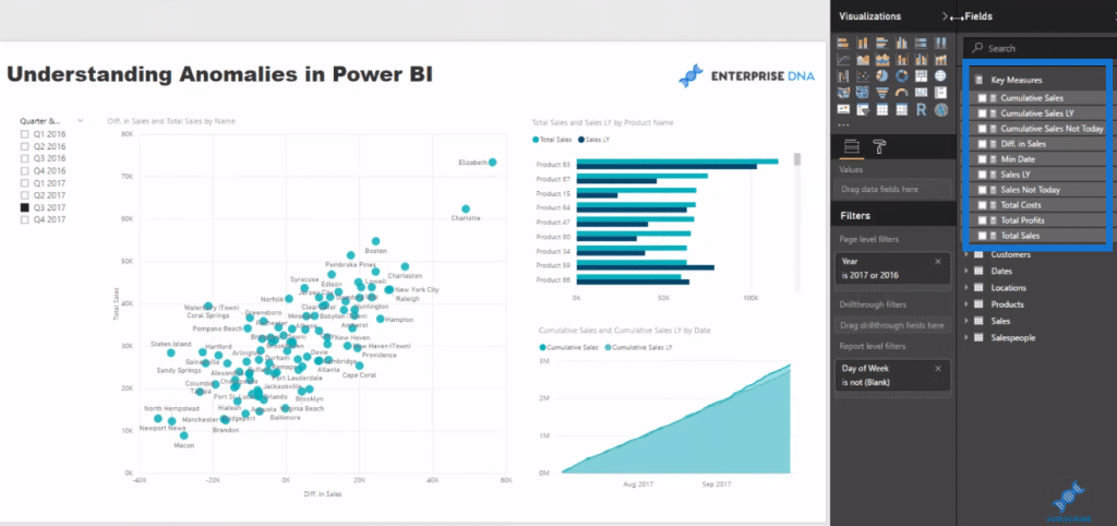
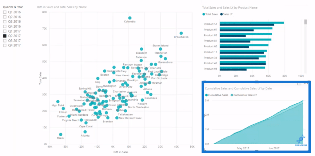
This sample data shows regional sales. We’re looking at the total sales in a particular quarter and also the difference in sales.
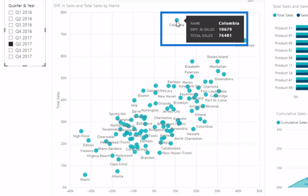
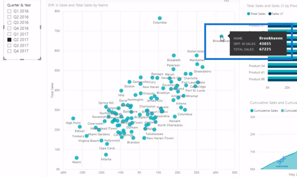
With this data, we can already get vital information. For instance, this customer had a significant amount of 76 million sales, but that’s only a small improvement on last year compared to this customer with total sales of 67 million and a huge improvement on the year before.
But then we also want to dive deeper to understand these anomalies. I wanted to see if it was driven by products or total sales versus last year. And we could drill into each product and work out the difference.
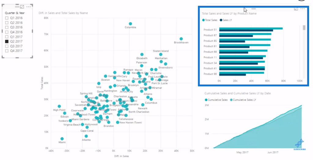
This cumulative information down here is what I always say is the best for identifying trends like this. If we had some sort of seasonality trend for a particular group of customers, we would see it very quickly inside the cumulative total pattern. It’s much easier to see it here than from a column chart.
Understanding Anomalies In Power BI
We can select within this chat any quarter we want to look into. So for example, we choose quarter three. We can immediately see some anomalies in our data. We could then say why has there been such a difference in sales for this particular customer.
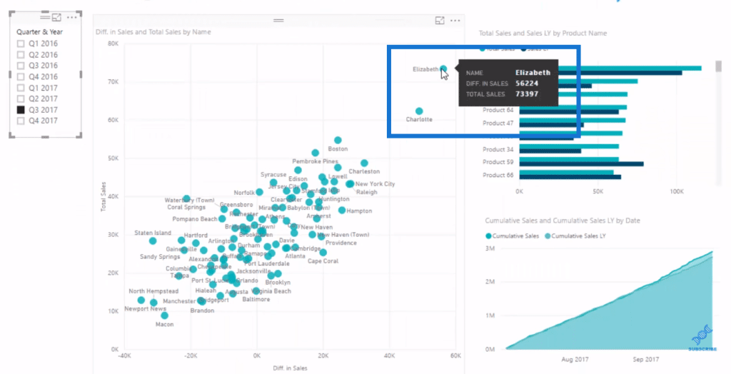
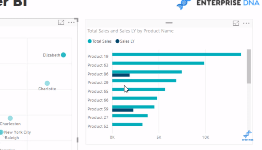
But we could select it and go through our analysis here. We can see that they’ve bought a whole range of products than they have in the past. So we can see here that these are the ones that they bought last year, and then all of a sudden they’ve bought all these other different products.
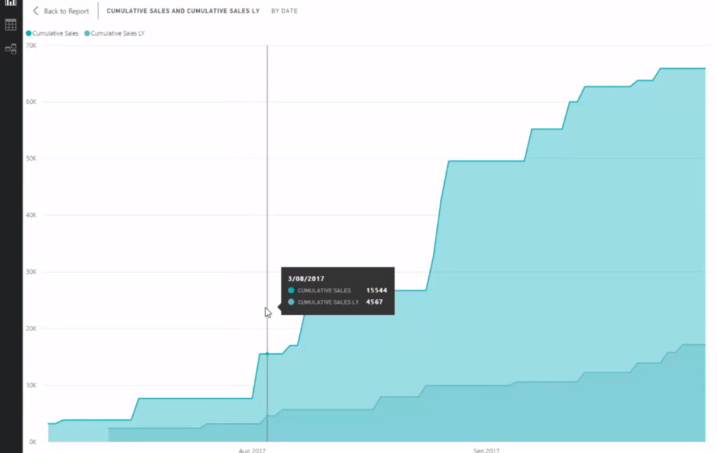
And in the cumulative total, it shows that it just outperformed everything that it did in the prior year like this:
We could select a range of anomalies as well, such as our poor-selling or worst selling compared to a prior period.
We can do ‘multi-select’ by holding down control (ctrl)
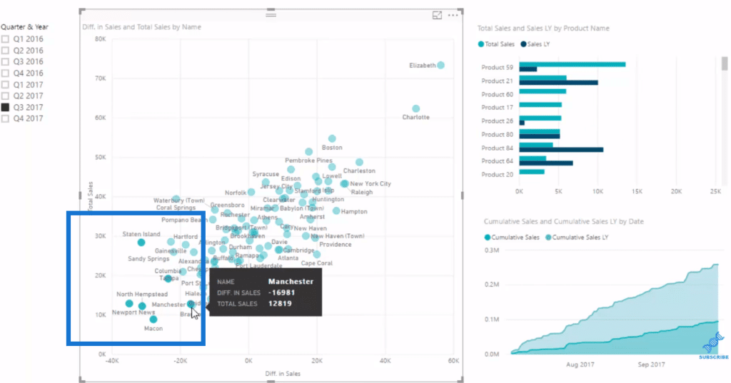
and then we can see the results here in our sales chart.
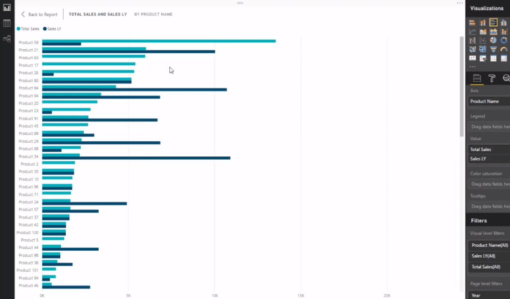
We might want to change the sorting here as well,
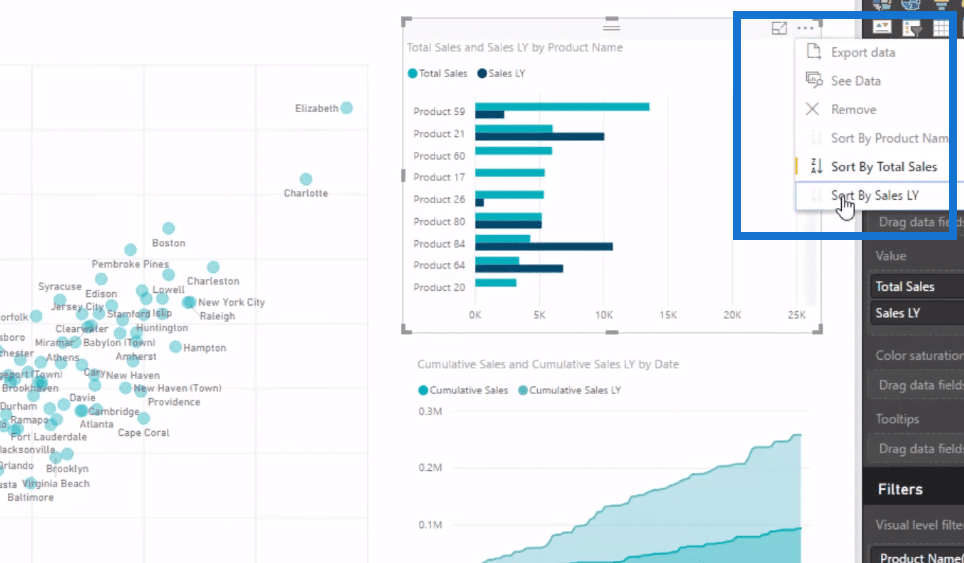
so we could get a better picture.
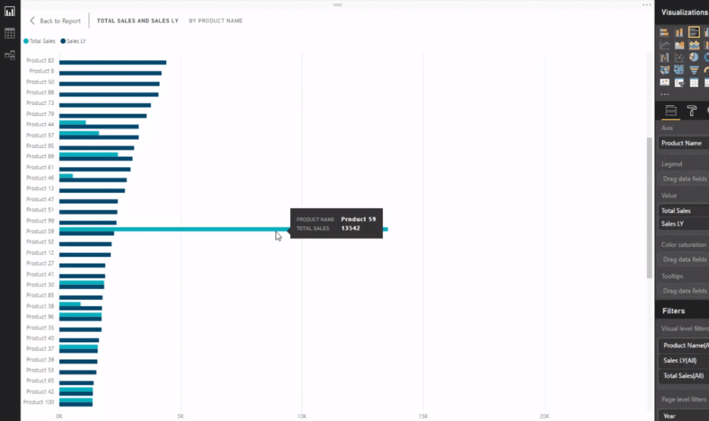
That’s how we can really understand our anomalies so much quicker with Power BI.
***** Related Links *****
Identify & Showcase Data Outliers In Power BI Using DAX
Detecting & Showcasing Outliers In Power BI – Free Training Workshop
Outlier Detection & Visualization In Power BI – Advanced DAX
Conclusion
The key take away from this tutorial to achieve this is to combine all your DAX techniques and layer them on top of one another.
You might start with Total Sales and go Total Profits, and then use some time intelligence. You might also want to use some cumulative totals.
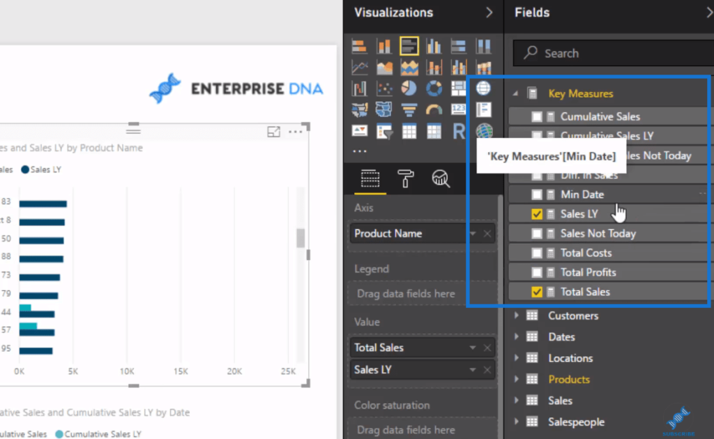
And then use the power within your data model to be able to place those filters. There are more techniques you can do here and this is just a few of them.
To discover more advanced analytical techniques that can be implemented in Power BI models, check out the links below. Watch the video for more details on this tutorial.
This is some really powerful stuff. Enjoy!
Sam


