We are going to take Power BI development to the next level and discover important new trends in our data. First, we need to dive into our data outliers through some advanced logic in Power BI using DAX. You may watch the full video of this tutorial at the bottom of this blog.
I’ll help you understand the difference between raw and filtered contexts. So, we’re going to analyze and showcase outliers in our data effectively inside Power BI.
Outliers are very similar to anomalies in our data. They are the results that lie outside the overall pattern of a distribution. Therefore, through our analysis, we will likely want to segment these specific results in our data.
But I do classify them slightly differently to anomalies because we may want to put trigger points around what we would consider an outlier.
So, how do we detect them? How do we showcase them really well in Power BI? And how can we do it dynamically?
Showcasing Outliers Dynamically Through Power BI
In this blog post, I want to show you something quite advanced that I love talking about. This is just one example of the amazing capabilities of Power BI.
To showcase our data outliers through Power BI, we’ll need to combine a number of DAX formulas and visualization techniques. This is how we can showcase what is an abnormal result and why this outlier may be occurring.
In addition, we also want to delve deeper into these outlier results to enable us to understand why they are so.
This is where we can take our Power BI development to the next level. We can really look through and understand what is driving the results we’re seeing.
Identifying Data Outliers
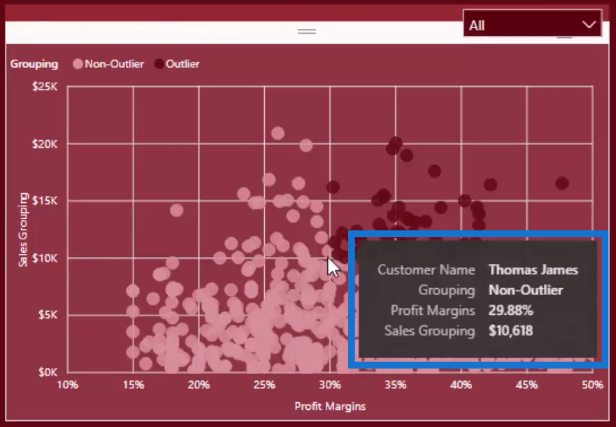
In this example here, we’ll use this dashboard to focus on looking at the customer performance outliers through Power BI.

As we can see in the upper-right part of the dashboard, we can click through different time frames. Most importantly, it will automatically show us the data for that specific year or quarter.
For example, if we want to analyze the outlier customers in the first quarter of 2017, we can click 2017, and then click Q1.

Above all, this is how we can manipulate our data in Power BI to extract insights the way we can never do in Excel. But we can, inside of Power BI. For me, this is really powerful and this is where the real value comes from our analysis.
For example, what I classified as an outlier in this particular sales case was a customer with sales over $10,000 that had profit margins over 30%, in any particular quarter.

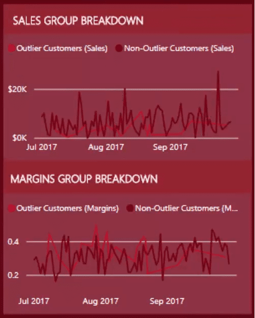
If we look around and drill into a particular insight, we might want to see the breakdown of the particular outlier customers through a certain period. Aside from that, we might also want to check the trends for non-outlier customers.

So, let’s jump over to this demo I’ve set up.

We’ll see here, I have two measures that specify the outlier customer sales and the non-outlier one. The bottom line in light maroon color signifies the outlier customers, while the upper line in dark maroon is the non-outlier customers.

Showcasing Data Outliers Using DAX
Moreover, let’s dive into the formula to break out and classify these data outliers in Power BI.

As we can see by now, different quarters have different data. So, our outlier here is dynamic as it changes over any time frame.
Thus, we need to create a dynamic calculation based on the overall outlier metrics that we have.

Basically, we just need to calculate the total sales which is the most important part.

But, we only want to calculate it for the customers who have exceeded the outlier numbers that we have previously set up. Thus, we can’t just place Total Sales in the formula because the data that we have is daily data.
What we can do here is add ALLSELECTED(Dates) to remove any context from the dates, but retain the quarterly context.

Furthermore, we can enter a selection for the locations – just enter ALL(Locations),

or a selection for the products, enter ALL(PRODUCTS).

To clarify, we just want to make sure that we don’t have an additional filter because what we are evaluating is the quarterly number which has $10,000 and 30%.
Remember, we want the Total Sales to be a quarterly number, the same with the Profit Margins. Our goal is to create some context of our customers based on the overall number comparison.
Now, let’s go back to our dashboard. What we can see in the table for CUSTOMER PERFORMANCE BREAKDOWN will always be the same subset of customers that we can see in the tables for sales and margins breakdown.

That’s how powerful we can get inside Power BI.
***** Related Links *****
Showcasing Anomalies From Your Data In Power BI
Detecting & Showcasing Outliers In Power BI – Free Training Workshop
Power BI Data Sets: Learn How To Detect Abnormal Behavior Using DAX
Conclusion
To sum up, our outlier results, be it above or below trend, are things we want to explore more. Thus, completing this type of work in Power BI does require a reasonable amount of knowledge about DAX formulas, which is why I decided to create this tutorial.
We have delved deeper into how we can build an entire report focused on outliers and all the different variety of DAX to make it happen.
Enjoy diving into this tutorial – there’s so much more to learn, but we’re sure that everyone is going love discovering more about this subject.
Cheers,
Sam


