In this tutorial, you’ll learn about creating visualizations using Charticulator and the custom visuals available in Power BI. These two visual tools are responsible for the creation of charts in your report. You’ll understand and see how both tools can generate the same results.
Creating Visualizations Using Charticulator
This tool can be found in the charticulator.com website.
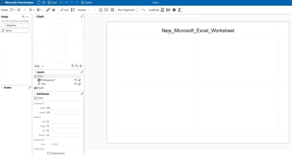
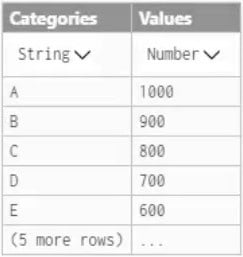
Before creating a chart in Charticulator, make sure that the format of the file you’re going to use is CSV. For this example, this data file will be used.
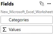
Once you’ve opened your data file, you can see Categories and Values in the Fields pane.
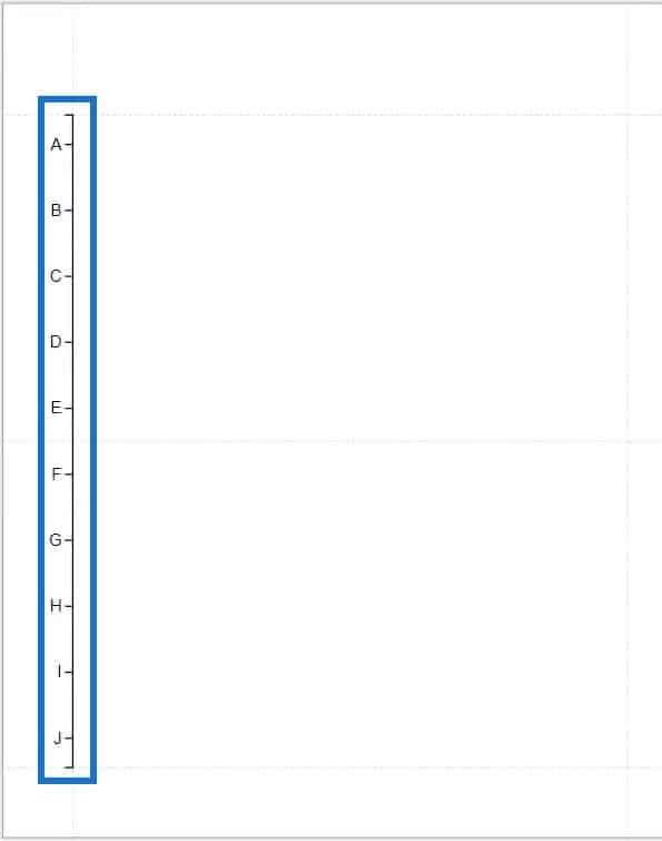
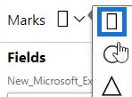
Drag Categories into the Y-Axis of the workspace, and select rectangle as the shape of your charts.
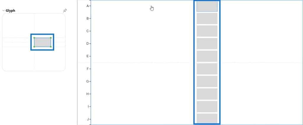
Next, define the size of the rectangle inside the Glyph. The defined shape will be reflected and shown inside the workspace.
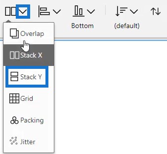
Click the workspace and change the first setting in the pop-up to Stack Y.
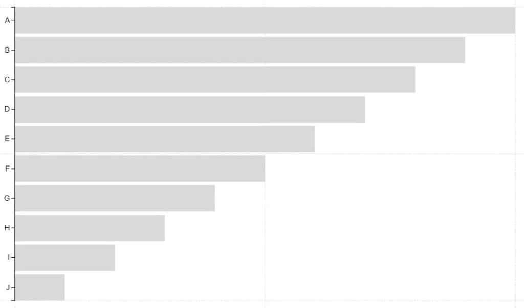
Next, extend the lines of the shape in the Glyph and align them with the edges of Y and X-Axis. Then, bring Values to the X-Axis of the chart. Your visualization will now look like this.
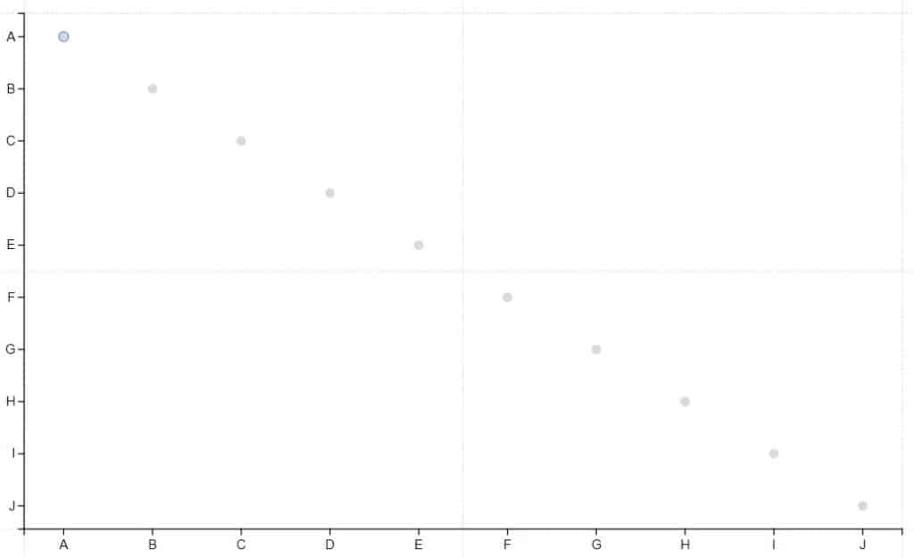
You can also do it with circle visuals. Just delete the previous layer and change the shape to circles. Next, drag Categories again to the X-Axis and you’ll see this result.
Recreating The Same Visuals In Power BI
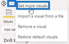
Now, open the same data file that was used and recreate this visualization with the custom visual in Power BI. Click the three dots in the visualization pane and select Get More Visuals to go to the App Source.
In the Power BI Visuals App Source, search for Charticulator and click Add.

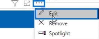
Next, click the Microsoft Charticulator icon below the visualization pane and enlarge the visualization. Once done, click the three dots on the visual and select Edit to go to the edit mode.
A pop-up will appear on the page. But before you select Create Chart in the pop-up, bring Categories into the Data fields.


You will then see the same interface that you see on Charticulator. The only difference are the positions of the panes and workspace.
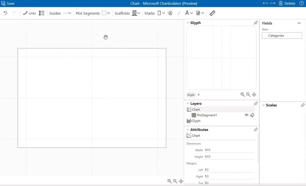
To recreate the same visual as the website, bring Values in the Data fields and assign Categories to the Y-Axis. Next, select a shape and define its size inside Glyph. Lastly, drag Values to the X-Axis.
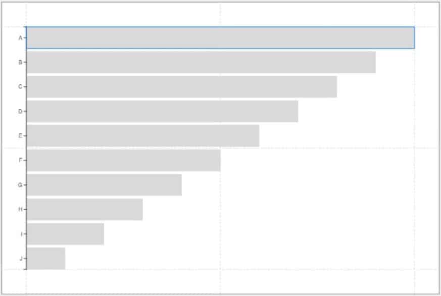
You can see that the custom visual provided the same results as Charticulator. The process of creating the visuals is also the same.
***** Related Links *****
Power BI Desktop Update: The Charticulator Visual
Custom Bar Chart In Power BI: Varieties And Modification
Power BI Slope Chart: An Overview
Conclusion
Data visualization is one of the most important things that you need in your report. It will help make your report more compelling and easy to understand. You can create visuals in either Charticulator or inside Power BI.
Mudassir


