
If you’ve been searching for custom visuals for Power BI, I’m going to show you an awesome one that I’m guessing 99% of you have never seen or heard of before. You may watch the full video of this tutorial at the bottom of this blog.
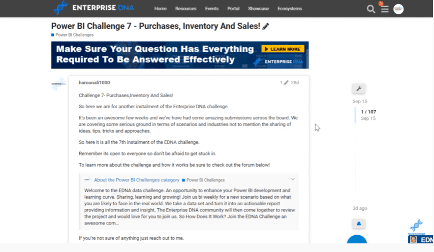
I came across this in the Enterprise DNA Challenge 7, which dealt with purchases, inventory and sales. We had a data set that was primarily focused on purchase orders, receivables, and invoices.
For this challenge, we needed to depict the time in between those events and visualize them in a useful way. One of the things that jumped out at me initially about this challenge was that it would be great if we can show the different events on a horizontal timeline scaled by date. I knew there was not a way to do that in the base visuals within Power BI.

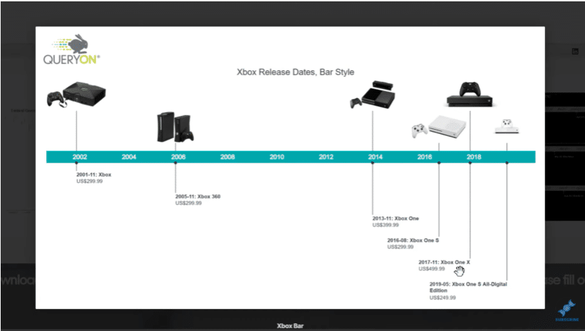
So I went to the AppSource marketplace and looked for custom visuals that can do horizontal timelining. I found something called Query On Timeline.
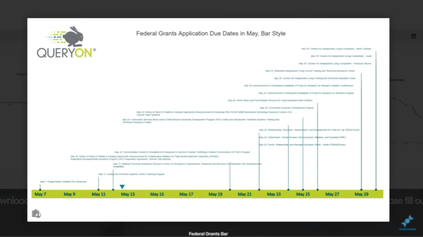
It has something that I was looking for – a bar with dates and graphics and the ability to include some additional information below the line like purchase order dates, bill of lading dates, and invoice dates.
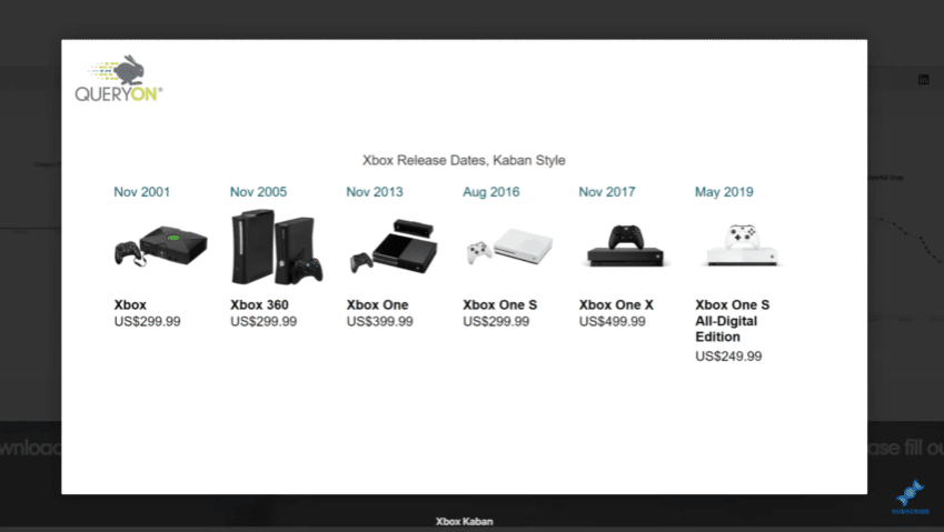
There are other ways that you can use this, like this Kanban style.
You can also use the scaled-down version without the visuals.
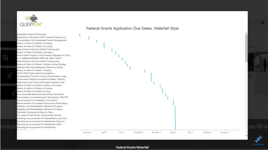
Or choose the waterfall style.
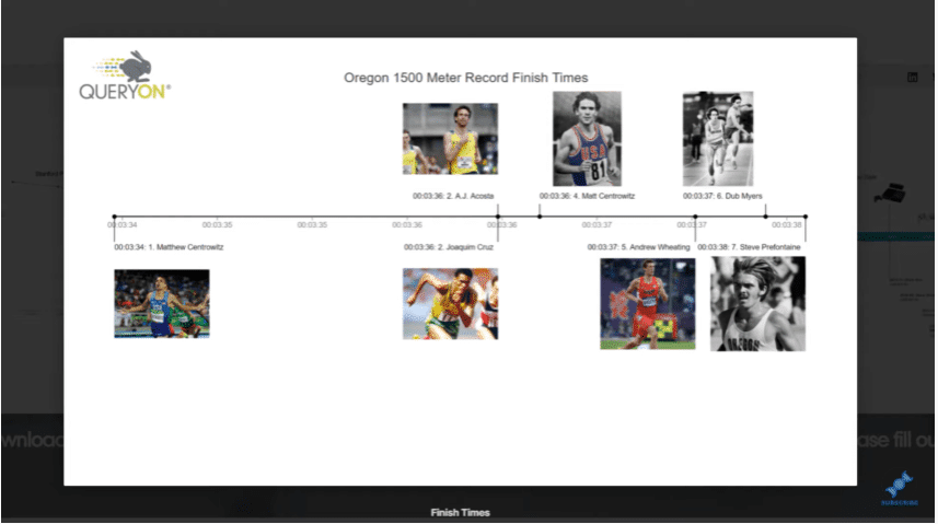
You can even go for the picture-in-line style.
There are lots of ways you can go about this. As I started to investigate this, I found out that there was no documentation about this. There was surprisingly nothing about this in the Microsoft community, where you can almost always find something that will answer your question.

I had to explore this one primarily on my own. In this blog, I want to show you what I did with it and walk you through how to use it in case you’re interested in applying it to your own reports.
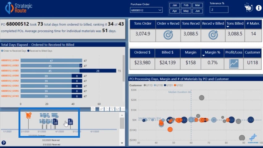
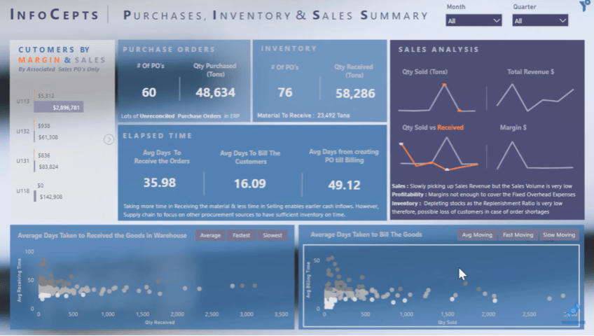
This was my entry for Challenge #7 using the Query on Timeline visual.
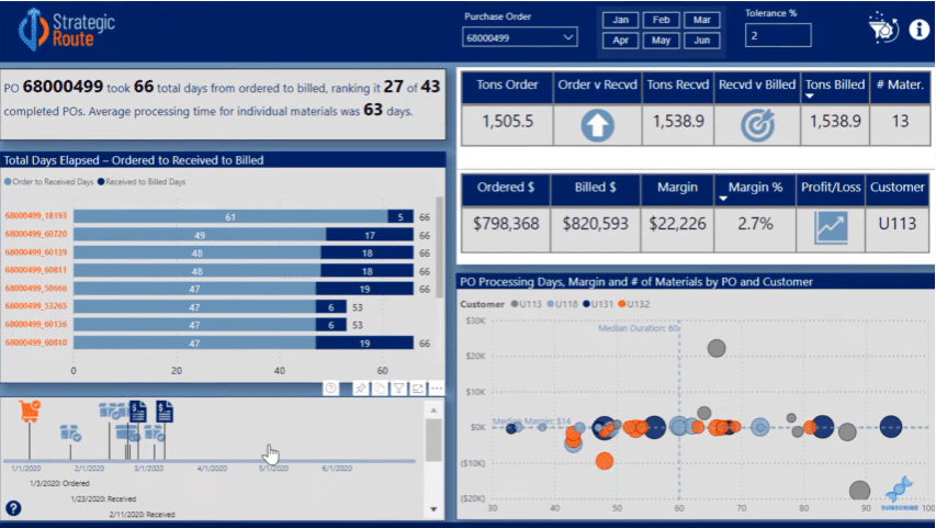
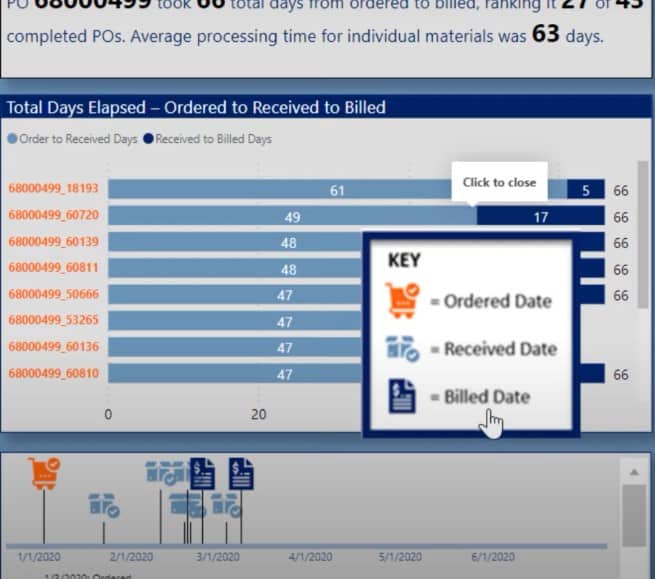
The bottom left visual has this key: the orange was for purchase order dates, the medium blue was receivables, and the dark blue was invoice dates.
Each of the purchase orders has multiple materials with different delivery dates and different invoice dates. Everything is fully dynamic so if you select on another purchase order, you can see that the visual changes and you can filter it by material.
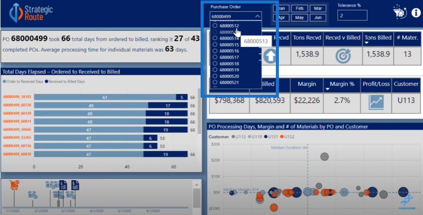
You can also move out of focus to see the full range of dates associated with the different receivables and invoices.
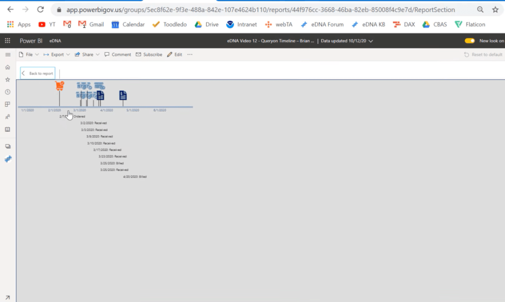
If you click through any of these icons, it will actually take you to their page. For example, if you click on the invoice…
…it will take you to a mock invoice template.
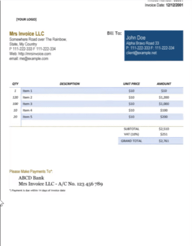
And similarly, if you go to purchase order, it’ll take you to a purchase order template. The same thing happens for deliveries and bills of lading.
Key Steps To Achieve One Of The Best Custom Visuals For Power BI
This is a sophisticated visual and there are several key steps to getting this to work on your own reports. The first one is to prep your visuals.
The second step is to upload the visuals to a public hosting site where you can easily grab the URLs for manipulation in Power BI.
You also need to get your supplemental URL set up, which in this case, are the mock templates that we linked to the icons.
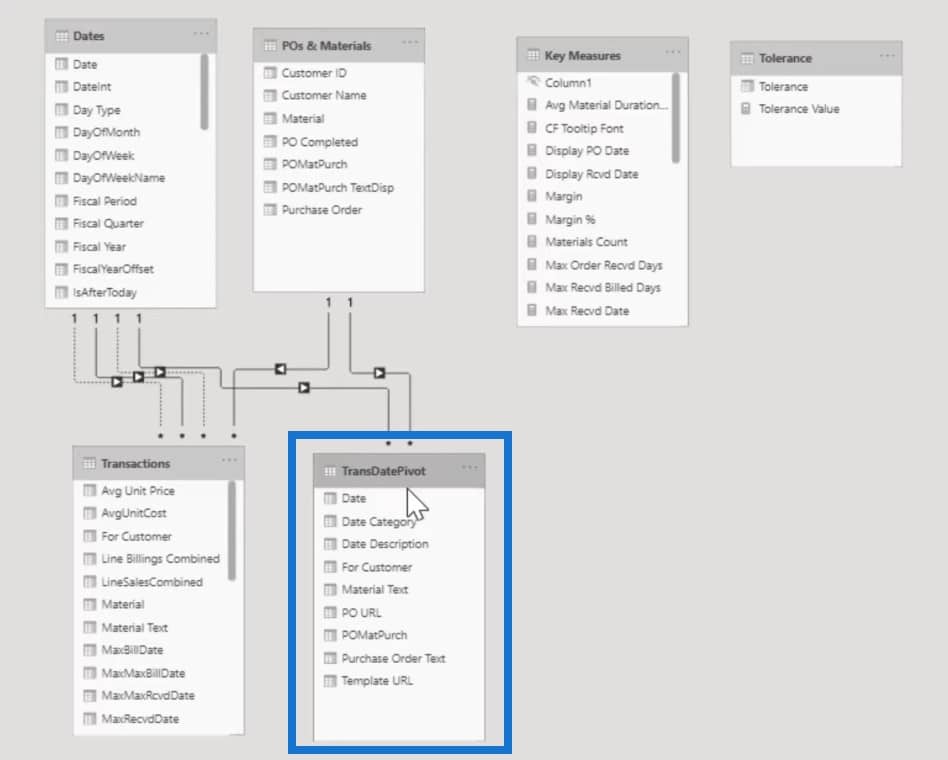
Then you need to set your data model up in a way that is consistent with the Query on Timeline requirements.
Unlike other visuals which are flexible when dealing with a variety of data models, this one requires some strict limitations on how you structure your model.
You have to take this into account ahead of time and then configure the visual itself. It has a lot of configurability, with some of it not being intuitive.

Prepping Your Visuals
Let’s start with Step 1. I use a site called Flat Icon for my visuals.
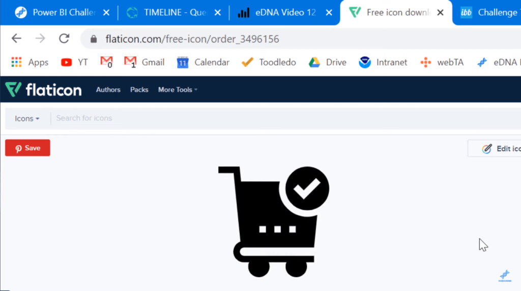
There are a lot of good icon sites; this just happens to be the one that I use. What I did was select three icons, one each for purchasing, deliverables, and invoices.
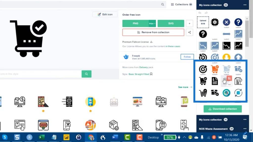
I altered these icons using my color theme. If you’re curious on how to get these to match your color theme, check out my video on easy hex code wrangling for Power BI.
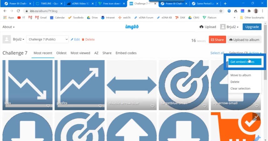
Once you have your photos, images, or icons all set up, download and upload them to an image hosting site. Again, there are a lot of good ones. The one that I use is called ImgBB, which is a free site that’s easy to use.
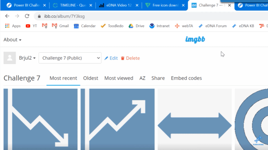
The icons that I used in my entry for the Query On Timeline are the orange, medium blue and dark blue colored icons.
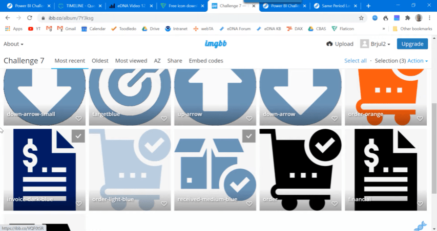
The key here is to select the icons you need and select Get embed codes.
This will allow you to see Viewer links.
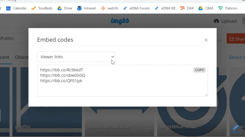
Click on the dropdown button and go to Direct links.
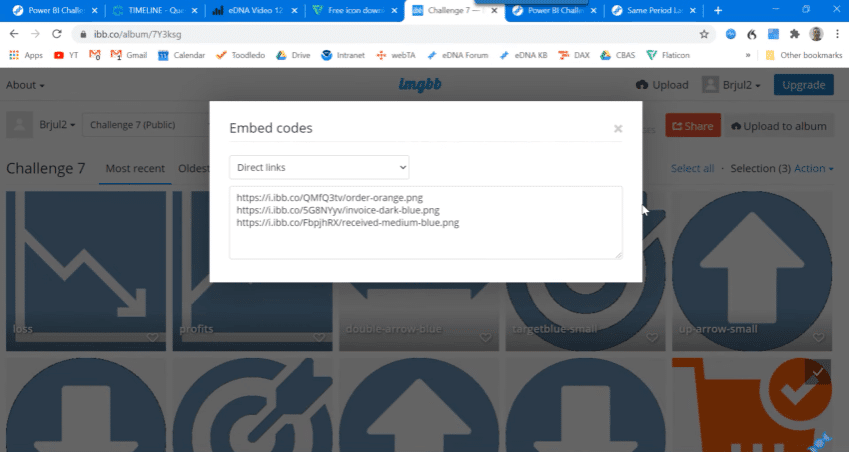
Then copy these links into a notepad. The key here is to get the URLs of these publicly hosted images.
This is similar to what you’ll do for your supplemental URLs. In this case, the site I sourced from is called Template Labs.
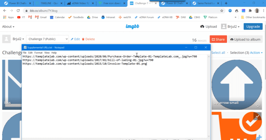
I copied down the URLs for the purchase order, bill of lading, and invoice templates in a notepad. We’ll handle these the same way that we’re going to handle the icon URLs.
Prepping Your Data Model
The next thing to do is prep our data model. I’ll show you how most people in the challenge handled their data models. This is Mudassir Ali’s submission, and he put together a wonderful entry for this challenge. I really encourage you to take a look at it.
There are a lot of really interesting visuals and tooltips embedded in here, as well as some cool techniques. To achieve this, he built a data model with three fact tables, which is a perfectly good approach in this challenge.
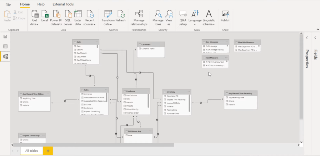
This was a good way to do the calculations and come up with the analytical findings that were needed. But this model will not support the timeline approach.
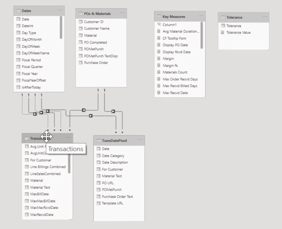
My submission was basically a lot of power query work to get those three fact tables into one end-to-end transaction table.
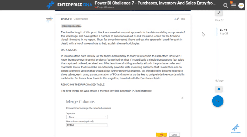
In the forum, we do get to write extensively on how we came up with our entries. You can read this post to see how I put together the end-to-end transaction table in extensive detail.
If we look at the transaction table, we’ve got a number of dates: purchase order date, invoice date, receivables date, and other calculated dates.
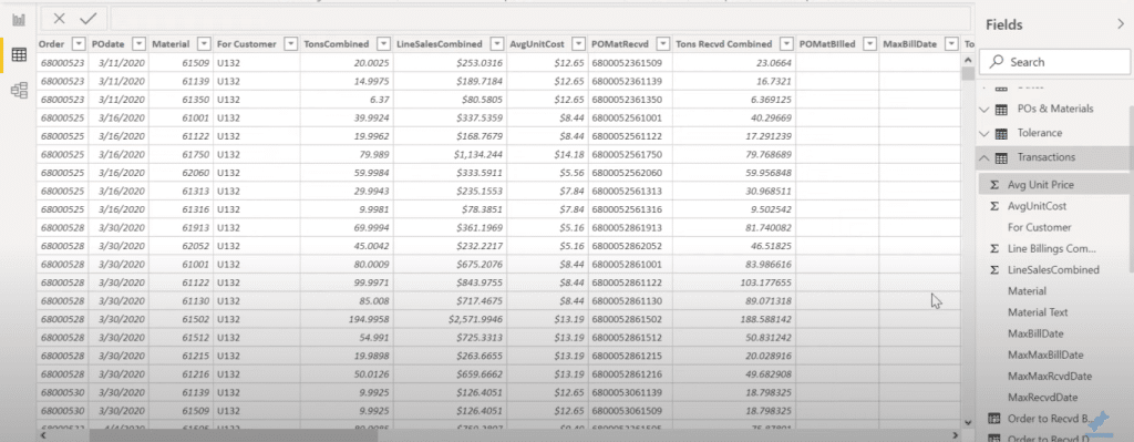
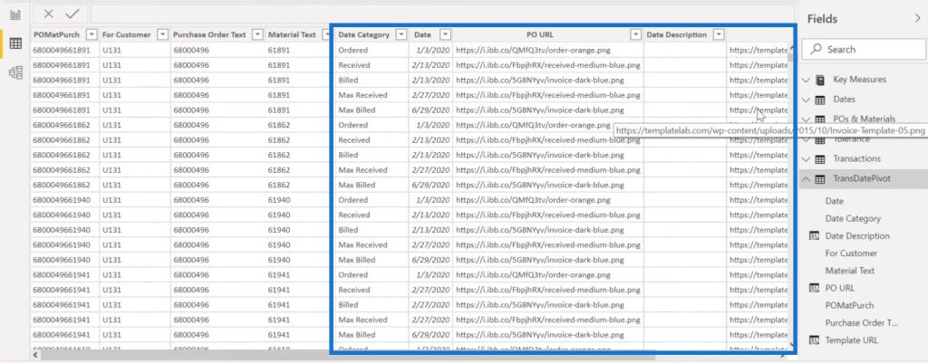
What’s needed for the Query On Timeline is a single date column. So after putting this single transaction table together, I’ve unpivoted it and then linked the unpivoted version into my data model. Note that the title says pivot, but this is actually unpivoted.
If we take a look at the transaction table again, we’ll see the Date category column and the single Date column.

The Date Category column has been basically collapsed down into three main categories: ordered, received, and billed. But there are also local and global maximums and minimums in there.
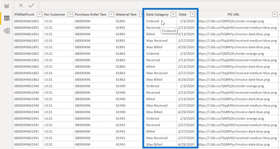
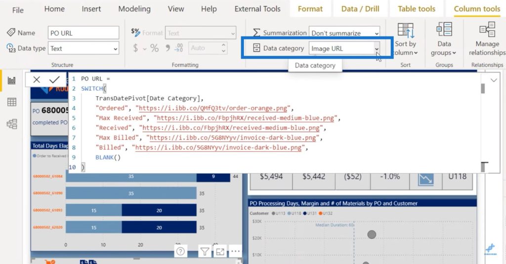
We also have the Purchase Order URL (PO URL).
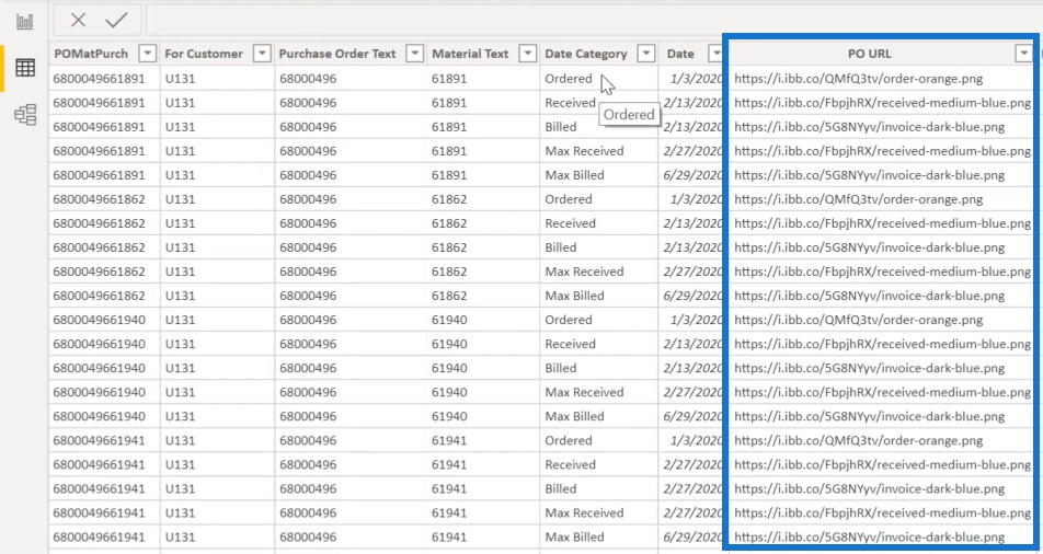
If we look back at the transaction table, we’ll see the calculated columns for these URLs which are SWITCH statements that look at the data category and assign the URL from the image hosting site to the appropriate icon.
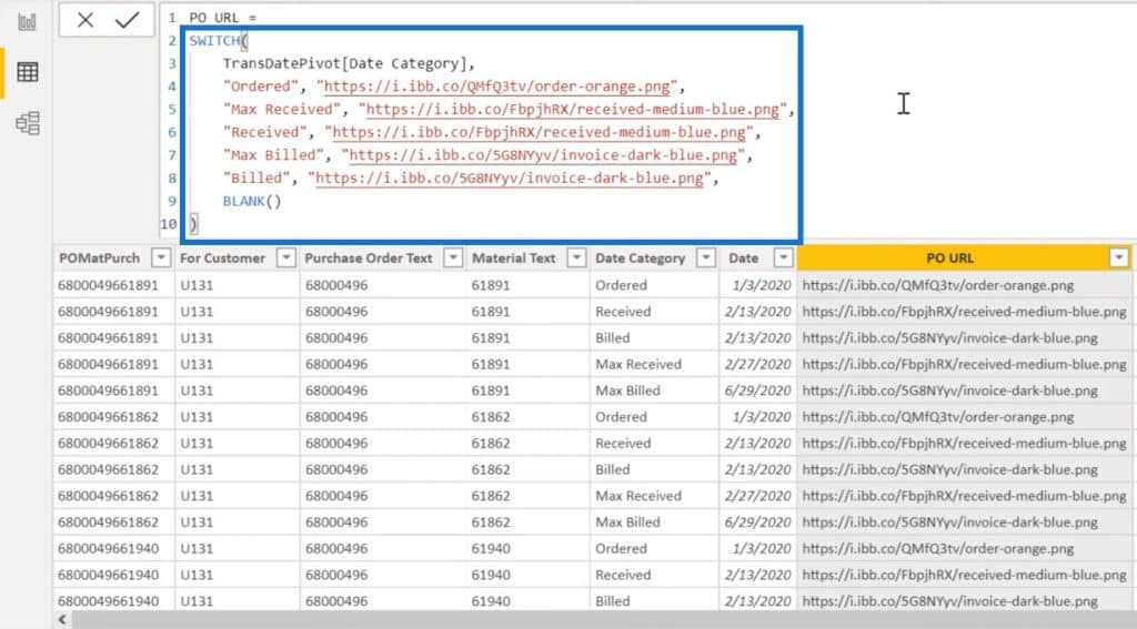
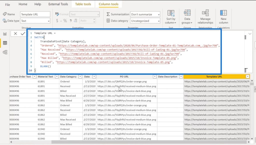
We do the same similar SWITCH statement for assigning the template which is also based on the Date Category field.
This is how I assigned the proper icon and template for each of the records.
If we go back to the unpivot table, we’ll see the single Date Column, the Date Category, and the two URL fields for the purchase orders and templates.
This is all we need to get the timeline set up properly.
If we go into our visual and the main fields here, the Title is the unpivoted Date Category that I showed you.
The Date/Time can be one of two things: the fact table date in the unpivoted version or the validated date in the Date table. Either one works here.
The Optional URL is the template URL that is linked to the icon click.
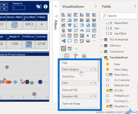
The Optional Image is the purchase order URL field.
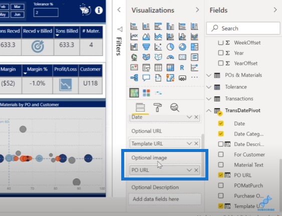
Now, if we take a look at that PO URL field, we need to set the Data Category into Image URL, since it will automatically default to text. If you keep it as text, the images are not going to render properly.
If you set it to the URL field, the images will come through properly from the image hosting site.
These steps are basically how you can get the foundational fields set up properly on the visual.
Formatting The Custom Visuals For Power BI
Now, I just want to walk you through some of the formattings I did for the report. The first one that’s relevant is Stagger Text, which creates a cascade effect.
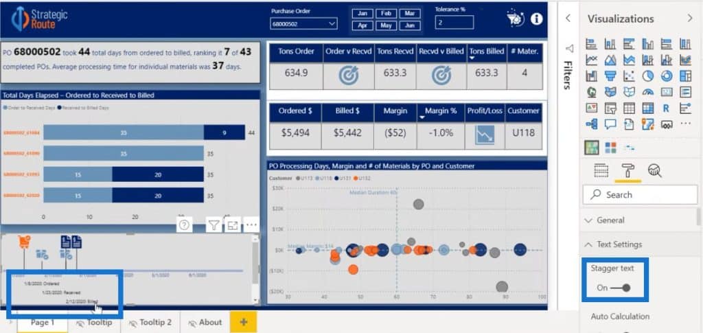
If we turn Stagger Text off, what we get is everything on the same line. But when you have multiple fields relatively close to each other, they just overlap and become unreadable. This is why we staggered the text on the auto calculation.
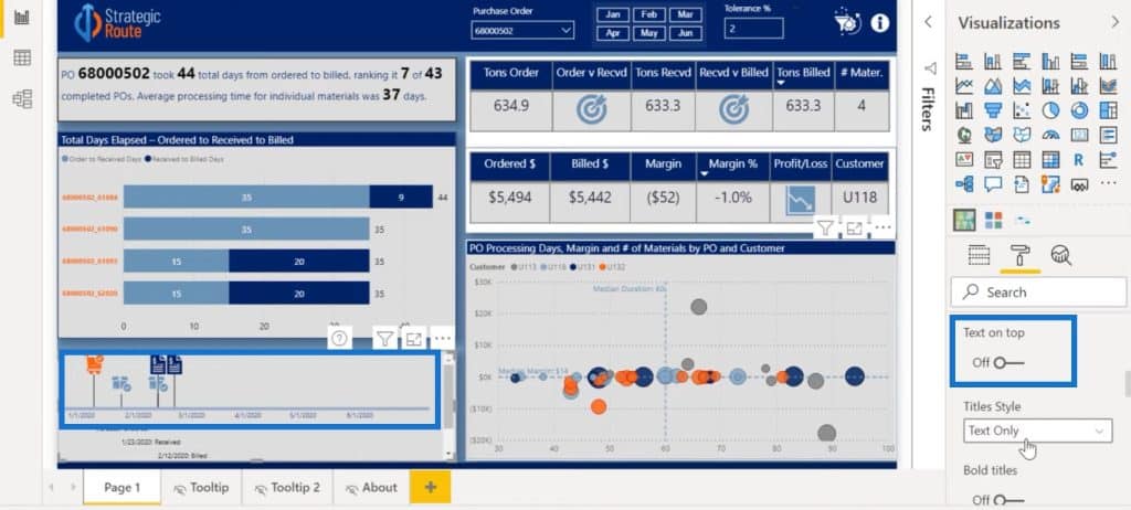
The Text on Top function lets you move the cascading text below to above the line.
The Bold titles allow you to highlight the title in bold. There’s also some date formatting you can do on the X axis. You can show or not show the dates on the axis.
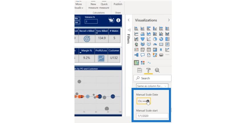
The Manual Scale Date switches are also important because if you turn it on, the beginning point and the end point remain constant.
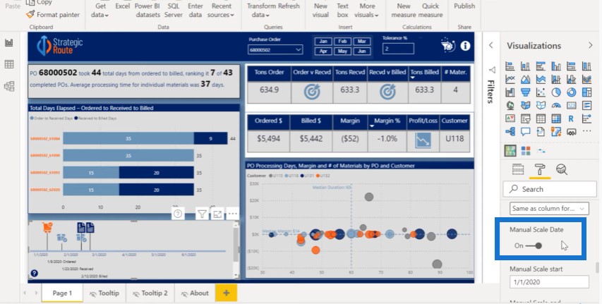
This needs to be on because we have a fixed period of time for the data. We want to show relative to that fixed point in time where these different events occur.
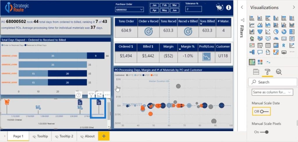
If we turn this off, the last data point in every purchase order becomes the end point of that line. As you can see, the end point is March.
In this case, we want to turn Manual Scaling on and start it on January 1st, which is the beginning of the dataset, and end it on June 30th, which is the end of the dataset.
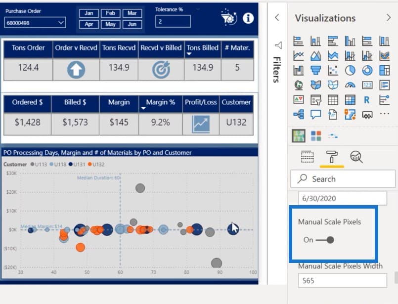
The Manual Scale Pixels sets the width of the line. The only reason we turned this on was to create a gap so that it didn’t run and create a scroll bar at the bottom.
The Single element properties is useful if you only have one event per category.
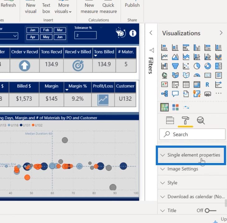
Since this doesn’t have full-blown custom conditional formatting, you can set the font, color, and properties of each category with this feature. It only lets you do the first one, while the rest of them are in the default color. Hopefully, in a later version, they’re going to have the full conditional formatting.
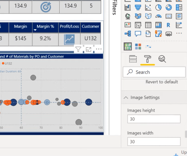
The Image Settings lets you scale the size of your images and maintain the proper spacing.
The Style allows you to choose from several styles: Bar style, Line style, Waterfall style, and Kanban style.
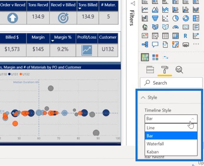
We’re going with Bar style, but for other applications, you may want to experiment and play around with this feature.
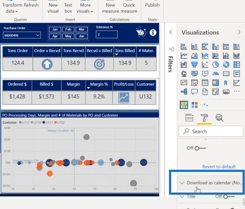
This custom visual also has a dynamic ability to show today’s date but it’s not relevant in this case because it doesn’t extend to the length of our data.
It also has the ability to download the dates as a calendar file from Google Calendar or Outlook.
Conclusion
This is an example of how you configure custom visuals for Power BI. There’s a lot of experimentation required to get it to look exactly right, but I think it provides a valuable way of displaying the data.
Hopefully, you found this tutorial useful and you found something that you may want to experiment and play around with.
Please subscribe to the Enterprise DNA TV if you haven’t yet. We have a lot of new video content coming out soon.
***** Related Links *****
Utilizing Custom Visuals For Power BI
Power BI Custom Visuals – Build A Reporting Application
Power BI Custom Visual – Creating Text Summaries
***** Related Course Modules *****
Data Visualization Tips
Dashboarding & Data Visualization Intensive
Mastering DAX Calculations
***** Related Support Forum Posts *****
Power BI Challenge 7 – Purchases, Inventory And Sales!
Power BI Challenge 7 – Purchases, Inventory And Sales Entry from Brian J
Can You Spot The Custom Visual?
For more custom visual queries to review see here…..


