
In this tutorial I demonstrate how to create a cumulative visualization in Power BI, showing cumulative results versus targets or budgets. This is a really good visualization to show things over time. You may watch the full video of this tutorial at the bottom of this blog.
But, in this example, I only want to show the results up to today’s date or the very last date of a sale that we have made now. So we’ll generate cumulative results only up to a certain point.
This is a budgeting example from one of the Enterprise DNA Learning Summits. It’s a really relevant example if you are running some time comparison analysis and you’re looking at trends over time as a cumulative total in Power BI.

Here’s a description of a specific scenario below.
You want to analyze your results up to a certain date versus the results that you received last year, but because of the misalignment of data, you might have results that look like they exist in the future when those dates haven’t actually come up yet.
Utilizing this simple technique that I run through in this tutorial allows you to create a visualization that looks more realistic, where you only see results up to the last sale date, for example.
Cumulative Sales vs Cumulative Budgets
In the visualization, the Cumulative Sales (Actuals) is the aqua-colored line, while Cumulative Budgets (Forecasts or Targets) is the dark blue line.
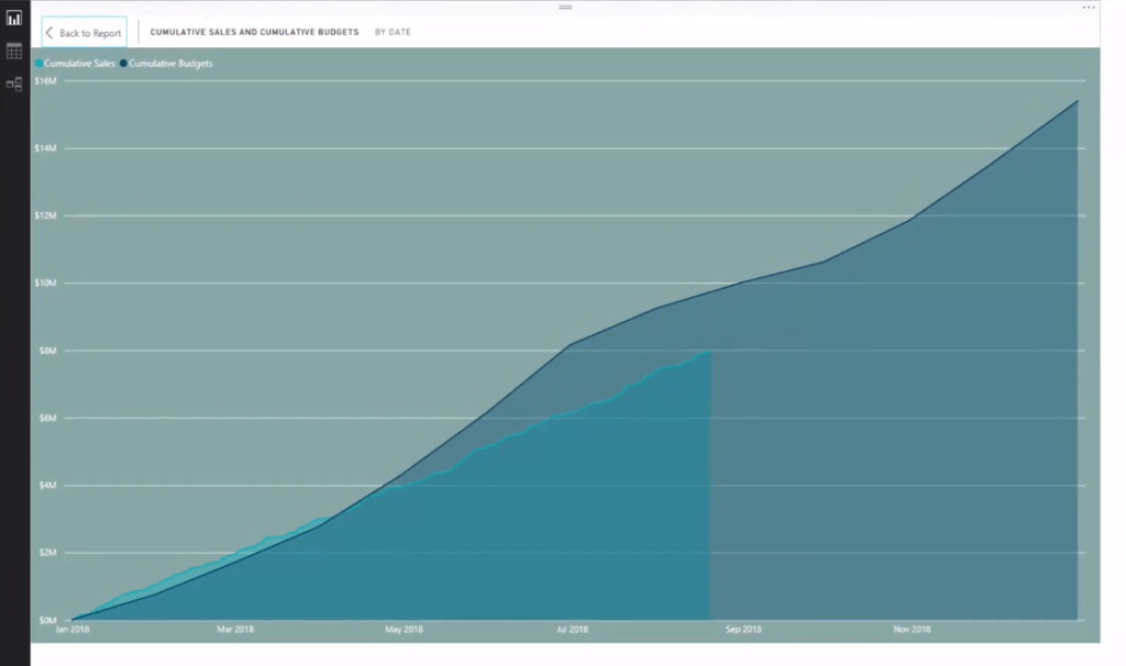
If we do not use this simple technique, we’ll have cumulative results with a line that goes straight out. Because there’s no single result posted here it is 0, then the cumulative total is the same result as the rest of the dates.
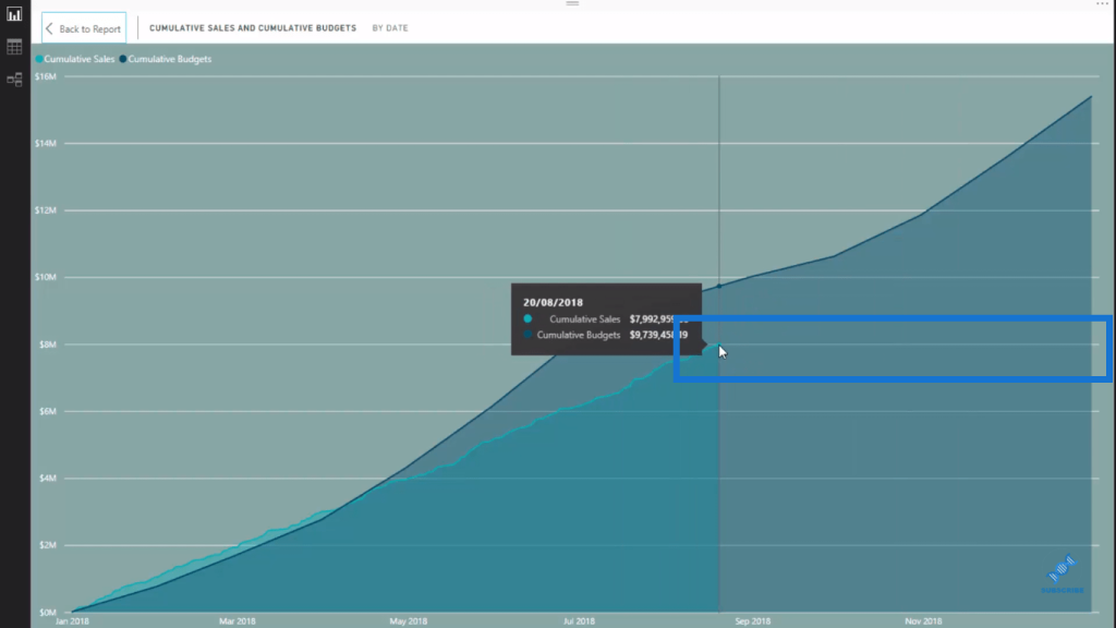
But what we’re trying to do here is for this to stop at the last sales date. We don’t want a line to continue for Actuals, but rather blank it out from the last sales date onward. As we go through the days, we make more sales and this line would just gradually grow.

To achieve this, we need a formula with a logic that would generate cumulative sales only up to a certain point in time.
Generating Cumulative Sales Only Up To A Certain Point
So let’s have a look at the formula I created for this analysis.
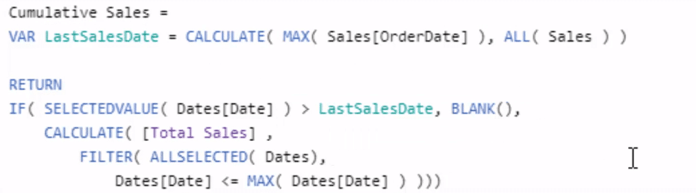
In the first part of this formula, which I call Cumulative Sales, we need to work out the LastSalesDate, wherein we use CALCULATE, and then ALL to remove any filters that are coming from the Sales table. Regardless of where we’re at, or whatever day we’re on, we’re always just looking for the very last sale date.
We then need to make sure that we have this blank space, and so the second part of the formula is the key logic to achieve that. This logic is actually the cumulative total pattern, which you can use over and over again.
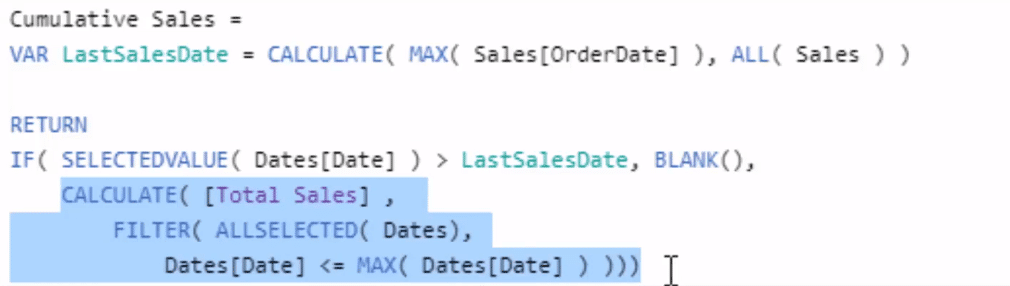
Here we’re just creating cumulative total based on any selected context. And in this case, we work out the day we’re on and whether that day is greater than the LastSalesDate. If any particular day is greater than the LastSalesDate or the last day we made a sale, we’ll return a blank. BLANK returns a nothing result. It doesn’t return a zero; it simply blanks out, just as it’s name suggests.
If it is less than or equal to the LastSalesDate, we’re going to return the cumulative total like we have in this example.
***** Related Links*****
Cumulative Totals In Power BI Without Any Dates – Advanced DAX
Create Dynamic Cumulative Totals Using DAX In Power BI
Using Variables in DAX – A Detailed Example
Conclusion
Utilizing this simple technique that I run through in this tutorial allows you to create a visualization that looks more realistic, where you only see cumulative results up to the last sale date, for example.
This isn’t a very difficult DAX formula technique but one that I’ve seen requested many times in the Enterprise DNA Support Forum from members.
It’s well worth having a good understanding of how you can utilize Variables (VAR) effectively inside your DAX formulas, which is what I have done here.
When trying to highlight trends over time inside Power BI, the best thing to do is utilize cumulative totals and show them visually inside an area chart in my view. I believe this is the most effective visual that you can use when analyzing or comparing trends over time.
For more trend analysis related examples, check out the links below.
Analyze & Showcase Quarter On Quarter Sales Trends In Power BI
Tracking Trends in Power BI Using DAX Formulas
I hope you enjoy working though this one!

Sam


