In today’s post, I want to show you a unique way of using the TOPN DAX ranking function to showcase your top clients over multiple periods. You can also watch the accompanying Power BI tutorial video below this post for more help. You may watch the full video of this tutorial at the bottom of this blog.
But first, let’s take a look at what we would have if we didn’t use this technique from a visualization perspective.
We can create a visualization where we’ll look at our clients based on the context that we have selected and how they have performed over time from a revenue perspective.
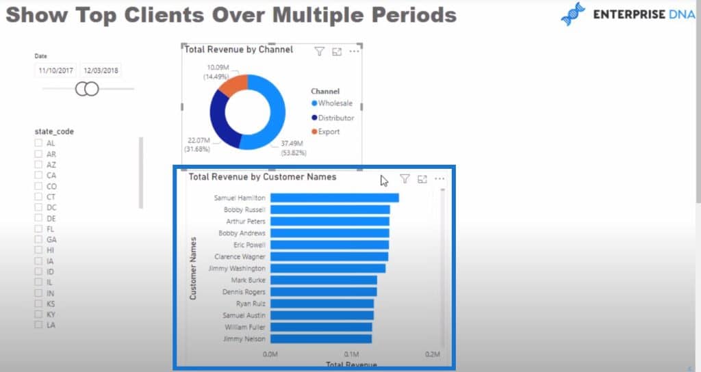
Then we can also add another visualization where we incorporated a simple logic using the DATEADD function to find out the revenue last year.
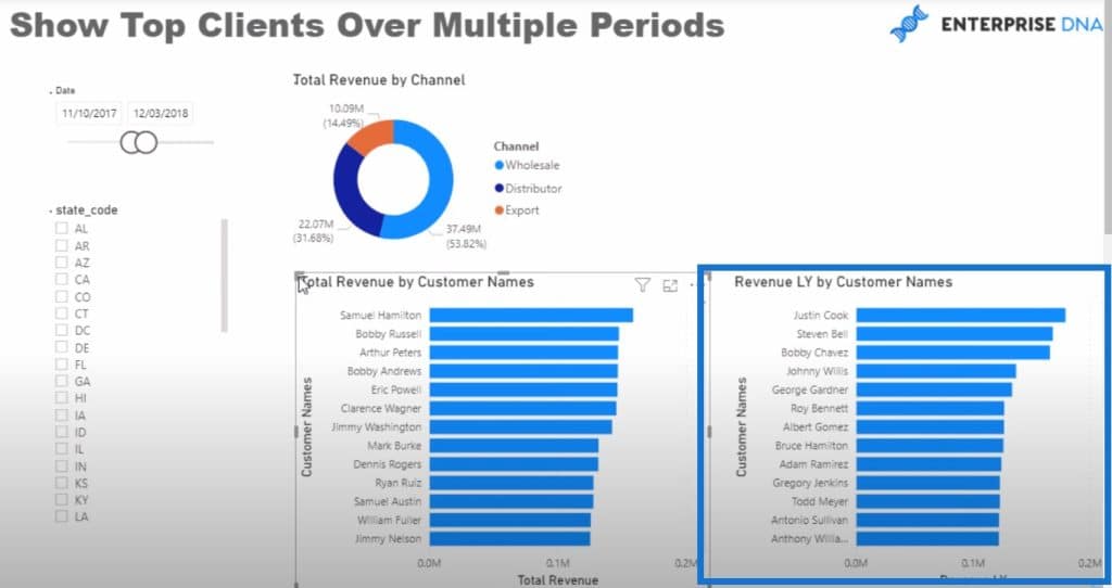
But what if we want to drill down into this? What if we don’t want to see all of our customers? Maybe we want to look at just a few of our customers or we want to visualize this in a slightly different way.
We can utilize a TOPN DAX to be able to isolate the key customers we want to look at. This way, we can showcase individualizations some unique values, like the current sales of our top 5 customers or the sales of our top 5 customers from last year.
Calculating Top 5 Customers This Year Using TOPN DAX
Let’s quickly create the formula itself using a new measure.
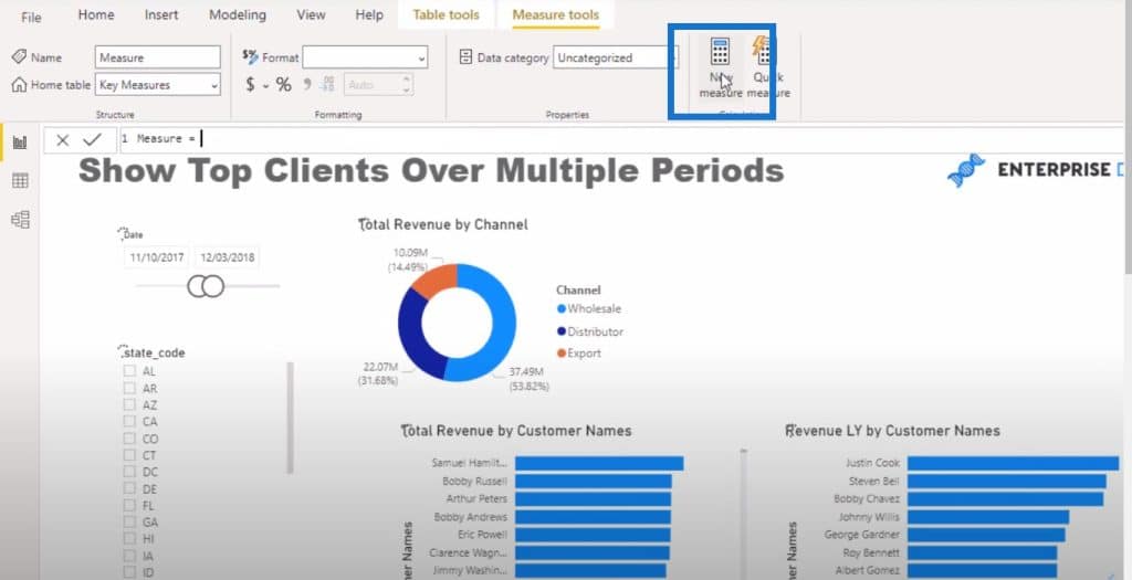
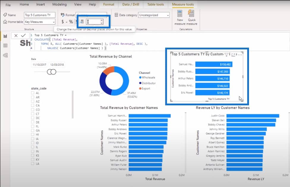
I’m going to name the new measure Top 5 Customers TY, use the CALCULATE function, and reference Total Revenue.
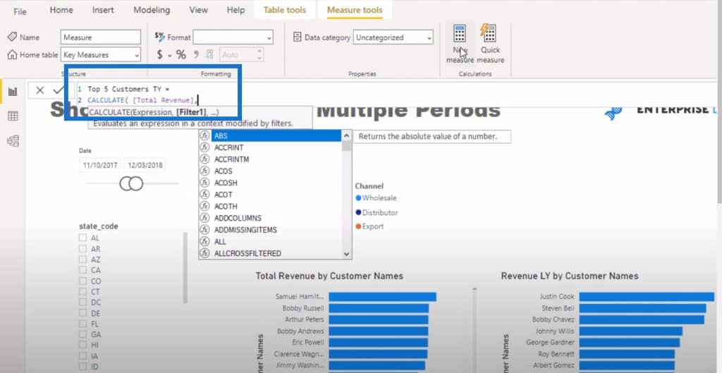
Then I’ll use TOPN DAX function. Remember that TOPN is a table function, so you can put it in the filtering area of CALCULATE. Then I’ll write 5 to view my top 5 customers.
I want to look at all of my customers so I’m going to use the ALL function. Then I’m going to order this by total revenue and then sort it in descending order.
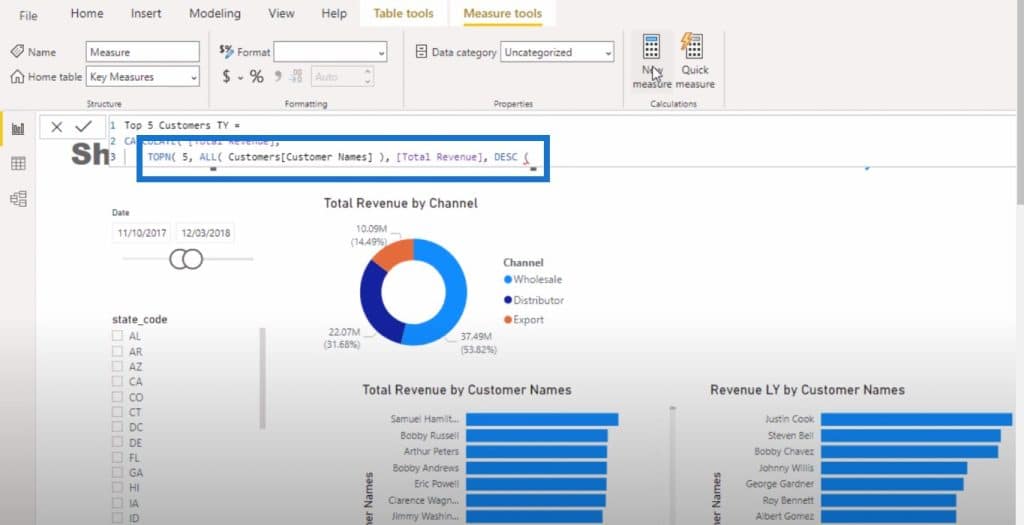
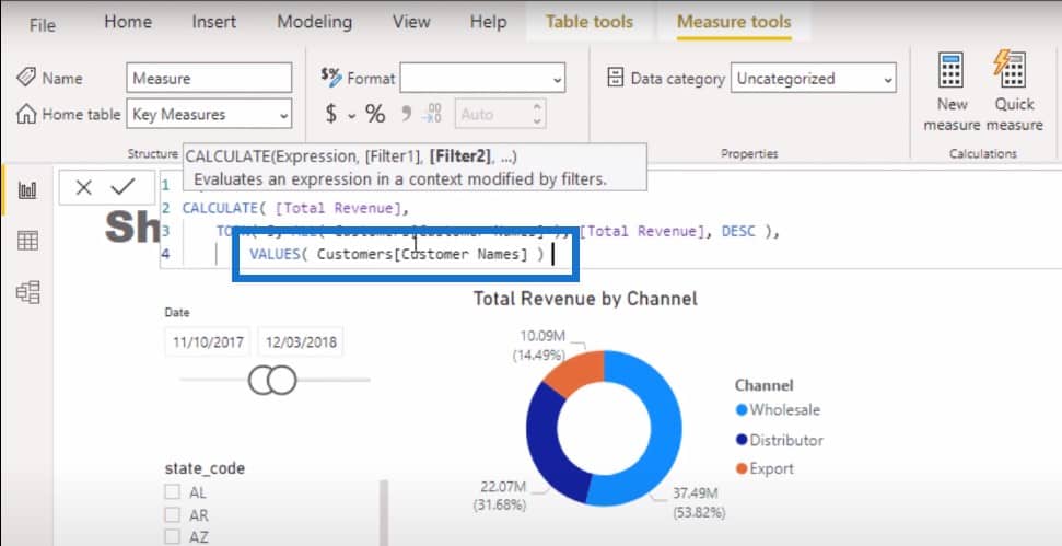
With the formula above, we removed the context from customers. But if we want to show only the top 5 customers, we need to bring our customer context back. I’m going to use the VALUES function to bring it back.
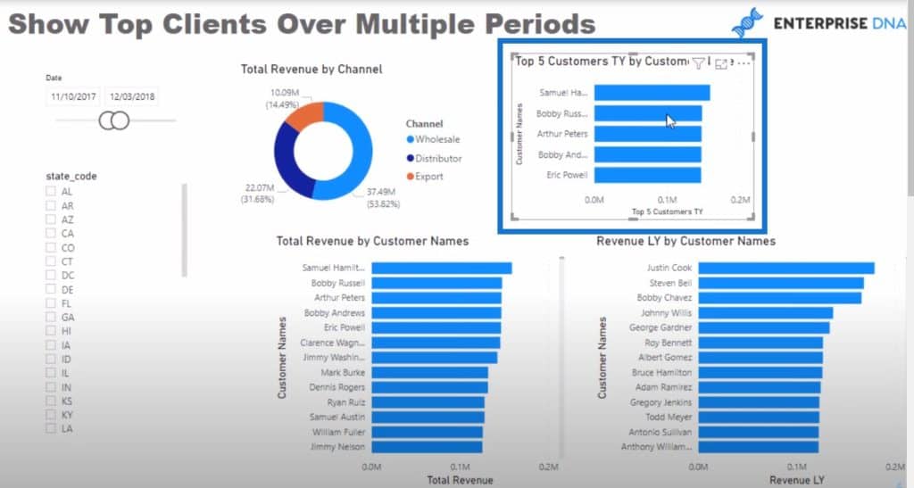
Now, I’ll create a visualization out of this measure and bring in my customers like this. You can see I am only showing my top 5 customers instead of all my customers.
To simplify things, I would put data labels here.
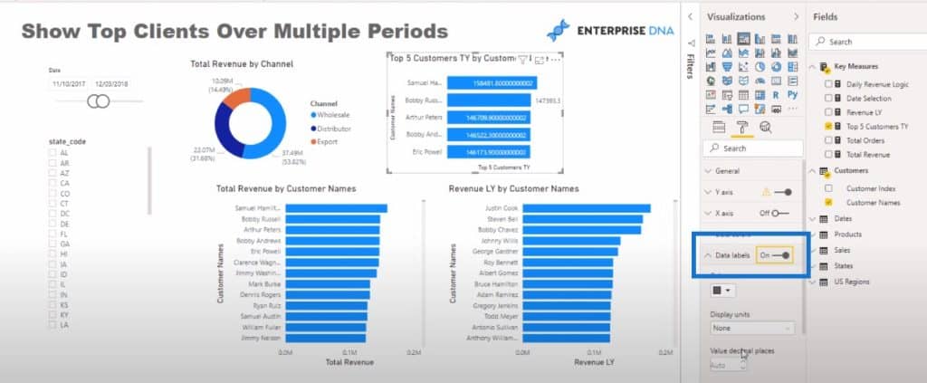
We can format it as well to make it look compelling.
Formatting DAX Formulas With App
I also want to highlight how important formatting formulas are. I’m going to copy the formula we just created.
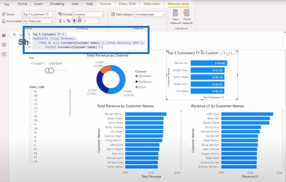
Then I’ll quickly navigate to the DAX cleanup tool and paste the code here.

Then I’ll click on the Format button.
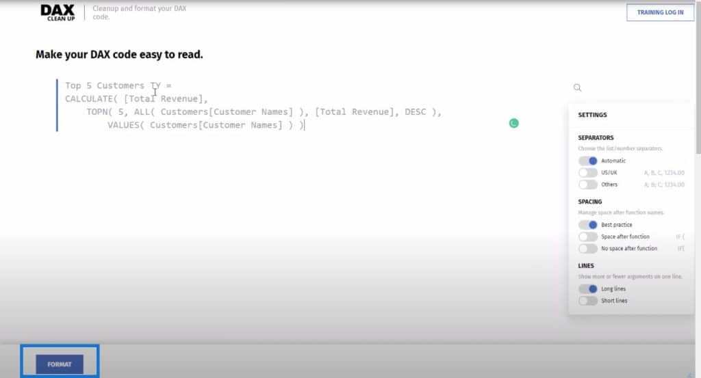
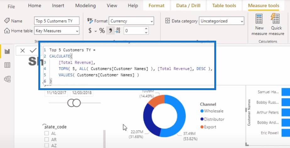
The resulting formula didn’t change too much, which is all right. This is a pretty simple formula to write, so there isn’t a lot that needs to be done.
But on bigger formulas the DAX cleanup tool makes a huge difference.
If you’re not using this tool, please use it. It makes the format of your formulas easier to understand.
You can also watch our Power BI tutorial video on our DAX cleanup tool for more information.

So now we have a good format for our formula and we also have the logic that we want.
Calculating Top 5 Customers Last Year With TOPN DAX
The next thing to do is look at my top 5 customers. I want to see their generated revenue this year, but I also want to rank it based on their revenue from last year.
I will name this measure as Top 5 Customers (LY Rev). All I needed to do here is use the old measure from earlier and change the logic. Instead of using Total Revenue, I’m going with Revenue Last Year. We’re going to rank our customers based on their last year’s revenue.
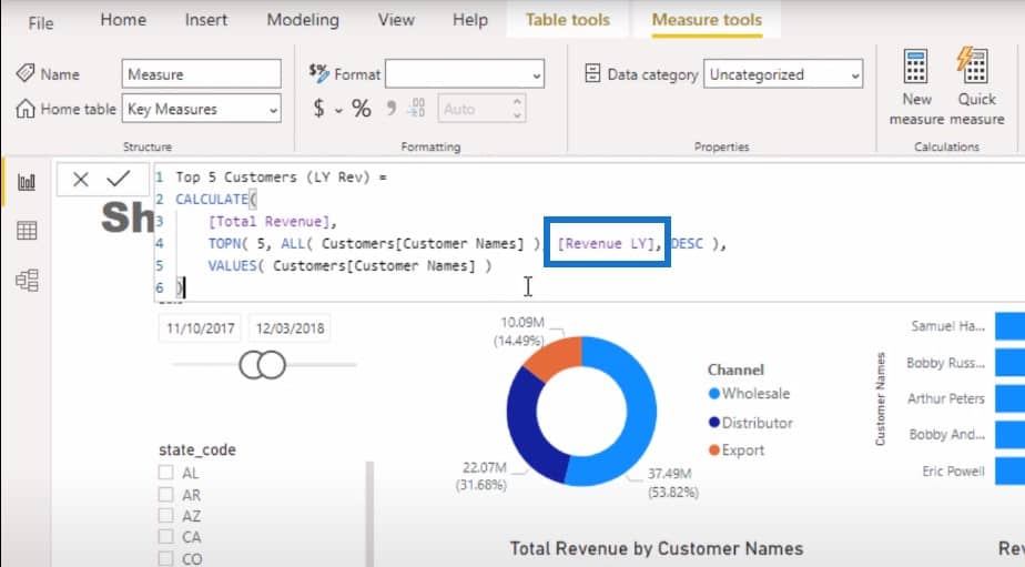
Then I can bring this new measure into the canvas.
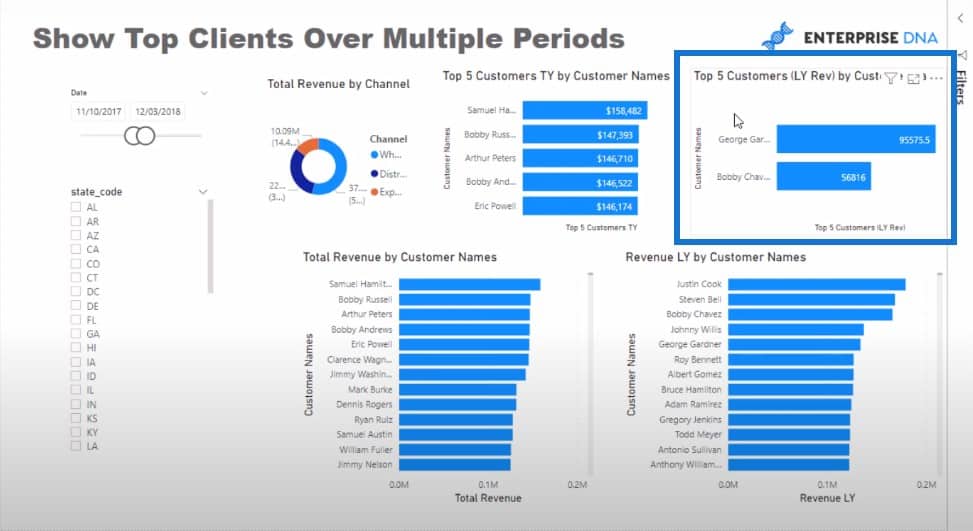
It’s interesting that only 2 customers came up in this visualization. Why is that?
The logic we used looks right to me, so let’s do a quick audit to find out what has happened. I’m going to get rid of the Revenue LY by Customer Names visual and then turn the Total Revenue by Customer Names visual into a table.
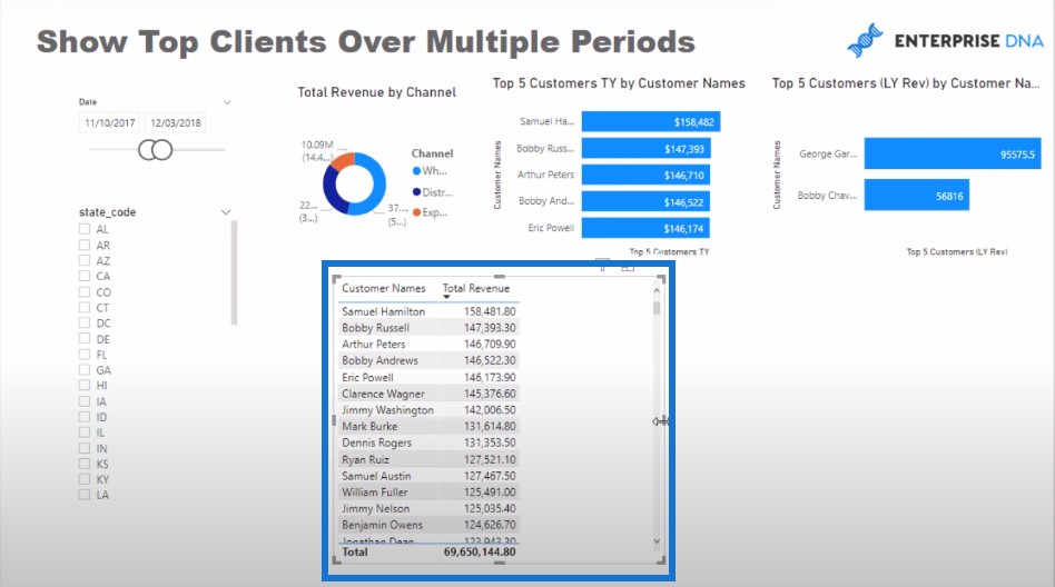
Let’s format this table and bring all of the data points we have worked on. These formulas will work within the tables as well.
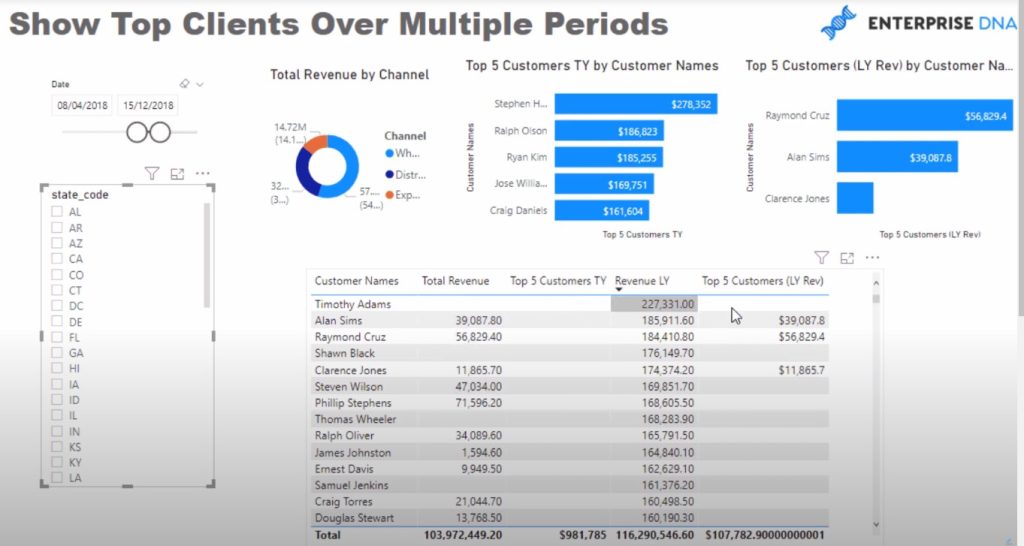
The logic itself actually works. The reason why the customers are not showing up is because we’re working with an incomplete data set. This is why Timothy Adams had a large revenue last year but made no revenue in the current year.
We can put in the Revenue Last Year‘s numbers, which will give us a full number.
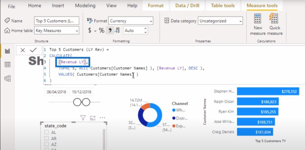
And this is how we can actually compare our top five customers’ sales from last year and this year.
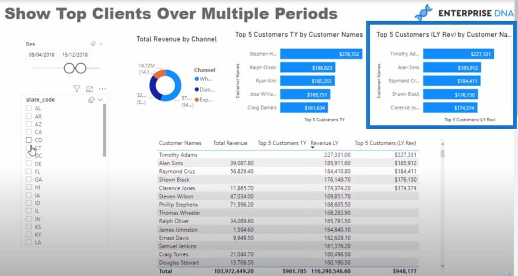
Since this is a dynamic list, we can change to a different region or filter based on a different channel.
***** Related Links *****
Using SAMEPERIODLASTYEAR To Compare The Difference Between This Year & Last Year
Sorting Dates By Financial Year In Power BI
How To Control The Interactions Of Your Visuals In Power BI
Conclusion
The technique I showed you in this post is something you can use in many different ways when using the TOPN DAX function. One way you can use this is to make comparisons from one time period to a different time period.
Let’s say you wanted to know your top 30 customers from last year and find out if they are still in the top 30 this year. You can quite easily match them up like this, and then create a TRUE or FALSE piece of logic that you can then embed into the conditional formatting parts of a visualization.
I showcased this recently, and I really like how there are many ways you can visualize things using the conditional formatting rules within charts now.
All the best,
Sam


