
In this Power BI Showcase, we’re going to focus on time intelligence in Power BI to showcase how our business metric changes over time.
We have a reseller of a product that’s being sold throughout the East Coast of Australia. We want to analyze all their key metrics which includes Sale and Profits among other transactions. We also want to see how they’ve changed over time. You may watch the full video of this tutorial at the bottom of this blog.

Sales Intelligence
In the first report, we have a chart that’s showing the Cumulative Profits based on the selection we made using a filter or slicer.
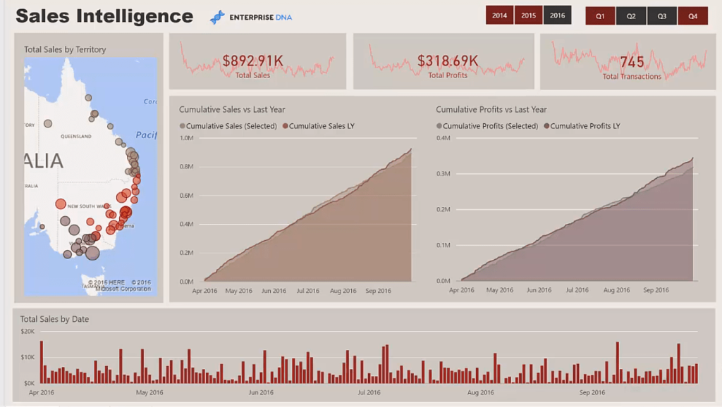
We’re tracking the performance of this year versus last year. This has also been done for Sales.
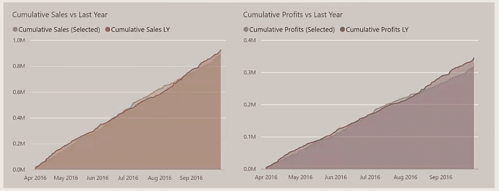
The great thing about this setup is we can dynamically change it to the time frame that we want to look at.
If we want to look at the data for the third quarter, we just need to click on Q3 in the filter.
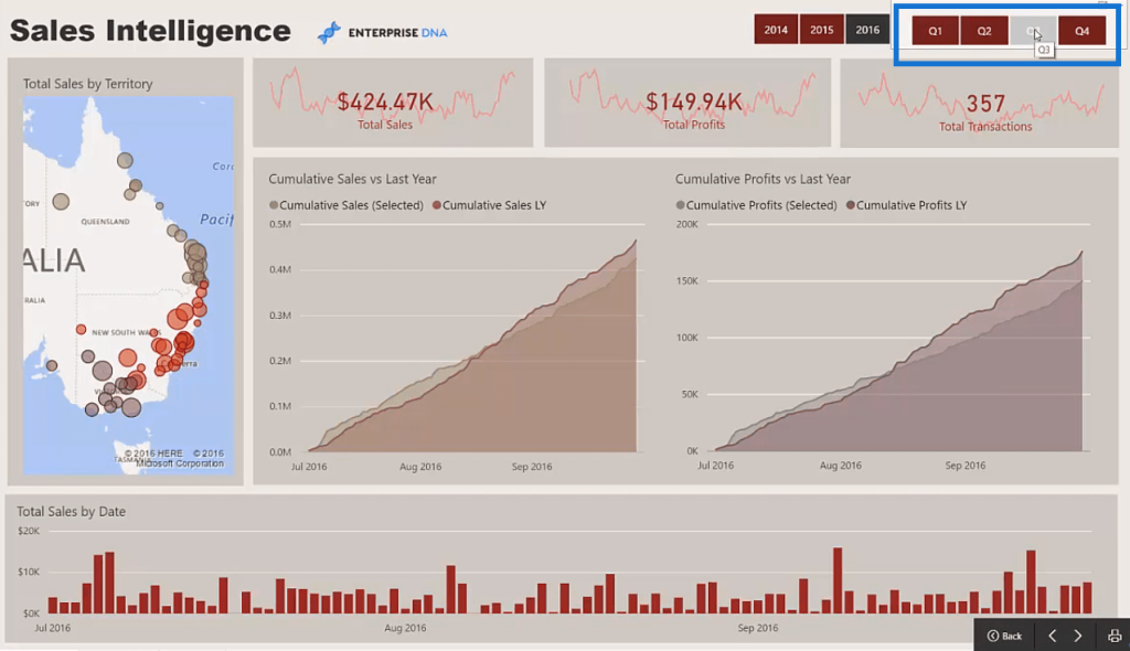
We can also go back historically to look at the Q3 of 2015 and then compare the data to the years before it.
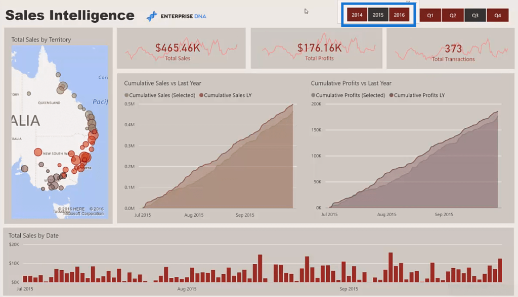
The slicer makes it easy to view the data of a different time frame.
We also have a snapshot or a trend analysis of our Total Sales and Total Profits within the time period we’ve selected.

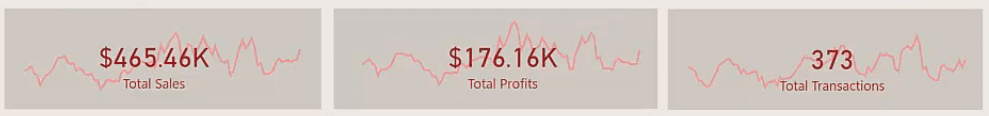
This is a great way of getting a quick snapshot or insight into the trends that are appearing in our data.
Another feature in this report is we can also click on a Region and drill into the statistics of that specific area.
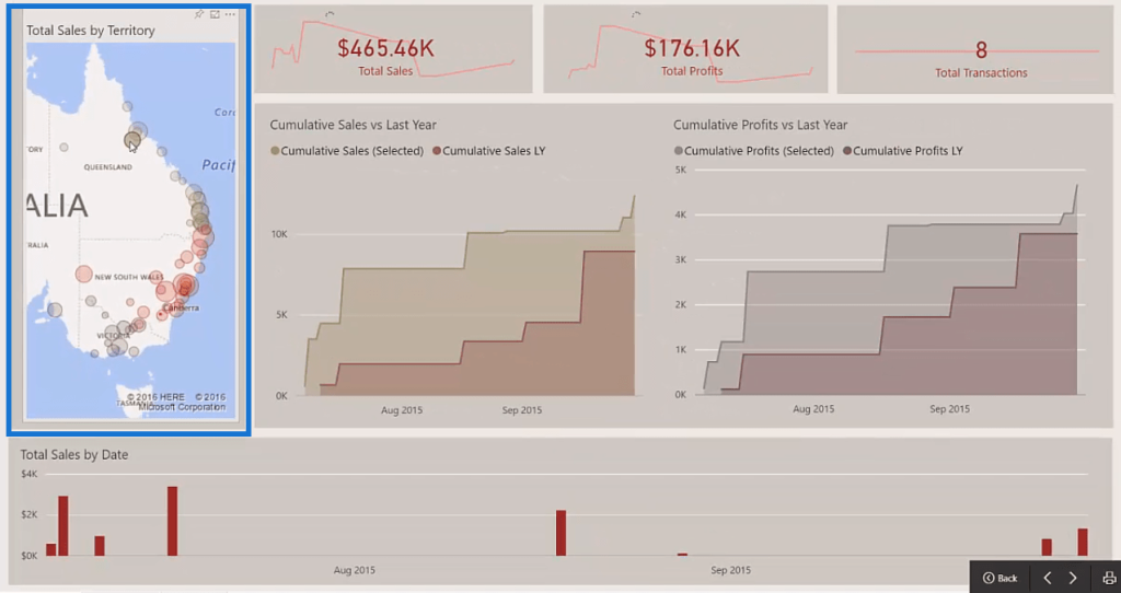
At the bottom of the report, we’re showing Total Sales’ changes over time.
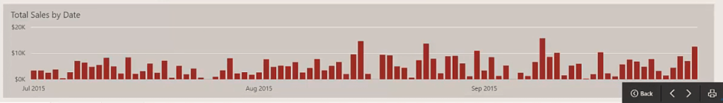
This chart also dynamically changes to suit the time frame we select.
Margins Analysis
In the second report, we’re looking at our Margins over time.
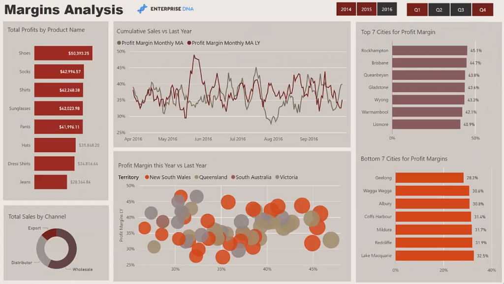
We’re analyzing how our Sales Margin has held up over a certain time period.
The Margins can be analyzed over our entire scope of products. We can also drill into each product we’re selling.
The data in this report is an aggregation of the Total Profits for the two quarters in 2016.

In this chart, we’re showing the moving average of the Profit Margins for this year versus last year.
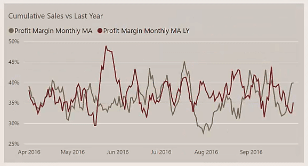
When we try to show the varying products in this chart, it becomes hard to understand. Instead of using the actual Net Profit Margin, we normalize the number using a moving average.
With this, we can get a good sense for deviations and divergence between one year to the next. We can use this information as highlights in our analysis.
Furthermore, we also used a ranking technique to dynamically rank the top versus bottom cities based on the Profit Margin.
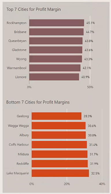
Having this information will allow us to get answers to questions we may have concerning our performance. We can identify why our Profit Margins are high or low for a product or region.
These are great conversations to have with sales managers or sales representatives. Moreover, it’s a quick and easy way to find insight into a key piece of profitability within a business.
At the bottom of the report, we’re showing Profit Margins this year versus last year based on territory.

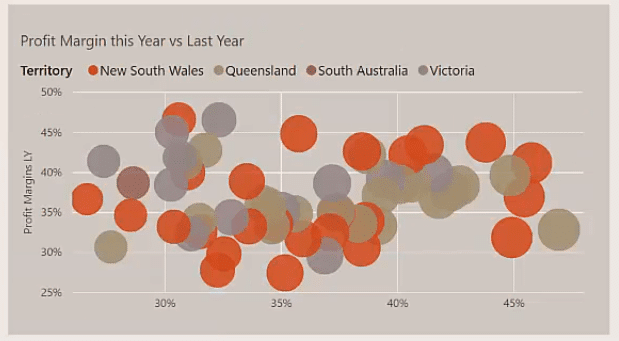
Again, with this information, we can understand why the Profit Margin is high for a certain year and territory. We can then ask good questions which allows us to create a robust discussion with our Regional or Global sales teams.
Cost Trends
For the third report, we’re looking at our Cumulative Costs versus Cumulative Sales over time.
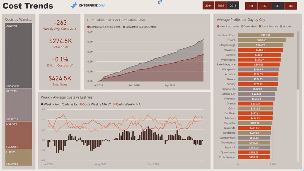
The great thing about this report is we can dive into each individual City we’re selling in.
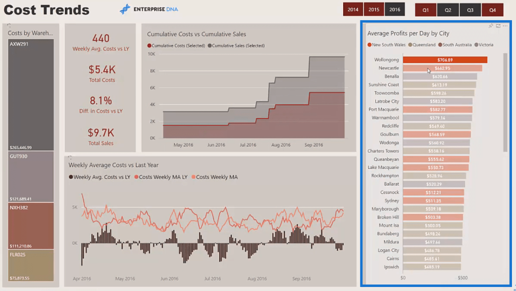
We can select the top cities and see where divergence occurs through time.
This report also contains analysis on the warehouses that distribute our products.

For this chart at the bottom of the report, we have an analysis on the costs of this year versus last year.
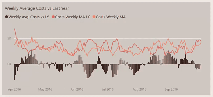
We can see if there was a great change over this exact time period between the years we’ve selected.
If we had large input costs, such as a commodity cost, for a specific product, we may see a larger divergence compared to the one we’re seeing in the chart.
***** Related Links *****
Calculating Dynamic Percentage Of Total Change Using Power BI Time Intelligence
Adding Workday And Weekend Numbers Into Your Date Table: Time Intelligence Technique In Power BI
Showcase QoQ Sales Using Time Intelligence In Power BI
Conclusion
This tutorial presented reports that we can create using time intelligence in Power BI to showcase changes over time.
Being able to dynamically shift and compare between the metrics of different time periods allows us to get valuable information on the business’ performance.
These insights help us ask the right questions. They give us guidance in creating the strategies that we should implement to further improve our business.
All the best,
Sam


