Today, I’m getting complex with DAX, but that’s because I enjoy showing the power of this formula language inside Power BI. I want you to get there too. This is why I always want to get practical about implementation. Dynamic segmentation is a perfect example of a really valuable commercial insight you can extract out of your analysis in Power BI. You may watch the full video of this tutorial at the bottom of this blog.
Say you want to see which customer groups are buying your products. When I say customer groups, is it your top customers, your middle-of-the-range customers or your bottom customers? You’ll quickly discover this is not actually that easy to work out, as this ‘grouping’ doesn’t even exist in your raw tables. You need to create it via a supporting table, and I show you how in this blog post.
In this post, we are going to go through how you can visualize which customer groups are contributing the most to your profits. Now, there are a few steps we have to go through to get to this point, but this is a really great piece of analysis if you wanted to trek through time and determine how much your Top 5, Top 5 – 20, and the rest of your customers are contributing to your profits.
You can use the same techniques we will go through in this blog post to actually do your own analysis. By utilising the data model, you can create this kind of dynamic visual. For example, in this visualization we’re looking at what is the contribution of the Top 5, Rank 5 – 20, and The Rest.

Since everything is dynamic, what we can also do is click through each product that we sell right and see the difference for each different product. We can see some products are being totally dominated by the Top 5 but it’s probably because not much actually sells with that particular product.

On the other hand, when we click on a high selling product, we can see that it’s a bit more distributive. These are the kinds of great insights that you can get from this type of analysis.

Calculating Total Profits
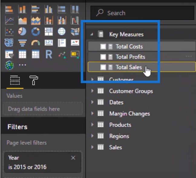
Let’s start from scratch and work through how we can actually get to this point. The first thing we’ve got to do is set up some simple calculations.
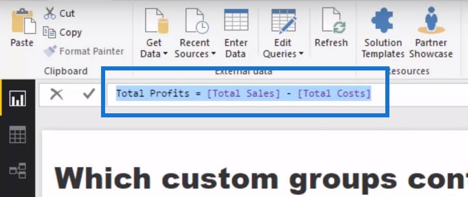
We’re going to calculate our Total Profits first by using our Total Sales minus our Total Cost.
Creating Table For Ranking
Let’s just jump back to our data model first. You’ll see that at the top, we’ve got our core data models: Dates table, Products table, Regions table, and Customer table, all of which go down to the Sales table at the bottom. Every single transaction that is made is in our Sales table, and that’s where we’re doing our calculations over.

If you think about it, we don’t have anything in our model here that tells us who’s in the top five or who has ranked from 5 – 20, or who everybody else is. This means we need to create it. Also remember that we want it to be dynamic, right?
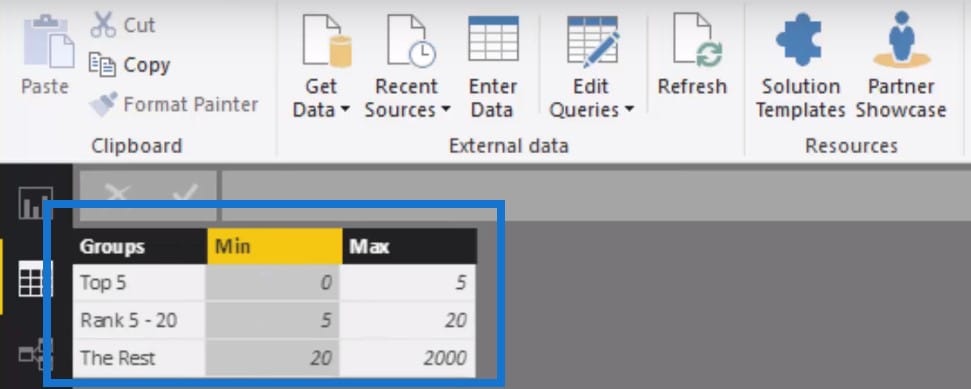
So we need to create a table which will do this for us. We will create groups as well as their MIN and MAX. For the Top 5, the minimum is 0 and the maximum is 5. For the rankings 5 – 20, it will be 5 and 20, and so on. We will then integrate this table into our data model through the Dax formula and this will then dynamically rank customers based on whatever the context of the calculation.
Formulating Customer Profits By Group
We are going to find out how to look up Customer Profits by Group (4:00). Let’s quickly go through what’s actually happening here. First of all, we’re going to calculate Total Profits, which is the Total Profits measure I taught you earlier.

But what we need to do is to see what rank each customer is in and if they sit within each of those custom ranks that we just created in our table. If they do, they are then put into that group by Top 5, Rank 5 to 10, or The Rest.

This is the logic that we will use to actually create or run these calculations.

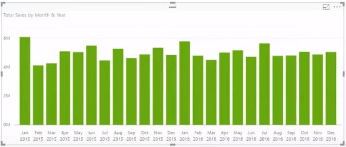
Let’s just mock something up very quickly here and drag the Month & Year into our table. We’ll be able to see the Total Sales for each of those months.
Using Customer Profits By Group
If we drag our Customer Groups in the table, it does not give us a correct result. If you really drill into these numbers, they’re all exactly the same. So what we have to do is use the Customer Profits by Group. This will deliver each of the profits per rankings to us.

What we need to do is to drill into a more specific time frame so we’ll put a filter on for the last six months of 2016.

If we put some data labels on, we can see that this is calculating the total profits but then dividing it up per our customer group.
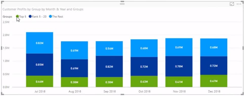
Visualizing The Table
Let’s give it a chart and see the percentage. All we need to do is change the visualization to the 100% Stacked Column chart.
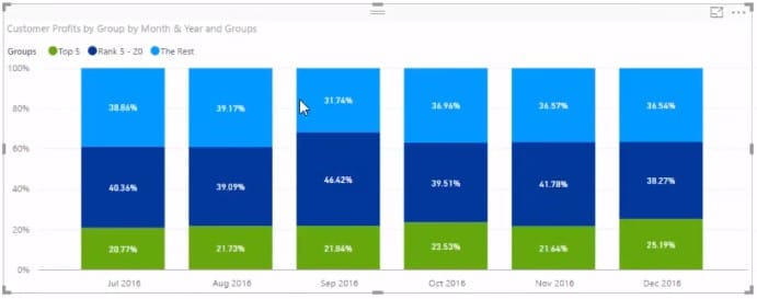
This is now giving us the percentage of sales from these custom groups. We’ll change the visualization a little bit and turn this into a drop-down. And then we’re going to create another visualization, which will give us our Sales Per Product.

This calculation is automatically going to adjust based on whatever context we put it in. So if we adjust and include all of the months in 2016, we can see how things change for every different month.
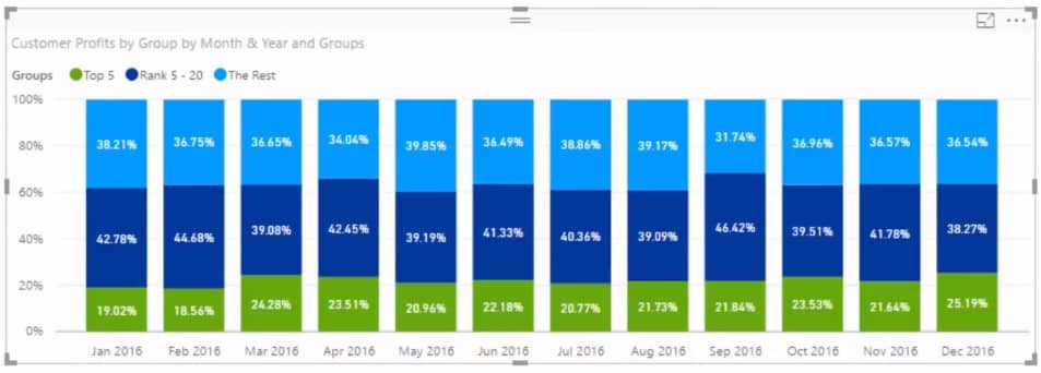
If we click any of the products on the left table, we can dynamically see from a percentage basis how much of our profits are being determined by specific groups.

Visualizing The Makeup Of Profits
Once we click through all the different products, we can see what’s the makeup of our profits through time for each of our products that we sell. We can look at it from an entire portfolio perspective.

Or we can even drill into our top 3 products and see there was a dip at the end of 2015. We can ask why a higher proportion of our smaller clients are buying these products compared to our larger customers not buying anything.

Obviously, things like these would make for a really good discussion to hear from your sales people and your management. This DAX formula is a really great technique that can actually be reused in a number of different scenarios. I highly recommend diving into this dynamic segmentation technique and having a look at how you could actually utilize that for yourself and for some of the analysis that you’re doing.
***** Related Links *****
Customer Segmentation Techniques Using The Data Model – Power BI & DAX
Custom Dynamic Segmentation Using DAX In Power BI
Segmentation Example Using Advanced DAX in Power BI
Conclusion
As you can see, there’s a bit to it, but it’s really powerful stuff. This analysis is great to see the makeup of who is buying your stuff, not only across your products as a whole, but you can even dive into specific products and compare how the makeup might be different. This technique has a technical term – dynamic segmentation. It’s because we are dynamically segmenting our results by placing them through some logic, which will slice it up into its own pie.
I run through this particular technique in a comprehensive way in my Solving Analytical Scenarios course at Enterprise DNA On-demand. Check this out to learn more. In this video, I run through an overview of how you could implement it yourself and how it may look in your reports.
Good luck implementing this one!
Sam


