In this tutorial, you’ll learn how to create a rose chart using Charticulator. It is a graph that displays data using polar coordinates. The length of each segment from the polar axis’ center is measured by the value it represents.

Exporting To Charticulator
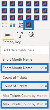
The first step is to create and export a dataset to Charticulator. For this example, the dataset contains the Short Month Name, Count Of Tickets, and Max Tickets Count by Month.
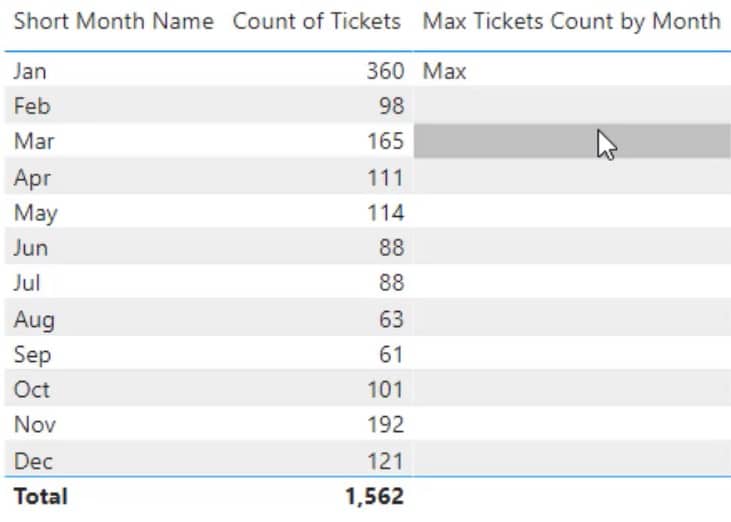
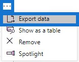
Click the ellipsis at the corner of the dataset and select Export Data.
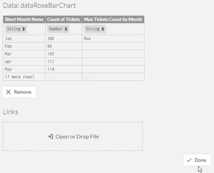
Then go to charticulator.com and click Launch Charticulator.

Locate and open the exported dataset. After that, click Done and you’ll be directed to the Charticulator canvas.
Creating A Rose Chart
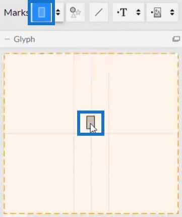
Bring in a rectangle from Marks to the Glyph canvas.
Place Short Month Name in the X-Axis of the actual canvas.
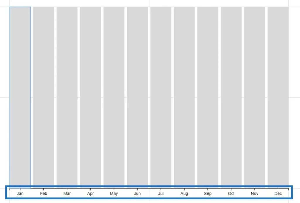
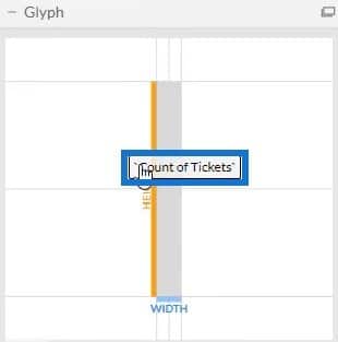
Bring Count Of Tickets in the height of the rectangle inside Glyph.
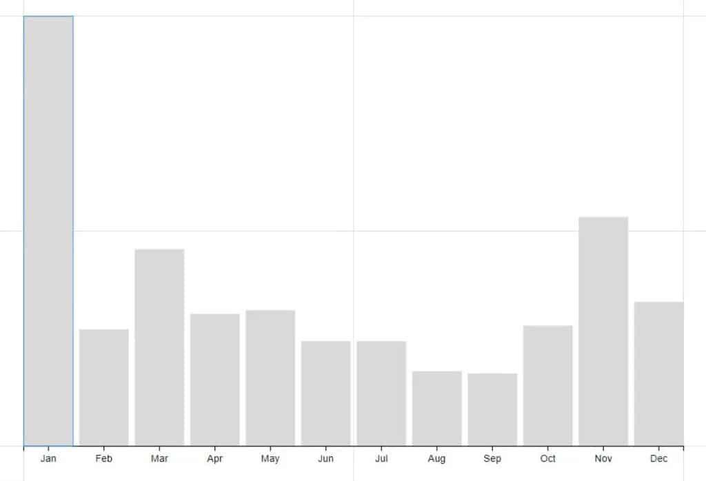
You will then see a column chart forming in the actual canvas.
Now, drag Polar from Scaffolds into the actual canvas.
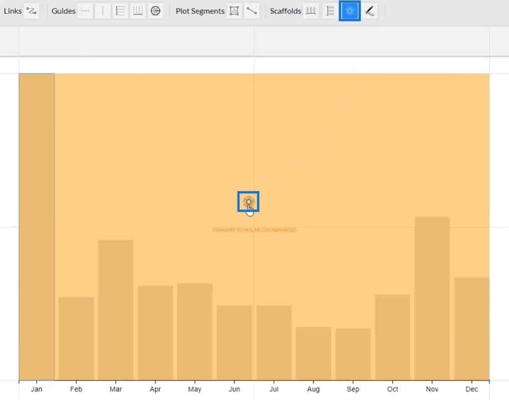
Once done, the column chart will turn into a rose chart.
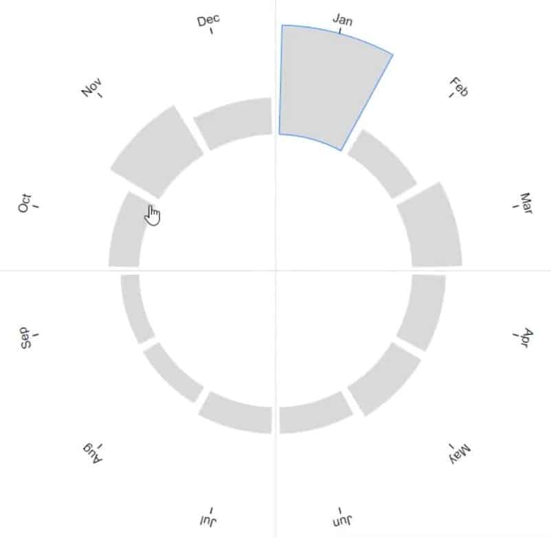
Adjusting The Format Of The Chart
Minimize the inner circle by dragging its circumference towards the center of the circle.
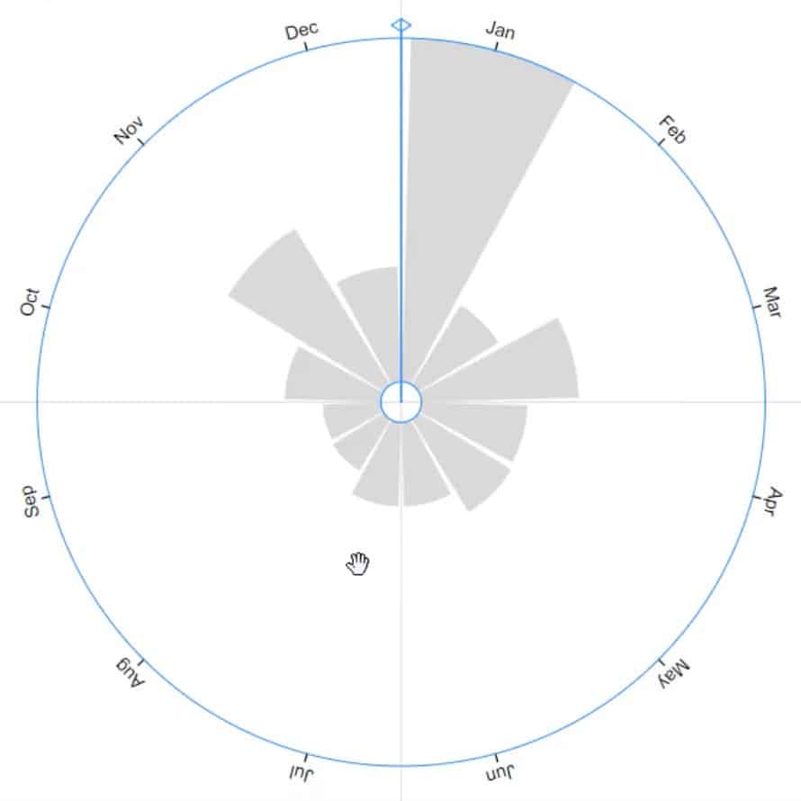
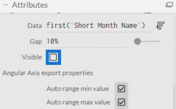
Add labels inside the bars but first, remove the month names of the outer circle. Open PlotSegment1’s Attributes and uncheck the Visible box.
Then, place Text inside the Glyph Canvas and put it at the top of the bar.
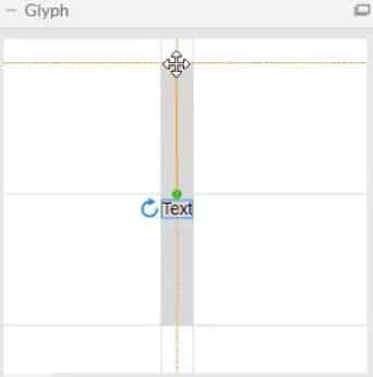
Open Text1’s Attributes and place Short Month Name in the Text section.
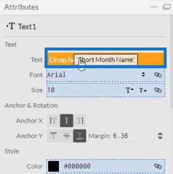
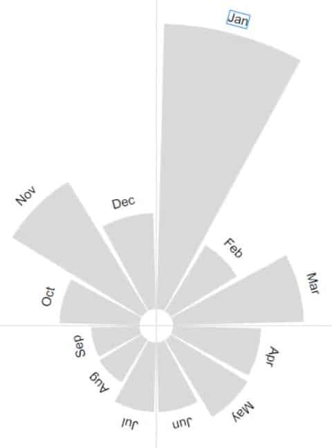
You can then see the month name labels at the top of each bar.
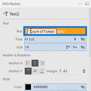
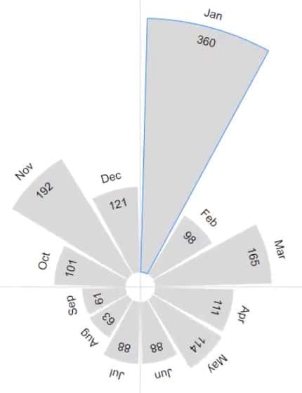
Next, put the values inside the bars and place it under the month names. Bring another Text in the Glyph canvas and put Count Of Tickets in the Text section of Text2’s Attributes.
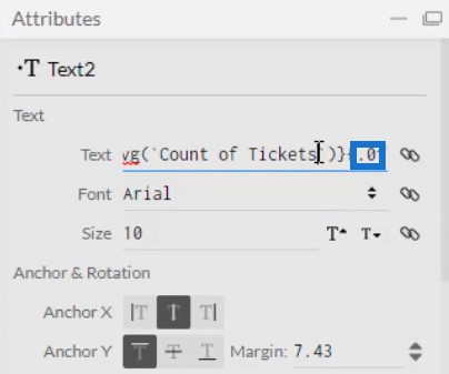
Make sure to remove the decimals in the values by changing .1 to .0 in the Text section.
The visualization will now look like this:
Highlighting Important Information
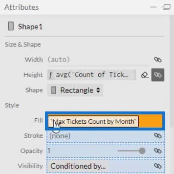
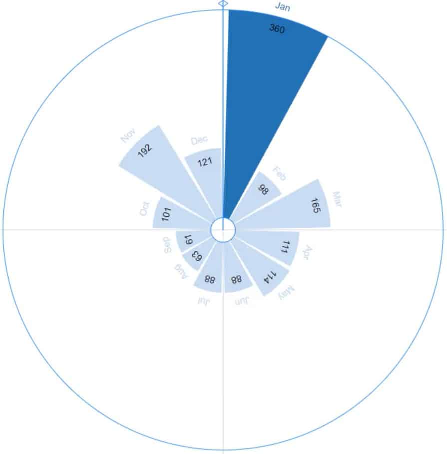
You can also highlight the bar and label with the highest number of tickets per month. To highlight the bar, open Shape1’s Attributes and place Max Tickets Count by Month in the Fill section.
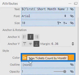
To highlight the label, open Text1’s Attributes and place Max Tickets Count by Month in the Color section.
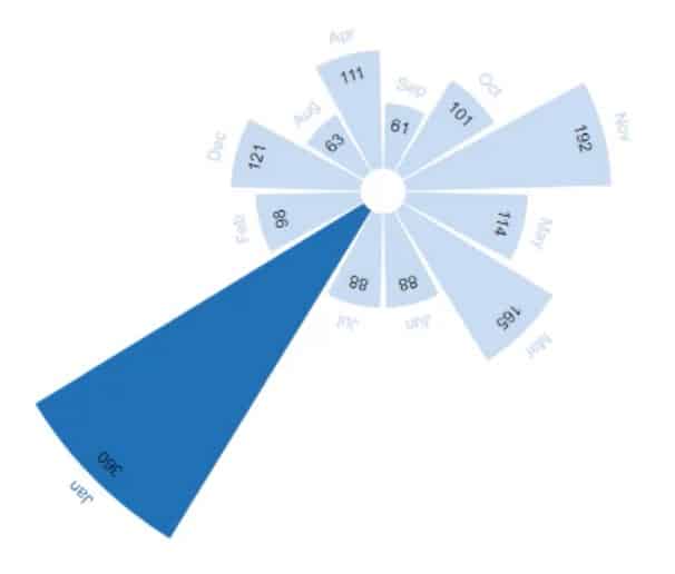
You can then see that January, the highest value among all months, is highlighted.
Placing The Rose Chart In Power BI
Save the file and export it to Power BI Custom Visual.
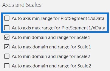
Uncheck the auto axis options in the Axes and Scales settings so that the axes won’t change even when a context transition is invoked. Once done, input a visual name and then export it to Power BI.
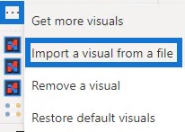
Open Power BI and import the chart file. Click the ellipsis below Visualizations and select Import a visual from a file. Then, locate the file and open it.
Click the Charticulator icon with the visual name of the rose chart and fill the Fields section with the corresponding data.
You can now see the chart in the dashboard.
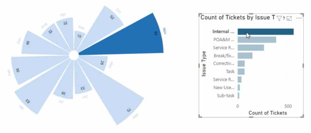
You may also add another chart to create a filter context transition. For this example, a bar chart is used to invoke filters. Make sure to create interactions among the charts by going to the Format tab and clicking Edit Interactions.
If you click a bar from the bar chart, you can see that the Rose chart changes along with it.
***** Related Links *****
Charticulator: A Visual Creator For Power BI
Power BI Donut Chart: Custom Visualization Tutorial
Custom Bar Chart In Power BI: Varieties And Modification
Conclusion
If you want to present your data in an aesthetic way, you may consider using rose charts. They are visually compelling and provide information in an easy and understandable manner. You can easily create a rose chart by using Charticulator with the correct dataset.
Learn more about rose charts and other visualizations by putting this tutorial into practice and by enrolling into the Enterprise DNA modules.
Mudassir


