In this tutorial, I’m going to show you the basics of PowerApps galleries. A gallery is a list of records, with every item in the record coming from a table. The example I’ll be using here shows one of the most basic galleries you can build using Power Apps.
Power Apps is an amazing tool that makes it easy to build your own app even if you have little to no coding experience. Since the gallery is one of the most basic parts you can add to your app, I’ll show you how to manipulate the different elements on your gallery.
Properties Of PowerApps Galleries
In a past tutorial, I talked about the different screens and elements that go into an app. When you look at the left pane on our example, you’ll see that the app I’m currently working on has three screens.
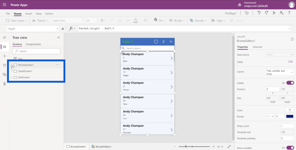
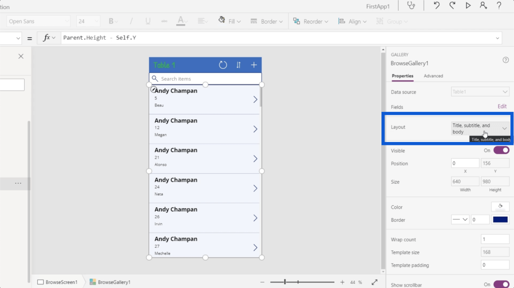
Under the Browse screen, that’s where you’ll see the gallery. If I click BrowseGallery1, it automatically highlights the entire rectangle containing the gallery on the app in the middle pane.
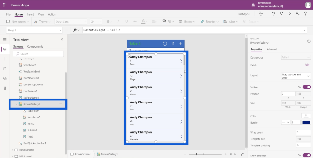
Since galleries display a preview of a list of records, they only show a few details. In this app, for example, it’s only showing the agent name, the customer number, and the customer’s first name.
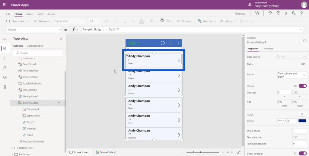
Let’s take a look at the different properties that a gallery has. The properties can be found on the right pane.
The Data source is on top of the list. This shows that the app is fueled by Table1. These sources can be anything from a Google sheet to an SQL table.
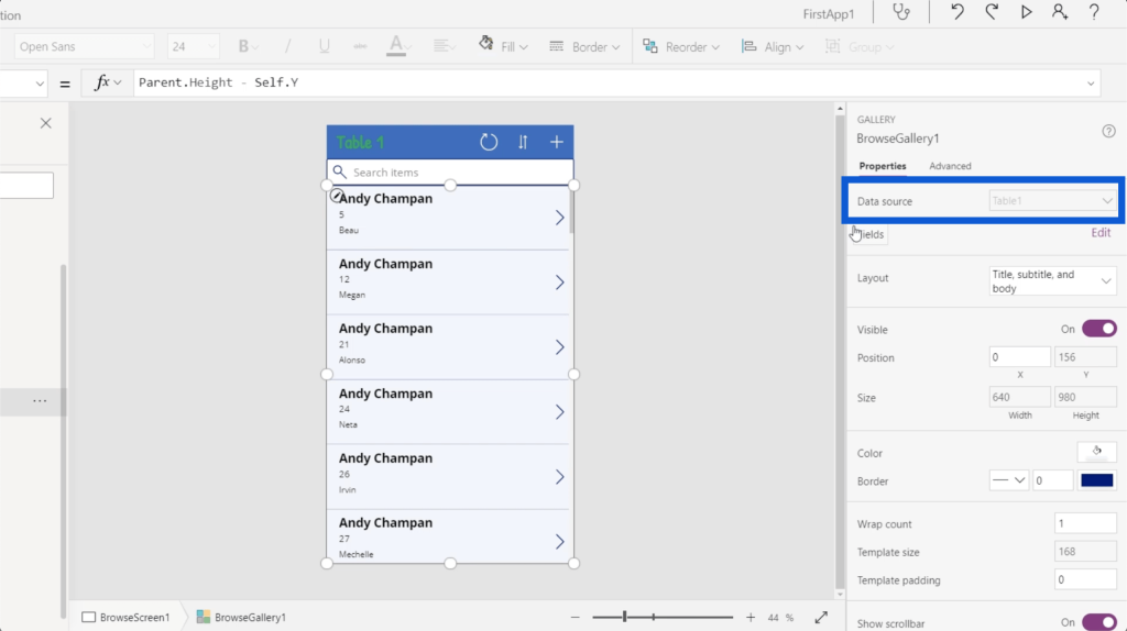
Next is the Layout. This is where you decide what appears on your gallery. For now, it’s showing Title, subtitle, and body, which corresponds to the items we have.
But there are other options aside from that. You can even show images in some of the entries on your list.
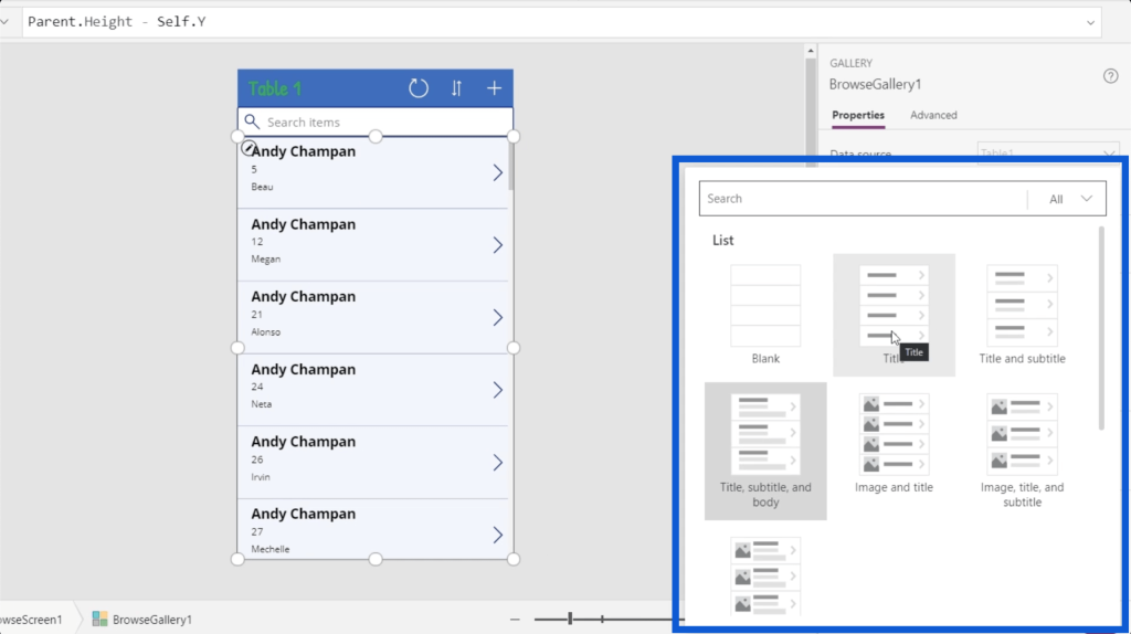
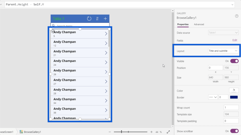
For now, I’m going to change the layout to just a title and subtitle because I only want the most important information showing up.
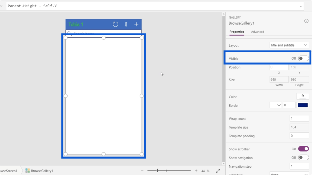
You can also toggle the gallery’s visibility on and off.
You can change the color as well as how the border appears.
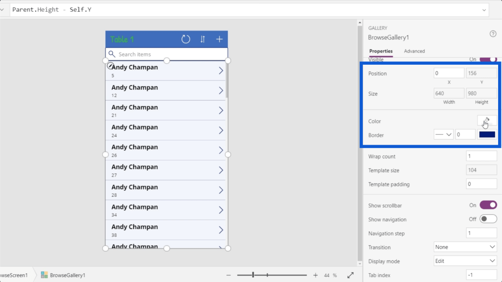
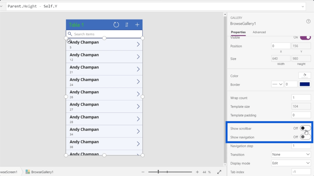
You can also choose whether to show the scrollbar and navigation or not.
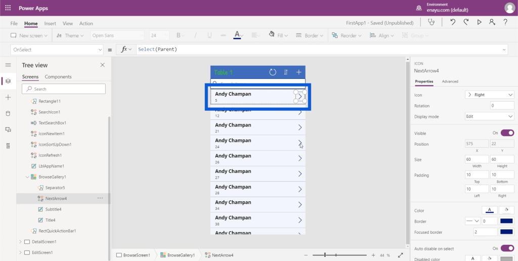
Note that each element inside the gallery would also have its own set of properties. In each data card on this gallery, there’s an arrow, a separator between each card, a title, and a subtitle.
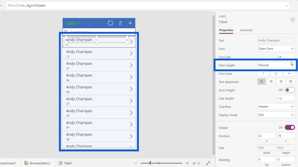
The title has properties that include the font, font size, font weight, text alignment, etc.
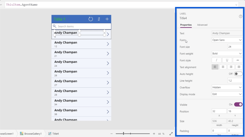
I’ll change the font weight to Normal instead of Bold since I don’t really need to highlight the titles on each data card if I pick the right font size.
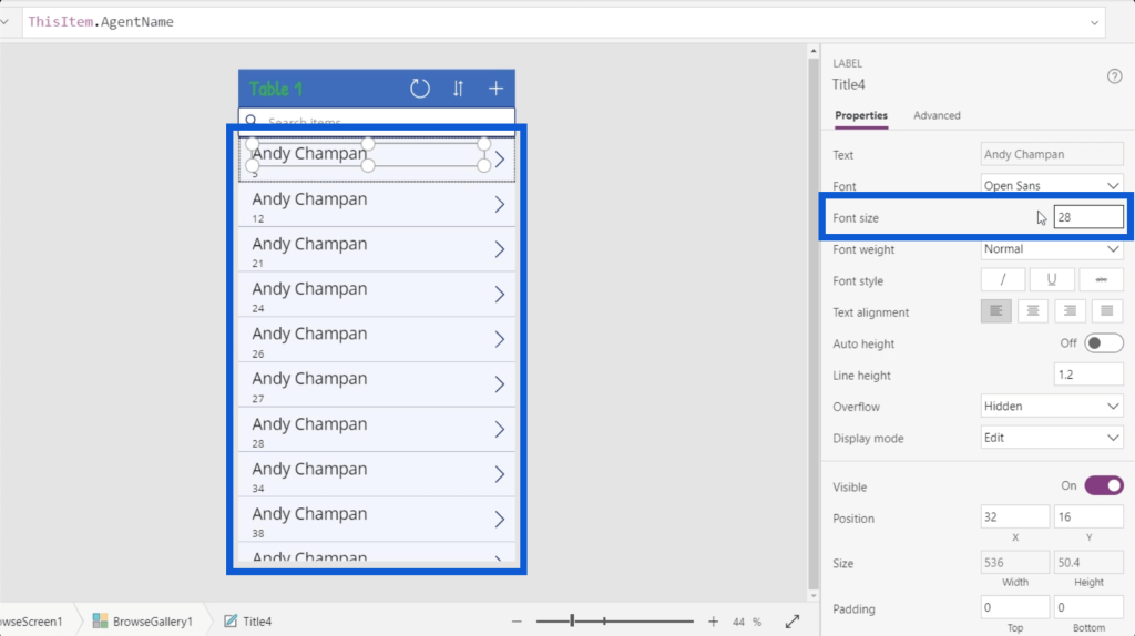
Since there are only 2 elements now instead of 3, I can make the title larger. I’ll change the font size from 24 to 28.
Setting Gallery Elements Dynamically
One of the key things in setting up PowerApps galleries is knowing how to set some important elements dynamically.
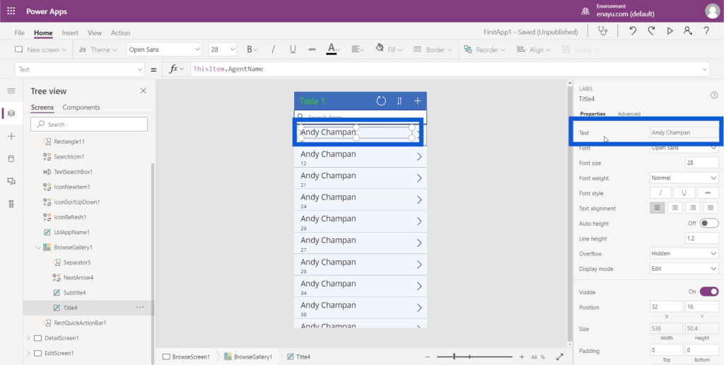
Let’s look at the text property in this data card, specifically for the title. If you look at the properties pane, it says Andy Chapman, which is exactly what appears on the data card’s title field.
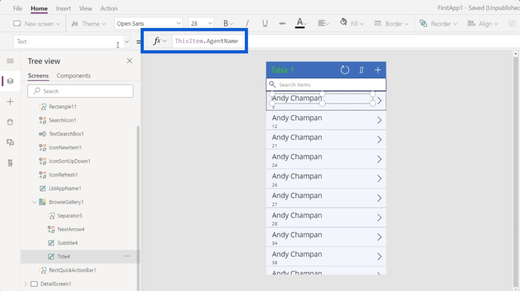
But if you look at the formula bar, it says ThisItem.AgentName. This shows that the element has been dynamically set.
Earlier, I mentioned that the data source for the items in this gallery is Table1. This means that each of the items in the gallery comes from Table1. I discussed how to link a data source to PowerApps in a past tutorial as well.
So if I go back to the data source, each one of the entries is an item object.
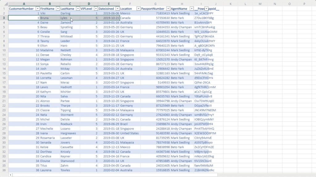
As for the title element in the app, that comes from the column called AgentName. That’s the same column referenced in the formula bar.
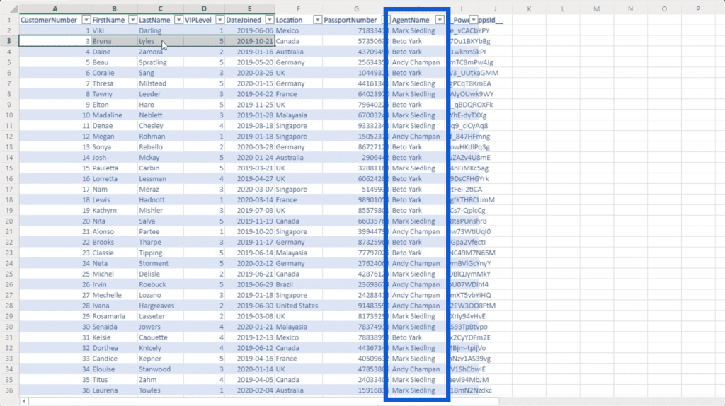
This means that I can simply change that formula and reference a different column as needed. Let’s go back to the Power Apps environment we’re working on to change the formula and reference the column FirstName instead.
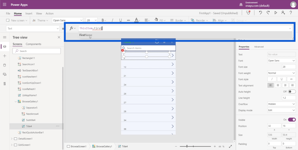
Note that as you type something into the formula bar, it’s going to give suggestions on how you can complete the formula. In this case, it’s already showing FirstName even before I can finish typing it. So I can just click on that to auto-populate the remaining space.
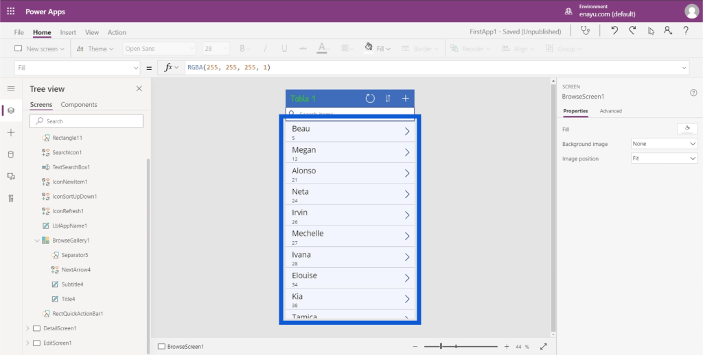
Once I click Enter, the title fields on each card will automatically change.
Concatenating Text Values In PowerApps Galleries
The most logical next step here would be to include the last name on the title field as well. But on the data source, the first and last names appear on different columns. This is where the Concatenate function comes in.
If I type Concatenate into the formula bar, it actually gives a brief description of what this function does. It shows here that Concatenate joins several text values into a single text value. This sounds perfect for what I want to happen, which is to put two different values (FirstName and LastName) together.
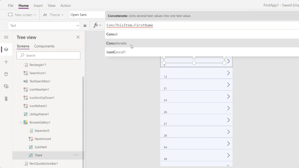
Now that I’ve chosen Concatenate, it shows me that I can start adding arguments in the form of text values.
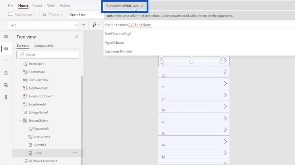
I’m going to put ThisItem.FirstName as my first text value, followed by ThisItem.LastName. I’ll close that formula with a parenthesis.
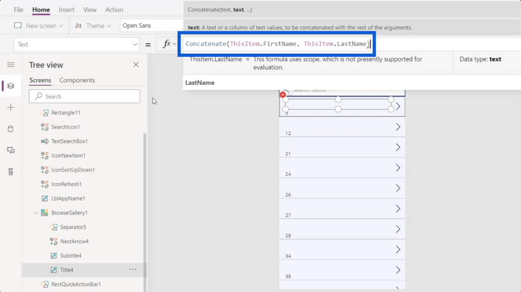
Once I click Enter, you’ll see that the title fields now show the first and last names of each customer.
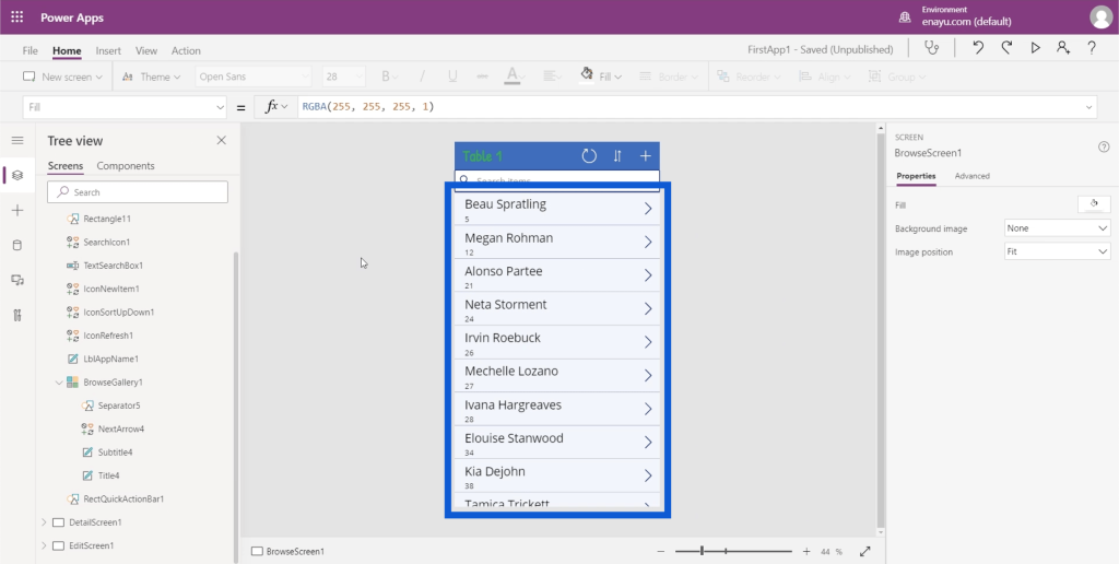
The great thing about customizing your PowerApps galleries like this is that everything is intuitive especially if you’ve used Excel before. The use of Concatenate, for example, is exactly the same if you use Excel.
Let’s see a preview of our app by clicking on the Play button on the upper right. This would give us an idea on what we’ve accomplished so far.
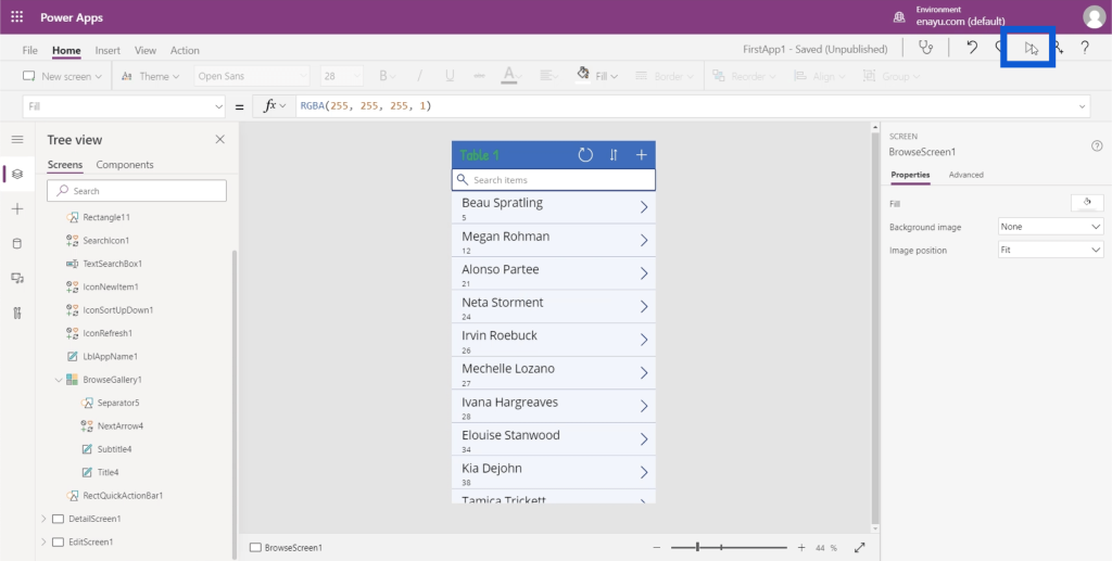
It looks like the items in our gallery are starting to make better sense. We just need to work on the subtitle.
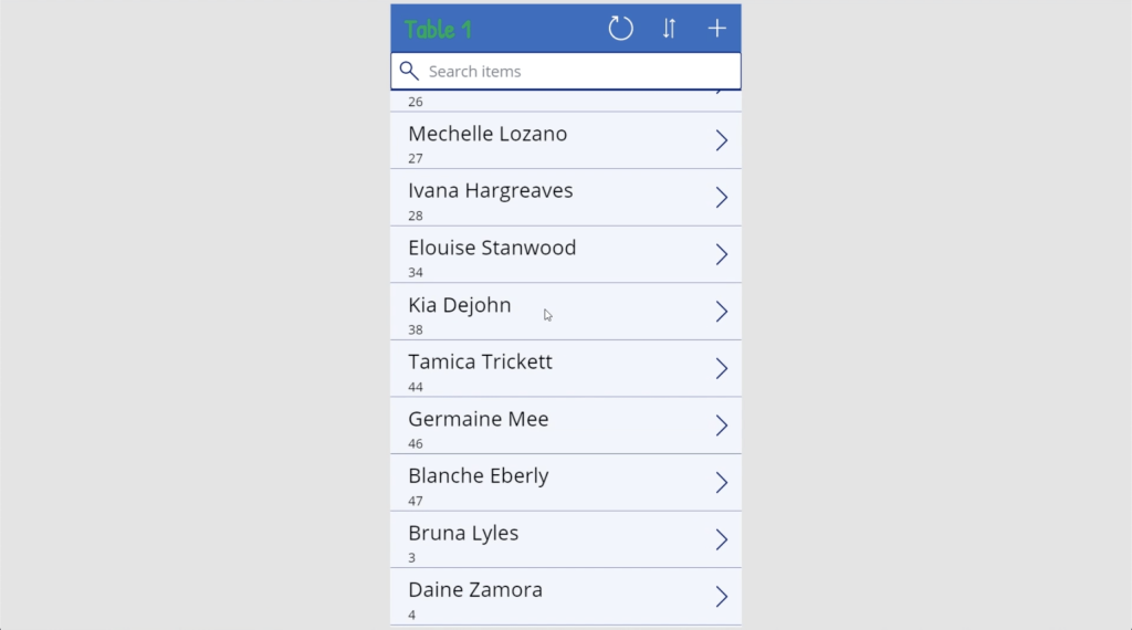
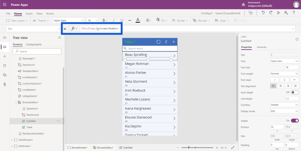
Currently, the subtitle is referencing the CustomerNumber. But this is not essential because I already see the first and last names of each customer.
Let’s go back to the Excel file and see what would make a better subtitle. Of course, this would depend on what you want to get out of the app you’re working on. I just want information about each customer. So in this case, the customer’s location would be a good alternative.
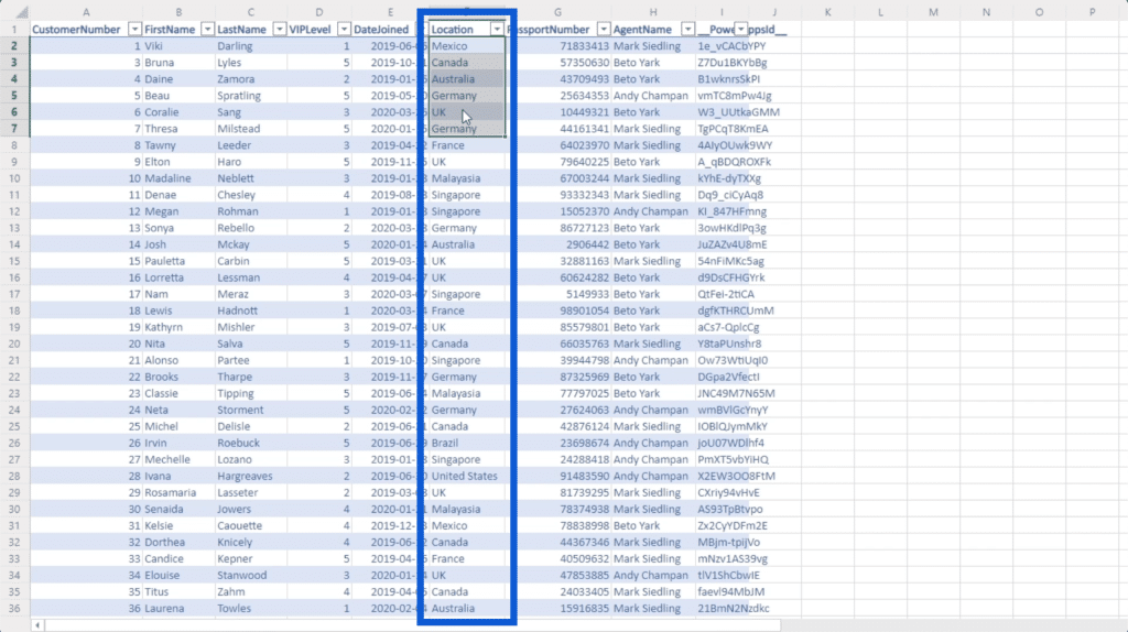
I’ll just change the column from References to Location.
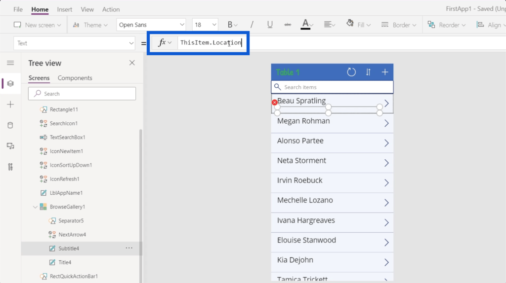
When I click Enter, the subtitles will now show the location os each customer.
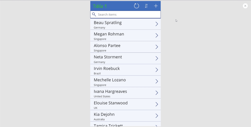
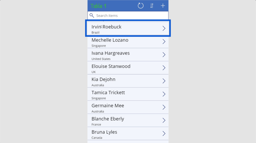
Despite the changes I have made, these data cards will still have the same functionality. Let’s say I click on this data card for Irvin Roebuck from Brazil.
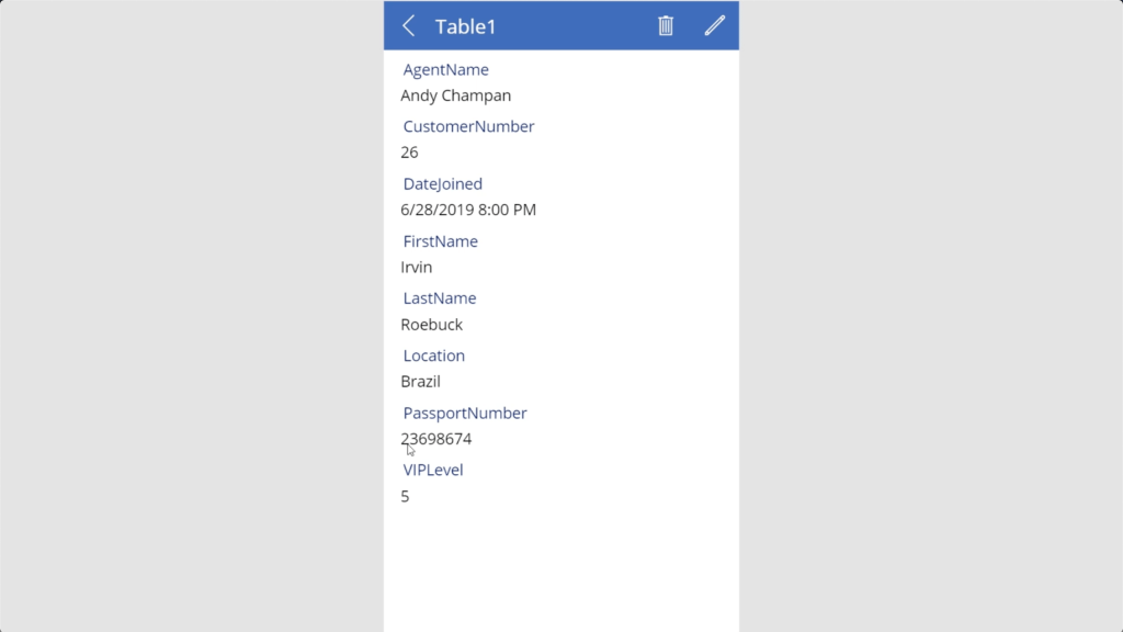
It’s going to show the same information coming from the data source. The only difference is, instead of the AgentName and CustomerNumber being highlighted in the gallery, I’m showing the FirstName, LastName, and Location instead.
***** Related Links *****
Power Apps Introduction: Definition, Features, Functions And Importance
Power Apps Environment Setup: Connect To OneDrive & Google Drive
Power Apps Environments: Setting Up The App Elements Properly
Conclusion
The way Power Apps was designed shows how intentional Microsoft is in keeping things as intuitive as possible. As evidenced by the way I played around with my app gallery, it’s safe to say that even those who have little to no experience in creating apps can produce a decent application that would benefit their organization.
Of course, Power Apps also has advanced features, which makes it a good tool even for advanced users. It’s all about knowing what you want to achieve with your app and putting them into action.
All the best,
Henry


