In this blog, I’ll share a great Power BI visual tip. I’ll show you how to dynamically visualize things over time based on some selections. In this example, we’re looking at customers. You may watch the full video of this tutorial at the bottom of this blog.
First, I’ll show you a few things that can occur within your visualizations that can make them not as compelling as they should be.
One is when you select a customer and the natural context gets placed on your report, you get this filtering where you see these small bars that show you when a customer has purchased.
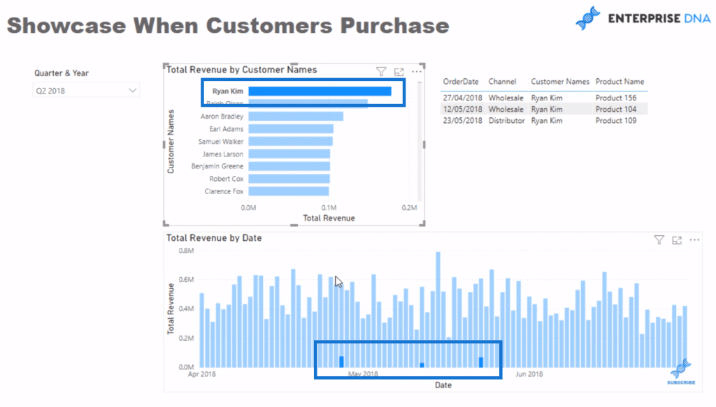
What I don’t like about this visualization is that it doesn’t really show when the customer purchased well enough, especially when you multi-select customers. You cannot see the exact dates of purchase in the visualization. It’s not obvious when the customers purchased.
Another option you have, which I also don’t like, is when you go to the Format ribbon and click on Edit interactions then select that visualization (click on the first icon on the upper right of the chart).
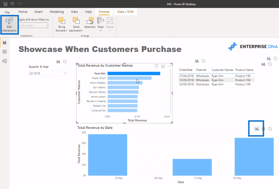
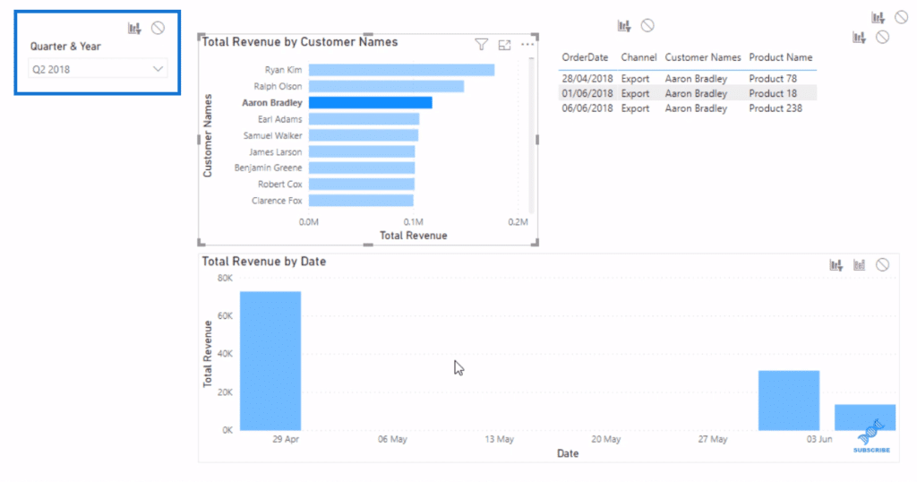
In my view, this visualization doesn’t add much value because it doesn’t really show, in the context of a quarter, when this timeframe is. It’s just working out the first and last purchase, and then building up the purchases in between, if there were any.
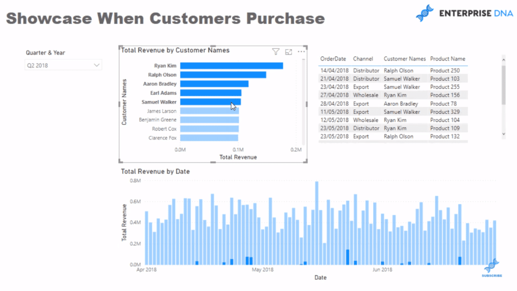
What I want to do is to keep my visualization looking like this:
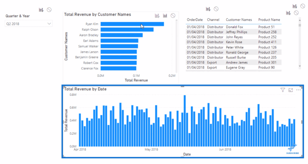
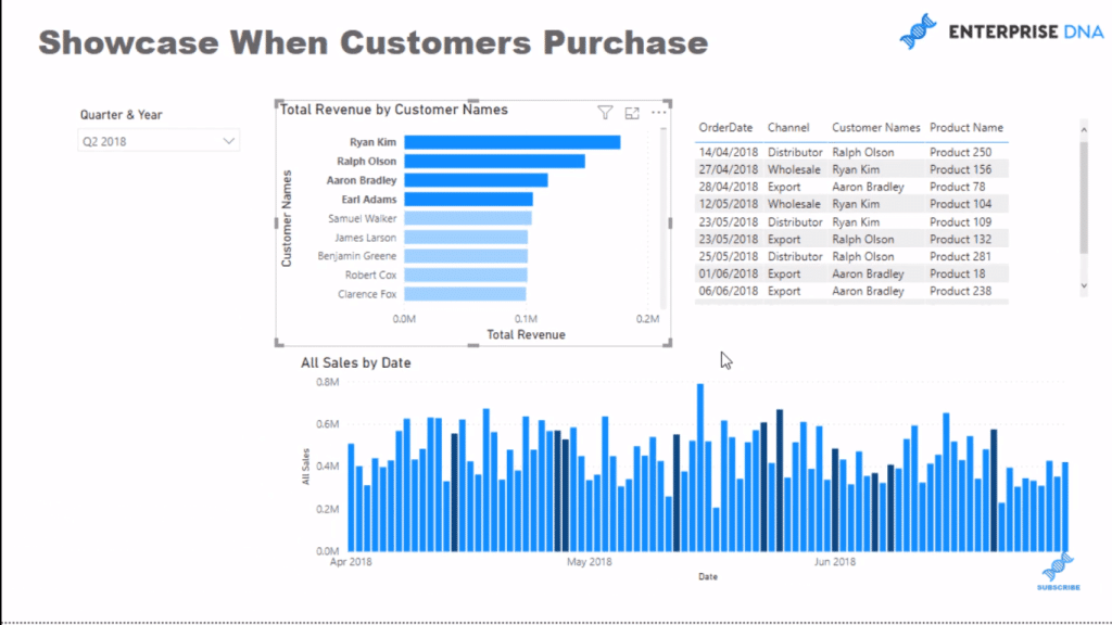
I want to show everything, but I’ll change the color of the bars to highlight when a customer has purchased or when multiple customers have purchased. I’m going to show you a couple of steps around how you can do this.
Using A Calculation That Doesn’t Get Affected By A Selection
First, I’ll copy and turn the visualization, Total Revenue by Date, into a table for demonstration purposes.
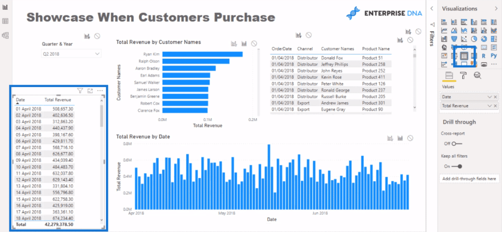
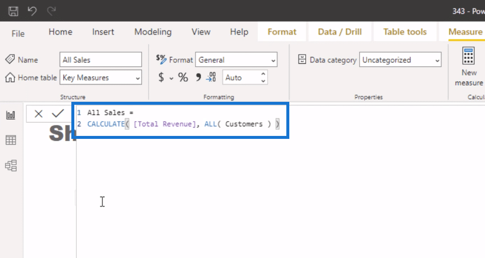
Then, I’ll create a calculation that doesn’t get affected by a selection on customers. I want to see all sales regardless of when a customer is selected. I always want to see the total sales on a particular day.
This formula (with the CALCULATE function ) calculates Total Revenue but disregards any filters that come from Customers using the ALL function.
I’m just going to replace the Total Revenue measure in the visualizations with this All Sales formula.
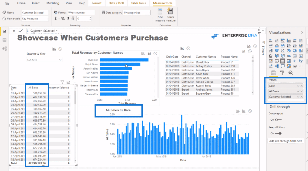
When there’s no selection in the Customer visualization, there’s actually no difference to the value.
Power BI Visual: Using A Customer-selected Logic
Then, I create this logic that gives a true and a false if I select something in the Customer visualization.
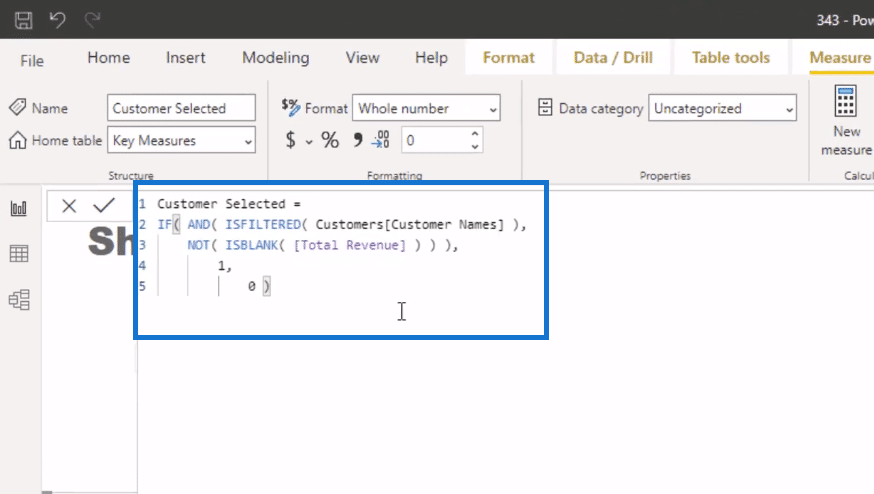
In this formula, I used the functions, ISFILTERED and ISBLANK. So, if a selection is made in the Customer Names column, it’s going to be filtered. The Total Revenue is not blank because it is still going to be filtered by a selection on the customer visualization. Then, it is equal to 1. If not, it will equal to zero.
When I make some selections in the Customers visualization, we’ll get a column that has a “1” when the customers I selected have purchased even though the All Sales column is always going to have the full customer sales.
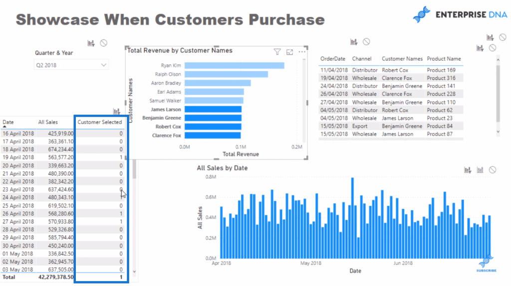
And so I need to bring this over to the All Sales by Date visual.
Change The Colors Based On A Rule
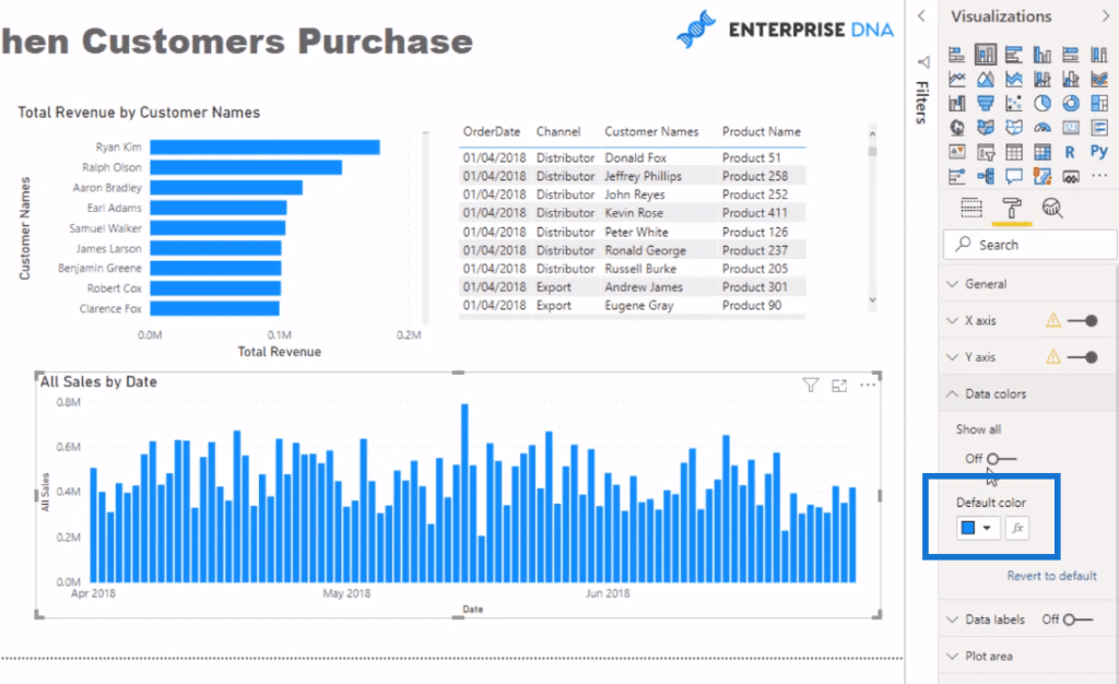
I’ll go first to the Data colors and change the colors based on a rule. I’ll click on this box here default color.
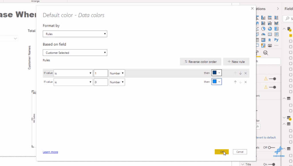
And then I’ll go to Rules and do a rule based on the measure Customer Selected. If it equals to one number, I want it to be dark blue. If it equals zero, I want it to be a lighter blue. Then, I click OK.
An important thing to remember here is to select this filter here (first one on the upper right corner of the visual) to make this work:
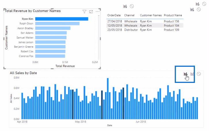
This is a great use of the Conditional Formatting feature where you can determine what actually shows up as a color based on a selection. It doesn’t have the downsides of those filtering effects.
***** Related Links *****
How To Control The Interactions Of Your Visuals In Power BI
Custom Conditional Formatting Techniques In Power BI
Using Filter Fields & Visual Interactions To Create Compelling Visualizations In Power BI
Conclusion
I think this is a really cool Power BI visual technique. I’ve showcased a few examples using the Conditional Formatting feature in some of my other tutorials; I think it is the ultimate way to show so many unique insights.
You can do it in column charts like this, bar charts, and even tables. You can create a compelling look for an insight without too much advanced logic. In my view, it’s a real game-changer in terms of variability on how you can showcase things.
I hope you can implement this well in your own Power BI visual reports. Check out the links below for more Power BI tutorials.
All the best!
Sam


