In this tutorial, we’ll particularly delve into Standard Power BI Theming, and review some of the features built into the Power BI Desktop application itself. You can watch the full video of this tutorial at the bottom of this blog.

In my experience, the majority of examples that you can find online demonstrate the use of the built-in color themes or the creation of custom color themes, but there are limited discussions on some of the available texting customizations.
To provide a canvas to showcase some of the built-in theming available in Power BI, I used the Enterprise DNA practice data set, which is a simple sales data set from which a number of visuals can be easily constructed. So here, we see the standard default color theme, which is a blue, orange, and purple combination.
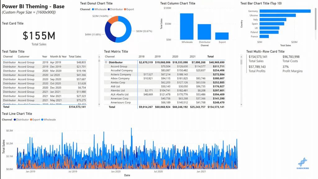
Custom Power BI Theming
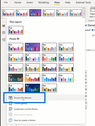
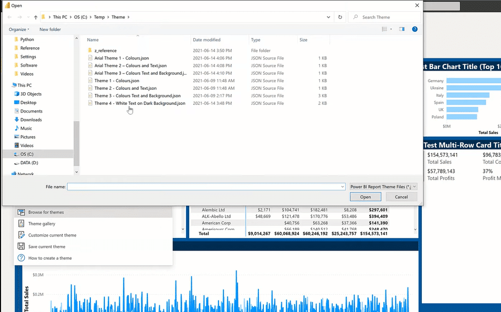
If you want to change the current theme, go to the View tab and then click on Browse for themes.
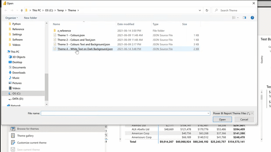
And that will take you to your saved files. In this example, I choose a white text with a dark background theme.
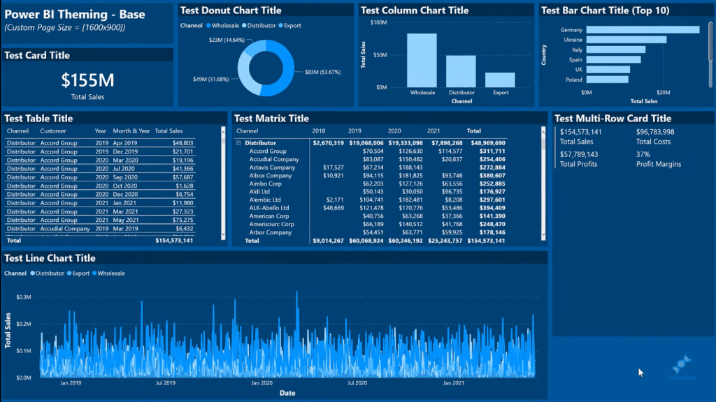
This gives us an idea of what can be accomplished with minimal use of the Format pane for individual visuals.
If you want to customize or reset the current default theme, just go to the View tab, then click on Customized current theme.
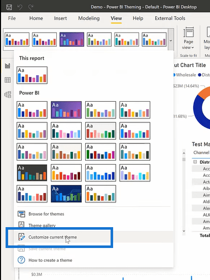
We have a number of different sections available to us to make changes. We have naming, colors, text, uh, visuals page, and filter pane.
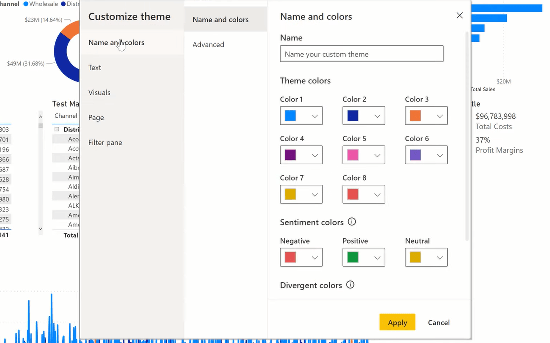
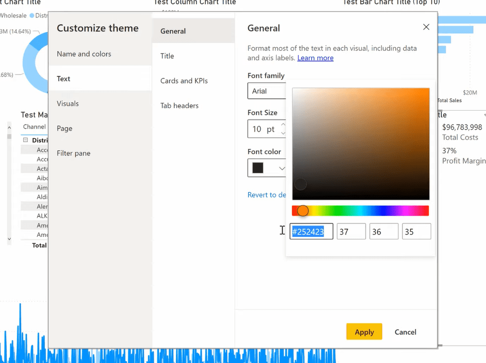
You can make the changes that you desire within here, including the font, the size, the colors, page background, visual colors, etc. And don’t forget to save your work.
You can also go Advanced for the Name and colors section to change the different elements in your visuals.
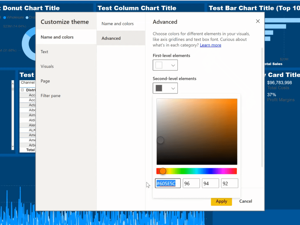
And now we can see that most of the text on our report is white. We can do a couple of things manually here and use the Format pane to get the entire report to look the way we want. We’ll have to use the Format pane for the background color of the title here. I’ll choose a dark theme color.
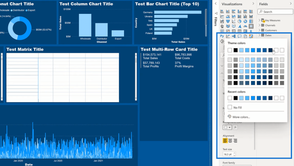
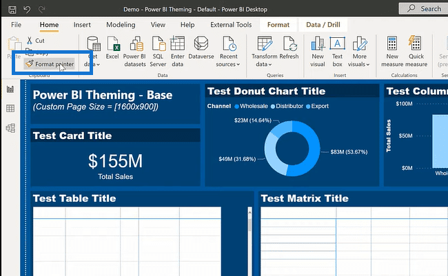
I can then use the Format painter (in the upper left corner of the Home tab) and copy it as many times as I want to adjust the rest of the visuals.
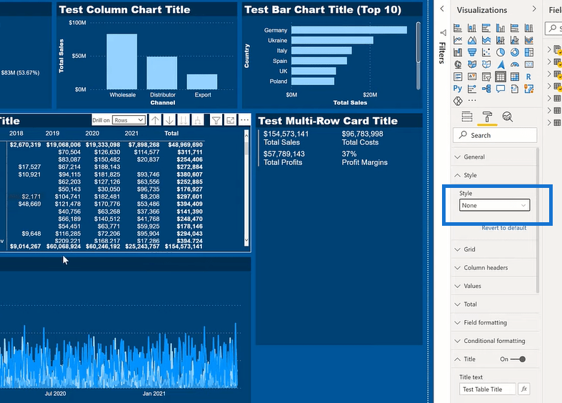
Finally, we must update the style for the matrix and table visuals. We’ll change that from Default to None.
To put it all together, we’ll reset the demo and we’ll apply things incrementally. We go to View, then Customized current theme. And then we’re going to go Browse for themes and apply the color theme we had. Next, we’ll apply the colors and text, and then use colors, texts, and background. Lastly, we’ll apply the white text on the background and change the style to None for the table and matrix visuals.
***** Related Links *****
Power BI Theme: How To Simulate Dynamic Theming
Power BI Report Designs: How to Get Inspiration Through Enterprise DNA
Power BI Report Development: Creating Themes, Company Logos, Icons and Backgrounds
Conclusion
In today’s tutorial, we’ve examined some of the texts theme customizations available in Power BI theming. Hopefully, you can add some of the built-in theming to your power BI toolbox, and you can save yourself some work in the future.
This is actually a continuation of my previous tutorial on dynamic theming, so definitely read through it as well. For more related content, check the links below.
Best of luck!
Greg

[youtube https://www.youtube.com/watch?v=wWNvlf3ybnQ&w=784&h=441]


