In this tutorial, I’m going to show you how to use Canva to design Power BI themes and backgrounds. This can take your reports to a whole new level, knowing that the aesthetics of your reports can greatly contribute to the way people understand and engage with the data on each page. You can watch the full video of this tutorial at the bottom of this blog.
I discovered how useful Canva is when I was doing my Lean Green Belt training with Lean Sensei. The training was split into three modules, and completing each module meant submitting presentations for each one.
The problem is, we were only given a short time to prepare a comprehensive presentation. I wanted to create an impressive and visually-appealing presentation for module one, but I failed to do that because of the tight schedule.
For the second module, I decided to use Canva for my presentation. That decision made a huge difference.
Knowing that we often use PowerPoint to create Power BI themes and backgrounds, made me realize that Canva can be just as useful for those exact same things.
Canva: An Overview
Canva is a user-friendly tool that allows users to create designs by either using the available templates or starting off from a blank page.

So it’s not just something you can use to design your Power BI themes. You can also use Canva for other things your organization might need, from business presentations to social media content.
Canva allows users to collaborate and form their own teams so that they can share designs, templates, and elements. I teamed up with our Chief Content Officer, Brian Julius, so you can see that there’s a folder on the left pane for our collaborative work.

Being part of the same team also allows team members to work on a single template at the same time, the same way you can when using Google Sheets.
Designing Power BI Themes Using Canva Templates
The great thing about Canva is that it already has readily available templates you can use. If you want to create a video, for example, you just need to click on the video on the menu.

Because we want to create Power BI themes, the best template to use would be the one for presentations. You can find that here under the Business category.
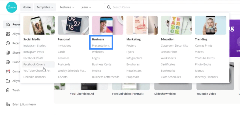
Once I click on presentations, I can get different types of templates to work on.

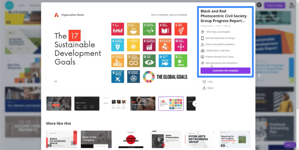
For my presentation, I chose this template.
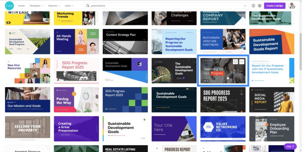
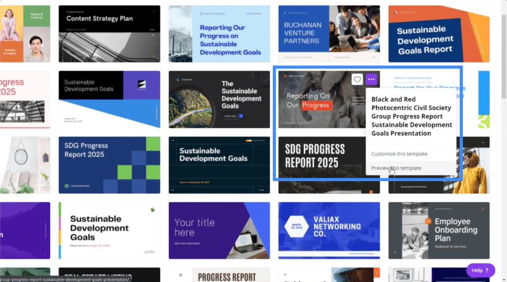
Now, if I click on the ellipsis on the upper right corner of that template, I get two options. I can either customize the template or preview the template.
If I choose to preview the template, it gives me this overview that also shows the other pages I can use within the same presentation.
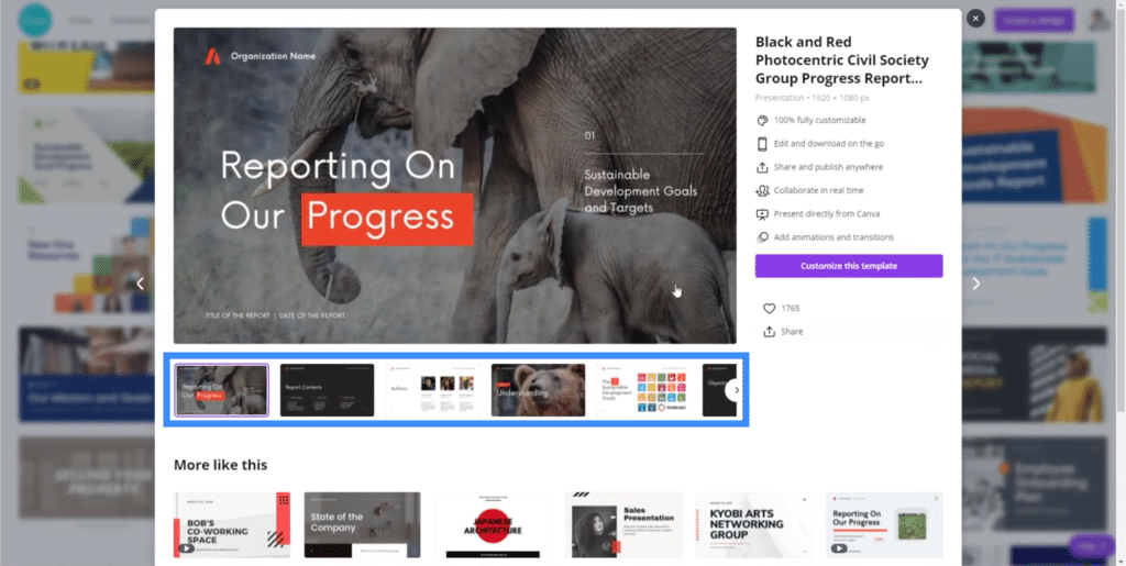
It also shows a list of the things I can do if I choose to customize this specific template, like adding animations and transitions.
So let’s start customizing the chosen template. Once you click on “Customize this template”, it will go straight into edit mode.
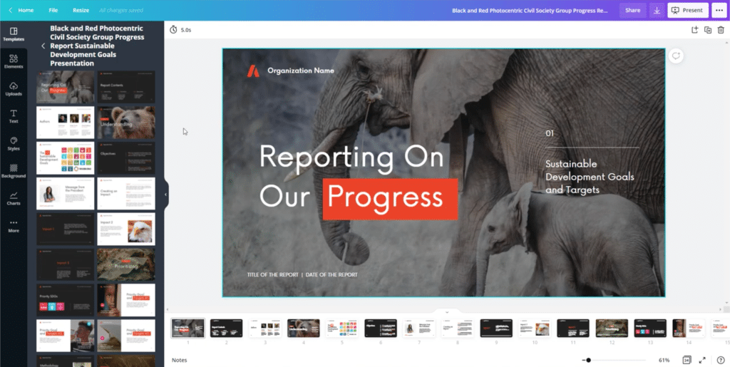
The good thing about using the existing templates is that you don’t have to do a lot of work. Since everything has been laid out, you just need to personalize the details to match what you need.
Let me start by changing the background. Although this elephant background is nice, I would like to use something simpler. So I’ll go to the Background section on the left pane. Here, you’ll see a lot of different options.
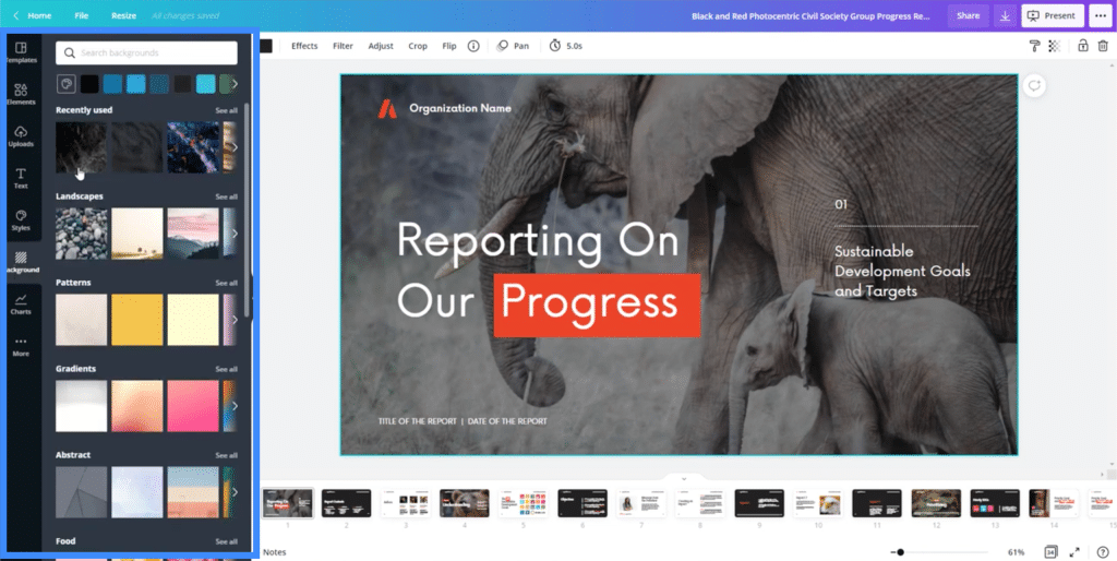
Once you see a background you like, just click on it and it will automatically be applied to the slide you’re working on.
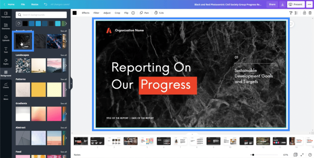
I can also move the text around and change it. Let’s say I want to move this header higher.

I just need to click on the text box and drag it upwards to move it.
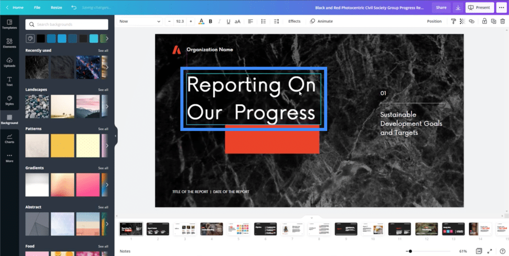
I can also change the text into anything I want.
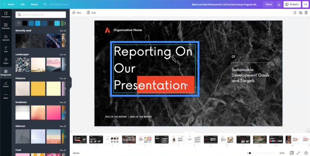
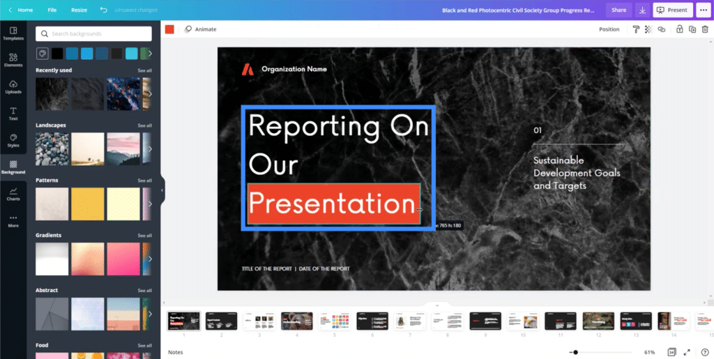
Another element here is the orange rectangle previously under the word “Progress”. I can also resize and drag that so that it appears under the word “Presentation”.
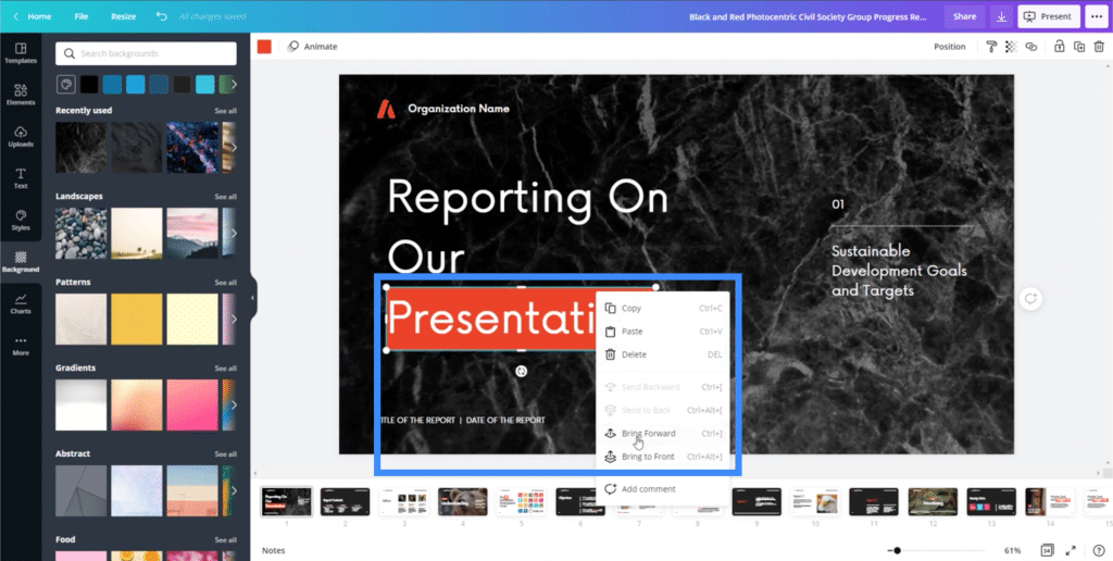
If I click on any of these elements, I also have the option to either bring it forward or backwards, depending on which elements I want to appear on top of the others.
All the other text boxes on the page can be edited as well.
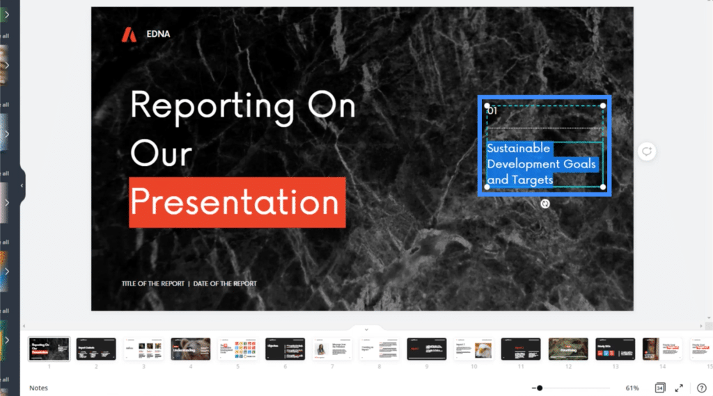
Seeing how easy it is to move everything around, it really makes it possible to finish a presentation in just a couple of hours.
Adding Elements To The Page
Let’s move on to a different slide this time. As you can see, the other slides within the same presentation template can be seen at the bottom. You can click on any slide that you want to work on next.
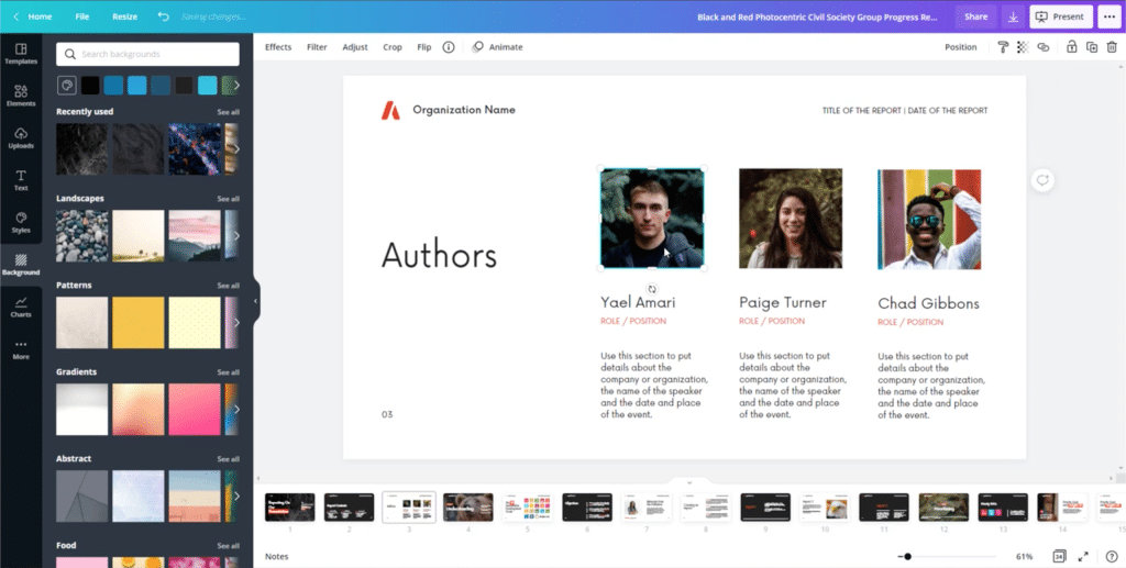
Let me remove the first picture on this slide that we’re working on and replace it with my own. To do that, just go to the Uploads on the left pane then click on “Upload media”.
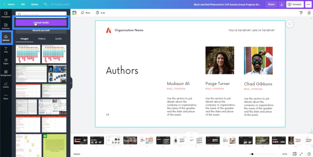
After choosing the right file, the picture will show up on the left side.
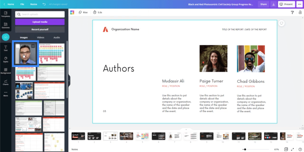
Clicking on that uploaded picture will then bring that image into my slide.
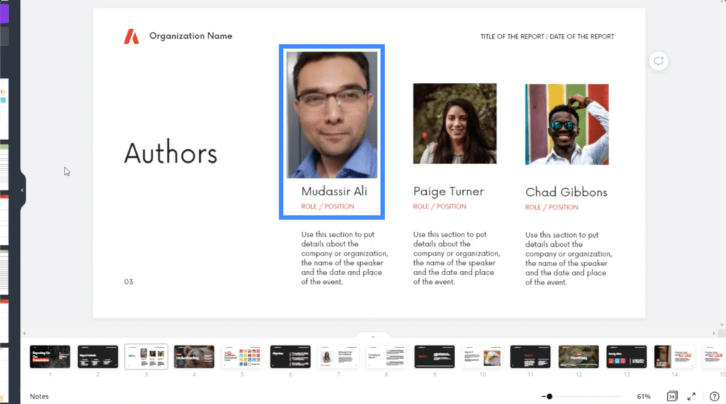
We can also add other elements from Canva. Let’s go to another slide to try that out.
On this slide, you’ll see that the only text on the left side is “Objectives”.
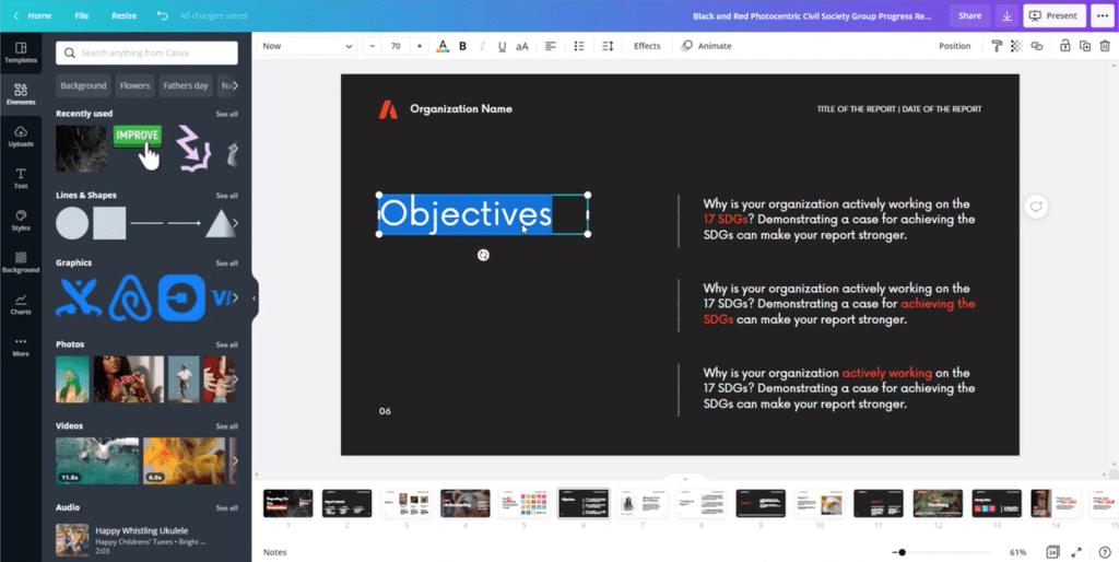
But what if I want to talk about different KPIs on this slide, like Cost and Quality?
So I’ll change the word Objectives into Cost.
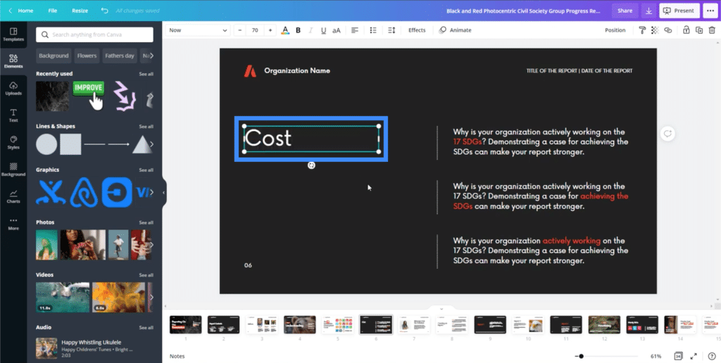
Then, I can highlight that text box and do a copy-paste.
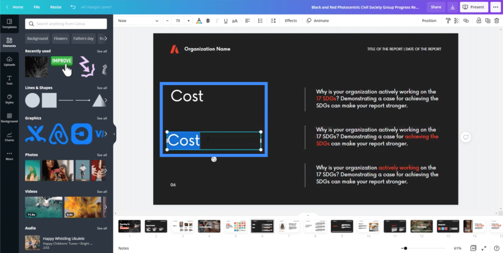
I can then edit the second text box so that it says Quality.
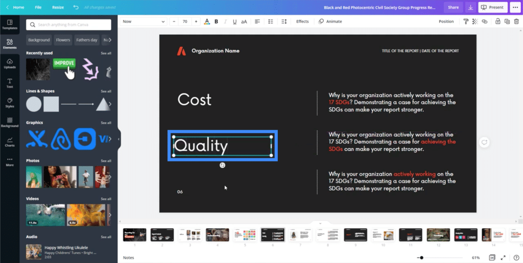
I can also add some icons or graphics here, too. For example, I can search for the word dollar on the left side within the Elements menu.
This will show me all the different elements that correspond to my search.
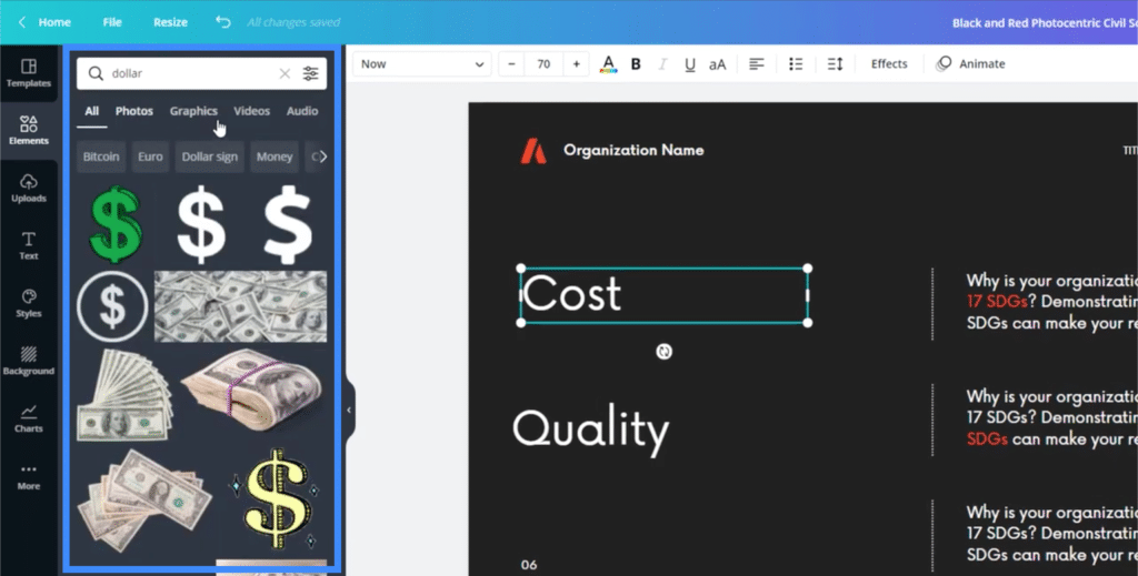
Again, clicking on any of these dollar icons would bring that image into my slide. I can also change its color by clicking on the color box on top of the page.
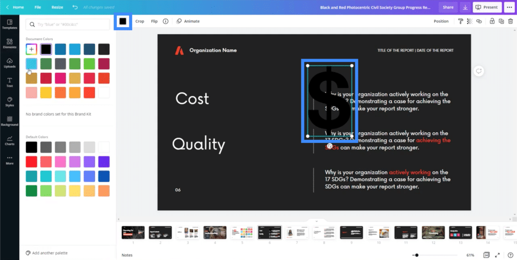
Once I click on the color box, it will show me a range of colors I can choose from. Clicking on any of the colors will automatically change the icon’s color.
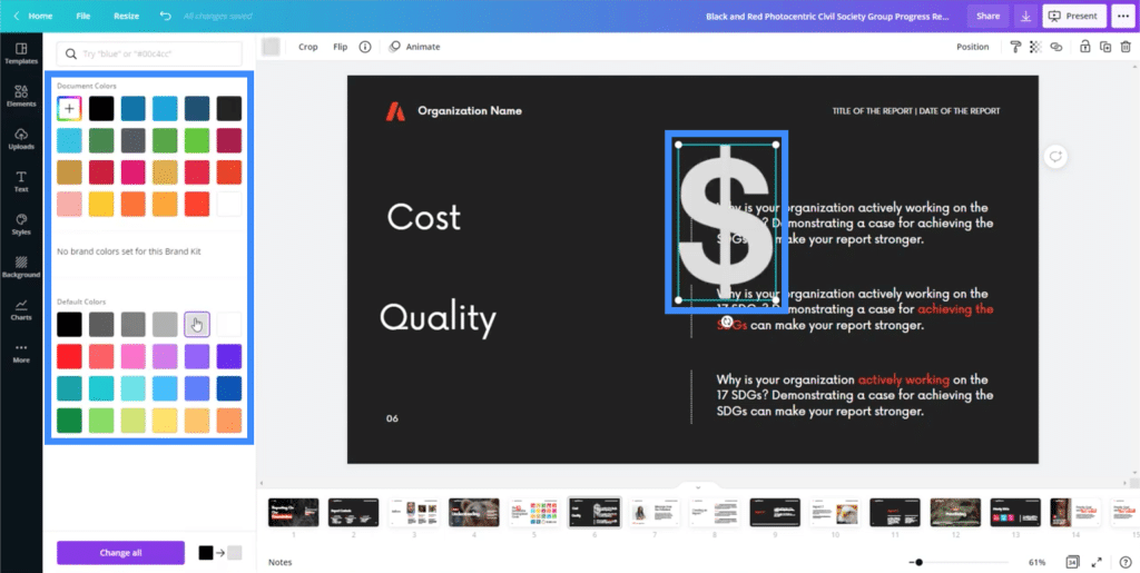
I can resize that icon too by dragging the dots on the corners.
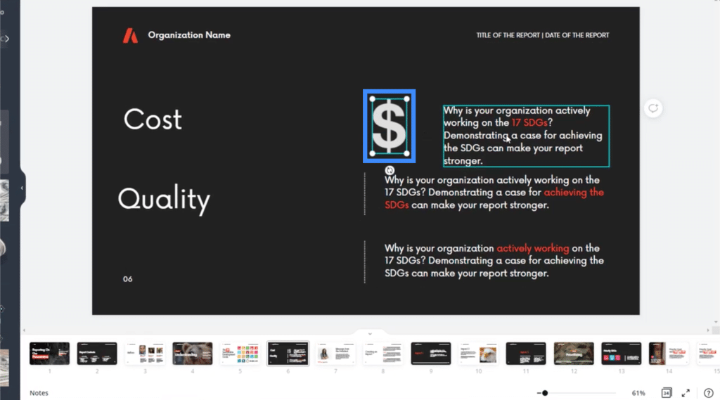
That’s another thing that can help cut down the process of making Power BI themes and backgrounds. Normally, you’d have to search across different sites just to find the icon you need. In this case, Canva has an entire repository of elements you can use.
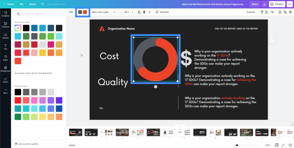
Another useful element you can add are charts.
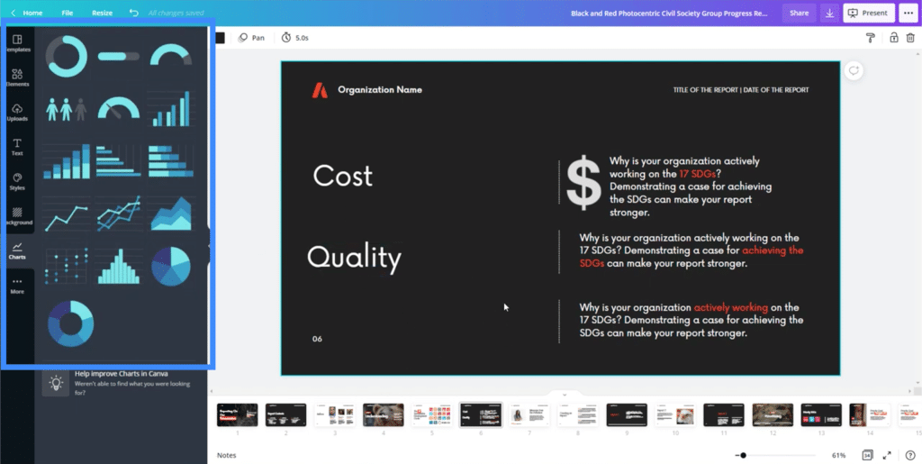
Of course, these charts would be useful if you’re just going to use them for a business presentation or for the sake of visualization on your Power BI report. However, if you need a dynamic chart, then it would be better to create that within Power BI.
Once you bring a chart into the page, you’ll see the different settings you can tweak on the right pane.
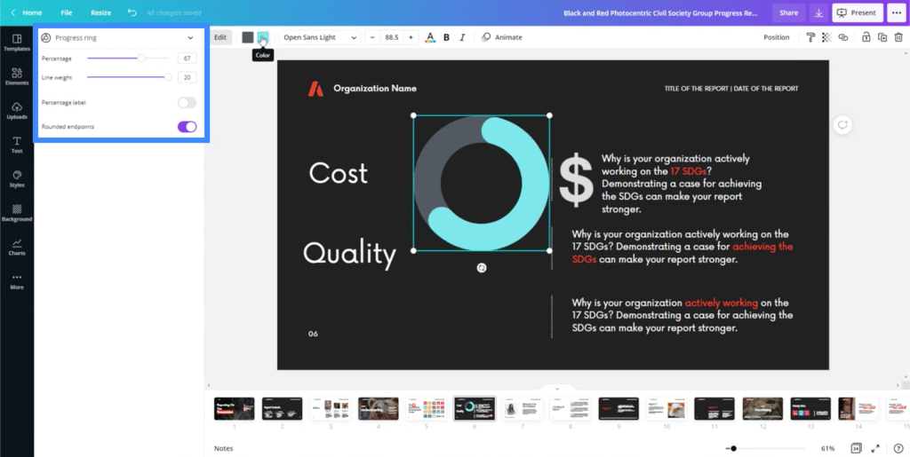
You can also change the colors by clicking on the color boxes on top.
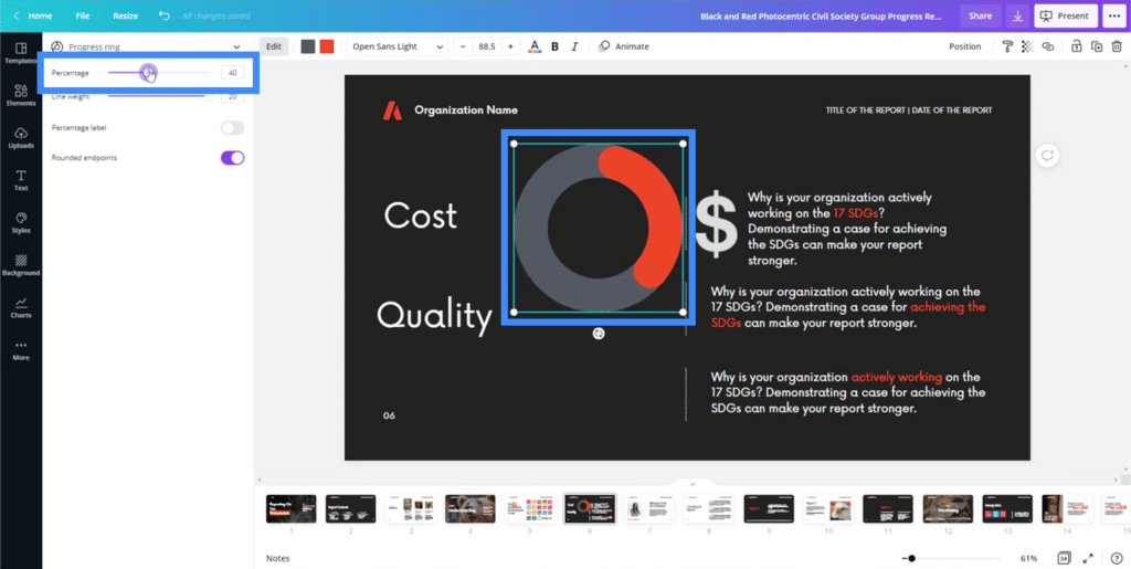
You can change the percentage here in the settings.
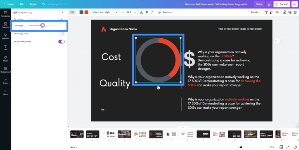
You can also adjust the line weight in case you feel the chart is either too thick or too thin.
You can add a percentage label by toggling it on.
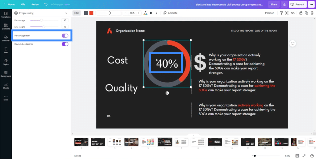
This is definitely much easier than creating charts within PowerPoint, which we used to utilize for themes and presentations. In PowerPoint, creating a simple doughnut chart can take time.
There are also other types of visuals you can use, like line charts and bar graphs.
Presenting Your Slides Using Canva
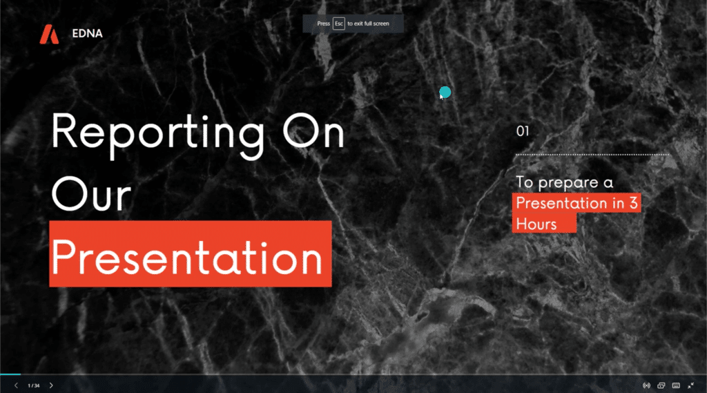
Once you’re done with the presentation you’re working on, Canva also allows you to do your presentation from within the app or site itself. Just click on the Present button on the upper right corner of the screen.
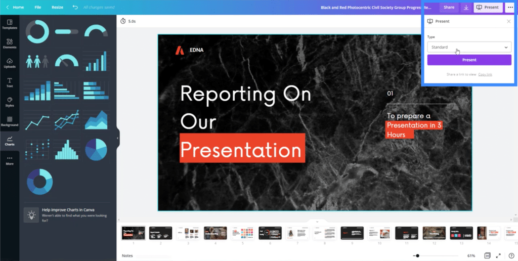
The cool thing about presenting from within Canva is that it automatically adds transitions from one slide to another. It also adds some cool animations, like the main text elements sliding into the screen.
Using Your Canva Slides In Power BI
What if you want to use the slides you created as one of your Power BI themes?
First, you need to download your presentation by clicking on this download icon on the upper right.

You can download it in different formats and it would usually suggest that you use the PDF format.
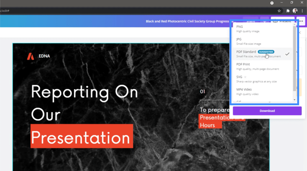
For now, I’m going to choose PNG because I need separate slides as images that I can use for separate parts of my Power BI report.
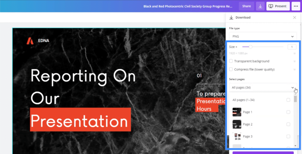
The download settings also allows me to make the background transparent or resize the file. Note that not all of these settings are available on the free version. Changing the size, for example, only comes with the paid account.
It also allows me to choose which pages I want to download.
Once you’ve downloaded the slides you need, Canva will ask you whether you want to keep editing the template or go back to the homepage.

Now, let’s go to the Power BI desktop.
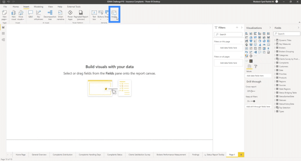
On the page you’re working on, go to the insert ribbon then click on images. This will bring up your files, where you can choose the slide you need.
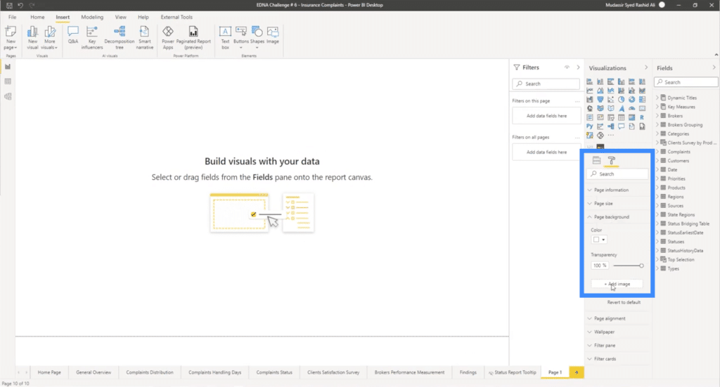
You can also bring it in as a background instead of just an inserted image. Just click on the paint roller icon on the right, then click “Add image” under it.
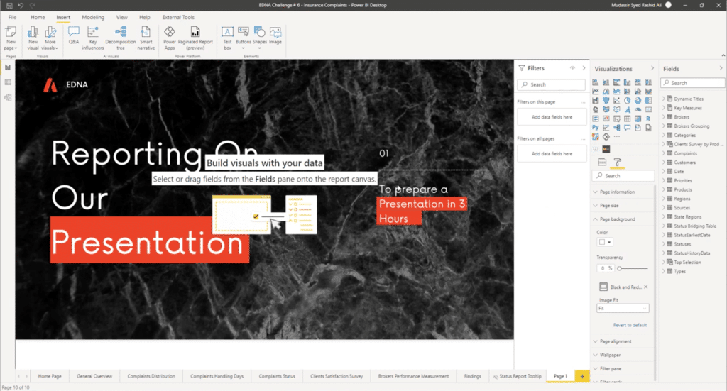
From there, you’ll see the slide on your report and you can add Power BI elements over it, or keep it as is.
***** Related Links *****
Power BI Report Development: Creating Themes, Company Logos, Icons and Backgrounds
Power BI Theming | Power BI Desktop Standard Theming
Power BI Theme: How To Simulate Dynamic Theming
Conclusion
If you’ve been using PowerPoint or any similar platform for your Power BI themes and backgrounds, you’ll know how much time and effort that usually takes. But with a tool like Canva, you can easily speed up your entire process.
Why is this important?
When you’re creating a Power BI report, it’s not just the analysis that matters. The amount of time it takes for you to complete everything as well as the way it looks once it’s done also matters. These are two things that Canva can help with.
Hopefully, you’ll be able to find more uses for Canva as you work on your reports. You can get images and other elements done there, for example, then bring those into your Power BI desktop.
All the best!
Mudassir


