I’m going to show you how to create a Power BI dynamic x-axis, also known as temporal scale using a disconnected table that can let you change the level of granularity depending on your date or time basis. You can watch the full video of this tutorial at the bottom of this blog.
A dynamic allows you to show a granular level of detail at the most important current information. It shows less granularity for previous dates.
This tutorial is a continuation of my recent blog where I built this visualization, which was the R10_table. It was built on these calculated columns DTS IsCurrentQuarter and DTS SortBy.
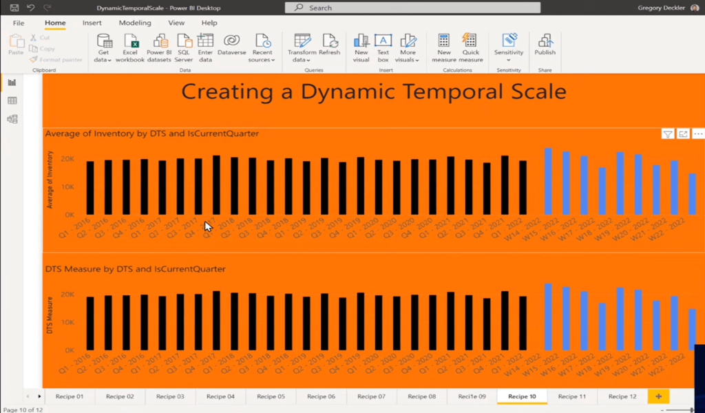
IsCurrentQuarter is identifying true or false whether we’re in the current quarter or not. Based upon that column, we can then create the DTS column, which essentially returns either a week format or a quarter format as text. SortBy gives us our four-digit year, then a quarter number, and then a week number in the case of week. Otherwise, it returns just the four-digit year and a week.
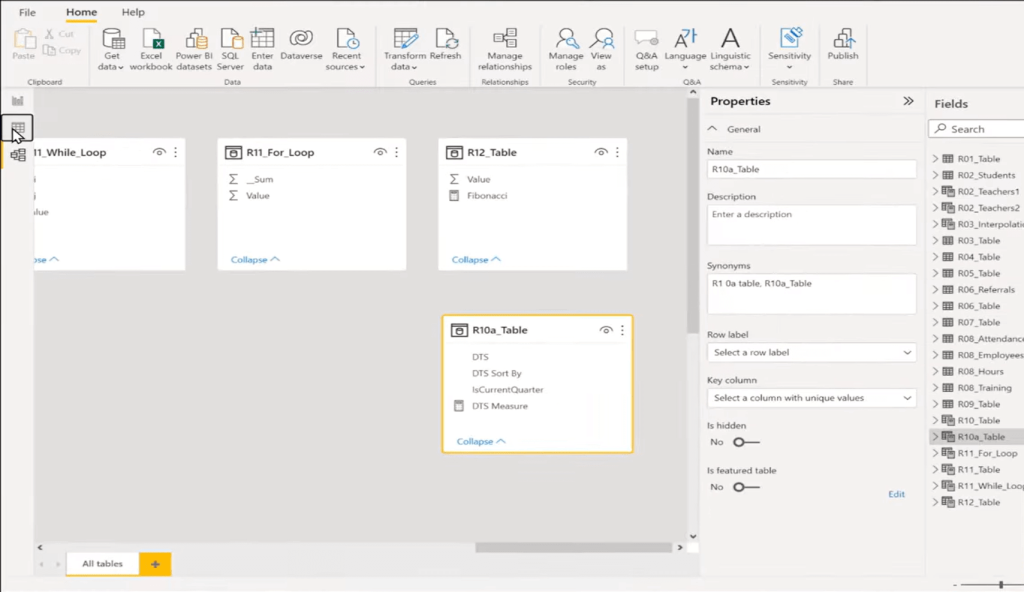
Today, I’m going to build an identical visualization, but instead of using calculated columns, I’ll be using a disconnected table, which is this R10a_table that uses a measure.
How To Create A Power BI Dynamic X-Axis
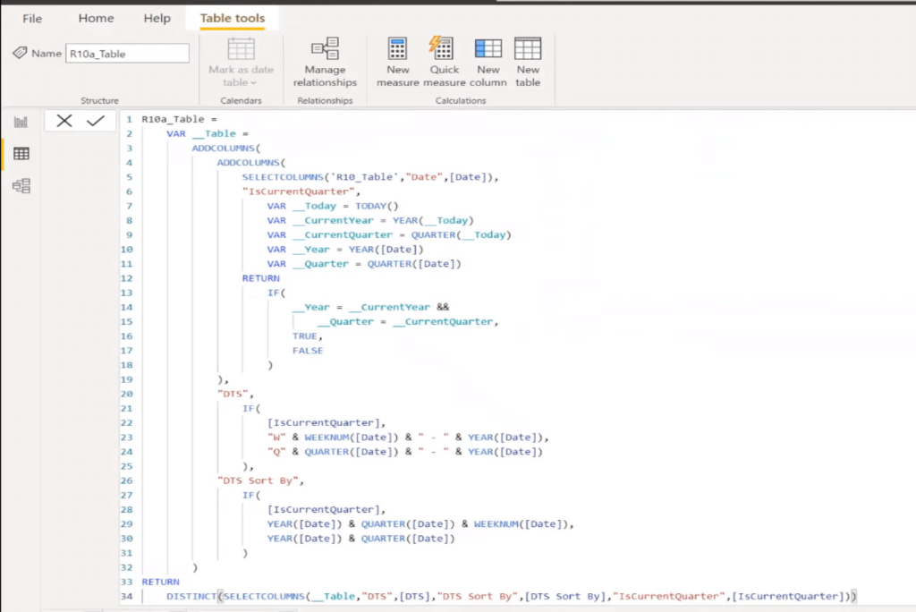
The R10a_table is actually based upon the R10_table, so the assumption is that you have some kind of fact table or a date table that has date in it. If you look at the DAX, it may look a little bit daunting, but it’s the exact same code as the calculated columns. We’re just basically creating the calculated columns within this table calculation.
We’re grabbing our Date column from R10_table. So, we start off with just a big list of dates, every date that’s in that table. Then we’re using ADDCOLUMNS and we’re adding that current IsCurrentQuarter. And then, we’ve modified it to not refer back to the table, but just to the date column.
It’s also true for our DTS column and DTS SortBy column. It’s the same code. At the end of this, we use SELECTCOLUMNS to select our DTS, our DTS SortBy, and our IsCurrentQuarter. And then, we use DISTINCT to return just the distinct rows.
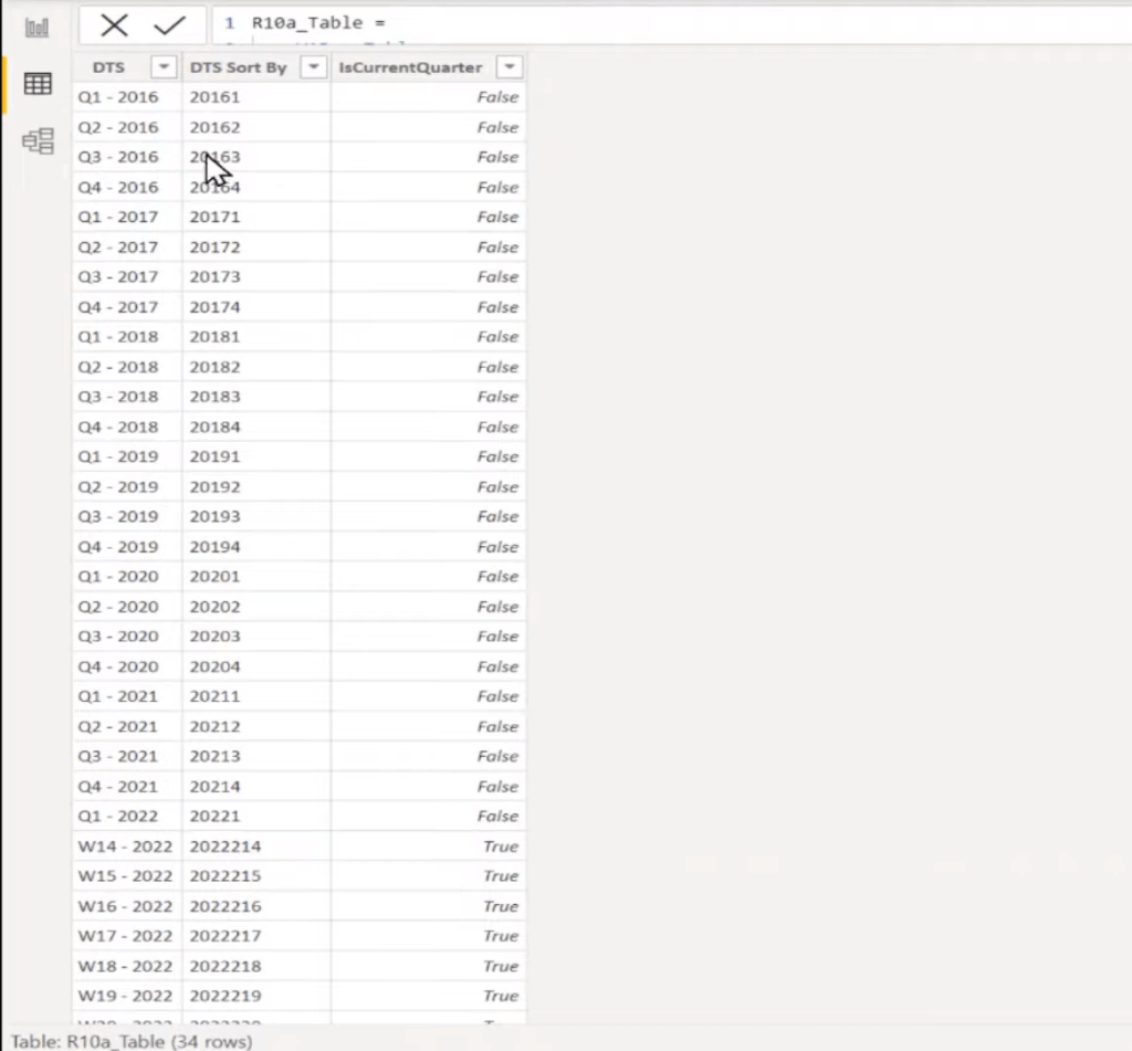
What we’re left with at the end of this is just a distinct list of values that is going to end up in the axis of our visualization. This is still dynamic and it keeps up to date as part of the data model.
Since this is not connected to anything, we need a measure in order to figure out where we are as far as this access, and then go calculate the Average Inventory. So, let’s take a look at the measure that I created.
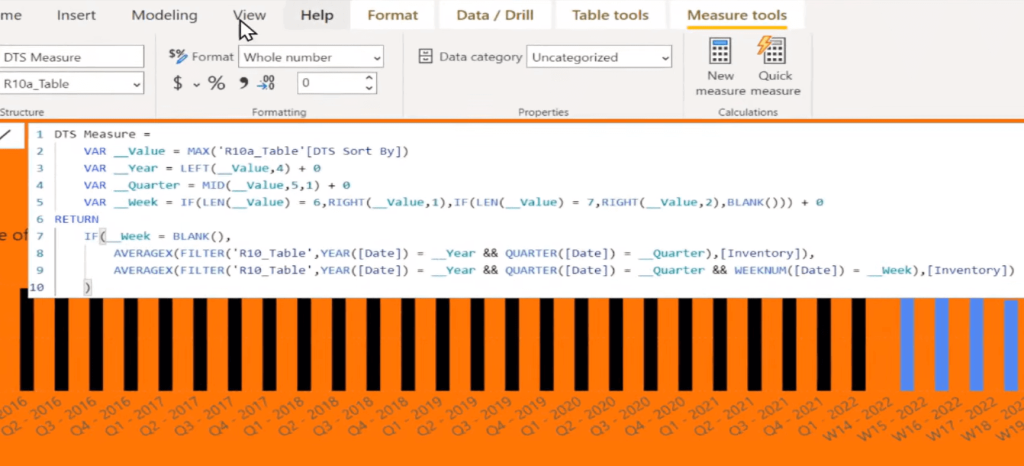
The first thing that we’re doing is we are grabbing the MAX of the DTS SortBy because that’s going to be the easiest thing that we can do to parse out what year, quarter, and week we’re in. In case for the year, we’re just grabbing the leftmost four digits.
And then, we have this add zero (+ 0) because we’re parsing out the value and we’re using a text-based approach to that. This actually returns a text. If we try to compare a text to a number, we’re going to get an error. So, the easiest thing to do is just add zero, and that forces DAX to then return this as a number instead of text.
For the quarter we’re just using MID function to grab the fifth character. The week is a little more complicated because it might be a one-digit week, or it could be a two-digit week. In this case, we’re just checking to see if the length of the value is six, we grab the last character, if it’s seven, we grab the last two characters and if it’s neither of those, then we return BLANK. Then, we add zero, of course.
If week is BLANK, then we do AVERAGEX, and we’ll know we’re in a quarter, so then we grab our quarter information. If we are in a week, and week is not BLANK, then we are going to end up grabbing by week.
***** Related Links *****
Calculated Columns Power BI: Tips & Best Practices
Comparing Calculated Columns And Measures In Power BI
Calculated Table And Column In Tabular Editor 3
Conclusion
That’s essentially all there is to it. That’s how you create a Power BI dynamic X-axis using a disconnected table with a measure. The DAX is not super complicated, especially if you take it in chunks. All we’re doing here is we’re filtering out by year and quarter, and then taking the AVERAGEX of it, and we have the same visualization as the one using calculated columns.
I hope you find this tutorial helpful and implement it in your own work. You can watch the full video below for more details and check out the first part of this tutorial for more information.
All the best!
Greg


