In this blog, I want to give you a sneak peek into something new that we’ve been working on at Enterprise DNA. I’m going to introduce to you some Power BI designs that we’ve developed to help you create compelling Power BI reports. You can watch the full video of this tutorial at the bottom of this blog.
The Team is all about empowering Power BI users as they hone their skills and expertise in Power BI. One of the most important skills that we believe has a huge demand is the ability to display insights effectively and compellingly. This upcoming initiative that we call the “Power BI Design Kits” will try to bridge that gap between data and design.
Sample Power BI Designs From Our Latest Game-Changing Initiative
Due to the skills of our Enterprise DNA experts and their participation in the Power BI challenges, we’re seeing some incredible designs of Power BI reports. They are probably some of the best designs out there by far. So, we thought why can’t we create design kits that others can use within their own Power BI reports?
Instead of having to build from scratch, we support you in developing reports about five times quicker than if you were to recreate them. Furthermore, you’ll have some flexibility in how you can rework the design and present it in a more customized way, such as changing colors.
Here’s an example of what our Power BI design kits look like.
The idea is that we can build this inside PowerPoint or a tool like Canva. Doing this enables you to use this preset template, adjust a few colors, etc. If you want, you can change a few things. For example, you could delete things. Also, you could come in here and create different pages, just like you would inside a Power BI report. First, you create these pages here before you move into Power BI.
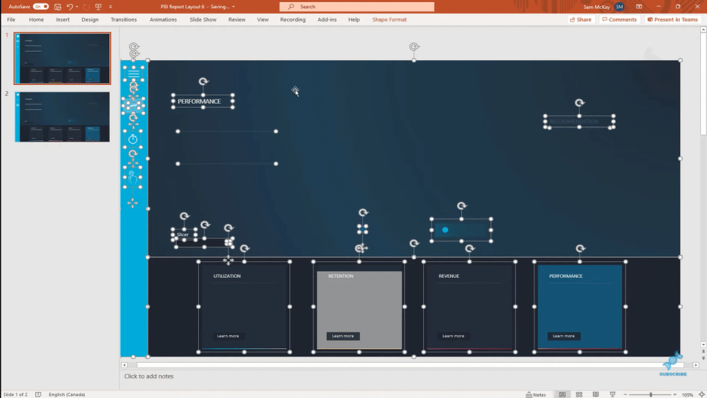
If you try to build this directly inside Power BI, you’ll find a lot of elements there. And if you can get this into just one wallpaper or background for your Power BI report, it actually makes the performance of your report that much better and faster. Also, you don’t have all these individual elements that you’re trying to move around; it’s literally just one background.
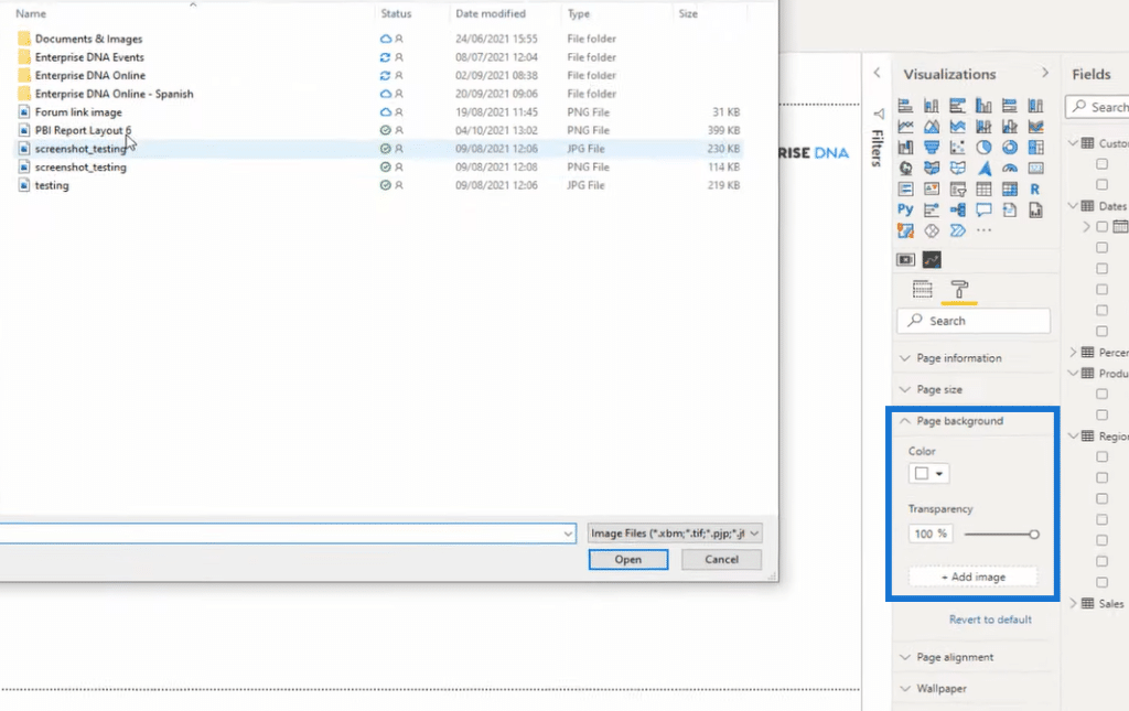
After you make the necessary changes, you can save it. When you come into Power BI, instead of recreating that from scratch using shapes and icons, you can just embed it in your background. Go to Page background, then Add image and make your desired changes.
For example, you wanted to create a visualization. You can simply create it on top of this background.
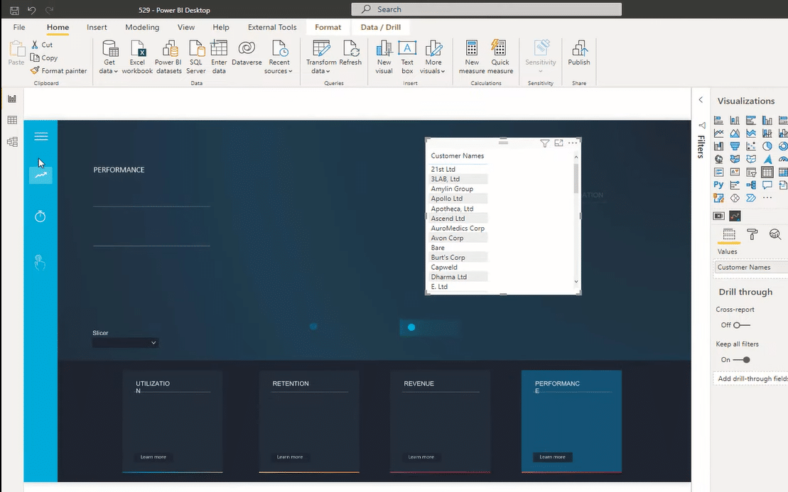
We also made sure that you’ve got the right color palette embedded into your Power BI report so that you can align your colors quickly to what you have in the background and be able to generate your visualizations. You can also create the actual navigation or embed bookmarks into this page.
***** Related Links *****
Power BI Report Designs: How to Get Inspiration Through Enterprise DNA
Tips For Power BI Report Design – Best Practices
Power BI Interactive Reports: Navigation And Bookmarks
Conclusion
These are just some of the examples of what you can get from our Power BI Design Kits, but there’s more. These are the things we’re trying to solve for those who are using our platform. Our goal is to make your lives easier when working with Power BI reports.
I hope this gives you a lot of excitement. I’m really looking forward to showing you more details in the near future. Watch out for a lot more coming up on our platform very soon.
Cheers!
Sam


