In this tutorial, I’ll show you a Power BI data visualization technique on highlighting KPI (key performance indicators) trends in your report. You may watch the full video of this tutorial at the bottom of this blog.
The data and dashboard I’m using for this demonstration was part of the Enterprise DNA Learning Summit in 2018.
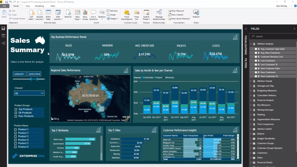
You can incorporate this technique in your own reports inside Power BI. It’s a great way to show performance trends or business performance metrics over time. This Power BI data visualization technique incorporates a specific index calculation that shows trends really well.
It also enables consumers to see high-level information really effectively. Sometimes, if you only have numbers in your report, it doesn’t actually show the full picture. Sometimes it’s not enough. You want to see what’s happening to the underlying trend and what’s behind the numbers.
The key to highlighting trends is to utilize moving averages, so let’s jump into it.
Using Moving Averages To Showcase KPIs
If we only show results at a daily level in every granular result, we’re going to have incredibly busy charts. They’ll be like the old squiggly lines that are basically not highlighting a trend effectively.
So I created moving averages for all of these key performance metrics. I created the same moving average for each key performance so that I could see the trend over time versus just what the result was every day.
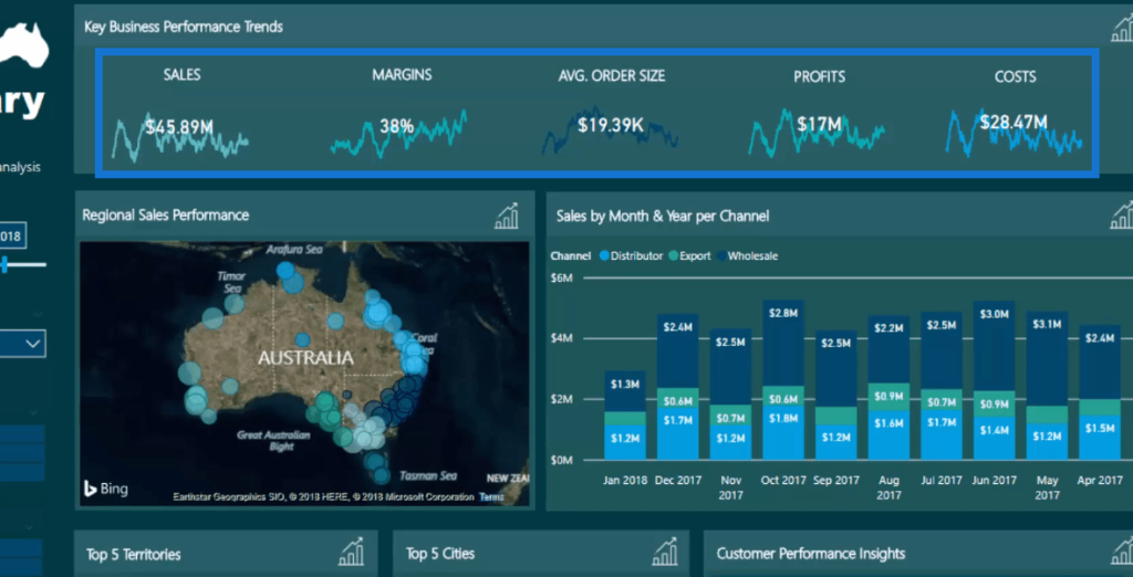
You can see here the measure group I created and called it Moving Averages. All of these measures correspond to the actual chart (KPIs), which are sitting within this top level of this dashboard.
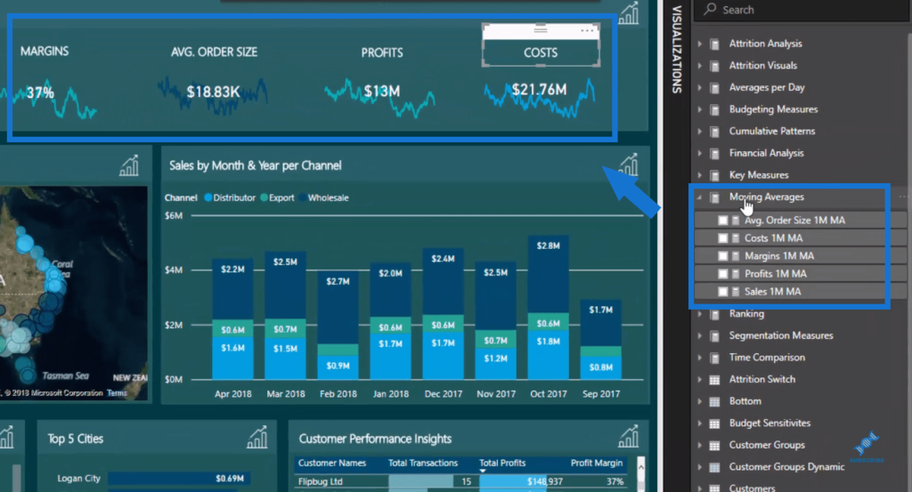
Let’s have a look at the formula that I’ve utilized here. You can easily replicate this formula in your own reports because this calculation is exactly the same in each metric.

In this formula, we’re looking at Sales and we’re doing a one-month moving average. The AVERAGEX function opens up a one-month time window back from today or back from any day, and then averages out all of the sales made in that one-month time window.
If we look at the Margins metrics, you’ll see that it has exactly the same technique or pattern. All I’ve done is input a Profit Margin here, which is a new measure from a prior calculation.

This also incorporates the technique called measure branching. In this case, we’re branching out of our core measures.
More Visualization Techniques
To really highlight and finish off this visualization, I have incorporated a card into it with the core measures.
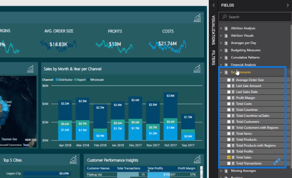
The core measures are the first layer of calculations. One example is this Total Sales measure, which is quite generic.

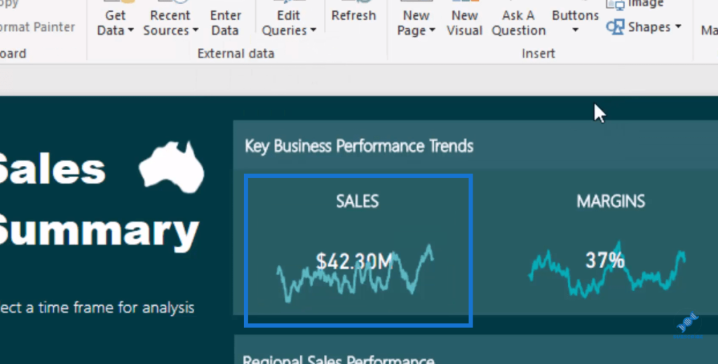
I put it inside a card and layered it on top of the visualization. And I’ve done the same with the rest of the performance metrics. And that makes our Power BI data visualization really stand out.
Furthermore, I’ve formatted it in a way that the number appears in front of the line. It doesn’t sit in front of the card. This makes our report more visually compelling.
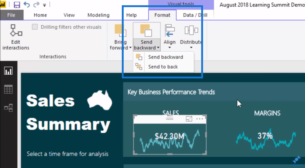
If I bring it forward or bring it to the front, for example, you’ll see that the line sits over the number.
***** Related Links*****
Using Moving Averages To Show Trends in Power BI
How To Do Trend Analysis In Power BI Using DAX
How You Can Re-Use Moving Averages In Power BI
Conclusion
This is a truly great visualization technique especially around these key performance business trends. It’s a great way that you can visualize these trends and still have all of the natural filtering.
This visualization technique provides valuable insights for consumers where they will be able to quickly see and understand the trends in a particular time period they select.
I hope that you can easily incorporate this technique into your own Power BI reports.
Cheers!
Sam


