In today’s blog post, we’ll learn how to create high quality reports using Power BI dashboard examples that are not that complicated, and not too filled with huge amounts of visuals and text. You may watch the full video of this tutorial at the bottom of this blog.
Simple designs can sometimes work really, really well as you can see with my discussion with Greg Philps, one of our Enterprise DNA experts.
The Rule of Thirds
Greg Philps: My philosophy is to limit the visuals on a page as much as I can. People generally have heard the rule of thirds. If you have more than three things displayed, it will be difficult for people to pick out something of interest.
For my challenge submission, one of the things I did was to leverage a little bit off of Python.
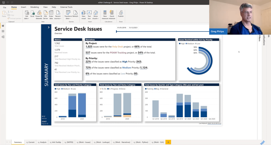
I only showed three percentages because I was hoping not to overwhelm the user with too many choices. This will make it pretty easy for them to choose one or the other.
I did the same by providing extra categorizations for priority, status, and type which had many different values. I basically grouped them all into threes and then used those in the bar charts the currencies which you can see at the bottom of the page.
Sam McKay: That’s really interesting because these dimensions weren’t in your raw data; you created these groups to break it down.
Greg Philps: That’s right. I think there were 5 priorities, 13 different statuses, and 9 different sites. I put a categorization on top so that it would be obvious to people what category things were predominantly falling into.
Know Your Audience
Sam McKay: Whenever you see reports with huge amounts of colors, it detracts from the insight that you’re trying to show.
Greg Philps: It depends on your audience. If you have a complicated report, you’ll be talking to knowledgeable people who know their data very well. But if your Power BI dashboard examples are intended for people who are looking for things at a summary level, then just give them the summary data.
I chose to keep everything in white here. I end up investing a lot of time in choosing colors, which is why I chose white. I didn’t choose a color theme. Instead, I went to Pantone’s and picked out the color of the year in 2020.
Sam McKay: One question on this particular report. How did you create the shadowed boxes?
Greg Philps: That’s just a simple shadow on any of the visuals. I think you can actually change the color of the shadow. I’ve never done anything but the main color, but you can choose a theme color on the placements and put it inside and outside the box.
Sam McKay: I really like that technique because I’m big on creating grids within your reports.
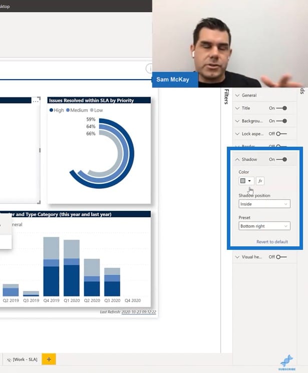
Greg Philps: I totally agree. I also extensively use the formatting pane and the General section. I can adjust the positions X and Y within height, to be multiples of 10 pixels for everything so that all my visuals are aligned, that they’re all the same height, and that they have the same spacing in between them.
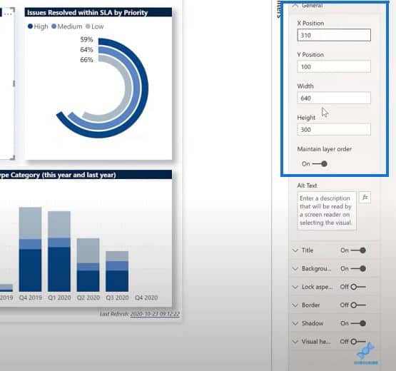
I use a 20-pixel border between every visual. I find that it looks great by itself. Also, one of the comments I seem to get from report consumers is “Hey, these things aren’t lined up. If they’re not lined up, how can I trust that the work you’re doing is right?”
So it takes me no effort at all to use the general section to format the report. It’s not perfect. It’s not as good as it can be, but it gets me over the hurdle of having an audience talk about my spacing.
Sam McKay: Yes. Having things out of alignment affects the way that your report can be engaged with and reviewed. Simple things like aligning inside of grids is crucial and add more to the report.
On Seeking Inspiration For Your Report Designs
Greg Philps: I think it’s essential myself. One of the other things that I was happy with was the simple chevron navigation here. I’ve done some pretty involved navigation things in my previous submissions, but this one was actually the easiest one that I did. They’re not images, they just have different colors. When I hover over it, it bounces from gray to white and that’s it.
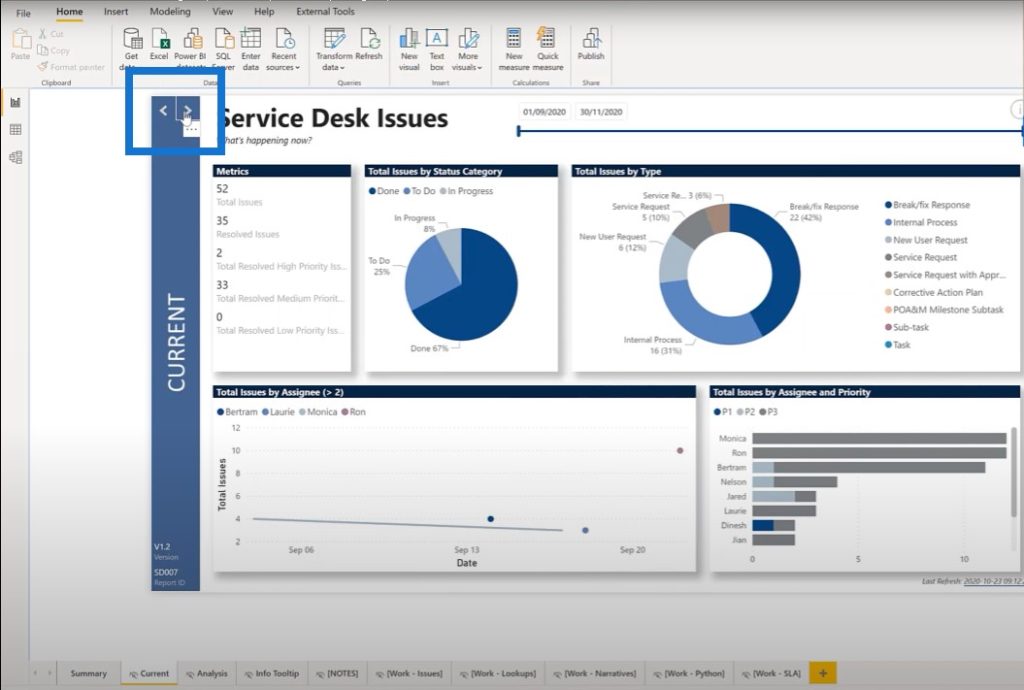
Sam McKay: I love the simplicity and originality of this navigation experience.
Greg Philps: I appreciate that very much, thank you. I actually can’t claim the idea myself since Microsoft Teams has it.
Sam McKay: I personally did something similar in one of my challenge submissions as well and copied it off from another website. There’s absolutely no shame in leveraging off what others are doing. That’s exactly what you should do if you’re trying to look for inspiration around your report designs.
Greg Philps: Totally. I think that any report is only as good as the people that are using it, when they’re using it. So ideally, I would not like to write a report that is still being used the same way for three years.
I would hope that it would be updated continually as people find out that certain visuals are better, or that they’d like to see different things. You would be changing the report as you go, so I have no problem leveraging from other Power BI dashboard examples. I think that this is a great thing to do.
The more simple you can make the report, the easier it’s going to be for people to use.
Greg Philps
This will result in less time for the report developer to support users, and the users can extract more value from day 1. They won’t have to ask a lot of questions on how to get around.
Sam McKay: Agreed. Now, Greg, just to round off this particular video, do you want to highlight other design philosophies that you have either within this report or another submission that you’ve done? I know you’ve submitted some reports to a number of the challenges and have won a challenge.
Greg Philps: I’ve been fortunate enough to win one and achieved honorable mention in a few of the others. The one thing that’s constant about all of them is the grid approach.
Regardless of whether I’m going with a simple or complicated color theme, I do everything in grids. I’m in a happy place right now where I use the General section and make sure that everything is in increments of 10 pixels. They’re easy to do, and it doesn’t take long.
I don’t have to worry about whether something’s lined up or not. By choosing the 10-pixel boundary, it’s really obvious when something’s not in the right place.
Sam McKay: Do you have another one of your reports open so that we can have a look at it? You can show one contrasting report where you’ve used similar techniques to this one.
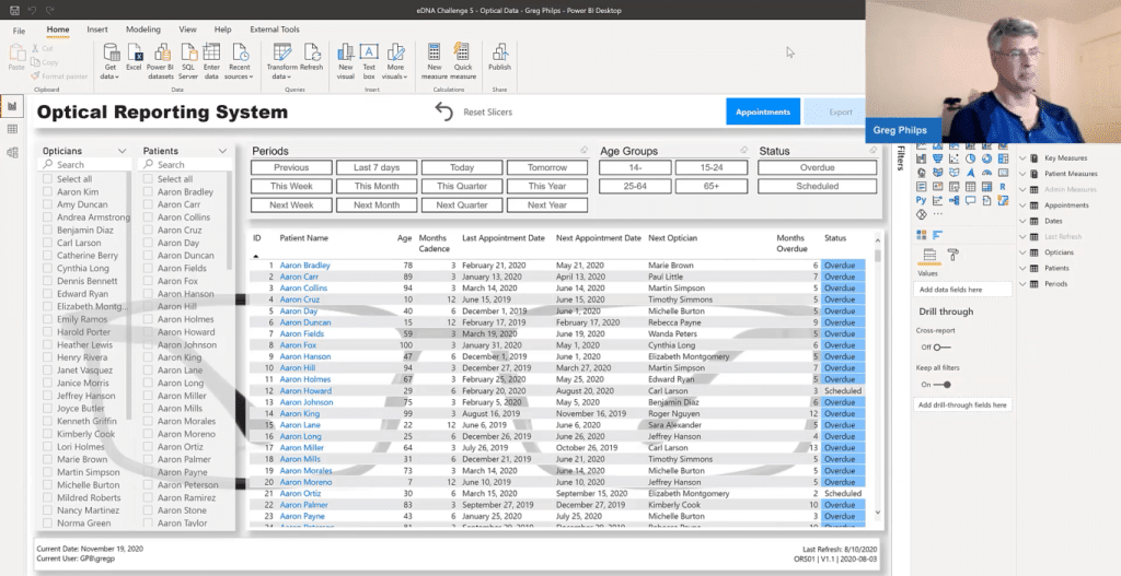
Greg Philps: This is my submission for Challenge 5, which is also mainly done in white. Instead of using a color theme, it pretty much uses just grids. I have a background image that was a black frame for a pair of glasses and used that as the background. Then I used semi-transparent visuals.
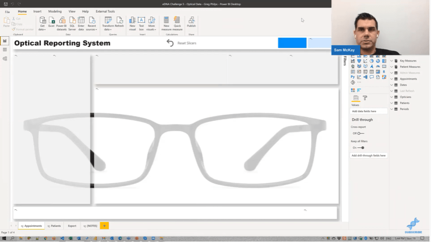
Sam McKay: This is one of the big things that I’ve really learned. All of the winners of the different challenges generally use colors in a limited way. There’s no significant use of colors.
Greg Philps: I spent a lot of time during my first year in Power BI doing a lot of colorwork, and I loved it.
But if you look at this report, I did use colors on the buttons for navigation at the top. I’m kind of wishing I didn’t, because it detracts, but overall I’m very happy with this report.
The color was shown only twice: first, to draw the eye to the fact that something is overdue, and second, that you can drill through on it.
***** Related Links *****
Show Last Refresh Date/Time In Your Power BI Reports
Power BI Custom Visuals – Build A Reporting Application
Power BI Custom Visual – Creating Text Summaries
Conclusion
The key takeaway we got from looking at these Power BI dashboard examples is that less is more. You don’t need to pack in everything into your Power BI reports making them look good. You can just keep it pretty simple with colors and grids.
Don’t forget to subscribe to the Enterprise DNA YouTube channel. We have a lot of great content coming up. There will be more showcases from Greg. I’m looking forward to getting that out to you as soon as we can.
Cheers,
Sam


