In this tutorial, I’ll run through my seven Power BI design best practices for dashboarding.
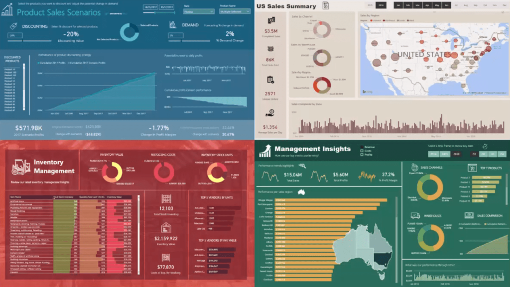
This is a snapshot of the reports you’ll be developing inside the Dashboarding and Data Visualization Intensive course in Enterprise DNA.

These seven best practices are what I use in every report that I create in Power BI regardless of what they’re about.
1. Think In Grids
The first tip is to think in grids.
In the four reports, you’ll see that I have rectangles that I use as divisions in my reports. They separate information effectively.
In each report, you’ll see that the rectangles are covering information for visualizations that have similar types. Layered colors can also be used to create or form a grid.
Grids effectively segment key information and draw the user’s eyes to areas in the reports that need to be focused on. They make it easier to extract insights.
This best practice is based on my personal experience in using Power BI. Grids are great alternatives compared to randomly stuffing information in the dashboard. Visualizations that aren’t aligned detract from good consumer experience.
2. Remember That Colors Are Essential
The second best practice tip is to use colors effectively.
Colors are what will make your presentation pop. It’s similar to a PowerPoint presentation. If someone comes to you with a PowerPoint presentation that has a terrible color scheme, you lose interest quickly. This is the same when it comes to Power BI.
In the next chapters, I’ll show you how to create good color palettes for your reports. A good contrast between different colors can be achieved, but this takes a bit of playing around.
3. Use Appropriate Charts Or Visuals
The next tip is to use appropriate chats or visuals for what you’re trying to showcase.
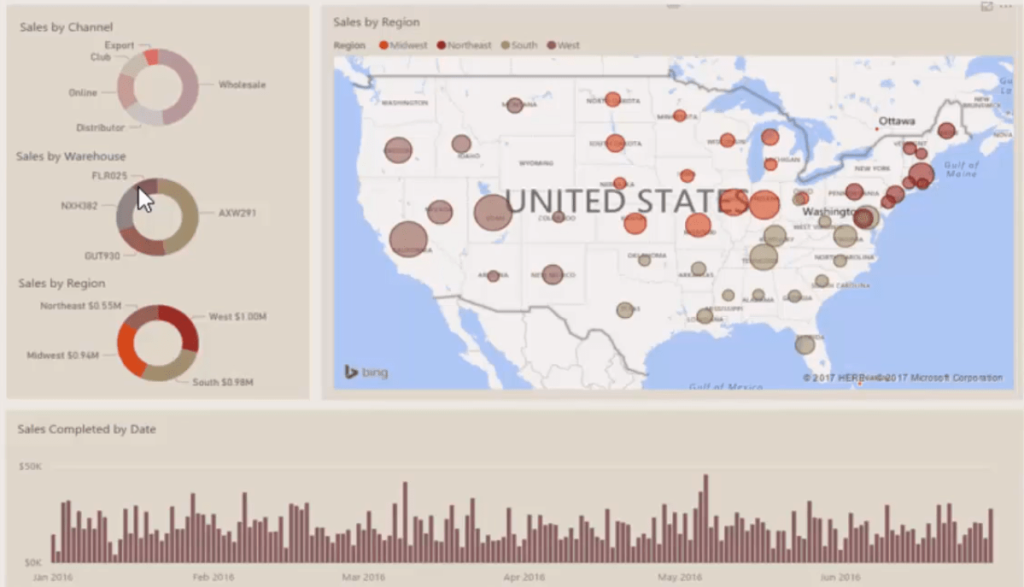
For example, when you look at the consumer goods example below, you’ll see that there’s information about the sales over time. You can also see regional information spatially. There are also donut charts that show information on channel, warehouse, and region.
These are good, simple visualizations to present valuable information in sales reports.

For time calculations, I recommend placing them in column charts instead of bar charts.

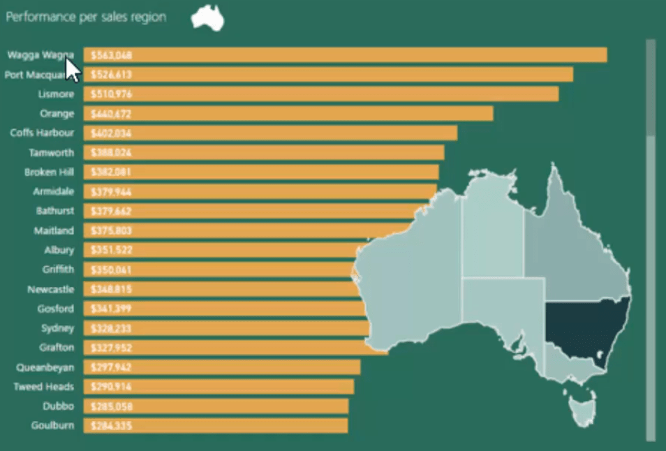
For other types of analysis, like regional performance, it’s better to use bar charts since they make it easy to read the region names along with the data.

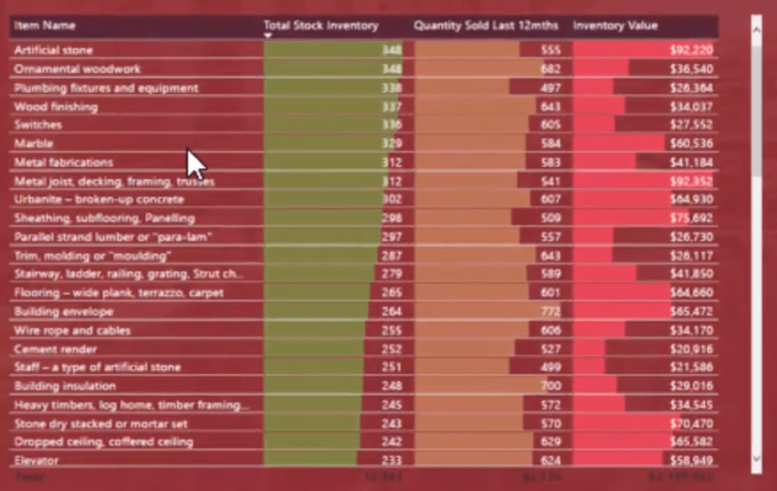
In the inventory management example, I used a table because it extracts a lot of insights in a concise manner.

Always remember that you don’t need to overcomplicate things. You can use simple tables and visualizations that can effectively showcase key information.
You don’t have to show all your data in a visual. Using a card for key metrics does the trick in a lot of cases.
4. Don’t Clutter, Simple Is Better
Keep it simple. Don’t make it too hard to see what you’re trying to showcase.
I often see reports that have been overcomplicated which makes it hard to understand what’s going on. Always default to the simpler option. Don’t put too many visuals in. Make it clear what the report page is about.
Simple is always better.
You don’t need to go and blast everything into one report page. Simplify it. Make use of the many features in Power BI like the filters and slicers. You can also choose to create another report page.
5. Make Key Information Stand Out
If you look at the four different report pages, you’ll see that the key information stands out.
Key metrics can be placed at the bottom, top, or side. What’s important is to make them stand out from the rest of the visuals in the report.
When you place the context on top of your report pages, you want the consumer to go straight to that point. You don’t want to have any ambiguity over what a user is looking at. You want to make it as simple and easy to consume as possible.
6. Use Clear, Simple Titles & Headers
With a simple glance at the demo models, you can easily see what each is representing because of the big titles on each report page.
There are titles on every visual and metric.
If you don’t have titles or you’re using abbreviations to name elements in your report, consumers won’t understand them.
You don’t know who will be viewing your dashboard. It could be a senior manager who doesn’t know the details. So you need to use labels that make it easy for any user to easily discover what they’re looking at.
7. Use The 10-30 Seconds Rule
Whenever you design a report in Power BI, make sure that those looking at it will understand everything within 10 to 30 seconds.
If it gets over that time, people are going to lose interest. Thus, your report won’t have the impact you want it to have.
When you create the design, make sure that those who are unfamiliar with the data can draw the insight they need within 10 to 30 seconds.
Conclusion
The seven Power BI design best practices for dashboarding discussed in this tutorial have worked very well for me.
Implementing these in your own reports will help you and other users immensely to draw great insights from them.
All the best,
Sam
***** Related Links *****
Tips For Power BI Report Design – Best Practices
Simple Visualization Techniques For Your Power BI Reports
Power BI Visualization Technique: Learn How To Create Background Design Plates
***** Related Course Modules *****
Dashboarding & Data Visualization Intensive
Financial Reporting With Power BI
Data Visualization Tips
***** Related Support Forum Posts *****
Database/Dataset To Report – Best Practices
CD (Continuous Deployment) Best Practices For Power BI Report
Multiple Companies – Best Practice
For more report best practice queries to review see here….


