
In this post, I’d like to continue presenting the Power BI best practice when developing reports. As I mentioned last time in part one of this series, I have consumed many online resources which have been instrumental in my own journey; but I quickly became overwhelmed by all the content. I ended up making my own notes that I turned into easy-to-digest PowerPoint files. You can watch the full video of this tutorial at the bottom of this blog.
This is by no means an exhaustive list nor even the top practices, but merely the ones that I’ve incorporated into my own development. I’ve discussed this topic with other Power BI users to get their input, but again, these are my own takeaways. Also, a Power BI best practice will evolve over time as new and enhanced capabilities are introduced both in the Power BI application and by the Power BI community.
The audience should always be first and foremost in the developer’s mind, and any steps you take to make the report experience better for report consumers is worth the effort.

Creating A Reset Slicer Button
I easily get lost when clicking on graphics and various visuals on a page, and there are times when I don’t know what filters I’ve applied. This is why I like to create a bookmark of the initial state of a report, and then create a reset slicer button so there’s a way for me to easily return to the initial report state.
Including A Slicer Selections Area
If report space is available, I like to add slicer selections to display all the current slicer selections. One of the “features” of Power BI is that when you select a single item from a dropdown slicer, that value is displayed.
But when you select more than one value, Power BI displays multiple selections, which doesn’t give the user confidence when exploring insights.
I used an example of this technique in my submission to the Enterprise DNA Challenge #3, and there’s a YouTube video showcasing this technique.
Adding Interactivity To Buttons
Another Power BI best practice is adding interactivity to buttons. You can do this by altering the On Hover behavior through the buttons. You can change many properties, such as font size, font family, text color, fill color, or line width. I recently showcased some of these techniques in another Enterprise DNA YouTube video.
In my example, when you hover over any of these buttons, you will notice a slight difference in the behavior of the visuals.
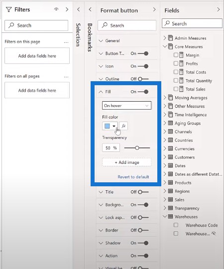
When you select a visual, go to the format pane, and then Fill. The default state is white and the On hover is of a different color.

Using Focus Mode
Another way to increase the usability of your report is to ensure that your visuals look as intended both on your report page and also when focus mode is being used.
As an example, when using a dark background and white text, it’s not uncommon for the visual text to not be visible when in focus mode. One way to handle this is to apply a dark background color at the visual level and set the background transparency to zero.
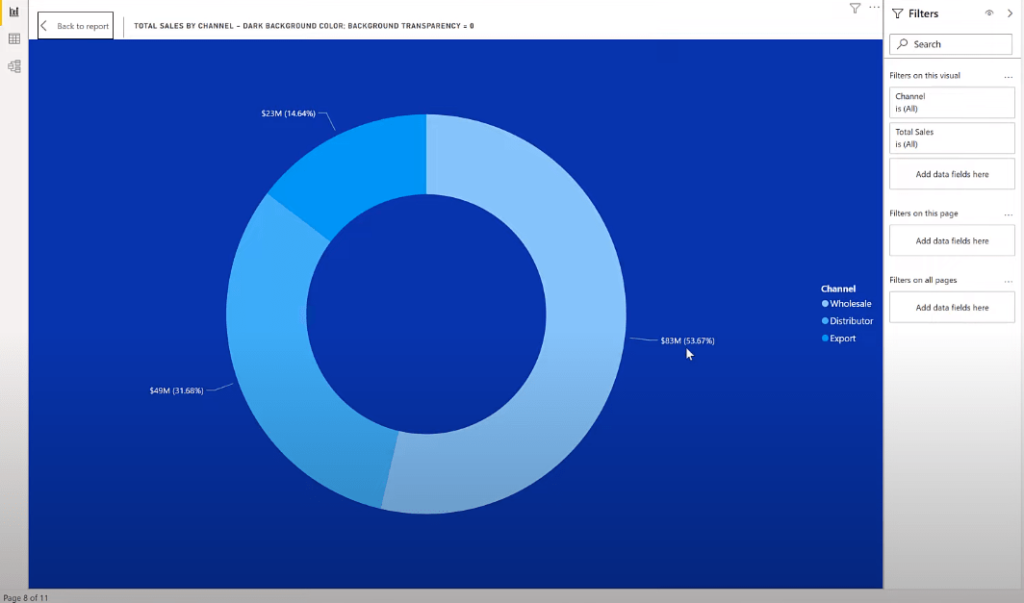
We can see the focus mode on the left donut chart in this example. We can also see that none of the detail labels are visible.
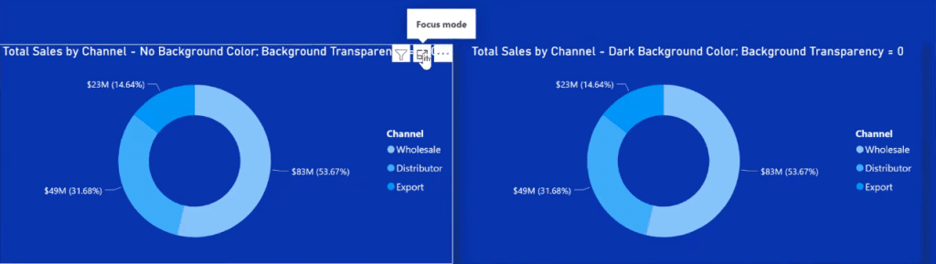
And if we go to the formatting pane, we’ll see under Background that the color is white and the transparency is set to 100.
For the right donut chart, we used the same color as the background and set the transparency to zero. When we use focus mode on this scenario, we can actually see the detail labels.
Using The Smart Narrative Text Box
I’m also a big fan of the smart narrative text box visual in Power BI. I frequently use them to display static text with dynamic measures.
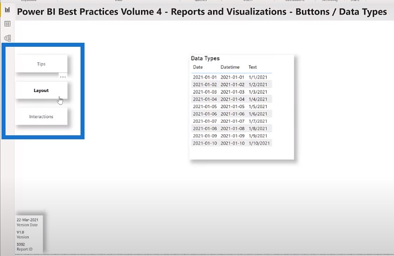
Using The Correct Data Type
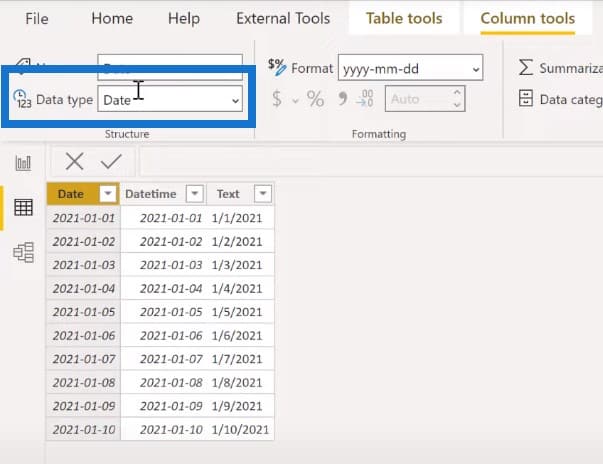
The data type of a column is important. Many times, data will be loaded into a Power BI file. While the data may look correct, the best practice is to always check columns that hold the date data and ensure they are of the date data type. If not, make sure that they are properly converted.
As an example, let’s take a look at the following table. There are three columns here, and it appears that all three hold the same data. Only the first column is actually the date data type so it should be used in any date calculation.
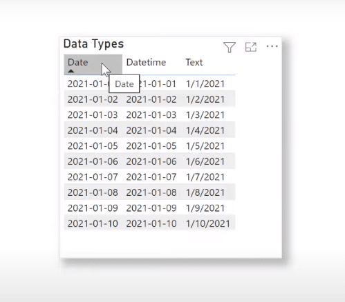
Let’s go over to the data view. We can see that the first column is a date data type.
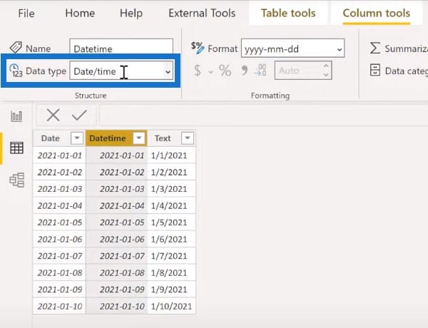
The second column is a date/time data type.
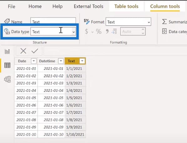
And the third column is a text data type.
You can convert the type of a column in the dropdown list beside Data type.
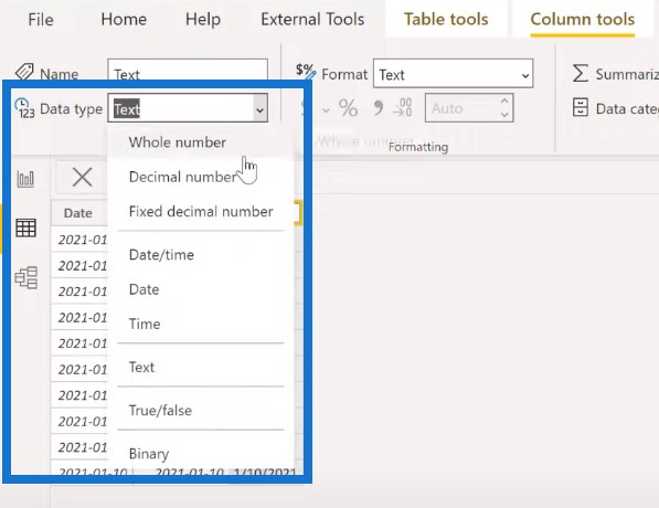
This also happens frequently with columns that hold integer or decimal data. The column may have been imported and identified as a whole number or a decimal number correctly, or it may have a text data type and just look like an integer or decimal. It’s important to ensure that numbers are in fact numbers in the data model.
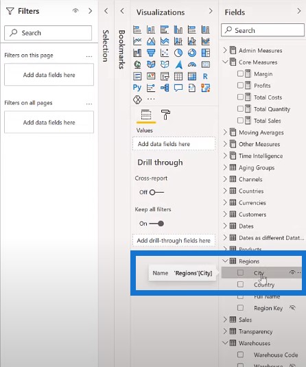
Identifying The Data Category
Another important thing to do is to identify the data category. This has a particular significance with location data, as it allows the mapping services in Power BI to identify the columns correctly. Columns that hold data for city, state, country, latitude, longitude, etc., should be identified as such.
Let’s go over to the Regions table. We can see that City does not have a data category.

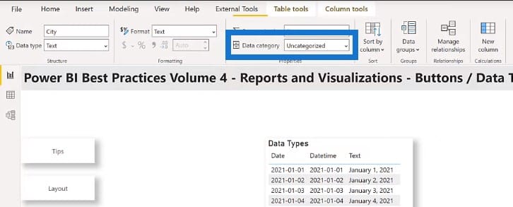
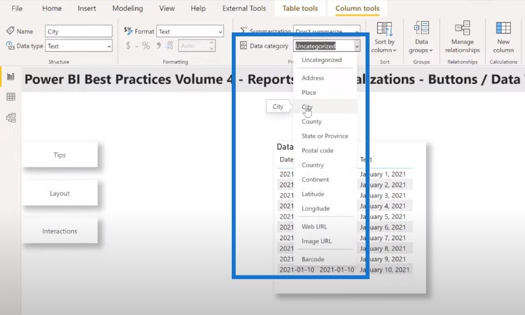
We can apply the data category of City to this column by clicking on the dropdown list. We’ll then see a globe icon in the field next to City.
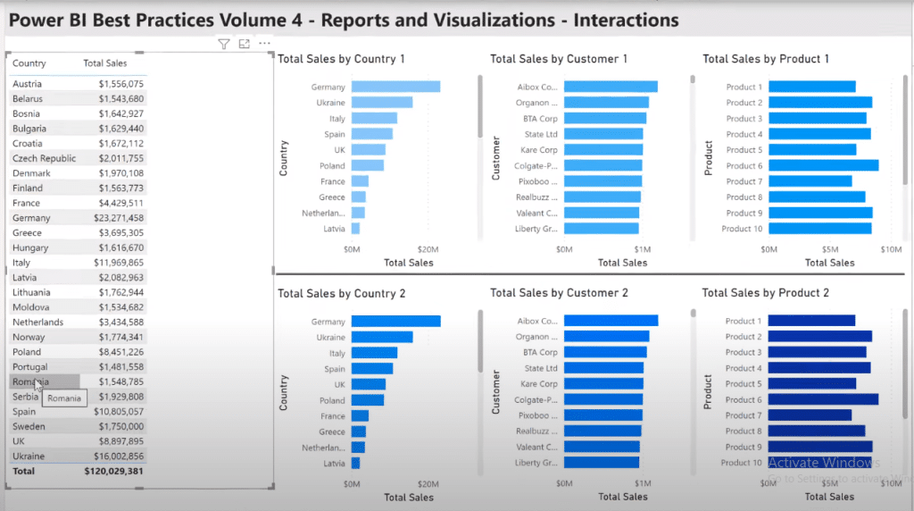
Making The Visuals Interact With Each Other
All the visuals on a report page interact with each other by default in Power BI. The report developer can control which secondary visuals are affected by the selections in a primary visual.
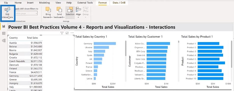
To achieve this, select the primary visual on your report page, then click the Edit interactions button on the Format toolbar. Go to each secondary visual and use the filter highlight or none icon to enable or disable interactions as desired.
In the example above, my primary visual is the sales table on the left. I go to Format to turn on Edit interactions.
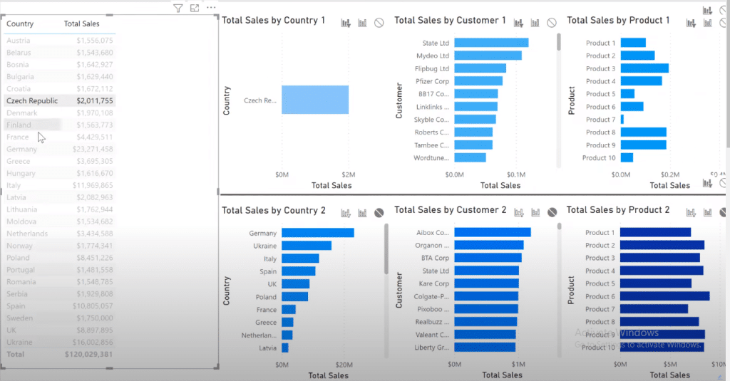
I select Filter for each of the three-bar charts in the top row. Then I’ll select none for each of the bar charts in the bottom row.
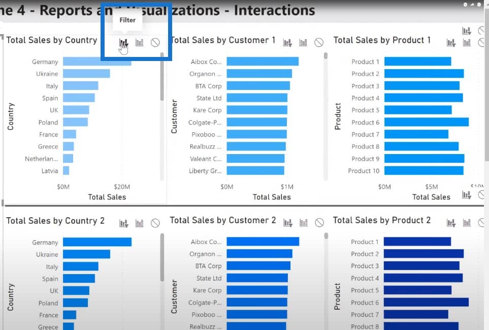
This way, when I make a selection on my main visual, the top rows change but the bottom rows do not.
Sam McKay has a terrific example of this technique on changing the interactions of your visuals.
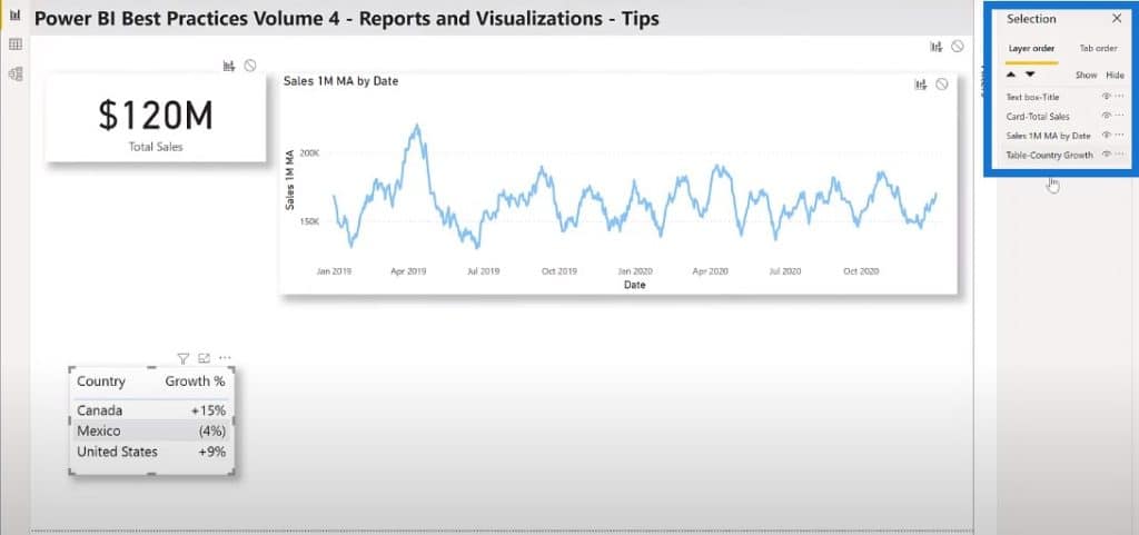
Whenever I use the selection pane to name all the visuals on my report page, iterative development is easier because I can select the visuals for adjustment purposes. The ordering in the selection pane lets me see what’s in front or above another. And again, the order can easily be adjusted.
I have four visuals on this report page example. Everything is named even if the title is not displayed on the report.
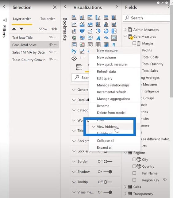
Hiding The Less Important Columns
Generally, there are a number of columns that are necessary for your data set, but which might not be useful for your report consumers. It’s considered good practice to hide all columns unless they’re specifically requested.
I generally hide columns of certain types, including key columns (as they are only used for relationships), sort columns (they’re only used for adjusting the sort of display columns), and all columns that are used only for measures (they prevent users from using the “naked columns” and visuals).
You can toggle the fields pane to see the columns. Right-click anywhere in the fields pane and choose View hidden.
Using Report Identifiers
There are certain items that I include on all of my reports. I want to ensure that the correct report and correct version are being tested, deployed, and used. This is why one of the first questions I ask any report consumer when they’re reporting an issue is what is the Report ID, Version, and Version Date?
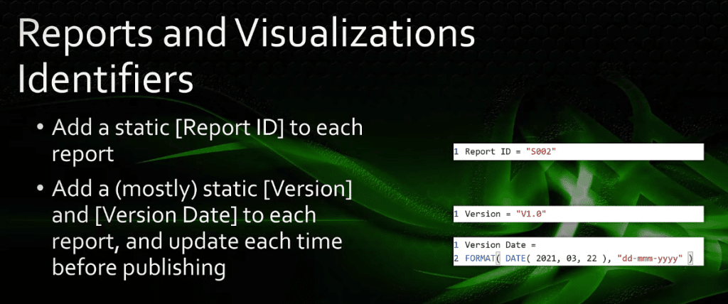
Once these details have been given and I’ve confirmed that it is the correct iteration of the report, only then will I proceed with the analysis of the issue. If the user, for example, is using an old version of the report, I’ll tell them to try the current version and see if their issue still exists.
This Power BI best practice makes it easy to identify reports that are in need of adjustments when business rules change. It also gives report consumers confidence that the business rule changes have been applied. This benefits both the report authors and report consumers tremendously.
Minimizing Visuals In A Report Page
There are a few things that you can do to reduce the time required to render a report page after making a filter or slicer selection. You can try to minimize the number of visuals on a report page.
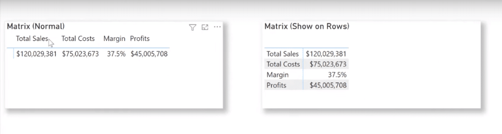
You can do this by combining visuals and replacing different card visuals with a single multi-row card. You can also use a matrix visual to select values that will show on rows. You can replace many different line charts with a single line chart using small multiples.
Let’s go over to Power BI for a second. If we go to the performance page, we can see that the normal matrix (left) has columns for all the values. You can also use columns that show the values on rows (right).
Another Power BI best practice to reduce the number of visuals is by adding new pages and moving visuals to these new pages. You can also use slicers of the drop-down type.
List type slicers need to issue a query every time a report page opens, whereas slicers that have the drop-down type only issue queries when a selection is actually made.

Collapsing The Filter Pane
Also, make sure to collapse the filter pane before saving your Power BI report. An expanded filter pane issues a query every time a page opens, whereas a collapsed filter pane only issues queries when it is expanded.
***** Related Links *****
Data Loading And Transformation Best Practices
Data Modelling In Power BI: Tips & Best Practices
DAX Calculations In Power BI: Best Practices
Conclusion
Hopefully, you can add some of these ideas to your Power BI toolbox and they will prove to be useful in the future.
In this post, we’ve discussed the Power BI best practice for the fourth pillar of report development, reports and visualizations.
I wish everyone the best on their Power BI journey.
Greg


