In this tutorial, I go over a Power BI banding and grouping example using the DAX formula. This is quite an advanced example, but it does show an awesome way that you can visualize your reports. You may watch the full video of this tutorial at the bottom of this blog.
Sometimes, you might want to visualize your reports in a certain way that shows a particular insight effectively. However, this would be quite hard to do in a traditional Excel report. On the other hand, creating compelling and unique visualizations like this in Power BI is very easy.
In this example, I work out my total sales for my customers in a particular year. But instead of just having this plain total sales per year, I want to see who among my customers grew a lot, those that didn’t, and the ones with average growth. This is what we call Power BI banding and grouping or segmenting.

I work out a logic to achieve that, then I incorporate this logic to create comparison visualizations. I’ll show you how to do this from scratch.
Calculating Sales Growth
First, we want to work out Total Sales, obviously we start from here.

Then, we branch out to Sales LY (last year), which is a simple time intelligence calculation.

From here, we can work out Sales Growth because all we have to do is divide Total Sales by Sales LY, and subtract 1.

We can then create a table like this with our Total Sales and our Sales Growth so we can see the results.

But at the moment, this doesn’t really group, and so this is where we need to use the banding. This alone doesn’t group our customers by anything. In this case, we wouldn’t know what the growth was and which group these customers belonged to.
Creating The Bands Or Groups
To achieve this Power BI banding and grouping, we first need to create the groups or bands that we would classify as good growth, average growth, and bad growth.
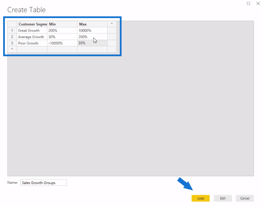
To do this, we’re going to use the Enter Data feature. This is where we create our table, Sales Growth Groups.

We simply input the details that we want to have in this table’s columns, and then click Load.

This will just become a supporting table. It doesn’t integrate into our model at all.

We now have our Customer Groups in this table.

With this, we can now create the logic or calculation to group all these customers.
Working Out The Logic For Sales Per Growth Group
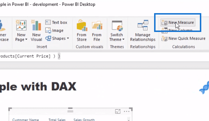
To create a new formula or calculation, we click on New Measure.

Let’s call this one Sales Per Growth Group. We’ll go CALCULATE Total Sales to provide a different context. Then, in our FILTER logic, we’ll use VALUES Customer Name. We want to evaluate which row remains based on the growth of that customer, so we go COUNTROWS, and then FILTER our supporting table (Sales Growth Groups). Then, we’ll write our logic to run through this supporting table.

As we drag this formula into the Date context, nothing actually changes, which is exactly how it should be.

It’s meant to equal the Total Sales because we then have to overlay the context of our customer segments to get a breakdown.
Overlaying The Context Of Customer Segments
We turn this table into a matrix like so to bring in our Customer Segments into columns. We can see that this breaks up based on the growth from year-on-year (YoY) growth for that particular customer.

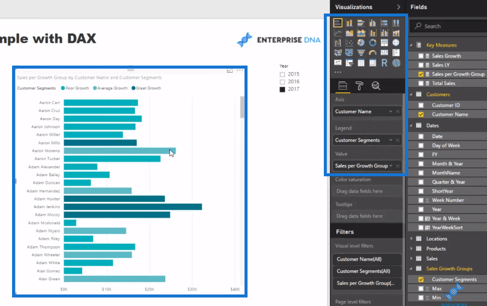
From here, we can then create the visualization (click on the stacked bar chart and bring in Customer Segments into the columns) where we can look at each customer, but also have a clear delineation whether they’re good growth customers or poor growth customers. Simultaneously, we’re still highlighting Total Sales here.

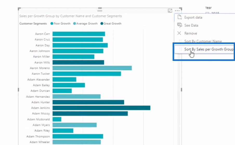
Then, we sort it properly.

Now we have clear results.

We can also show these results (on the left table) as a bar chart with the custom banding inside it. We can have more insight than just the standard visualization.

Moreover, through this logic that we’ve developed, we can create a range of visualizations. We can create a scatter chart by utilizing this calculation.

With this logic, we can overlay our Customer Segments in the Legend. That’s going to break down the good versus bad growth customers, which brings that additional insight or element to our visualizations.
***** Related Links*****
Use DAX To Segment & Group Data In Power BI
Segmentation Example Using Advanced DAX In Power BI
Data Segmentation Based On Percentage Groups – Advanced DAX In Power BI
Conclusion
This is a really powerful Power BI banding and grouping (segmenting) example. This is not the only way that you can use this technique. There are many ways that you can apply this technique.
If you can understand the logic that I go through in this tutorial, you’ll go a long way. Think about what logic or banding you could do on any calculation and on any metric that you’ll calculate. It’s just a matter of setting it up and running through some very similar logic.
All the best!
Sam


