Today, I would like to show you how to use page navigation in Power BI using icons in a creative way to enrich your story and reveal it only when necessary.

Furthermore, you will learn how to create a powerful navigation experience starting from an icon by creating a user workflow for your Power BI reports.
We will create an onboarding environment for the end users directly inside Power BI.
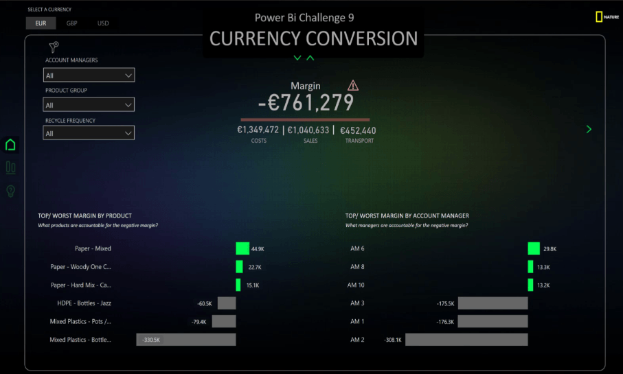
To start with, let’s direct our attention to the example I created for my Challenge #9 submission. I spent quite some time achieving perfection for this KPI and even though it seems simple, in reality, it is full of surprises.
In this example, we have a page navigation in Power BI with icons representing costs, sales, transport and margin. We also have a red line dividing the margin from the other dimensions. The number in the line is not a card, but a button.
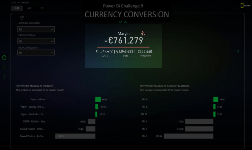
Using A Warning Sign Icon
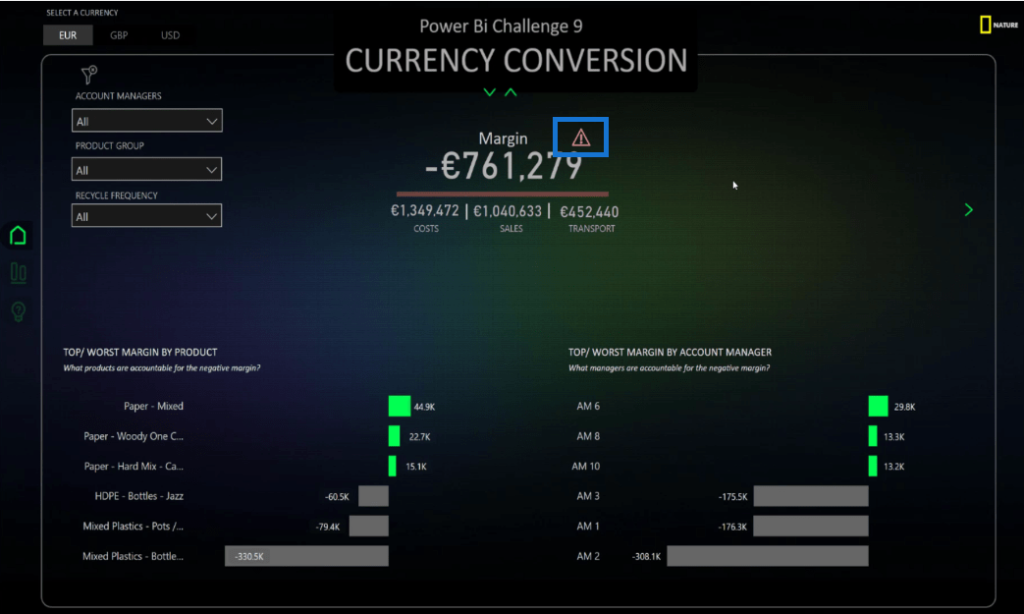
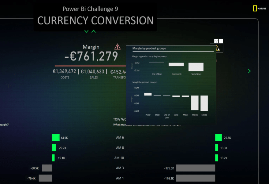
We have this warning sign or warning card icon. It is dynamic because it disappears if the margin is positive.
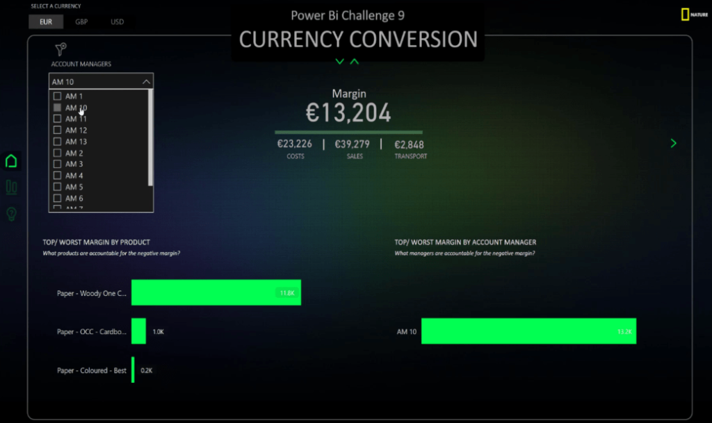
Let’s choose Account Manager 10. Notice that the warning icon disappeared.
At this point, you might be wondering why I created a dynamic icon to show that the margin is negative when the red line already shows the exact same thing.
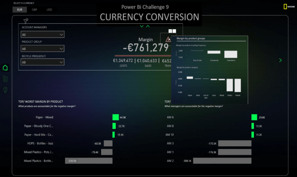
The answer to that is to provide additional information. A card has the advantage of having a tooltip which means when the margin is negative, we have the possibility for additional insight. This is a special technique in storytelling called progressive disclosure.
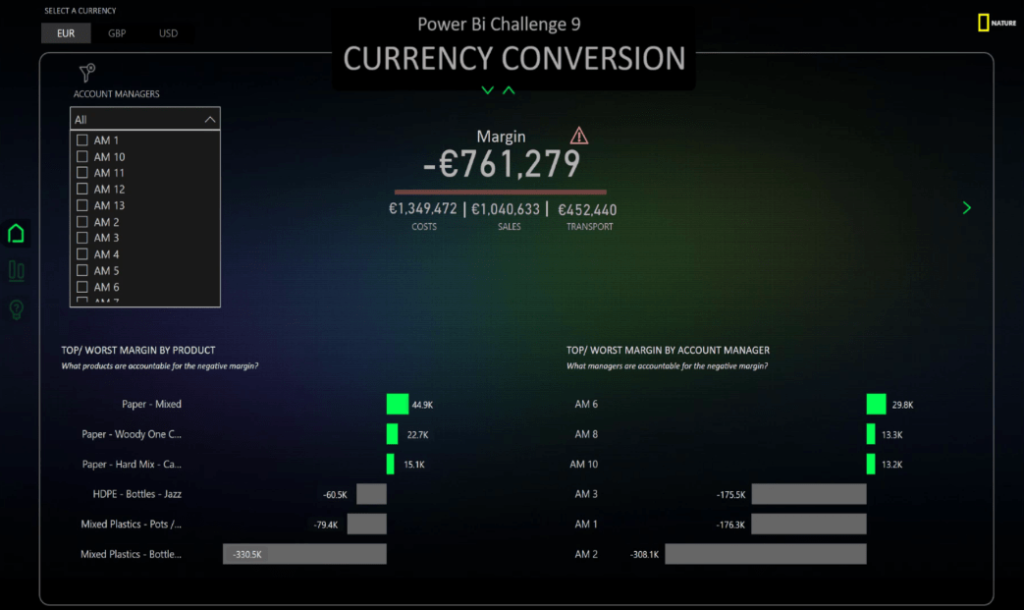
To showcase this feature, hover your mouse to the warning card icon to see additional information. This is important because as an end user, I will be interested in additional insights only when the margin is negative.
Progressive disclosure is an interaction design pattern that sequences information and action across several screens and step by step flow. The purpose is to lower the chances that users will feel overwhelmed by what they encounter.
By disclosing information progressively, interaction designers reveal only the essentials and help users manage the complexity of rich websites or applications.
This is a technique you can use in order to keep your design simple and your information easy to digest. You’ll make it easy for the end user to navigate around and find the insight they want. The user will have a compelling experience through the page navigation in Power BI.
Building The Power BI Icon
To build it from scratch, insert a Blank button into the screen.
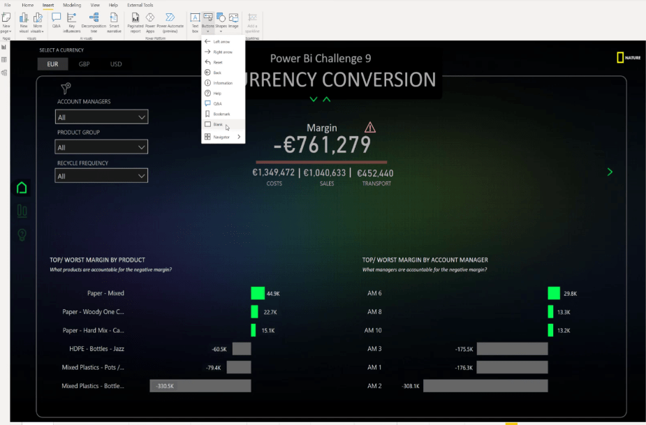
Disable all the features except for the Title.
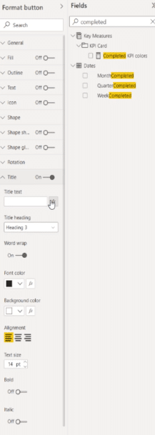
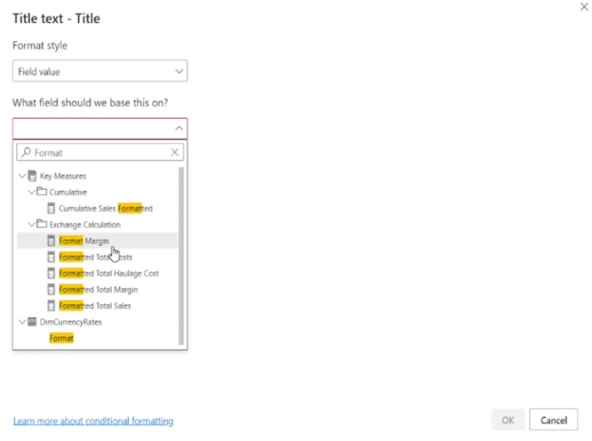
Go to the Title text, choose Field value, choose Format Margin, and click OK.
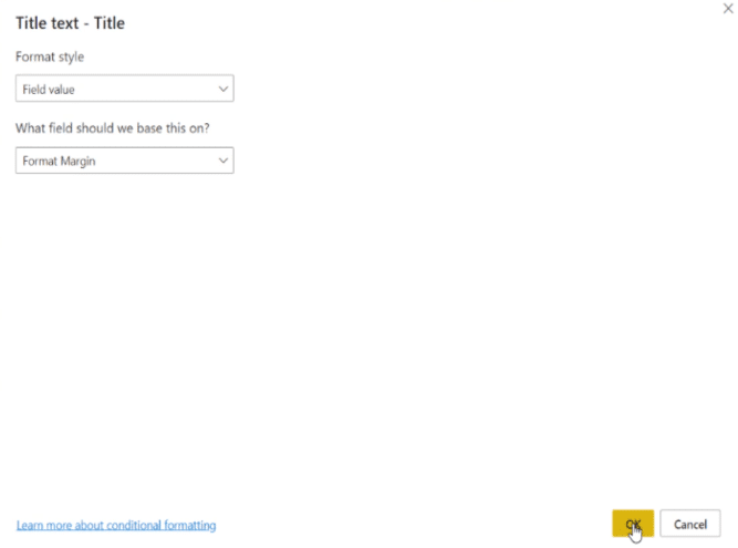
After that, let’s increase the size of the KPI to 20 and change the color to gray.
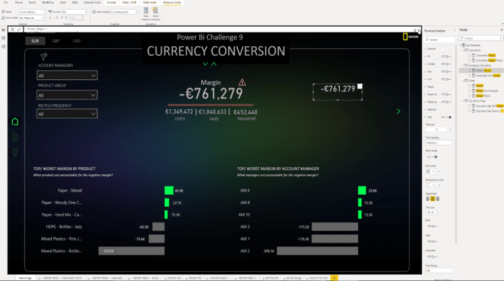
For the measure, I used Format Margin and arranged it in order to achieve the output that I created.

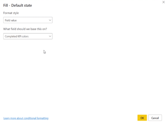
Next is to go to Fill and activate it. Then, select the Field value and base it on another measure called Completed KPI colors, then click OK.

Let’s go to the Visualizations pane and then select the Card icon.

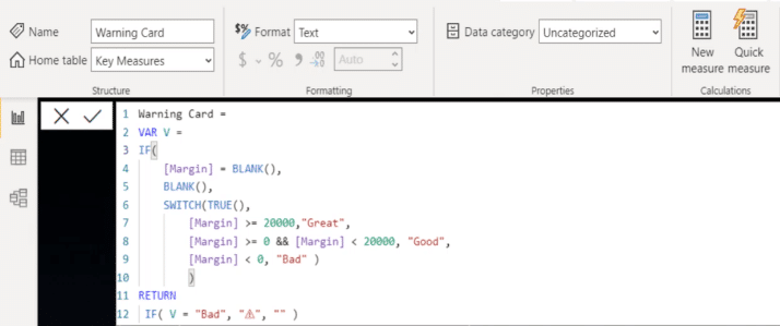
This is the formula I created for Warning Card. It means that if the Margin has no value, then I want a blank value.
I also used a SWITCH TRUE statement that says if the value is above or equal to 20000 then it is Great. If it is above zero and below 20000, then it’s Good, and if it is below zero, it’s Bad.
When the value is Bad, I want to have this icon; else, I do not want any icon.
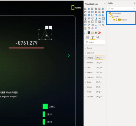
The next thing to do is to slide the icon and toggle off the different options.
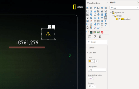
To reduce the size and color of the icon, go to the Data label then set it to 20 and change the color to yellow.
In this case, we can move the warning icon beside the numbers and activate the tooltip by choosing the page where I created the KPI.
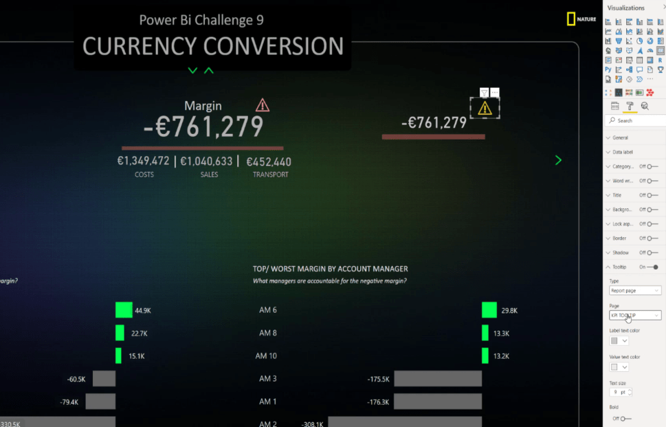
Finally, we can now see the information for our KPI. We can definitely include additional contexts on this, such as summary of costs, sales, and transport.
***** Related Links *****
Power BI Custom Icons | PBI Visualization Technique
Power BI Report Development: Creating Themes, Company Logos, Icons and Backgrounds
How To Add Custom Power BI Icons Into Your Reports
Conclusion
Understanding the best practices for building icons and how you can use them to your story’s advantage can make a significant improvement to your Power BI reports.
With this purpose in mind, you can go one step further by using the icons in a creative way and giving a powerful navigation experience to your end users.
I hope you can apply these techniques to your own development work and organizational scenarios.
All the best,
Alex


