Today, I’m going to run through an insightful discussion about my top 3 best practices for organizing Power BI models. You may watch the full video of this tutorial at the bottom of this blog.
Placing good organization rules into your models is going to help you immensely in developing more advanced techniques inside Power BI.
If I was to give you one simple recommendation when starting out, it would be to adjust your setup. The techniques that I’m going to teach you here are quick tips that are very essential, especially if you want to start to deepen your understanding of Power BI.
Setting Up Your Data Model Intuitively
The first tip is about setting up your data model intuitively. I understand that your data can get a little messy when you bring in multiple tables. That is why it is important to adapt what I called the lookup tables.
The lookup tables are basically my filtering tables in most of the scenarios. I always put them on top, just like this one.

I also have my fact tables at the bottom. Fact tables are the underlying tables such as transactions tables or a table with every single row of information.

Personally, I recommend this setup because this makes everything so much easier, at least mentally. This is because you can easily picture how filters flow going down as pointed by the arrow, especially if you follow my table positions. Additionally, you can easily see the impact of a filter on the visualization or calculation that you’re going to have.
Adding Measure Tables Into Your Models
Secondly, create measure tables or measure groups, whenever you can. Honestly, I’ve seen some people bring very long tables in terms of columns into their models. Sometimes, it goes on until 150 columns with an added 20-50 measures within the tables. This is an absolute no-no.
It will make it hard for you to go and reference the needed calculation as it may take you a lot of time to search where the measure is among all your tables. You need to create a straightforward measure table.
First, you have to go into the data. Then you need to put a placeholder on, like 1, and then name the table accordingly. For me, I like to name this as the Key Measures. After that, click Load.

Now, a table has been created and I’m going to turn it into a measure table at the moment. As you can see, this table has no connection to our actual data model.

The next thing to do is to create a measure inside this group. For example, a simple measure for Total Sales. To do that, click New Measure.

For the new measure about total sales, it’s just going to calculate the sum of the total revenue column.

That’s how I created my first measure. As you can see, there is a calculator symbol for all the measures so you can easily identify it.
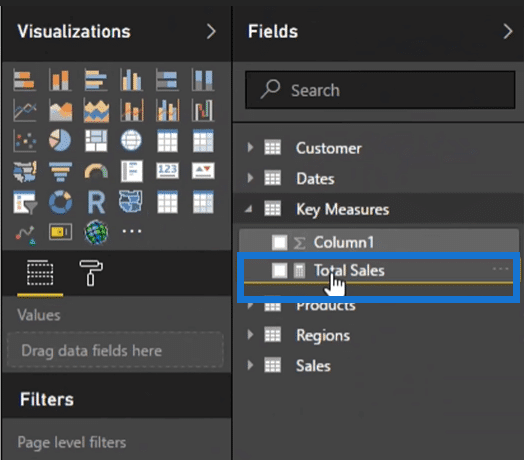
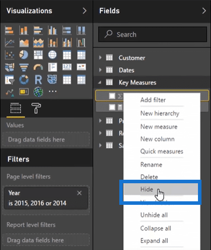
One more thing, you need to hide Column1 here. Just right-click, and then select Hide.
Then, on the upper-right corner, you can just click the Show/Hide pane symbol.
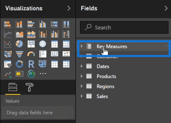
You can also see that there is now a double calculator symbol for Key Measures here. That is how you can identify a measure group. Now, you can see the measures at the top for easy access when you need to use it in the report.
Maximizing Your Visualization Techniques
The third tip is something that I haven’t actually mentioned many times, but this one’s a very beneficial technique. This is generally essential when you have fact tables that you need to pull from a database. You’ll surely find that with too many columns in tables.
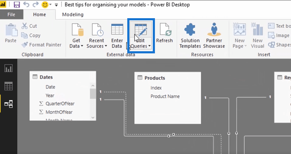
Well, you can actually reduce those columns a lot using the query editor. To do that, click Edit Queries.
Sometimes, you need to retain those columns because you need to connect them to a lookup table or maybe use them as reference points. But if you want to reduce the number of columns for the ones that you don’t need in the visualization, you can hide them so they don’t appear in the Fields section, such as this Customer Name Index column.

I’m not really going use it in the report because it’s just a random number. Some other columns that I can also hide are Total Revenue, Total Unit Cost, and Unit Price. I mean, I’m not going to drag them to my report since I already have my key measures like Total Sales. Similarly, I can hide the dates like Order Dates, Ship Dates, etc.
So to hide these columns, go to the tables and then right-click and select Hide in Report View.
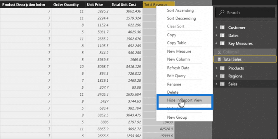
After hiding some of the mentioned columns, there are now three columns left here.
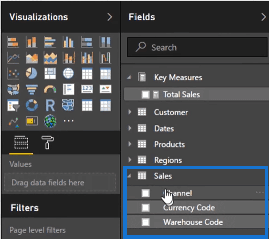
This is really going to help you easily find out what you really need. I do this all the time, and I make sure that only the columns I will use inside of visualizations remain. You’ll be amazed at how clean your fields will look if you do this.
Conclusion
***** Related Links *****
How To Organize Your Power BI Data Model – Best Practice Tips
Best Practices In Using The Q&A Feature In Power BI
A Best Practice Implementation Strategy for Power BI
Hopefully, you liked these three best practices and can somehow apply it to your own Power BI model. I actually go over these topics and more inside my online course Power BI Super Users Workshop. So, if you are just in the beginning stages of your journey in learning Power BI, this is a good place to start.
If you have any thoughts or comments, certainly leave me a comment and let’s get the discussion going.
Sam


