
In this post, I want to show you what is, without a doubt, one of the most compelling visualization techniques in Advanced Power BI. You may watch the full video of this tutorial at the bottom of this blog.
Never feel you are confined to use just the general visualization options inside Power BI (or custom visuals for that matter). You have a significant opportunity to make your visuals even more compelling by using DAX to create dynamic measures.
In this advanced Power BI tutorial, I’ll show you how to use, what I term as, the multi-threaded approach to dynamic visuals. Creating a dynamic measure through one selection is cool, but what really takes your visuals to the next level is when you thread multiple variables into measures that then determine what is shown inside visualizations.

This is not an easy technique, but it is certainly worth learning and understanding. If you do, you can start applying it in many different ways.
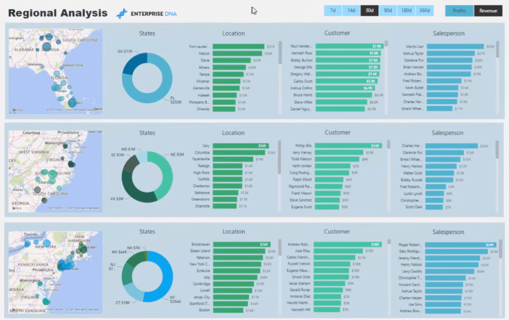
In the demo model, I’ve used the visual interactions to great effect by creating three layers within the report page to really hone in on key data and information in distinct regions.
I’ll walk you through this advanced Power BI technique in detail, from creating the tables to working out the DAX calculations. The first thing we have to do is to develop our core calculations (Revenue and Profits). But before we jump to that, let’s look at at our data model and see what we’re working with.
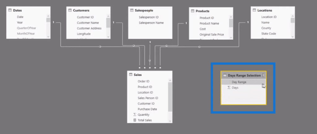
The Data Model Structure
In our data model, we have our Dates, Customers, Salespeople, Products, Locations, and Sales.
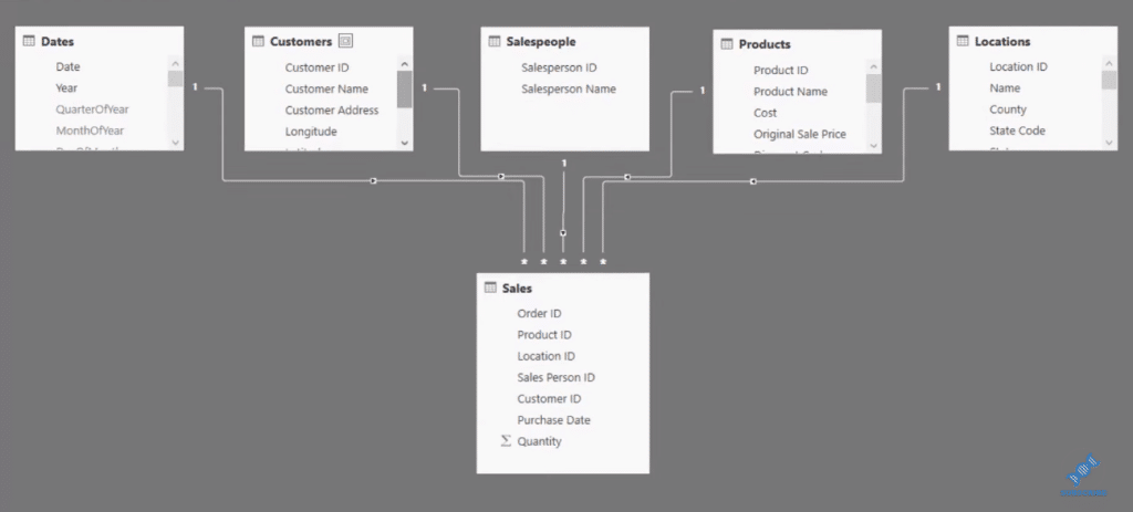
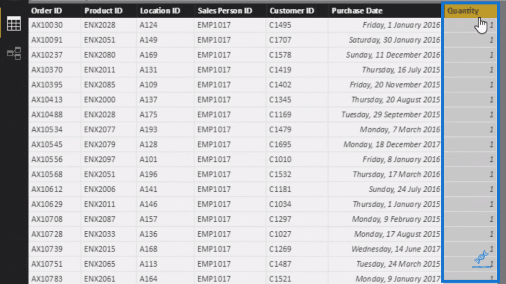
In our Sales table, where we’re going to do our core calculations, all we have is our Quantity sold.
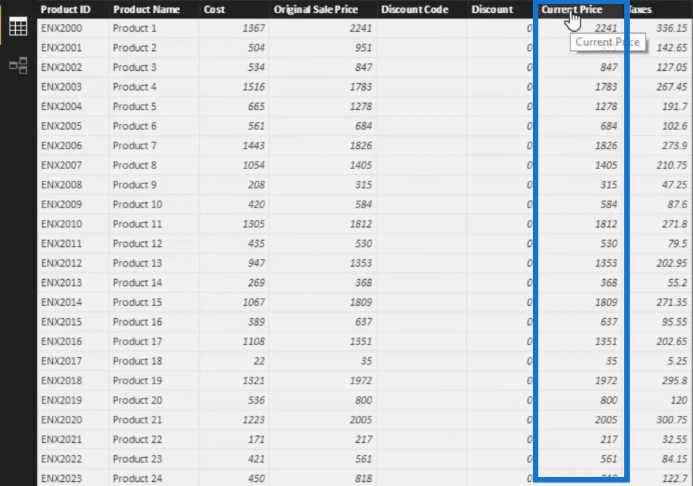
So we have to write some logic to work out the actual dollar value per sale. And in our Products table, we have a Current Price column, so we can utilize that and work out the Total Sale value per item that was sold.
Working Out The Core Measures
To create that measure, we click on New Measure and type in the calculation.

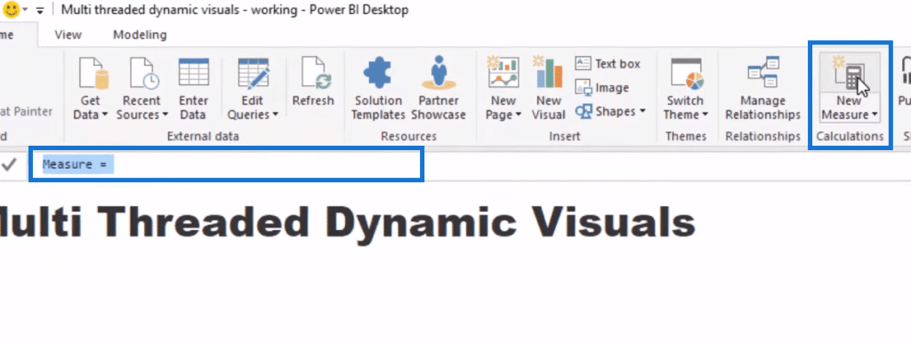
We’ll call it Total Sales and we’ll use SUMX to iterate through every row in the Sales table, and then multiply the Quantity sold by the price. And so we use the RELATED function, which allows us to go back up, through the relationship, to the Products table.

So that’s essentially our total revenue. Now we’re going to work out our Total Profits wherein we have a few steps to go through to get it. First we’ll calculate our Total Costs, which we’re able to do because we have Cost column in our Products table.
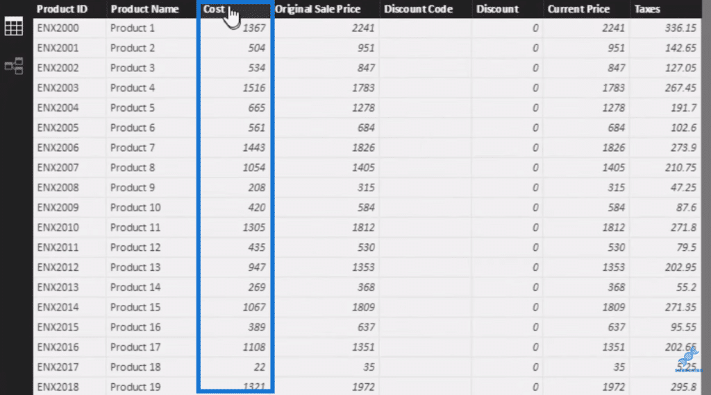
We can use exactly the same logic (Total Sales calculation), copy and paste it, and create a new measure. We simply change the name to Total Costs, then instead of current price, we’ll put Costs.

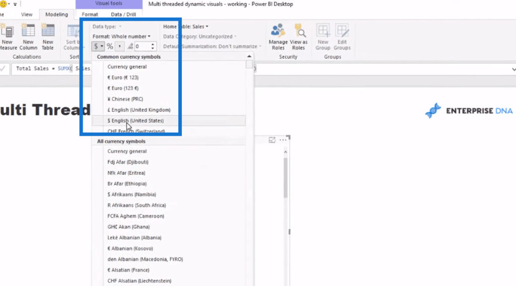
We can put this in a table to make sure that things are calculating correctly. Then we do some formatting and turn this into a dollar value.
So now we’re looking at per product the Total Sales and the Total Cost.
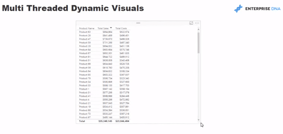
From this, we can work out Total Profits quite easily. We simply subtract Total Costs from Total Sales.

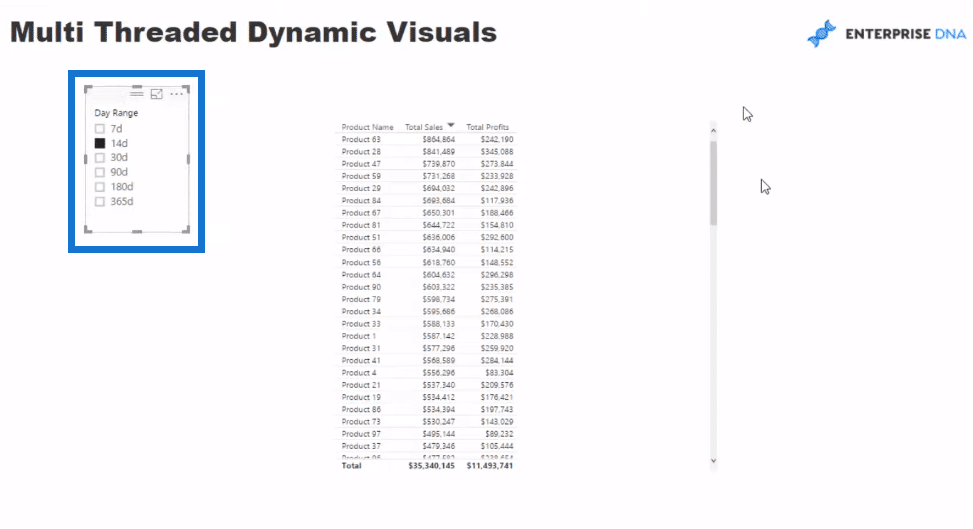
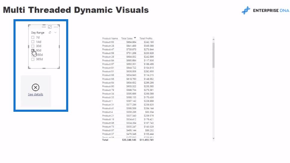
Now we have to figure out how we can make these visuals dynamic. Note that we want to dynamically look at dates through time and choose different time frames. For example, we want to look at the last seven days and/or the last 30 days, etc. We can’t do that from a standard date table. We need to create an additional table and feed it into our calculations.
Creating A Supporting Table
There’s a number of ways to create this new table, but I always like to use Enter Data because it works fine in most cases and creates a table very quickly.
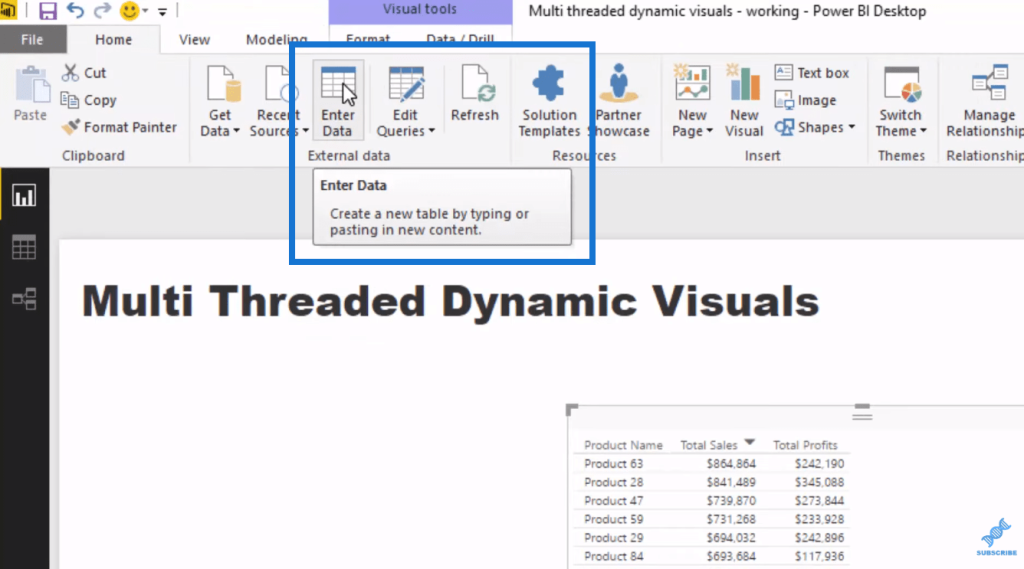
So we click on Enter Data and fill in the columns. We’ll call this table Day Range Selection.
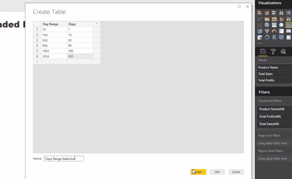
Once we load it in, it says that it’s trying to create a connection to the model, but it has absolutely no physical connection or relationship to anything in the model.
Then, we make that we sort by the Days column our table here to have it in the right order…
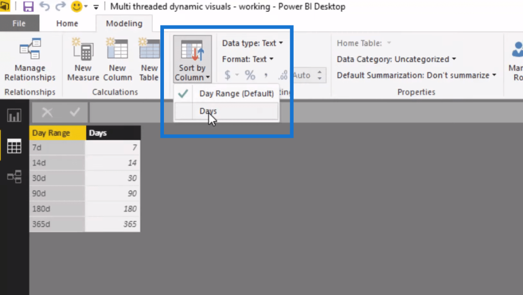
…and then turn it into a slicer.
Working Out The Day Range Selection Formula
Next thing we need to do is to work out what we’re actually selecting. To do so, we go New Measure again and type in our formula. We’ll use the VALUES function and go by Days, but we make sure we sort it out correctly. If we’ll use it like this, we’ll get an error if nothing is selected.

To correct this, we’ll use IF HASONEVALUE, and then go Day Range. So if only one value is selected in the Day Range, then it equals to the days. If not, then it equals to 0 or some default values. Or we can use COUNTROWS Dates, so if nothing is selected it’ll show everything.


Now that we have this Day Range Selection, which we’ll use in our calculations, we need to somehow determine what actually shows up in a date range based on the selection.
Working Out The Calculation To Show Date Range Selected
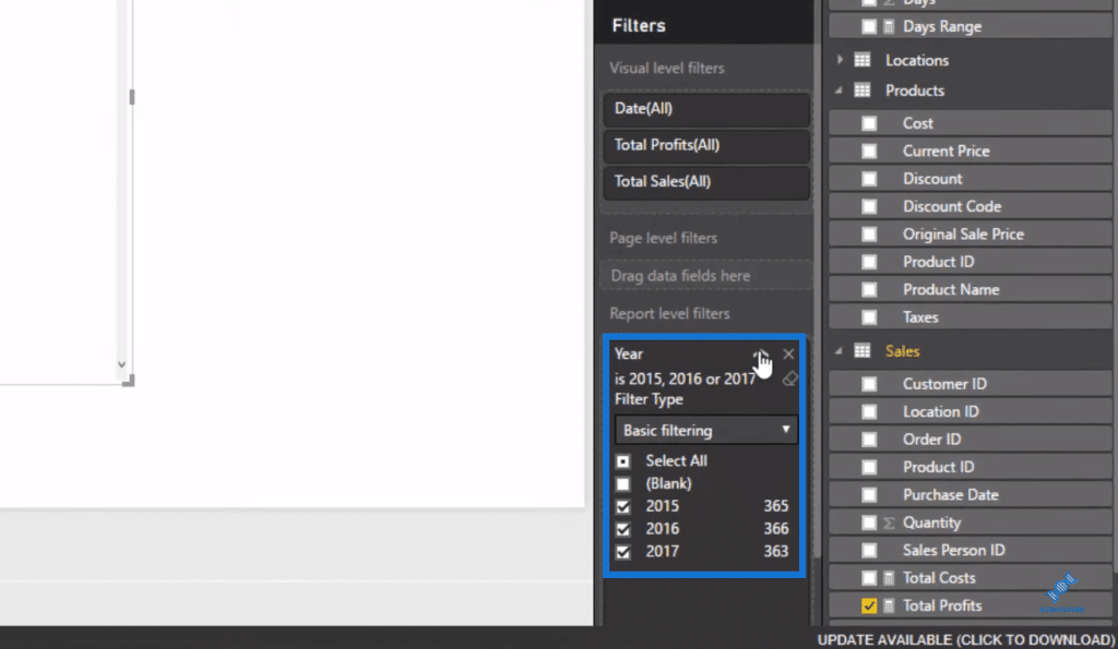
First, we put in the Date here in our table, then sort it out and get rid of let’s get rid of some time and specifically show 2015, 2016, and 2017 only.
Now we need to somehow create a calculation that only shows information for whatever range is selected.
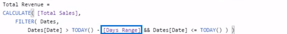
This logic utilizes the CALCULATE statement. This is going to calculate total sale, but only calculate it for a specific period. We can create that period by using FILTER over the Dates table. If the date is greater than (>) TODAY, subtracted by the Days Range, and if the date is less than (<) or equal (=) to TODAY, it’ll show the results.
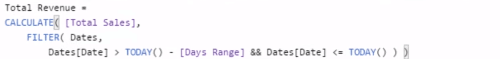
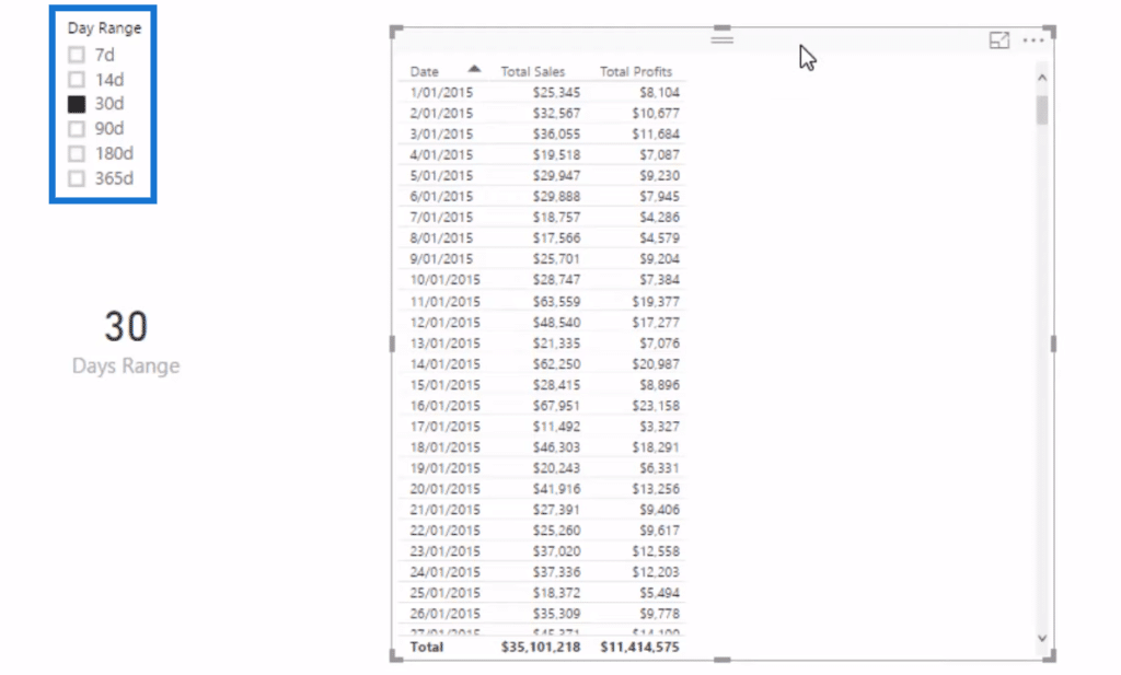
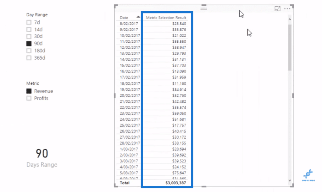
So, if we put this into a table, we’ll see that this table is dynamic. It’s going to change based on the selection of the slicer.

Context Transition Concept
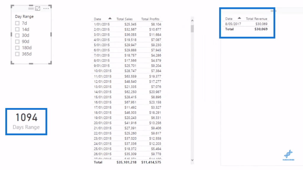
Before we proceed, I want to show you something quite interesting that if I select nothing, we only get one result, but we have 1,094 in our Day Range.
This is a very interesting concept called Context Transition.
If we look into our formula, our Date Range is 1,094.
This is because of the way it’s written when nothing is selected as in COUNTROWS Dates.

The FILTER function in our Total Revenue formula has the Day Range evaluating to one day every row versus the 1,094 rows in which it should.
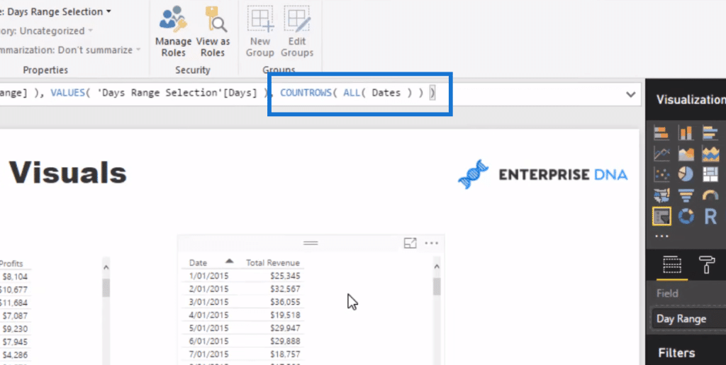
A very quick way to fix this, without going into details around Context Transition, is to wrap the dates in ALL. No matter where it’s at inside the iterating FILTER function, it’ll receive the total Day Range we have.
Creating A Multi-Threaded Dynamic Visual
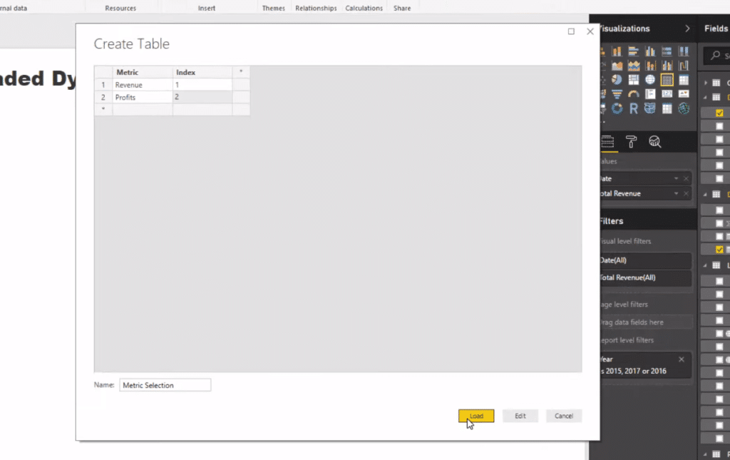
To make this multi-threaded, we want to jump between Total Revenue and Total Profits within the same visual. So we’ll do a similar step in terms of creating a supporting table. We’ll call it Metric Selection.
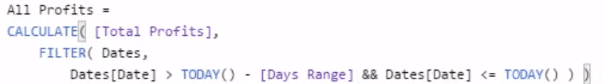
Then, we’ll have to create another dynamic Total Profits. We simply copy our Total Revenue formula, change the name to All Profits and instead of Total Sales, we sub in Total Profits.
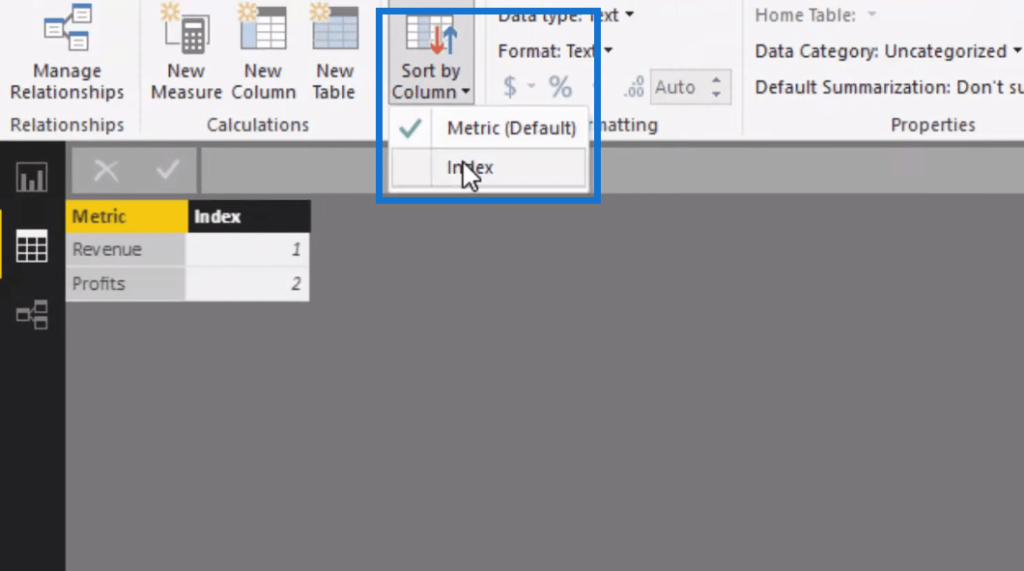
We then sort our Metric Selection table by the Index column.
And now we want to have a value that changes for the selection that we’re making (Revenue or Profits).

The way to do that is to create another measure. We’ll call it Metric Select.

Next thing we do is to create this master calculation where we feed these threads through it, and then input that one final or master calculation into our visualizations.
Creating The Master Calculation
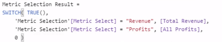
We’ll call this formula Metric Selection Results. In this calculation, we’ll use the SWITCH TRUE logic.
We drag this measure into our table and we have this multi-threaded result or calculation. We can select any time frame and any metric and will give us that result.
We can also use this measure in any of our dimensions. For instance, we might want to look at this from a daily perspective, our total products or customers, etc.

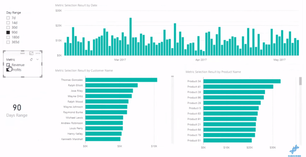
We can click through and look at our profits versus our revenues. We can look at a specific time frame and see how this dynamic visualization gives us a range of different looks. We can feed in a number of different selections or threads into it.
***** Related Links*****
Data Visualization Technique in Power BI – Multi Measure Dynamic Visuals
How To Create A Dynamic Power BI Report
Using Filter Fields & Visual Interactions To Create Compelling Visualizations In Power BI
Conclusion
In this tutorial, we have looked at an advanced Power BI technique. This is just one example of the way you can do this, but there are so many different ways that you can utilize this technique. One that just stands out to me is when you want to dynamically look at a ranking of customers.
My main goal with this tutorial is really to inspire you about what you can achieve within Power BI. It is seriously unlimited! While you have to learn a lot about all the different areas within Power BI to get everything working well, once you do, the visualization and analytical work can achieve amazing results.
Good luck with this one – I’d recommend learning this advanced Power BI technique well. You won’t regret it for a second!
Cheers!
Sam


