
Through this example I’m going to show you how you can dynamically adjust the size of your visual. And in this case, we’re going to do it via the result ranking in Power BI. You may watch the full video of this tutorial at the bottom of this blog.
We’re going to create dynamic visuals containing our top 10 customers for specific products.
This is a really powerful technique that you can utilize in Power BI. You can create a significant amount of visualizations by using the powerful DAX formula language.

Using dynamic visuals, especially on ranking based parameters, means you can really drill into the key driver of an attribute’s performance.
You may want to isolate your top and bottom customers, or your best and worst selling products. This technique would enable you to visually showcase all of these ideas.
To make this come alive we need to use RANKX within the CALCULATE statement.
Get a good understanding of how these fit together and it will help with the more technical aspects of implementing DAX measures inside your models.
It’s where you want to get to so that you can unleash the great analytical and also visual potential within Power BI.
So let’s dive into the first step in creating dynamic visuals based on ranking in Power BI.
Creating Total Profits Measure
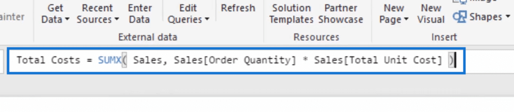
For this particular example, we’re going to need a Total Profits measure. But to actually create this measure, we first need to have Total Costs.

So let’s create our Total Costs measure. We need to add some logic here so we’re going to write SUMX, then we’ll go to the sales table and then Quantity, multiply that by the Total Unit Cost.
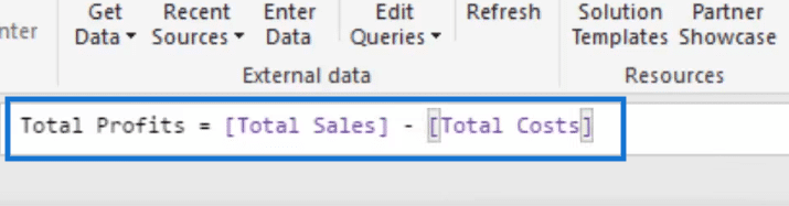
Now that we have Total Costs, we can use that to create our Total Profits. So for this other measure, we just need to go Total Sales minus the Total Costs.
So let’s drag in our Total Profits and then add Customer Names.
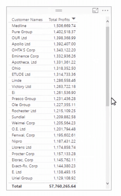
Notice here that we did not add any additional filters on time so this table covers everything. This table just shows the Total Profits per Customer throughout time.
Then let us turn this into visualization and then sort them by Total Profits.
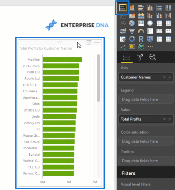
So now we have a graph of our customers starting from the one with the highest profit to the one with the lowest profit.
But remember that we need to show only the top 10.
Let us then create a formula that will give us the rank of each of our customers.
Using RANKX To Rank Customers Dynamically
So let’s call our new measure Customer Rank and then go RANKX. Then we’ll add ALL within the Customer Table, and then we’ll go Total Profits.
We do not need a value here but instead, we’re going to add descending.
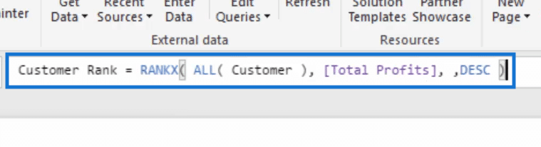
If we drag this into the table, we now have the rank of all our customers.
But then we still need to work on another step to isolate the top 10.
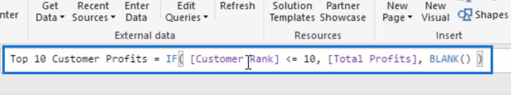
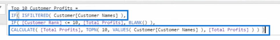
Top 10 Customer Profits
To create a table that shows only the profits of the top 10 customers, we need to create a new measure.
Let’s call it Top 10 Customer Profits.
This measure needs a bit of logic. So we go IF Customer Rank is less than or equal to 10, then that would be equal to Total Profits. If not, make that equal to blank.

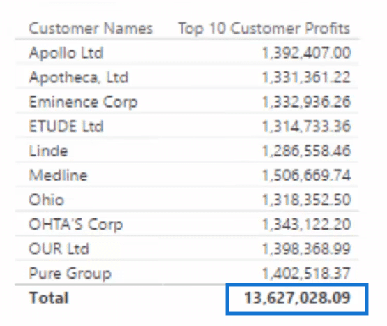
Now, let us create a table using this measure together with the Customer Names.
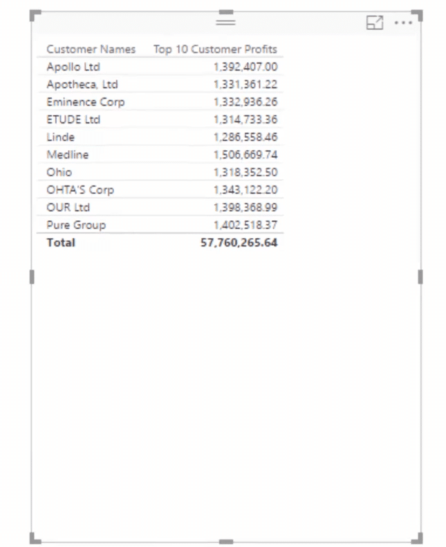
We now have a table with only the top 10 customers. However, we need to fix a little error here.
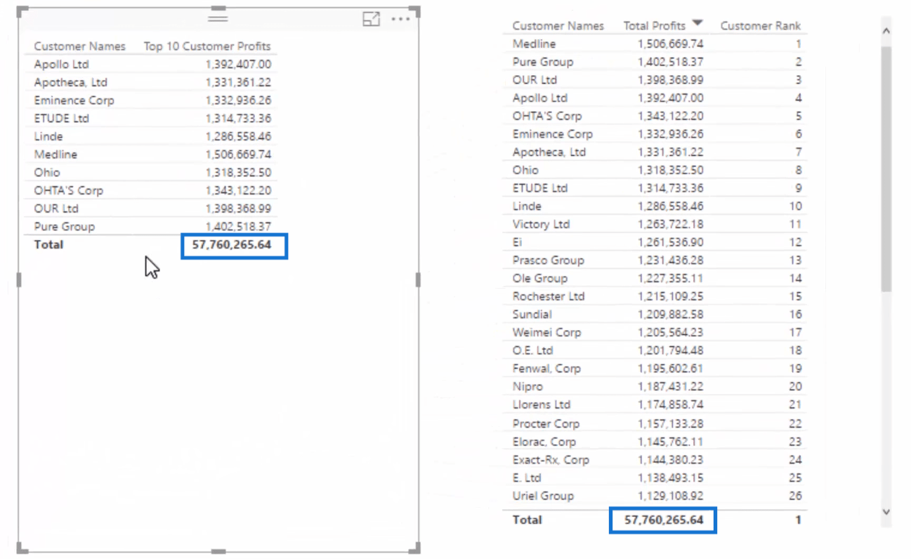
If we take a look at the Total Profits of our new table, we’ll see that this is the total of all the profits and not just only of the top 10 customers.
So, we need to edit our Top 10 Customer Profits formula.
Let’s add IF ISFILTERED, Customer Names. That means if the Customer Name is filtered, return the profits of only the top 10.
But IF it’s not filtered, we’ll go CALCULATE, Total Profits, then TOPN and then 10 which corresponds to the top 10 customers, and then go Total Profits.
What TOPN does here is it returns a virtual table of only the top 10 customers and then sum their profits.
Now we have the correct total profits for our top 10 customers.
Dynamic Visuals Based On Ranking in Power BI
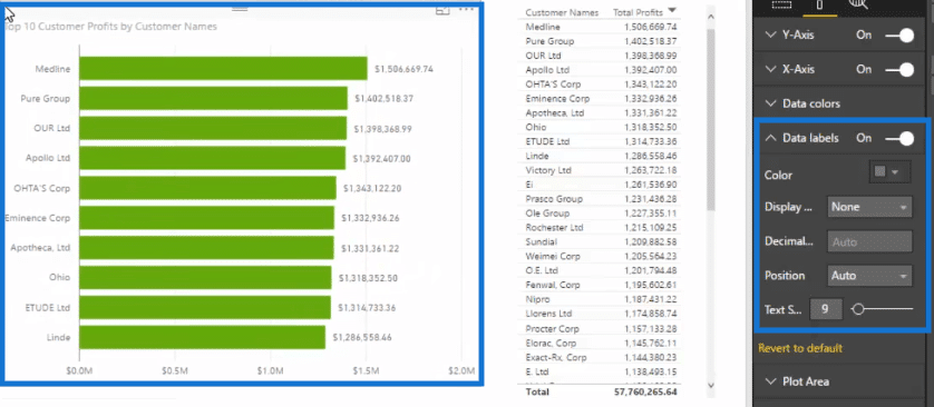
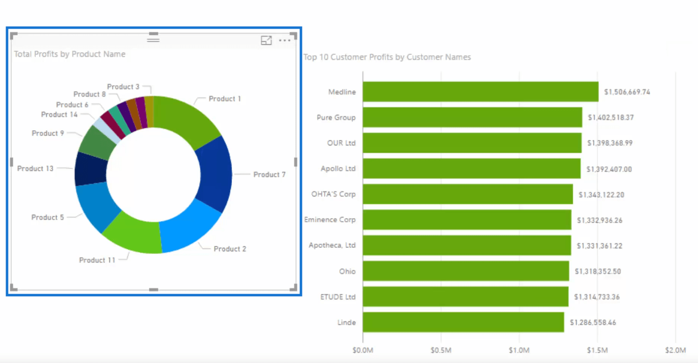
Since we now have a table with our top 10 customers, we can easily turn it into a visualization.
Let’s turn it into a stacked bar chart. Let’s also turn on some data labels.
Remember that we are creating dynamic visuals here. So let us drag in Product Name and then add our Total Profits.
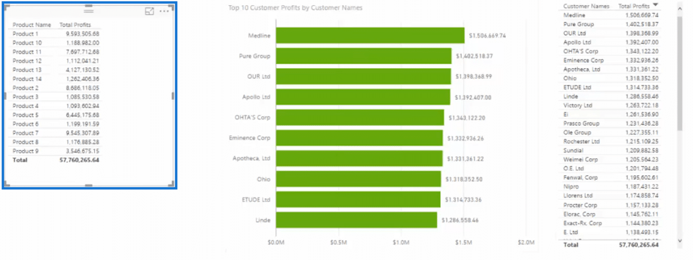
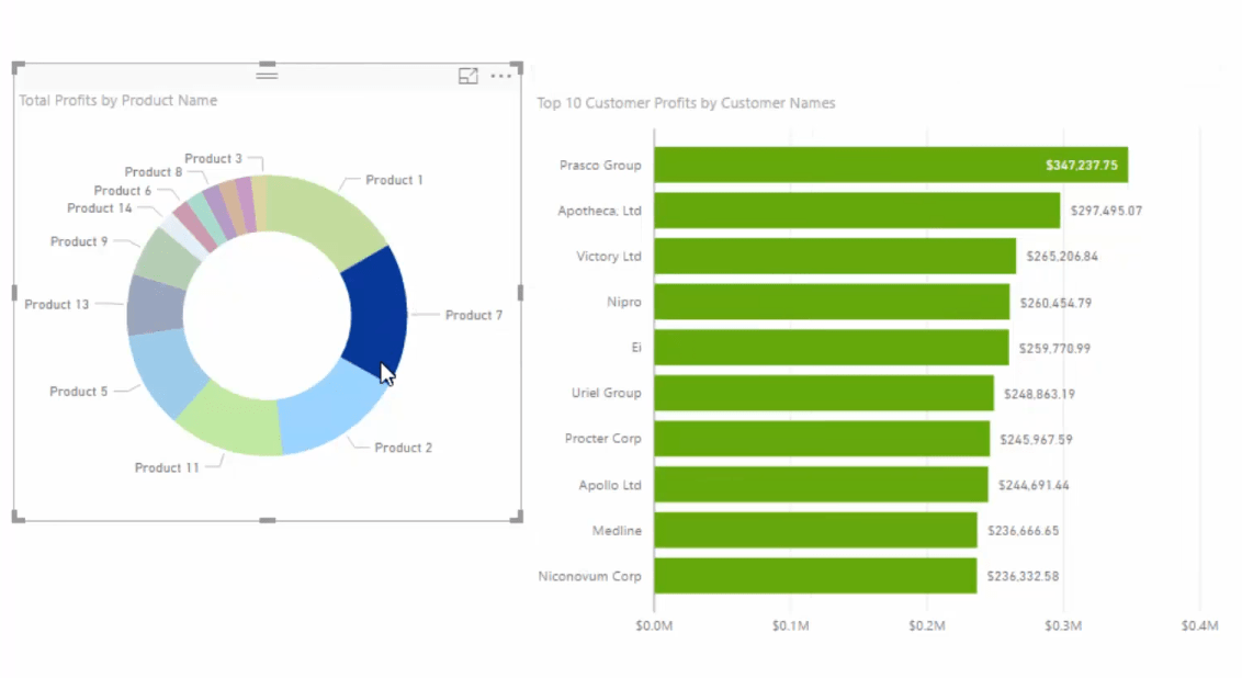
Then we can easily turn this new table into a donut chart.
Now let’s work on the interactions of our visuals. Click Edit Interactions at the upper left portion of the screen.
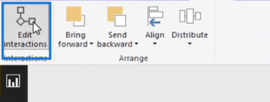
Then click on the filter in the visual that you want to be impacted.
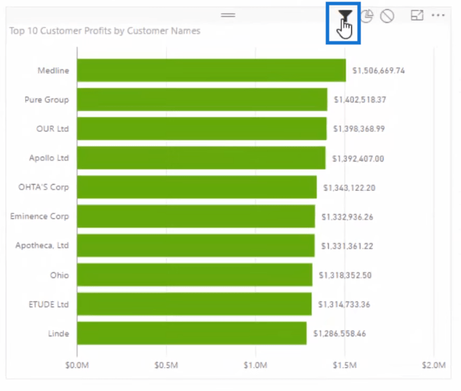
With that, if we click on Product 1 in our donut chart, our bar chart will show the top 10 customers for this product.
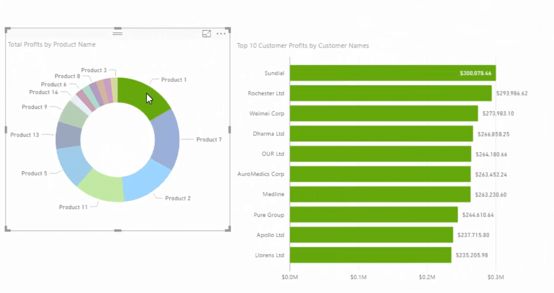
If we click on Product 7, our bar chart will then change to show the top 10 customers for this product.
***** Related Links *****
Creating Dynamic Ranking Tables Using RANKX In Power BI
Creating Multi Threaded Dynamic Visuals – Advanced Power BI Technique
The Ultimate Advanced Viz. Technique in Power BI – Multi Measure Dynamic Visuals
Conclusion

Good luck with this one.
Cheers,
Sam


