Have you ever heard of the Pareto Principle, also known as the 80/20 Rule? The rule stipulates that for every 20% of something, you’ll generally receive 80% of the results. You may watch the full video of this tutorial at the bottom of this blog.
If we look at this from a business perspective, we’re saying that 20% of our customers should make up 80% of our profits, or 20% of our stores should make up 80% of our sales. That’s how the Pareto Principle works.
The Pareto (80/20) Principle has become famous over time and it’s been referenced in so many markets, different environments, different businesses, and sectors. Because it’s true. It’s actually what happens. In most cases, most of your dimensions will have some 20% that make up 80% of your sales. It could be location, customers, products, etc.
Now I wanted to test this in Power BI. I wanted to test this insight on the current data that I’m working on inside my model in Power BI, because obviously, it’s not always going to be exact.
Significant Implication Of The Pareto Principle
It’s a really good idea to run a test using the technique I showcase in this tutorial, because if it does hold true, then that is where you should be focusing your efforts – from a marketing perspective, from an inventory management perspective.
The list goes on in terms of how this type of analysis can point you in the strategic direction that you should be focusing on from a business perspective.
I’m going to show you how you could use a pattern inside Power BI using a formula to work out and test this principle. Because at the end of the day, you want to focus in where you’re generating your best returns in your business.
If you discover that 20% of your customers make up 80% of your revenues, then you should be spending the bulk of your time trying to extract insights as much as possible from those customers or products, or locations, etc. It may not always be the case, but generally it is.
Testing The Pareto (80/20) Principle In Power BI
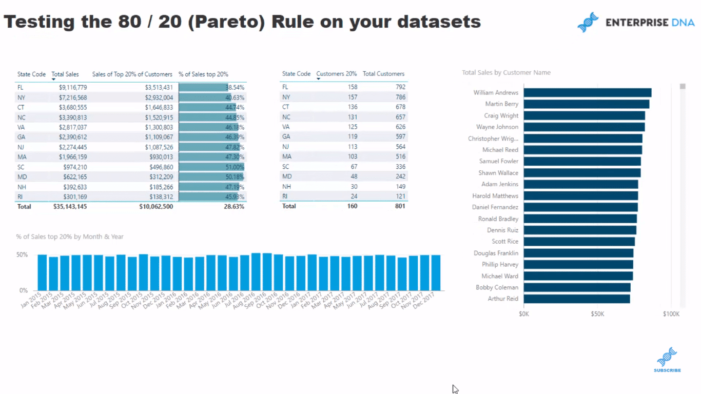
I’m going to show you how I set up this sample dashboard, which is pretty simple.
So if we’re looking at our states here, I wanted to look at within each state, how much of our Total Sales come from our top 20% of our customers.
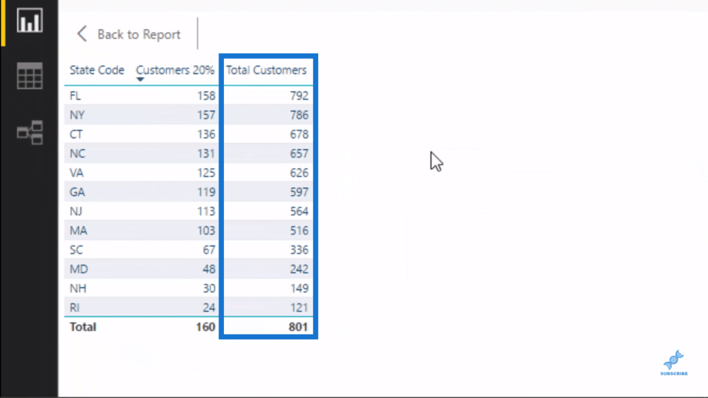
First, I work out how many customers we have in that particular region. We look at, say Florida here, we can see that we sell to 792 customers. And when we look at the bottom, we see much less here in Rhode Island, which is a smaller market for us.
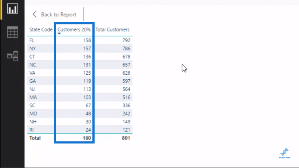
We have our top 20% customers as well. What makes up the 20% of our customers? So what I did was multiply 0.2 by our Total Customers. And that gives us a number that we can feed into our formula to work out.
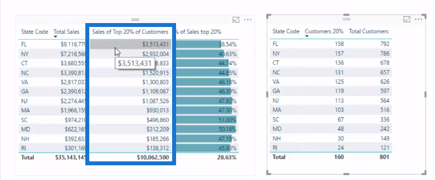
After I’ve done that, I needed to feed that number to some ranking logic and say, within each state, how many sales can be attributed to the 20%?
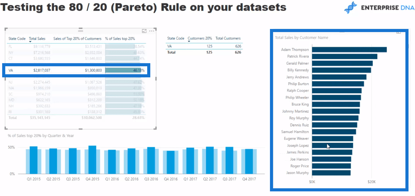
I’ve also set it up so we could click through each state and we could see the Customers, and the Total Sales of our Customers down in this chart on the right hand side.
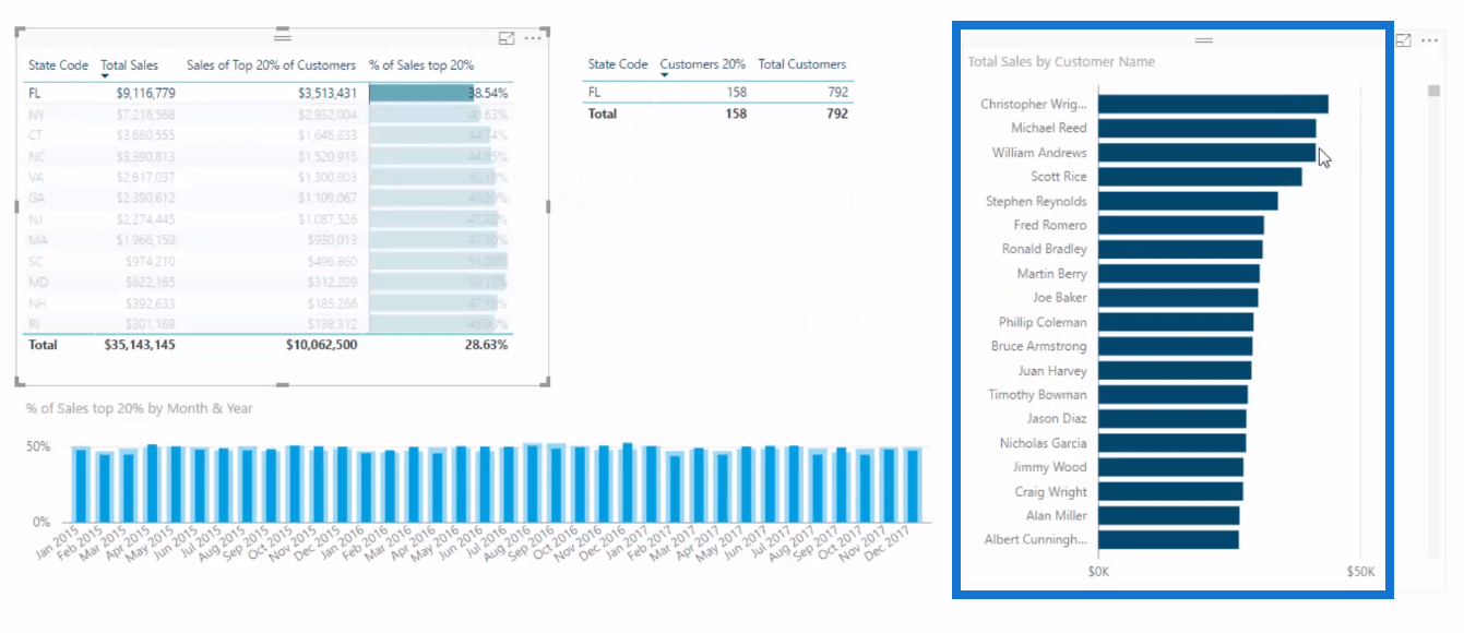
Moreover, say in Florida we’ve made $9 M in sales, and we have the answer in terms of our 20%, $3.5 M, I wanted to see what percent is that to our sales.
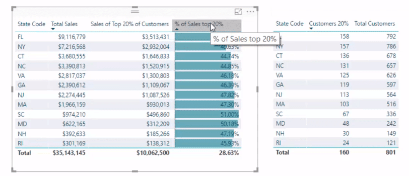
Now as you can see the 80/20 rule or principle doesn’t apply here because this data set is totally random. Most of the data sets have more of a reality to them.
Walk Through Of The Formula
Now I’ll show you the formula that sits in behind this visualization. There’s a little bit to it, but I’ll walk you through each element.
First thing we do is to work out dynamically the total number of customers. I’ve actually calculated it here for this table, but I’ve also done it within this formula so that we don’t have to reference another measure.
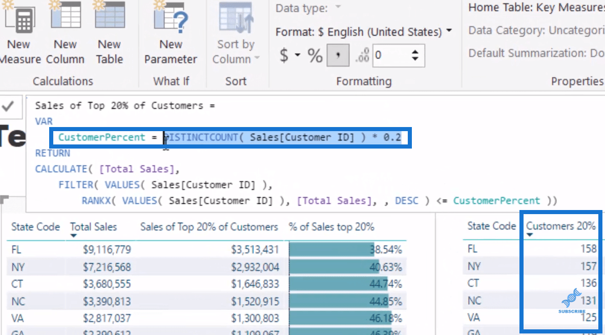
So I’ve used variables (VAR) and say the CustomerPercent we are looking for is 20%, so in this case I put in 0.2.
The thing to note is that I have used the DistinctCount within the Sales table. If I don’t use DistinctCount within this table, that’s not going to dynamically filter for each different state because of the way our data model is set up.
So we have to make sure that we reference something that was in the Sales table so that when a filter is placed on a state, say Florida, I would be counting the top 20% of the customers who actually bought in Florida.
Then we come down to CALCULATE. This function could change the context of the calculation. So we’re counting Total Sales, but we’re counting it in a different context. We want to break out this top 20%, and this is want the last part of the formula does.

So we’re are filtering every customer that we’ve sold in Florida. and we’re working out with this RANKX if that customer is, by the Total Sales, part of the top 20% that we work out in this formula up here, CustomerPercent.
So this is working out 158 in Florida as the top 20%, and if that customer is ranked by the sales in the top 158, then retain that customer and count up the total sales.
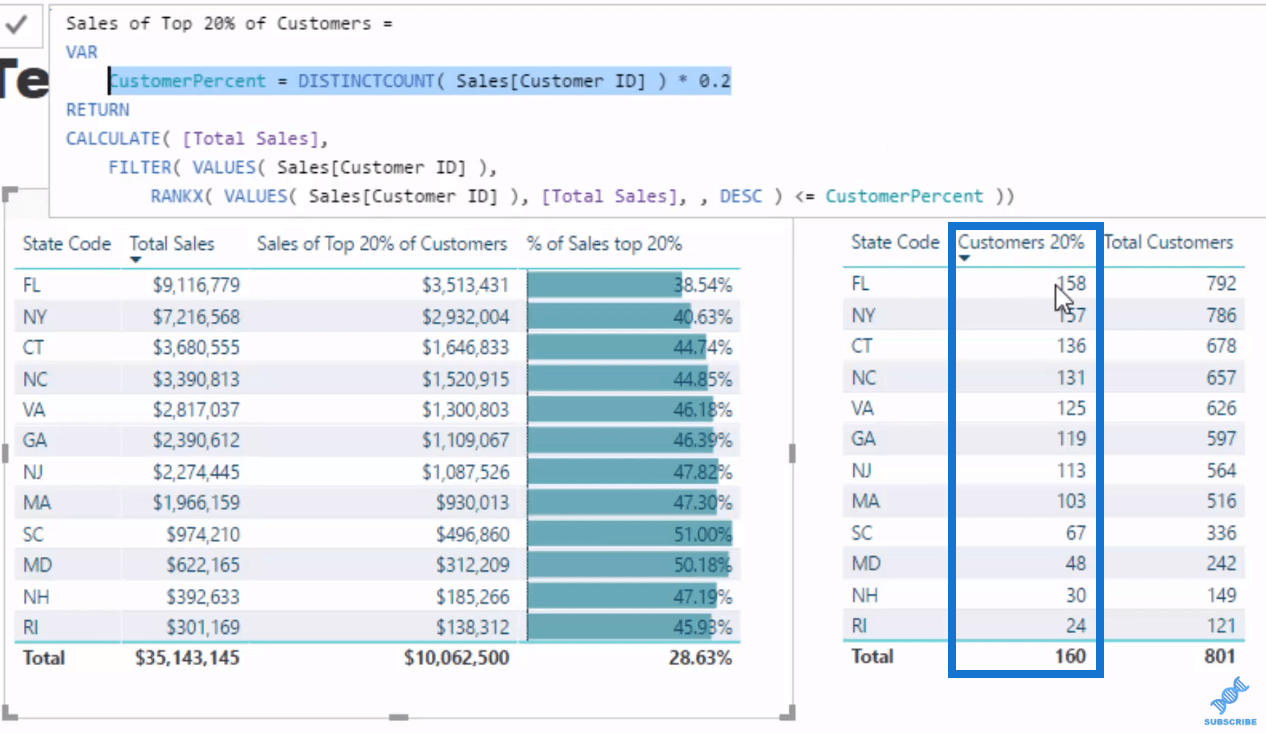
So that’s what’s going on behind the scenes. And if we look at the list here, they’re all dynamically calculated for every state. That’s how we get these numbers down here.
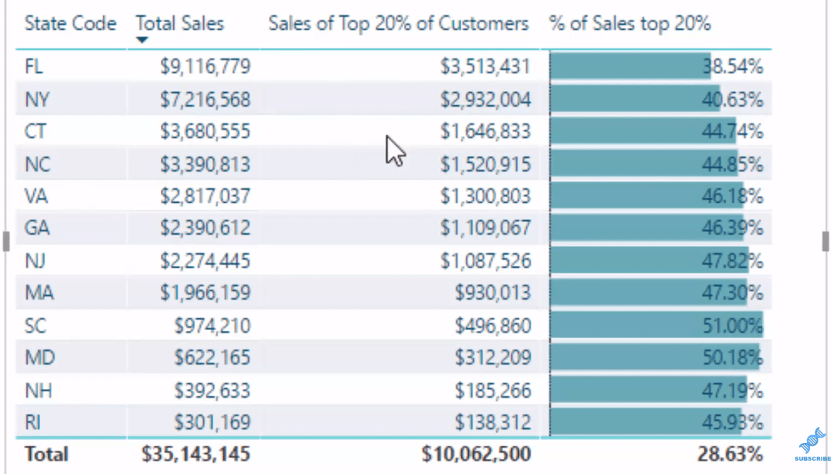
Furthermore, to get the % of Sales of Top 20% is simply divide Top 20% of customers by Total Sales. So that’s how we test the Pareto Rule within the data set.
Re-Using The Pareto (80/20) Test Technique
You could do this to any dimension in your data set and test the Pareto Principle using the same technique. All you need to do is change up the columns that are referenced in this formula based on the context that you want to calculate.
We could also use this formula in other visualizations and use the power of the data model to find and extract even more insight. For example, if we click on Florida, we’ll see that this chart changes and it’s showing how the top 20% are performing in each month.

We could also change this to Quarter and Year, and see how our top 20% are going in a quarterly basis. We can see the difference between the overall number.
Moreover, we can see what is making up that number, the individual break down of these customers. For instance, we click on Virginia, these 125 customers, the top 20% of Virginia’s customers, are what’s making up that number, 46% sales.
Conclusion
I have showcased to you how you can implement the Pareto Principle or the 80/20 Rule in your Power BI analysis.
This is an immensely powerful and practical technique that can help you derive great insights and analysis from simply utilizing and implementing Power BI in an effective way.
I hope you get a good idea of how this is created and how you could retest this in multiple ways. I want to reiterate the re-usability of this technique. You can utilise this formula and with a little adjustment on the reference columns, you’ll get more great insights.
There is plenty to learn here, not only about how to utilize this specific technique, but also about using DAX formula in your models.
Cheers!
Sam


