In this tutorial, you’ll learn how to sort and filter data in a chart in Report Builder. This tutorial will show you how to filter by year and performance. In addition, a quick discussion on how to format a chart using the Properties pane is also included.
Filter Chart Data In Report Builder
Filter Chart By Year
To sort a chart in Report Builder, go to the Chart Properties window. You can do so by right-clicking on the chart and then selecting Chart Properties.
Go to the Filters tab and click Add.
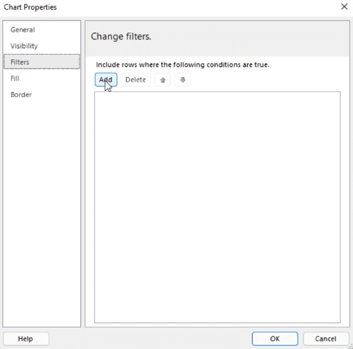
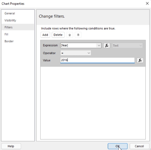
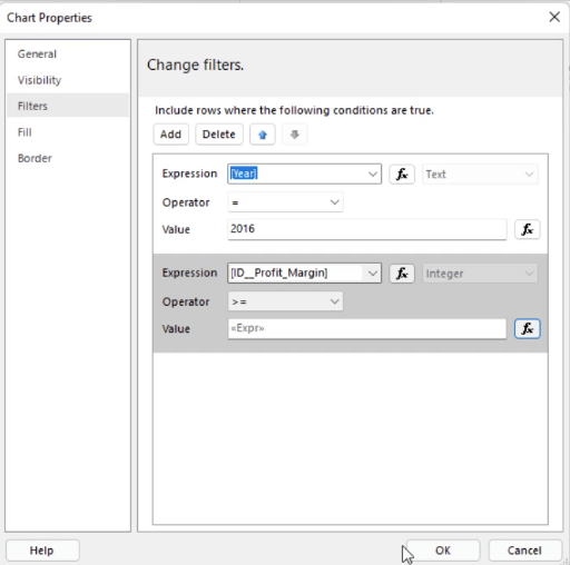
Then, choose the expression and value you want the chart to be filtered by. In this example, the report is filtered to only show data in the year 2016.
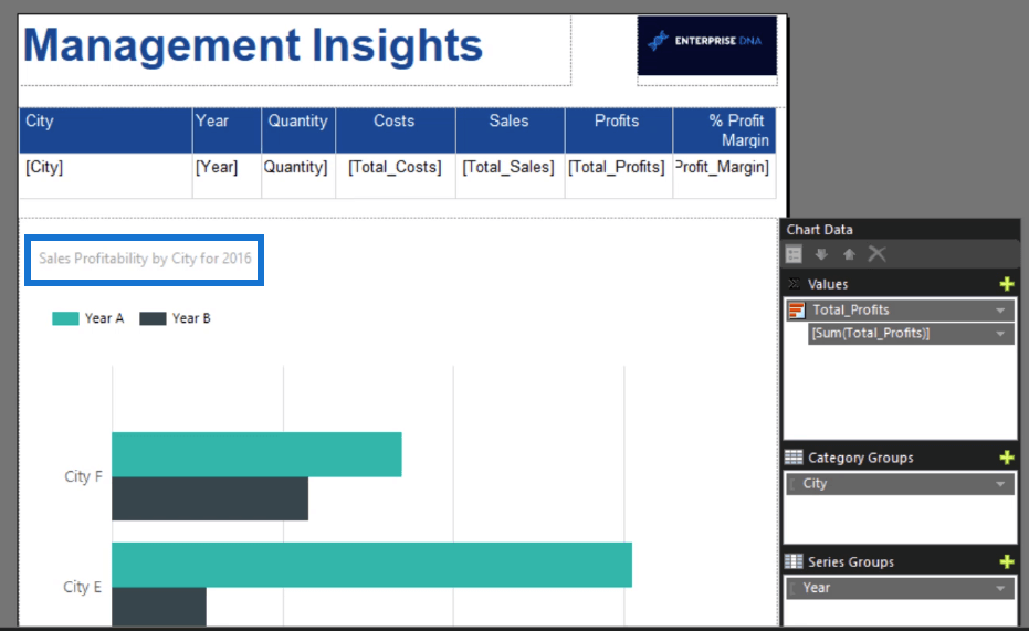
After you click Okay, edit the chart title that best represents the information in it. In this case, it’s Sales Profitability by City for 2016.
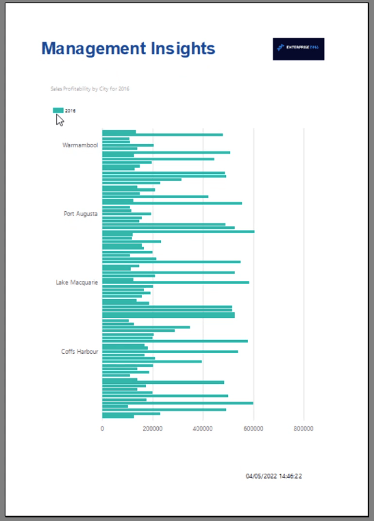
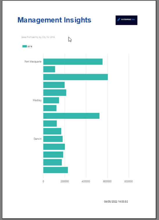
When you run the report, you’ll see that the chart only shows data belonging to the Year 2016.
Filter Chart By Top & Bottom N
Other that filtering by item, you also have the option to show the Top and Bottom N of your data. This example will show how to filter the top performing cities according to profitability.
Go to Chart Properties and add another filter.
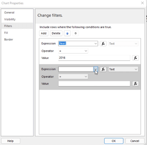
In this case, the chart should only show the Top Cities with profitability values equal or greater than 40%. So, select the Profit Margin for Expression and the greater than or equal to sign ( > = ) for the Operator.
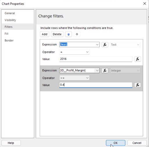
Note that the Profit Margin is designated as an integer. Therefore, the value assigned to it should also be an integer. If you just type in any value, you’ll get an error message.
So, click the fx button beside Value. This opens the Expression Builder. Go to the Common Functions category and select Conversion.
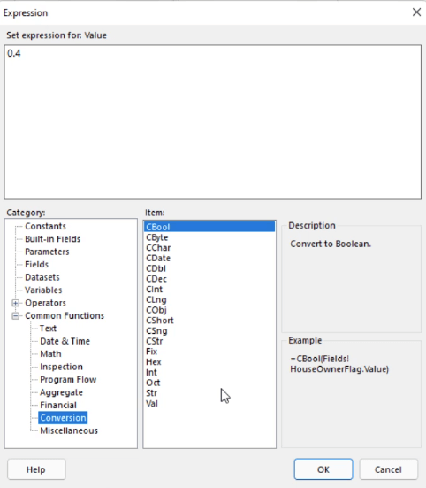
Double-click on Val. This will show on the Expression text box. Then, write the value you want to convert into an integer.
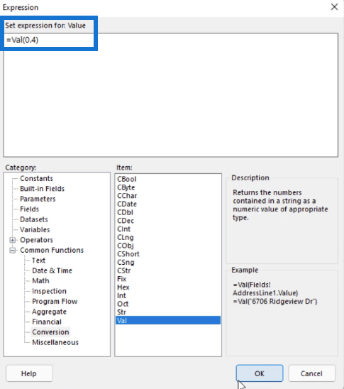
Val converts a number into the appropriate value type. In this case, it converts the value you inputted into an integer.
When you click OK, you’ll see in the second filter that you’re specifying the expression as the value.
When you run the report, you’ll see that the chart only shows cities which have profit margins greater than or equal to 40%.
Format Chart In Report Builder
Once the chart contains the information you need, it’s time to clean it up.
First, make sure to change the chart title to a name that appropriately represents the information it contains. Then, change the title’s format so that it pops out and becomes more noticeable.
Click on the title to select it. Then on the Properties pane, change the font style, size, color, and position to what you prefer.
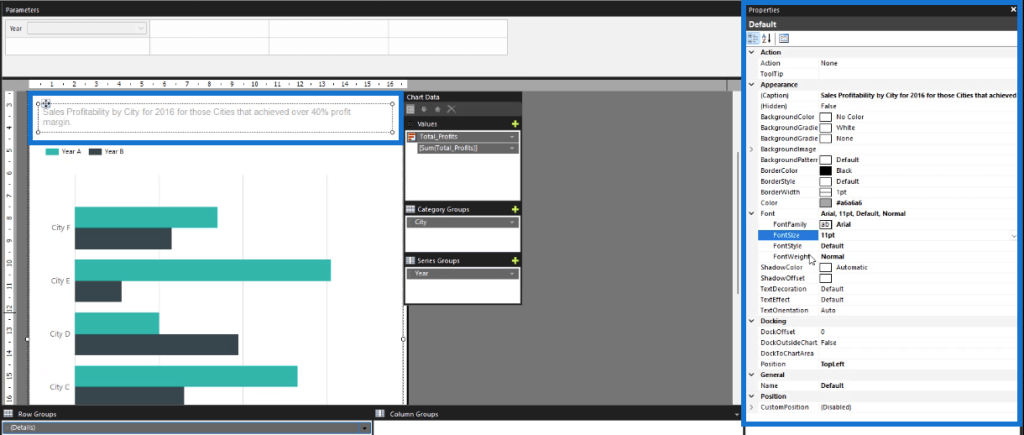
There are other options that you can customize. Feel free to explore and toggle with the Properties pane.
Sort A Chart In Report Builder
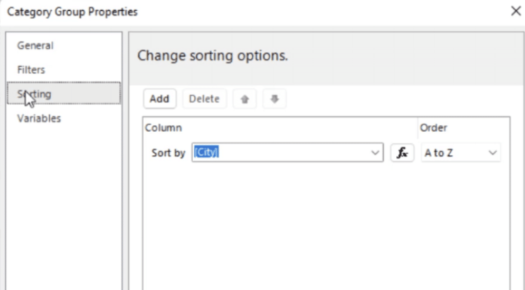
After filtering your chart data, the next step is learning how to organize it. First, let’s sort the category groups. Go to the Chart Data and click the drop-down arrow of the chart’s category group. Then, select Category Group Properties.
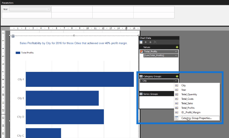
In this example, they’re currently grouped by city. You can arrange them either alphabetically or from highest to lowest according to profit margin. Once you’re done, click OK.
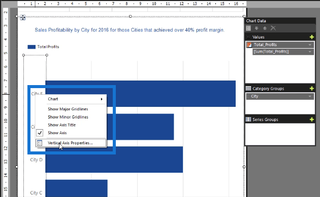
Next, you need to adjust the axis of the category groups. Right-click on a category group and click Vertical Axis Properties.
You’ll notice that it looks similar to editing a chart axis in Excel.
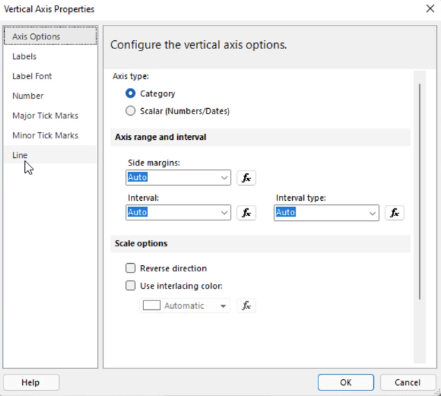
Adjust each option based on your preference. Depending on the amount of data you have, changing these options will have different effects on your chart.
You might get a different result than what you expect. So don’t be afraid to toggle and continue adjusting until you’re satisfied with how your chart looks like.
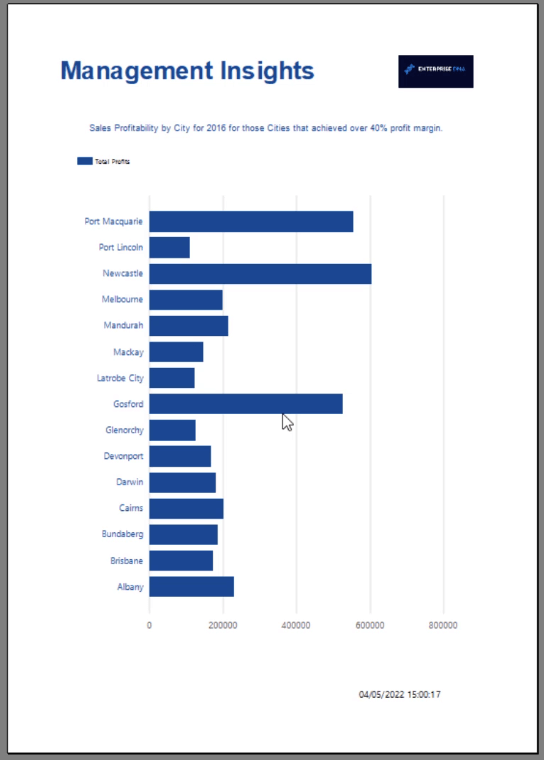
When you click run, you’ll see that the chart now looks significantly better. The City category group is also now arranged from A to Z from the bottom up.
***** Related Links *****
Report Builder Tutorial: Sort & Filter Data In Paginated Reports
How To Create And Format A Report Builder Chart
Visualization Technique – Power BI Column Charts & Filters
Conclusion
When it comes to visualizations, it’s important to make them look organized and presentable. In most circumstances, they are the highlight of any report, so it’s important to ensure that they can be easily understood by end users. Learning how to filter and sort a chart in Report Builder allows you achieve this.
You also need to take into account the other parts of the chart. It’s not only about the information; the details need to be considered as well. That’s why you also need to understand how to format your chart title, axis, and legends, to name a few. Formatting the chart up to the tiniest bit of detail allows you to create a seamless visualization in your report.
All the best,
Sue Bayes


