In this tutorial, you’ll learn how to add inferential statistics to a Power BI report. Specifically, you’ll learn how to perform a t-test using RStudio.

A t-test allows you to statistically compare the mean between two groups and then conclude if there’s a significant difference between them.
If you’re not familiar with statistics, it’s recommended to review and study it before proceeding with this tutorial. Doing so will make it easier for you to understand the purpose of this tutorial and the importance of performing statistical tests.
Execute A t-test In RStudio
Open a blank R script.
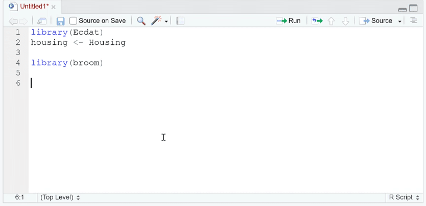
This example uses the housing dataset and the broom package. This package takes the t-test results and transforms them into a tabular format.
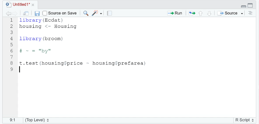
To perform a t-test, use the t.test ( ) function. Within the parenthesis, write the two groups you want to compare, separated by the tilde sign ( ~ ). This sign means “by” in RStudio.
In this example, the t-test compares the average of price by the preferred area. It then lets you know if those averages are equal or not equal to zero.
When you run the code, you’ll see the results of the t-test. In this case, the results say that there is a significant difference between the means of the price and preferred area.
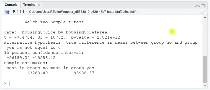
However, you can see that the confidence interval yields negative results. It’s recommended to transform these to positive numbers so that they are easier to interpret. You can do so by reversing the factor levels.
You need to use the fct_rev ( ) function of the forcats package. This is a special package that specifically deals with factors or categorical variables. When you run the code, you’ll see that the signs are now reversed.
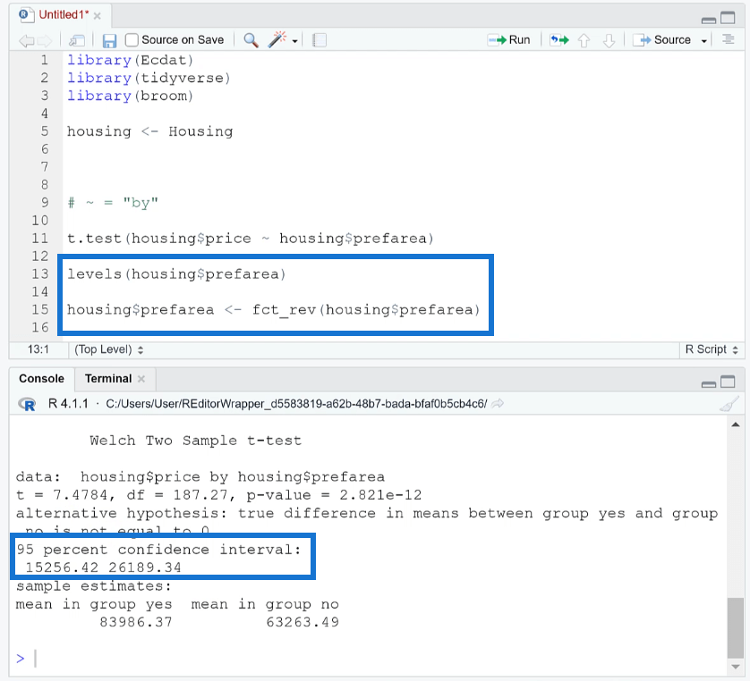
In this example, the results now indicate that housing with air conditioning is valued at around 15,000 to 26,000 dollars more.
Format The Results
Performing a t-test in RStudio is simple. However, oftentimes the results are difficult to read because of the way its presented.
You can change the result format using the tidy ( ) function. When you run the code, you’ll see that each value is now placed in a table with individual columns. They’re also properly labeled.
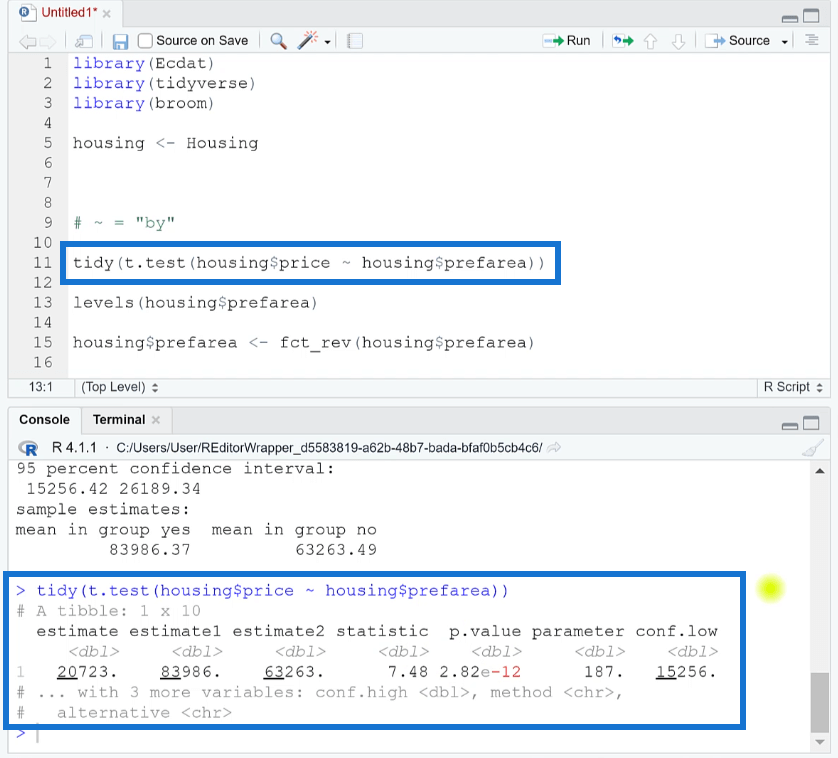
This now makes it easier to understand the results of the p-value and confidence interval.
The tidy ( ) function works with most statistical tests in RStudio. You can use this whenever you want your results to be in a more presentable format.
***** Related Links *****
R Scripting For Power BI Using RStudio
Seaborn Function In Python To Visualize A Variable’s Distribution
ggplot2 Plots In Excel For Advanced Data Visualizations
Conclusion
Results gathered from descriptive or inferential statistics are great elements to add to a Power BI report. They add depth and further substantiate the data presented.
A t-test is one of the most commonly used statistical tests because it’s simple to perform. Its results are easy to interpret, even with a basic or beginner-level knowledge in statistics.
All the best,
George Mount


