I wanted to highlight in this post some of my best practice tips for Power BI data modelling. In this tutorial, I go through many techniques in detail which I think you’ll find very beneficial as soon as you start implementing these into your reports. You may watch the full video of this tutorial at the bottom of this blog.
You’ll find that as you work through any development, certain elements of your Power BI reports will grow. This can be things like new tables of data, differing relationships between tables, an assortment of measure groups, and many more.
Organising all of these parts of your reporting is absolutely essential so you can have a clear understanding of what’s going on inside your model.
I want to talk about some of my best practice tips for organizing your models. What we are looking at here is an entire report that has been developed for an Enterprise DNA Learning Summit.
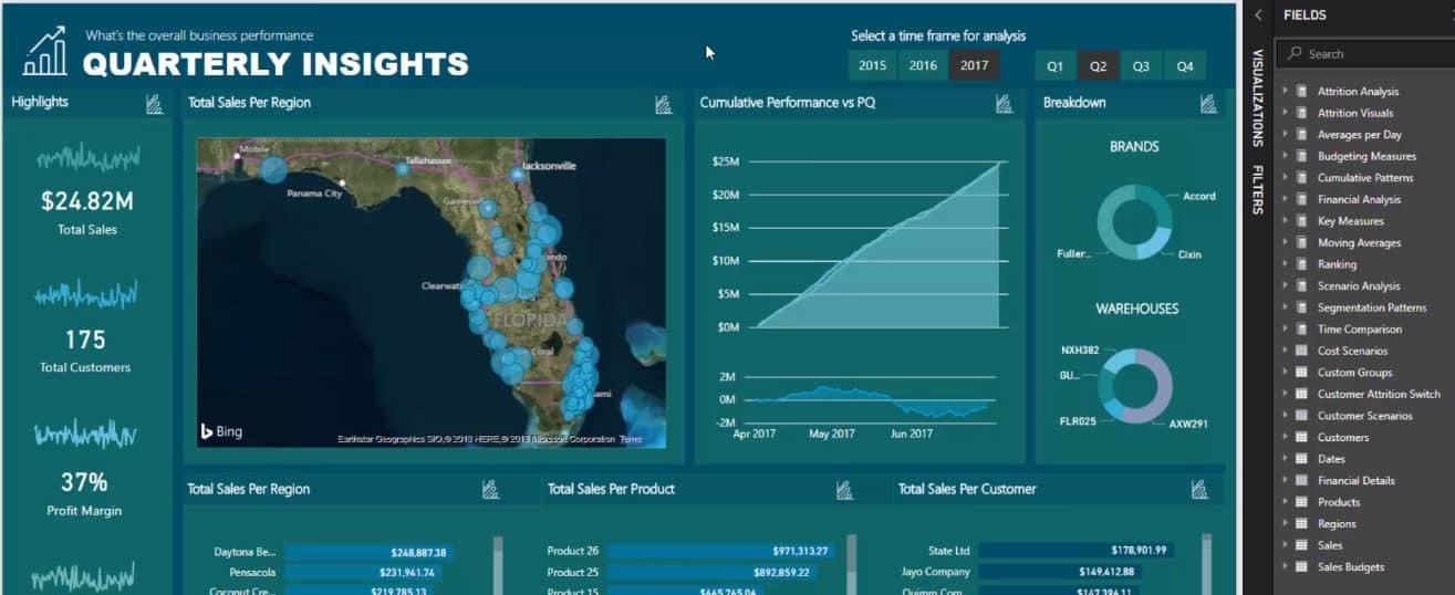
This model here is so detailed — so many calculations have gone into this report and so many supporting tables on top of this model. To come up with something like this, it is absolutely essential to follow some of these best practice tips on organizing things.
Structure Your Core Model Intuitively
Let’s go and visit the data model first. Now check out how detailed the Core Model is.
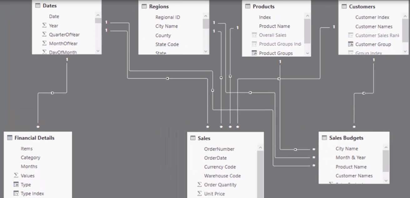
Many of you who have watched my tutorials before are familiar with how to set up your core model in the simplest way possible.
You will notice that the LOOKUP tables are at the top and the FACT tables are down at the bottom. You can also see here that we are actually dealing with multiple fact tables.
In this example, there is plenty of material we are dealing with in terms of financial details. Things like budgeting, comparing, and consolidating these numbers with our transaction data or sales data.
We have plenty of tables and relationships all over the place, but as you can see here, I have laid it out in a simple and intuitive way. If you set it up like this, it becomes simpler to understand even though what is being done is very complex in terms of calculations.
Organise Tables Where You Can See Them
Let me expand the screen so you can see how many tables and groups of things that I have in this model.
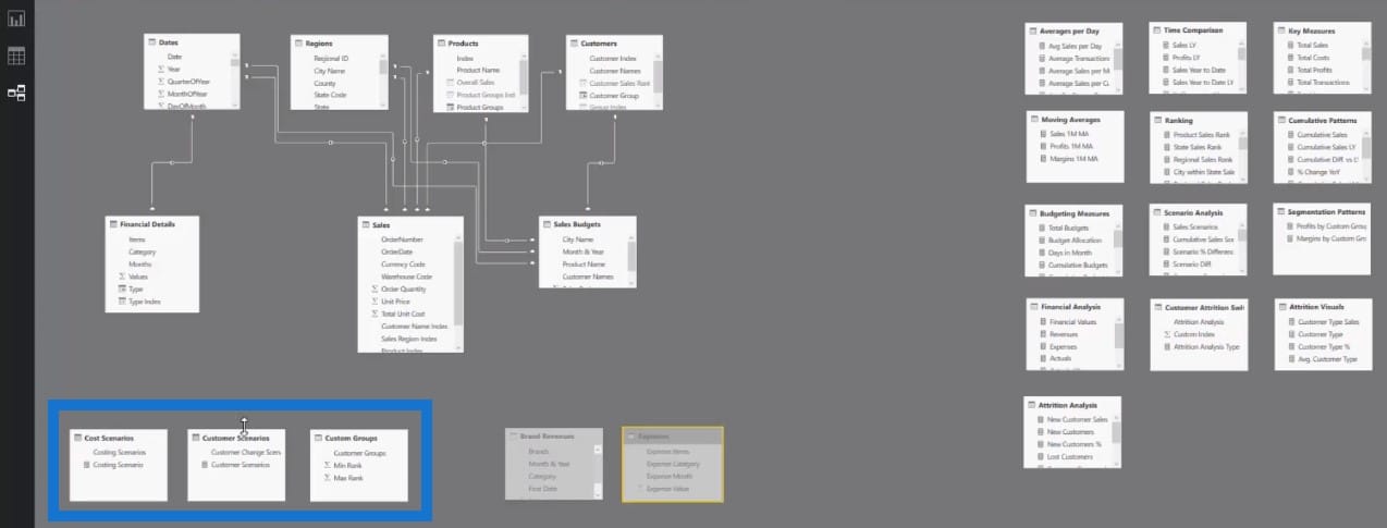
I put the supporting tables below my core measures where I can easily locate them altogether.
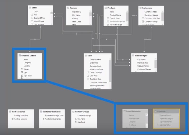
I also have some hidden tables which contain different data, and have consolidated them into the Financial Details table.
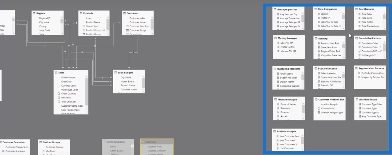
On the right side of the screen are my measure tables. Measure tables are key to organising your model. I put them to the side as well. I do these on all my models, and I highly, highly recommend that you do something similar.
I notice that for most of the Enterprise DNA members who post on the support forum, their model is a bit of a mess. This is perfectly understandable, because you don’t know what to do when you’re just starting out.
But if you can take some of these simple tips that I utilise and implement them in your own model, I’m confident that even these small changes will make things simpler to understand.
Visualise Things On Your Mind
What I like to do—regardless of the data scenario I am working on—is to visualise what is actually going on with my model while I’m building my report and writing my DAX calculations.
So I know when a filter is put in place, I know how it flows down to a calculation which I might be doing in my sales table, budgeting table, or even in a combination of tables.
Being able to visualise these things in your mind as they are actually happening is important.
Organise Your Measures Using A Measure Table
The last tip I wanted to go over concerns measure tables. Let’s take a look at the right-hand side and see how many measure tables I have. Quite a significant number, right?
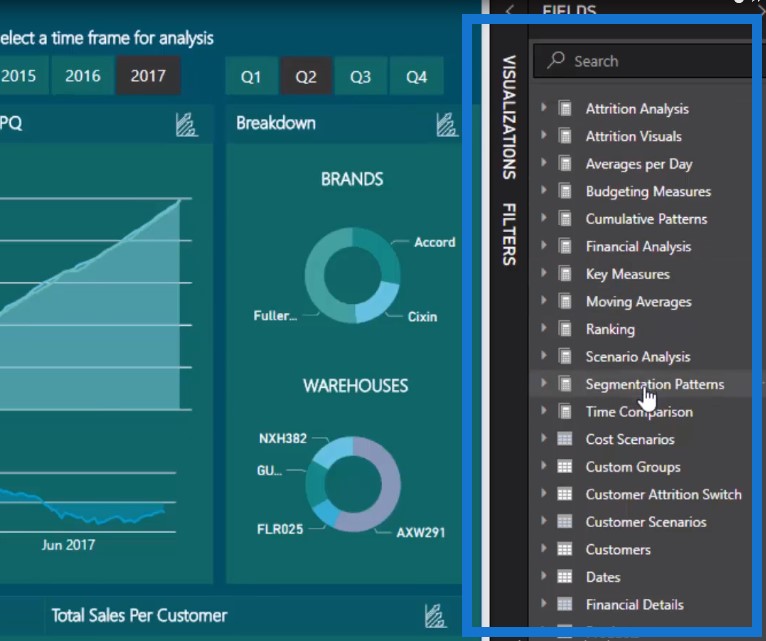
Check out what happens whenever I open any one of these fields, like the Attrition Visuals and Key Measures fields.
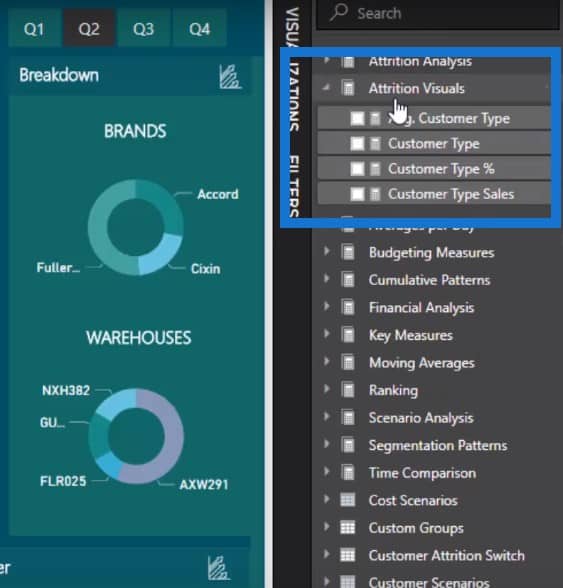
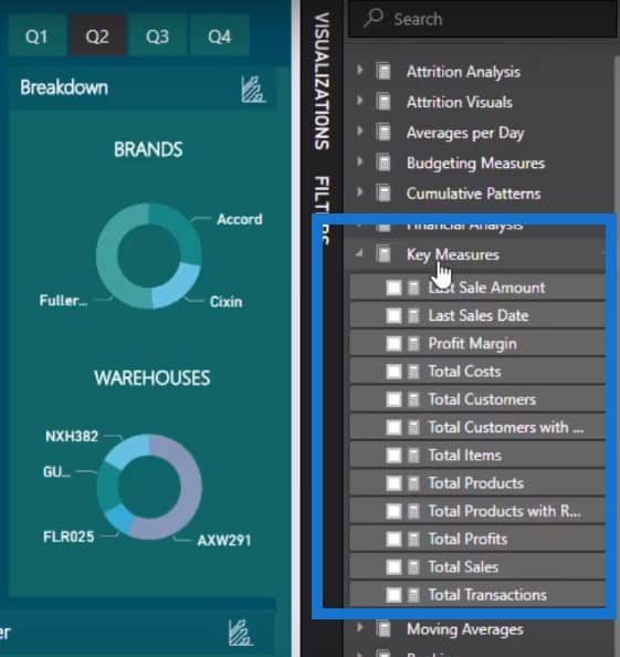
What I’m trying to show you here is that you can create a lot of measures. You can easily create 30, 40, even 50 measures in your model. If you do not put these into measure tables, then you can easily get lost in the sea of data. You’ll be searching for your measures and you won’t know where to find them. It will make life harder for any person who uses your model.
Name Measure Tables Intuitively
It is important to simplify things as much as you can to speed up your development, especially if you name your measure tables in an intuitive way.
For example, if I want to make a comparison of time periods, I know where to go. I’ll just click on the Time Comparison table, and then drag and drop it into my visualisations.
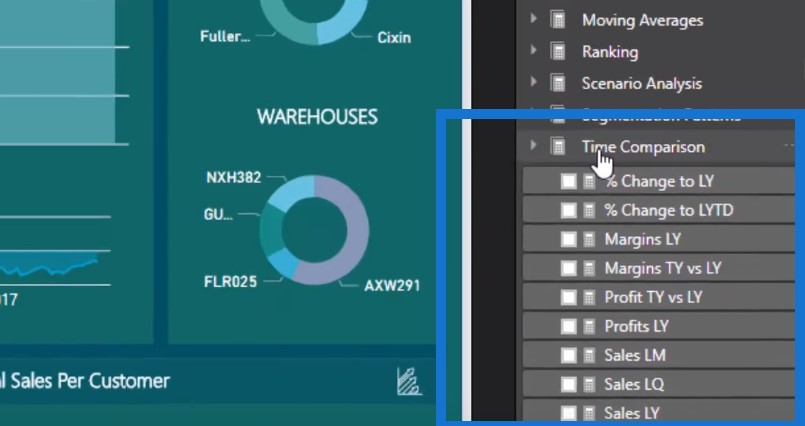
By implementing just these small things, you can improve your speed to development in Power BI.
This is not only for your benefit also. Others who are potentially going to use your model in the future need to be able to pick up where you have left your work.
They need to be able to audit the numbers that you’re calculating and also understand how these numbers are being calculated.
***** Related Links *****
The Ultimate Advanced Viz. Technique in Power BI – Multi Measure Dynamic Visuals
Using Filter Fields & Visual Interactions To Create Compelling Visualizations In Power BI
Build A Comprehensive Date Table In Power BI Really Fast
Conclusion
If you follow the best practice tips on Power BI data modelling that I run through in this tutorial, I’m very confident that you will be able to develop far more superior Power BI data modelling than others around you.
There are only a few small updates that you need to make and to do consistently well to optimise the reporting and development work you’re venturing into. You can also use these tips to make quick and easy updates to existing work also.
Sam
[youtube https://www.youtube.com/watch?v=5pQbIpnm-6I?rel=0&w=784&h=441]


