This blog post will demonstrate one of the best data visualization techniques I’ve discovered in Power BI to date — the multi-measure dynamic visuals technique. You may watch the full video of this tutorial at the bottom of this blog.
If you want to create dynamic visuals that can really make your analysis stand out, you need to make use of it.
It allows you to work and present your results in a dynamic way. Not only are you able to work with dynamic results, you can change the measure or the metric you want to show a comparison to.
I will show how you can set this up in various different ways to be able to ultimately visualize great insights.
I’m going to show a visualization technique which I stumbled upon when I wanted to compare one thing versus another and wanted to do it in a dynamic way. Obviously, you can show the difference of something from one period to the next, but what if you wanted to show one selection versus another selection in the same chart?
For example, you wanted to show a clustered column chart but wanted to be able to dynamically select this? I thought this was probably difficult to do, but then I realized you can actually do it because it is just another derivative from the dynamic of visuals that I’ve showcased a number of times.
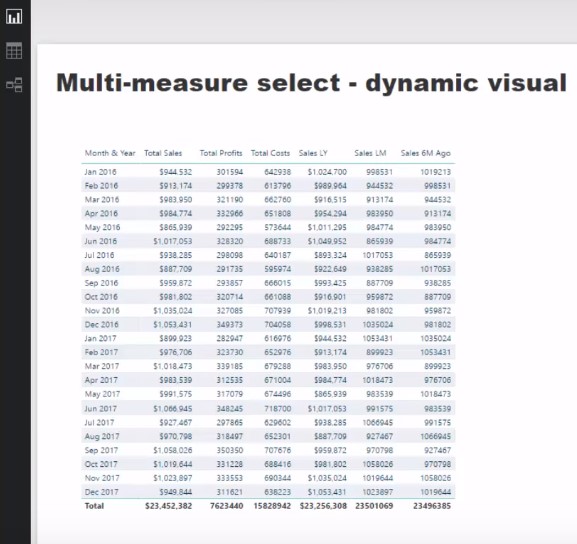
First, I’m going to set up some calculations that we can feed into a measure and will allow us to dynamically change with a selection. I’ve calculated my Total Sales, Total Profits, and Total Costs. I’ve also calculated my Sales Last Year, Sales Last Month, and Sales Six Months Ago. I want to create a clustered column chart where I can select any of these metrics versus another metric.

Creating The Slicers
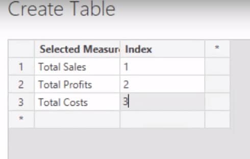
We’re going to create two filters or two slicers by going into data. I’m going to call the first slicer Selection A. We’ll name the first column as Selected Measure and put in Total Sales, Total Profits, and Total Costs. We’ll also put an index here and load that in.

I’m going to also create another slicer and call this one Selection B. We’ll name the column Comparison Selection and put in our Sales LY, Sales LM, and Sales 6M Ago. I will also create a Comparison Index and then load that in.
Now that we have these two slicers on the canvas, we can select through the options.

Measures Selected
The next thing we’re going to do is create a measure and call it Measures Selected using this formula. There’s a little bit of a setup involved here but this is what you have to do to come up with such an amazing analysis like this.

Then I’m just going to copy the formula, create a new measure, and paste the formula. I’m going to change Selected Measure to Comparison Selection and then choose Sales Last Year.

This is going to return the selections that we’ve made in the two slicers.

This is where the really cool part comes in: we’ll create dynamic measures that allow us to change the visualization based on the selection. We’ll create a new measure and call it Selection 1 and use the SWITCH function. We’ll go with SWITCH(TRUE) and then write a little bit of logic where if the Measures Selected is equal to Total Profits, Total Sales, and Total Costs, then go BLANK.

I’ll just bring in my Month & Year into the table. It is now returning our Total Profits, but we can switch it to Total Costs or Total Sales.


Comparison Selected
This is already looking pretty good but we can do even better. We’ll have to copy and paste the formula into a new measure and call it Selection 2 and then change Measures Selected to Comparison Selected. We will then add our Sales LY, Sales LM, and Sales 6M Ago.

Making The Comparison
So now we can add this measure to our visualization to make a comparison. I actually had about 25 measures but by using exactly the same technique, I could dynamically change the visualization to show the comparison. This is a seriously cool technique, in which you can select any measure and show the full results side by side.
***** Related Links *****
Using Filter Fields & Visual Interactions To Create Compelling Visualizations In Power BI
Creating Multi Threaded Dynamic Visuals – Advanced Power BI Technique
Data Visualization in Power BI: Showcasing Sales Performance Effectively
Conclusion
This is an incredibly effective way to highlight information in a very condensed manner in a Power BI report. Historically, if you were working with Excel on PowerPoint, you would have had to create an extensive presentation to showcase as many results as you can or want in just this one visual.
This analytical and comparison technique for Power BI opens up several visualization options that your consumers will love and find very valuable.
If you’re creating reports and you want to improve your visualizations in a compelling way, this is absolutely a technique you need to consider placing within your reports and models.
Check the link below for even more comprehensive guides on data visualization tips from Enterprise DNA Online.
Good luck with this one!
Sam


