Conditional formatting is a way of visualizing data by applying a certain set of format rules based on user-defined conditions. For Power BI visuals, it is mostly used when presenting data in a tabular form.
In this tutorial, I’ll discuss how to combine DAX formulas with the new conditional formatting feature to highlight the last or most recent period in your Power BI visuals.
I often see this technique used in financial or revenue reporting. This is a great way to make certain data stand out.

Let’s look at this sample report visualization.

What I want to do here is to highlight the last sale that I have made within this visualization. Moreover, I want it to dynamically have a different color.
In this case, I’m going to use a technique which you can reuse in various scenarios.
Let’s break down the things that I need to do to achieve the results that I require.
Creating The Last Sale Measure
Since I want to highlight the last or current sale on this visualization, the first thing that I need to do is to identify the date of the last or current sale.
In this demo data set, the last sale happened in November of 2018.


I created the Last Sale measure that will determine the date of the last sale.

I used the MAX function so it can calculate the max date in this table.

However, it only calculate the max date within each different month. What I want to get is the day when I last made a sale. That last sale clearly happened on the 15th of November, 2018.

For me to achieve the result I want, I need to change the context in which we calculate the max date. This is why I included the previous logic that I made inside the CALCULATE function. Then, I used the ALL function to return all the values within the Last Sale column while ignoring any filters that might have been applied.

After editing the formula, the Last Sale column is now displaying the day when I last made a sale, which was on the 15th of November, 2018.

Last Sale Date Isolation
After getting the Last Sale date, I need to isolate it using measure branching. This is an essential technique for this kind of scenario.
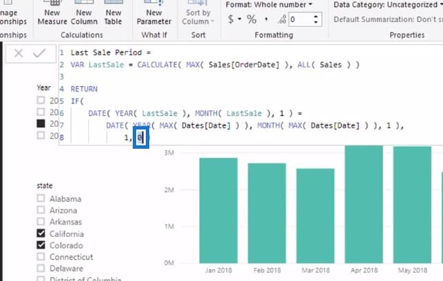
This is the actual formula that I used to isolate the Last Sale date. I named this measure as the Last Sale Period.

Initially, I created the LastSale variable to contain the same logic that I previously used for the Last Sale measure.

Then, I went through every single row within the LastSale list to evaluate whether the current date is equal to the month of the actual Last Sale date.
I used the Date column to compare the months and identify the one that matches the month of the actual Last Sale date.

I was able to match them out by utilizing 1 to represent the first day of the month.

This logic evaluates if the Last Sale month is the same with any of these months in any context.

If the logic returns TRUE, it’ll be set to a value of 1.

If it returns FALSE, it’ll be equal to 0.
Once I bring the results in this report, you’ll notice that every row displayed 0 except for the month of November in 2018. This means that only the month of November was evaluated as the same with the Last Sale month.


Conditional Formatting For Power BI Visuals
After isolating that particular Last Sale month, I have to visually change the color of this element in our chart.

Power BI made some cool updates to visualizations. These updates include the benefit of conditionally changing what you’re seeing within your visualizations.
Once I click on the Data Colors option under the Format Pane, there will be three dots in the upper right corner.

If I click these three dots, the Conditional Formatting will appear.

I’ll click on that and the Default color pane will show up.

You can change a number of things within this pane. For this example, I’m going to format by Rules.

Then, I’ll find my Last Sale Period measure within this field.

I’ll set the following IF condition that will be used to highlight the result of the Last Sale Period measure.

For this instance, if the value is equal to 1, the color should be set to gray.

I’ll be adding another IF condition. If the value is equal to 0, the color should be set to blue.

I’ll be adding these rules into my visualizations based on the Last Sale Period measure that I calculated.

To apply these changes, I’ll just click the OK button.

This is how the conditional formatting affects the visualization.

This technique goes along with the rest of the model whatever slicing or filtering that I place into my data.

I can also change the year in this filter.

Formatting Your Power BI Visuals Dynamically
When I clicked the year 2017, you’ll see that this doesn’t work as it should. This is because of the way I set up the formula where I was looking for the last sale that I have made from the beginning of time.
I want to make this more dynamic by showing the last sale period in any selected context on the filters.
To do that, I need to change the ALL function. This is because the ALL function goes over the beginning of time.

I need to change it to ALLSELECTED which only works over the context that I have selected or applied in my report.

As a result, when I go to 2017, it instantly highlights the last date in that particular context.

Now, I’ll change the Year filter to a Date slicer.


Because of that, I can now quickly change this to any time frame that will always display the last result in the visualization.

***** Related Links*****
Data Visualization Technique In Power BI – Multi Measure Dynamic Visuals
Advanced Power BI: How To Create Multi Threaded Dynamic Visuals
Power BI Visualization Technique: Learn How To Create Background Design Plates
Conclusion
That’s all I wanted to cover in this tutorial. You have now learned how to add unique conditional formatting to your Power BI visuals. It’s definitely an interesting technique where you can combine DAX functions with new conditional formatting inside your visualizations.
You were also able to see how to apply the measure branching technique in this kind of scenario. There are so many different ways that you can use and reuse this technique.
Just remember the importance of tables when creating your calculations.
It’s important to get things into a table so you can work things out slowly and understand what’s happening at each different level of your calculations.
Hopefully, you enjoyed going over this topic.
Sam