In this tutorial, you’ll learn how to group data in a retail sites dashboard in Power BI. You can monitor and harvest data easily by grouping data and values.
Data such as the customer name and salesperson name will be available for you to keep track of the performance status of your sites, customers, and products.
Grouping Retail Sites
Instead of showcasing all the retail sites, you can break them into three different regional areas. You can choose South East, Mid East, and North East of America.
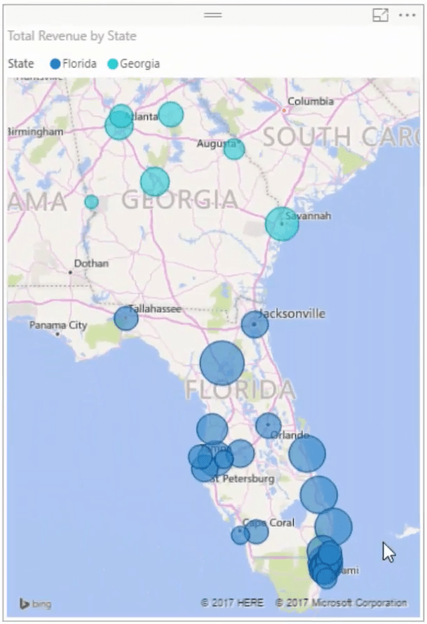
Bring State into the Legend of the map’s visuals to break down the different regions that you’re selling. Then, go to the filter section and filter the different regions. In this case, it’s Florida and Georgia.

You can now see a smaller subset of information from the visualization.
After that, get rid of the title and the legends because you will later learn how to make them stand out and highlight what the visuals are about.
Breaking Data Into Visualizations
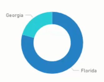
The next thing to do is create a doughnut chart. Again, bring State under Legend and instead of Total Revenue, use Revenue within Time Frame in the Value section. Now, proceed to the filter section and select Florida and Georgia. Get rid of the header.

If you check out your visualizations, they will all change when you select a time frame.
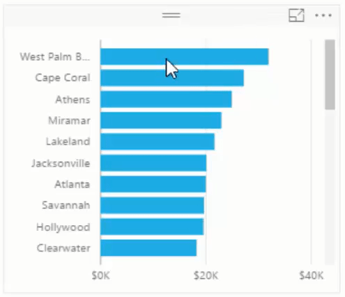
Next, copy the doughnut chart and replace the Legend with Name. Change the visualization into a stacked bar chart. Change the sort order to Revenue within Time Frame.

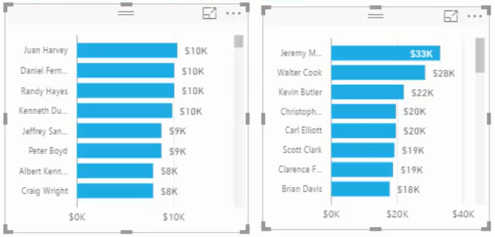
Copy that chart 2 times and change the Axis of both to Customer Name and Salesperson Name.

Copying and pasting visualizations speeds up the development of your dashboard in Power BI, so you have to utilize it.
From there, you can make a few adjustments to your visuals. First, reduce the size of the labels and add data labels. Next, you can put colors for the background and visualizations.
Create a rectangle and fill it with color. Add transparency to the shape and put it behind your visuals. The shape in the background breaks out all the key information in your dashboard. You have to make sure that the shape is sent to the back of the information you’re showing.

You have to get everything set up because you need to copy and paste these visuals twice for the other areas. Each line of information will then have changes in their values based on the different regions you select.
***** Related Links *****
How To Control The Interactions Of Your Visuals In Power BI
How To Harvest Power BI Slicer Selections To Use Within Other Measures
Custom Conditional Formatting Techniques In Power BI
Conclusion
When you group data and break down all the retail sites by regions, you can easily access the data that you need. If the sites are organized and categorized, it’s much easier to locate information.
Grouping information makes data gathering hassle-free. You can easily switch to any group of data and grab the values that you need.
All the best,
Sam


