
Gantt charts are a go-to tool for project managers and teams to track timelines and progress in an easy-to-understand visual format. With Power BI Report Builder, you can take this visualization to the next level by incorporating interactive, data-driven elements. In this tutorial, we will cover the basics of creating a Gantt chart in Power BI Report Builder, including how to transform dates into numbers using calculated fields.

Add A Title & Subtitle In A Gantt Chart In Power BI Report Builder
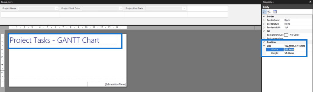
Create a blank report page. The first item you need to add is the report title. For this example, use Project Tasks – GANTT Chart.

Once you’re done typing the title, you can change its size, position, and style in the Properties pane located on the right-hand side.
Below the report title, you can add a dynamic subtitle that changes depending on the data shown in the report.
Write the beginning phrase and then drag and drop the field you want from the Report Data pane to the Subtitle.
Since the report is presenting a Gantt chart, the subtitle shows the chart range of the project start and end dates. You can change the chart range format using the Format option in the Properties pane.
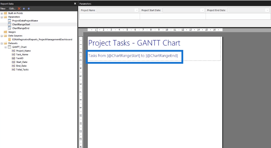
When you run the report, this is how the title and subtitle will look like.

The subtitle automatically changes depending on the parameters you set.
Create A Calculated Field To Transform Dates Into Numbers
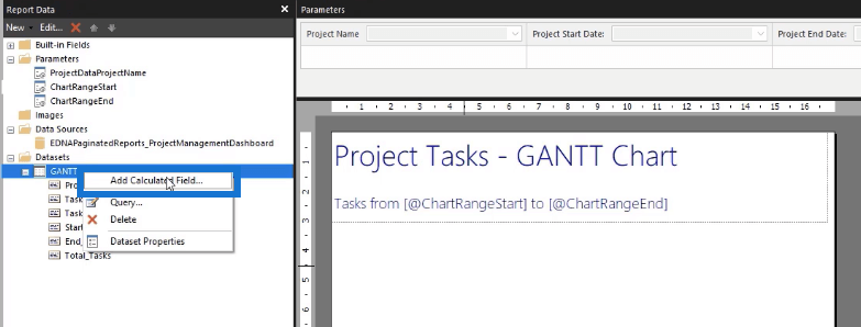
To create a Gantt chart in Report Builder, you’ll be using a gauge chart. However, this type of chart doesn’t work with dates. So you need to create a calculated field that allows you to transform the dates into numbers.

To create a calculated field, click on your dataset and select Add calculated field.
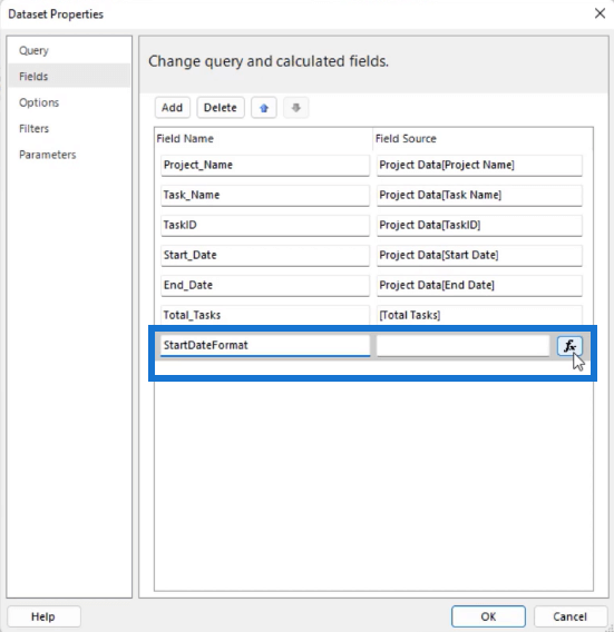
This opens the Dataset Properties window. Before anything else, you need to sort out the formatting of the parameters.
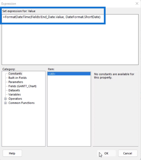
Click Add Calculate Field and type in the Field Name. In this case, it’s StartDateFormat. Then, click the fx button.
In the Expression Builder, follow the format below:

Then, copy this code and paste it in a new Calculated Field. For this example, the new calculated field is called EndDateFormat. In the Expression Builder, you only need to change the Field used in the expression.
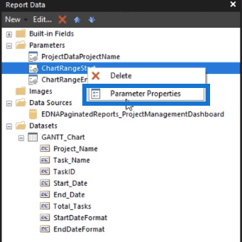
After you click OK, you need to make sure that the Parameters are using the calculated fields you created. So go to the Report pane, right-click on the ChartRangeStart and select Parameter Properties.
In the Report Parameter Properties wizard, go to the Available Values tab. Set the calculated field you created as the Label field.
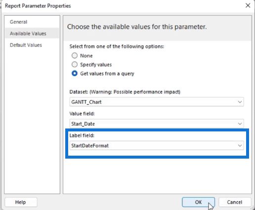
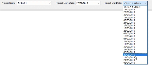
Do the same for the ChartRangeEnd Parameter.
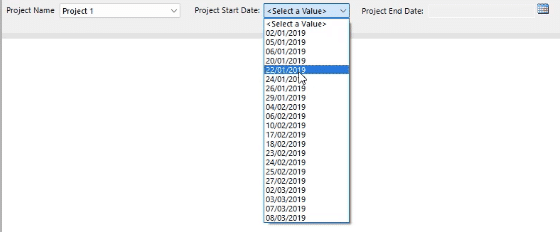
When you run the report, the Project Start Date and Project End Date parameters appear in an easier to read format.
Start Number & End Number In A Gantt Chart In Power BI Report Builder
To change the date parameters from a date to a number format, you need to create new calculated fields. In this example, we will call them StartNumber and EndNumber.
In the Expression Builder, create a field that will count the number of days between the Chart Range Start and End values. The gauge will then present the difference.
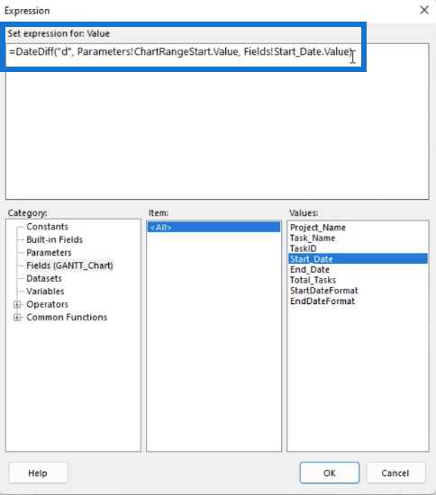
Do this for the Start and End fields. Don’t forget to change the Fields according to what’s needed. For the StartNumber, use the ChartRangeStart parameter and the Start_Date value.
On the other hand, use the ChartRangeEnd parameter and the End_Date value for the EndNumber.
***** Related Links *****
Creating A Gantt Chart In Power BI Using Matrix
Report Builder In Power BI: Formatting Objects & Visualizations
Deneb Power BI Declarative Visualization
Conclusion
A Gantt Chart makes it easier to track each task in a project. Adding this in your paginated report allows end users to be aware of ongoing and pending tasks.

The great thing about using Report Builder is how easy it is to make a dynamic report. Though it doesn’t have the option to automatically create a Gantt chart, you can work your way around and use a Gauge chart instead.
All the best,
Sue Bayes


