Today I’m going to showcase how you can discover patterns in your data when using Power BI. This is an advanced analytical technique using internal logic. You may watch the full video of this tutorial at the bottom of this blog.
Power BI is an amazing analytical tool, and by using scatter charts effectively, you can showcase some amazing insights.
What I do find with scatter charts, especially if there are a lot of data points, is that charts get extremely busy and it’s hard to see anything meaningful or see patterns of information which provide any value.
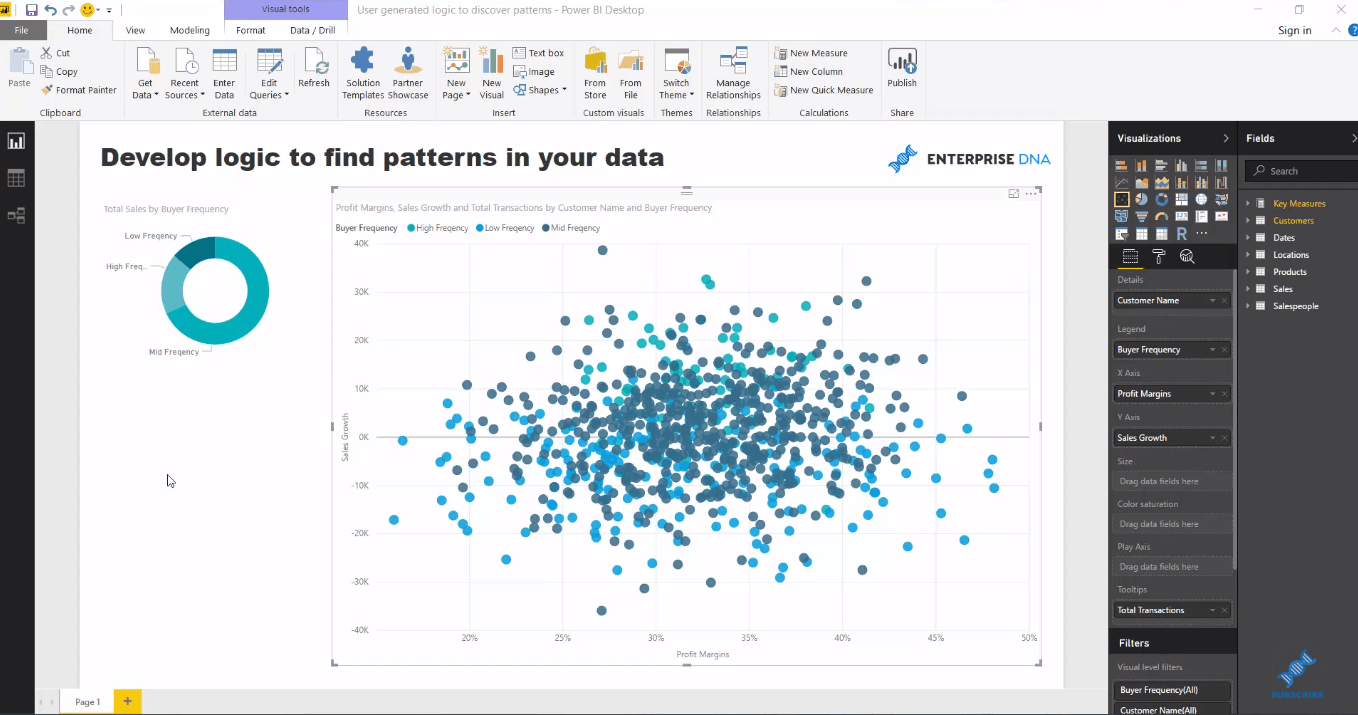
So, what I’ve devised is a development strategy where you can overlay some internal logic to break out your scatter charts in strategic way.
In this particular example, we investigate if the frequency of purchasing has made any difference to the margins and sales growth of our customer groups.
This is truly a really high quality insight.
I run through how you can bring in logic to your model that does not exist in your core tables. This enables you to find insight from things that might be somewhat unrelated, but allows you to discover a pattern in your data that you wouldn’t ordinarily find in your data sets.
Using Scatter Chart and Internal Logic
Using a scatter chart is a really great way to showcase patterns in your data, showing clusters in your data.
In this example, we’re going to use three different and unrelated calculations or pieces of logic, and see if there is any relationship to them. We’ll see if there is any relationship to what profit margins are for customers, to what their sales growth might have been, and to how many transactions that we make with them.
There are a lot of significant insights that we can extract from this, and that’s why I want to showcase how you can actually develop these in your models, and how you can dynamically drill into these patterns or clusters of information.
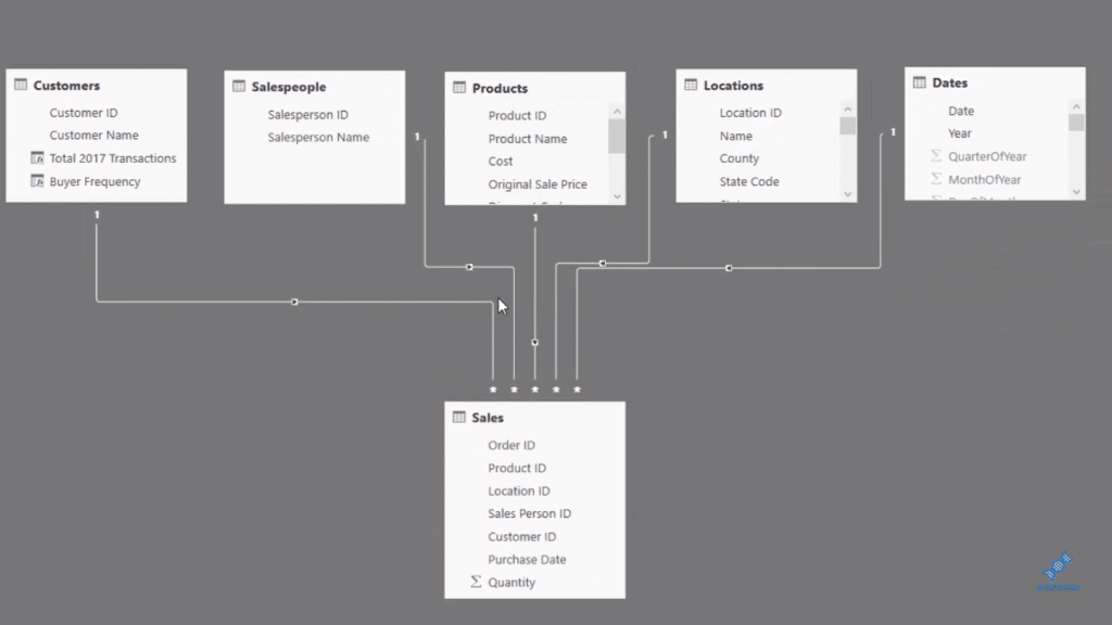
In this model, we have a few Lookup tables at the top, which all lead down to our Sales table.
So what I’ve done here is that I created a Profit Margins measure and a Sales Growth measure.
Then, I created this logic inside our Customers table. Inside this table, I’ve worked out whether the customers are high frequency, low frequency, or mid frequency, which is based on the transactions that the customers made in that particular year.
To do this, I used CALCULATE and FILTER. this logic calculates how many transactions each customers make in 2017.
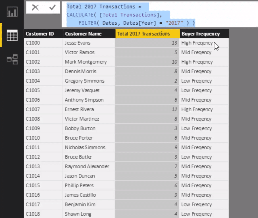
In the Buyer Frequency I used the SWITCH function, and qualifying the groups by identifying >= ten, five, and zero as higher, mid, and low frequency, respectively.
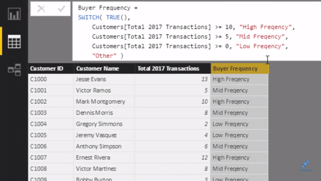
By creating this internal logic inside of this table, this additional dimension is created, we can then use in any visualization. We can use this dimension inside our scatter chart, which would then break up the scatter plot into different groups.
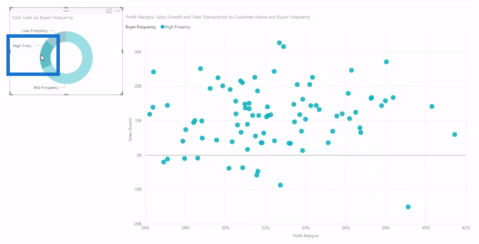
On the chart, we can see clearly the high, mid, and low frequencies. From this, we can get some insights regarding our profit margins, for instance. You can also think of things like age groups, or demographics, or performance. You can have performance on margins growth, and margins performance over the last quarter or year, etc. There’s a lot of ways you can do it.
Now to set this up, I’ve created the measures, which I’ve put inside the X and Y axes. Then I’ve used the legend to break it up to create these different colors.
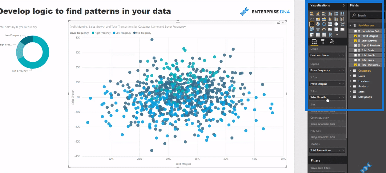
I’ve also changed the colors to make them standouts.
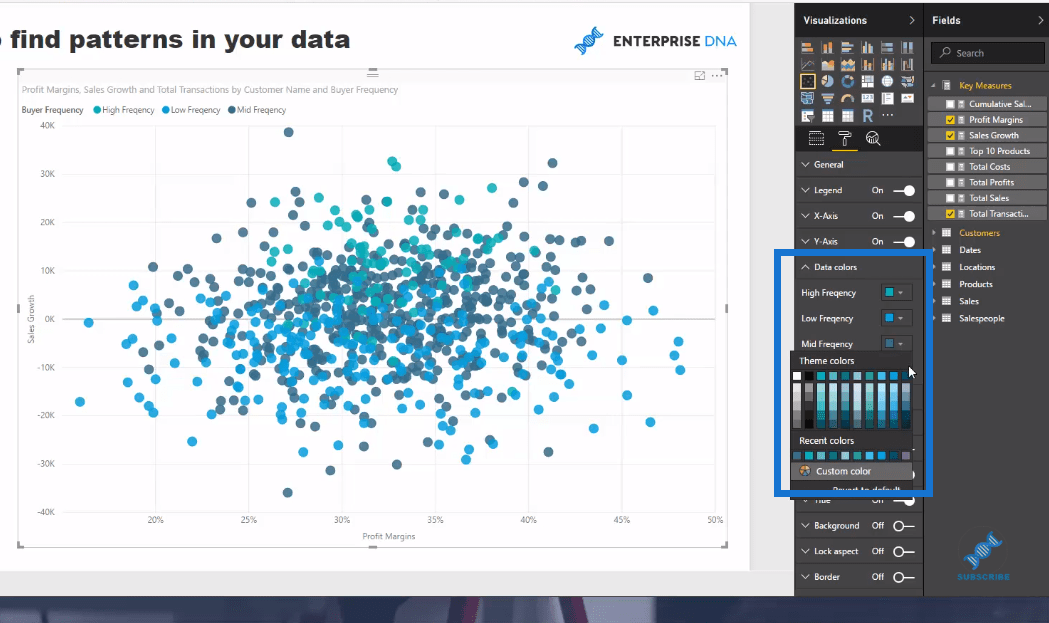
With the dimensions created, we could really drill in, break it up and see what the pattern is.
***** Related Links *****
SWITCH True Logic Explained For Power BI
How To Discover Clusters In Your Datasets Using DAX In Power BI
How To Use The In-Built Analytics Tools For Power BI
Use DAX To Segment & Group Data In Power BI
Conclusion
The key learning here is building logic into your tables. Doing so can really open up a lot of different insight.
By utilizing these types of development techniques, it enables you to visualize insights in a much more compelling way inside of Power BI. What I want you to get out of this tutorial is that sometimes the standard visualizations aren’t enough.
Sometimes you need to think analytically about the problem, decide what you want to showcase, and then overlay some advanced DAX logic to make your point.
This is a really good example of how to do that, as well as showing how to use Power BI in an effective manner.
All the best,
Sam


