In this Power BI tutorial, I dive into what’s perhaps a very niche insight. But don’t let that close you off to using this technique — there are plenty of ways to implement this across a range of scenarios. The key is to understand each different part and transfer them across similar elements in your own Power BI models and reports. You may watch the full video of this tutorial at the bottom of this blog.
As with many things I showcase at Enterprise DNA and through this blog, learning aspects of techniques is the key. Everyone’s data will be different and the scenarios you are analyzing will be different, but you can replicate a lot of what I’m doing over anything from an analytical perspective.
This Power BI tutorial will show you how you can showcase which grouping of customers contribute the most to the growth in your profits over any time period. Can you even imagine creating this insight in Excel? It would be extremely difficult. In Power BI though, we can achieve this through just a few formulas, and use the data model to filter the results in many different ways.
We’re going to explore how we can discover products – or any dimension – is contributing the most to a company’s profit growth. We’re going to stick to products here just to keep things simple, but you can use a range of different dimensions.
Determining Total Costs & Total Profits
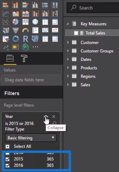
As we walk through the steps in this Power BI tutorial, I am going to talk about the logic on how you can actually do this yourself. First of all, you obviously need to start with the profits. In this example, we are going to show the profit growth from 2015 to 2016, then isolate the profits from those years as well. I’ve already placed a filter on 2015 and 2016 because the underlying data will cover exactly those two years.
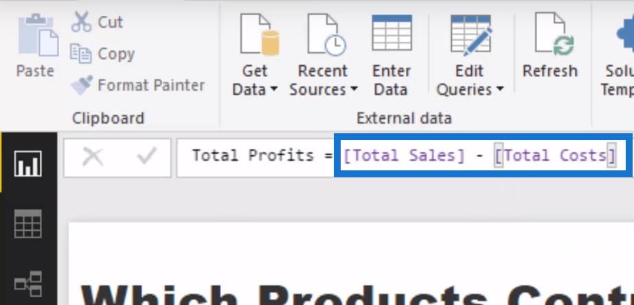
We already have our Total Sales, so the next step is to find our Profits. We are going to create a new measure and call it Total Costs. We are also going to use the SUMX function to look at the Sales table, and within the Sales table find the Total Unit Cost times the Order Quantity.

Now we have our Total Cost and from this, we can create another measure to determine Total Profits. To do this, we can just deduct Total Costs from Total Sales.
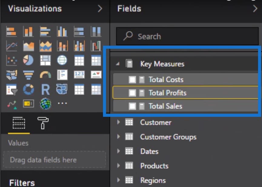
So now we have all three: Total Costs, Total Profits, and Total Sales.
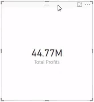
We drag our Total Profits into the canvas and we can now see that for 2015 and 2016, we have a profit of $44.77 million. So this is a pretty healthy business.
Isolating Product Growth Using The Filter Function
We need to see the product growth from 2015 to 2016, which is why we need to create some sort of filter here. We need to isolate the Total Profits from only each of those years and the way we do that is by using a filter inside of the calculation.
To achieve this, we create a new measure and call it 2016 Profits. We’ll jump down another line, use the CALCULATE function, and put in our Total Profits measure. We jump down another line and use the FILTER function. What we do with FILTER is to reference a table and then the filtering expression which is your additional filter, or what you want to isolate. In this case, we go to the Dates table and then only return the total profits from 2016.
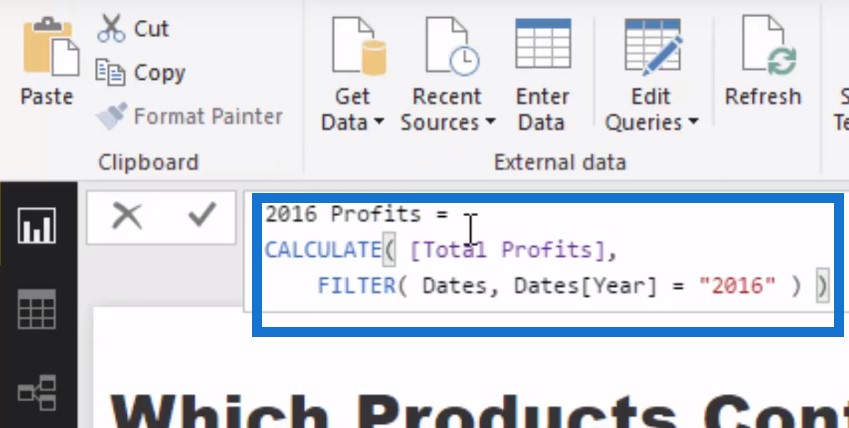
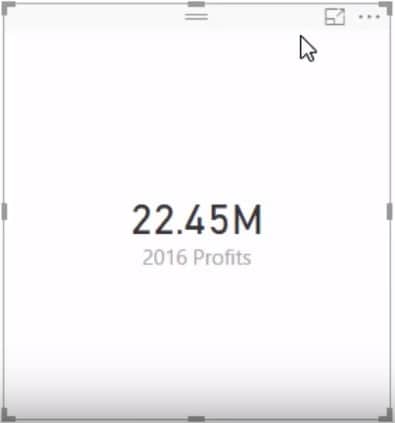
Now, we can isolate the 2016 profits, and drag it into the canvas. As you can see, we have 22.45 million which is about half of the Total Profits from those two years.
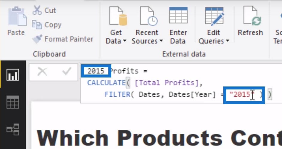
To get the 2015 profits, we just copy the previous measure, paste it into the new one, and then change the numbers from 2016 to 2015. Copy-paste is your new best friend in Power BI.
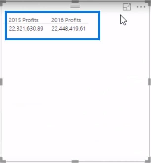
We started out with Sales then went to Costs. We were able to get Profits, and now we were able to break down these profits into years. So now we have our 2015 and 2016 profits using two different measures.
Determining Profit Change
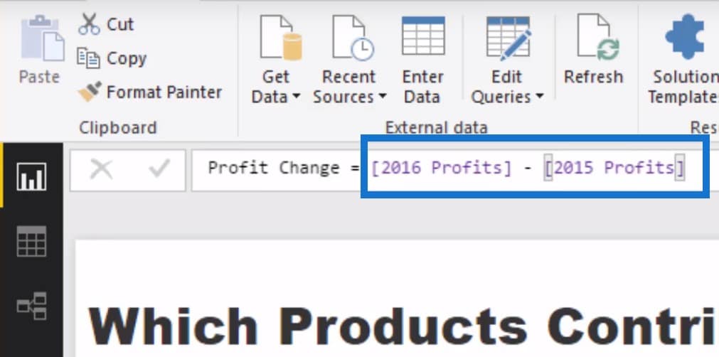
The next step is to determine what was the change from 2016 to 2015. All we have to do is create another measure and call it Profit Change. We are going to deduct the 2015 Profits from our 2016 Profits.
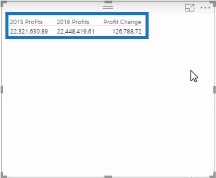
Once we drag it into the canvas, we can see the Profit Change between 2015 and 2016 in the table.
The next step is to filter the Profit Change by the products and achieve a result for the change for every individual product. Let’s copy then paste this table and then add our Product Name dimension to the mix. Now we can see the Profit Change for every single product.
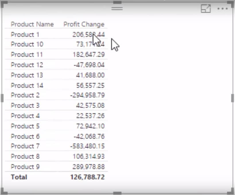
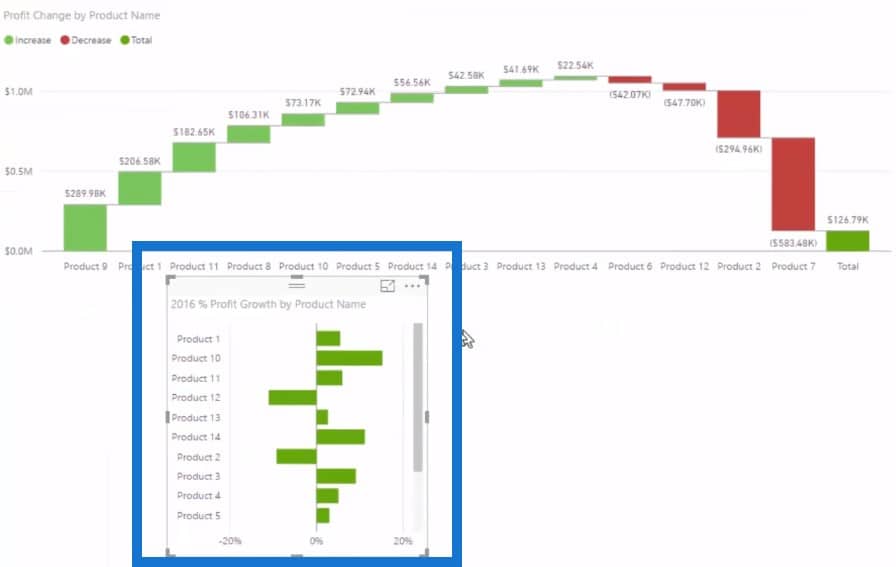
Visually, we can represent this data using the Waterfall Chart, which is perfect for this type of analysis. Now we can see quite clearly what products from 2015 to 2016 have contributed to the Total Profit Growth. We can also sort it out so the positives and negatives become a lot more obvious.

We can clearly see what products are contributing the most to our profit growth, which is Product 9. We can bring in other elements to our data model such as the difference between regions.
For example, I’m bringing in the Total Profits numbers from Island which breaks down the north and south of New Zealand and then create a visualisation out of this. If I wanted to isolate the North Island and see what was the change there, I could click on the North and see what is affecting the profits in that region. Obviously, if you have more regions in your own data model, you can click on any of those and the chart will update automatically for you.

Determining Percentage Of The Profit Change
Maybe we want to see not just the nominal numbers, but the percentage as well. So we just create another new measure and call it 2016 % Profit Growth, then divide Profit Change by 2016 Profits, with 0 as our alternative result.
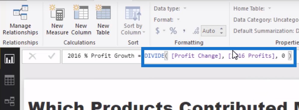
We will then change the format to percentage and turn it into a visualisation.
Showcase Positive And Negative Changes In Different Visualisations
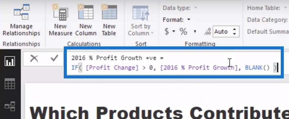
One last thing we can do in this Power BI tutorial is to only showcase the positive changes in one visualisation and the negative changes in another visualisation. To do this, we will create a new measure and call it 2016 % Profit Growth Positive. Then, we’ll write some piece of logic here:
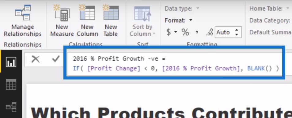
Then we copy this measure, create a new one and paste the old one. We just change the title to negative and the formula from greater than to less than.
We are now able to quickly isolate and compare how certain profits performed from one year to another.
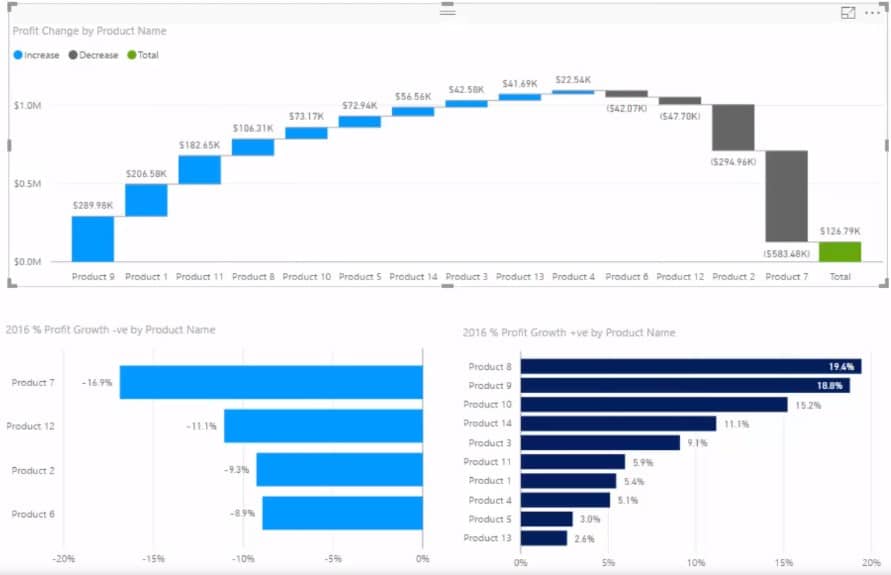
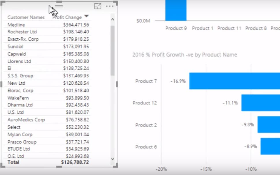
We can also see the changes from a customer perspective, and see who from our customers are affecting these numbers.
***** Related Links *****
Calculating Percent Profit Margins Using DAX In Power BI
Learn Which Customer Groups Experienced The Greatest Growth – Power BI & DAX
Check Whether Revenue Growth Is Profitable – Analysis In Power BI w/DAX
Conclusion
In this Power BI tutorial, we were able to analyse — based on some sales information — which are the products that contributed the most to profit growth. We also discussed the products that detracted from profit growth by looking up the negative numbers as well.
Perhaps, from a risk management perspective, you don’t want to see too much of your growth only coming from a few clients; alternatively, you do, and you want to see if it’s playing out how you want it to. Well, this technique is going to be exactly what you need to showcase this.
In business, not only do you have to manage your entire makeup of sales or profits, but it’s equally important to understand where the growth, whether good or bad, is coming from. What you’re getting is basically performance attribution on your results. It’s good insight.
Back in my portfolio management days, performance attribution was essential to show how you made the returns you did. This is exactly the same, but instead of bonds, stocks, and other assets, we are analyzing customers, products, and sales people.


