I want to show you some data visualization techniques in Power BI to create a compelling dashboard. You may watch the full video of this tutorial at the bottom of this blog.
If you’re a business that sells something, you definitely want to showcase your sales performance really effectively.
In this tutorial, I work through many different techniques that you can throw together within Power BI to extract really high quality insight.
I go through the data model in a bit of detail. I also run through DAX calculations, and finally I spend a lot of time going over how you can visualize things in a really effective way.
It’s a major oversight in a lot of Power BI reports that I see.
You really have to figure out ways to display your information effectively.
It’s not just about organizing a good data model or just writing fancy DAX formulas – it’s about combining those two things with really high quality visualizations.
The combination in Power BI is what makes it so powerful.
In this example, I run through some quite simple techniques around how you can improve your visualizations and the insights that you’re displaying.
If you can combine all of these different aspects of developing high quality Power BI reports, then the insights that you can discover is just phenomenal.
How It Works
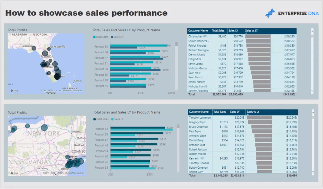
Here is a very good example of a great data visualization in Power BI.
We have so much insights in this dashboard. It’s just amazing how much insights you can have in just one dashboard.
Here I’m utilizing a range of DAX formulas to achieve this and visualizations as well.
There are so many ways that you can create visualization on basically any data set and when you combine all of these, you’ll create a really compelling dashboard.
This data set I’m using here is the one that I used a lot in my demos. It’s that of a retailer selling in the East coast of the US. In this example, we’re focusing on the Florida – New York region.
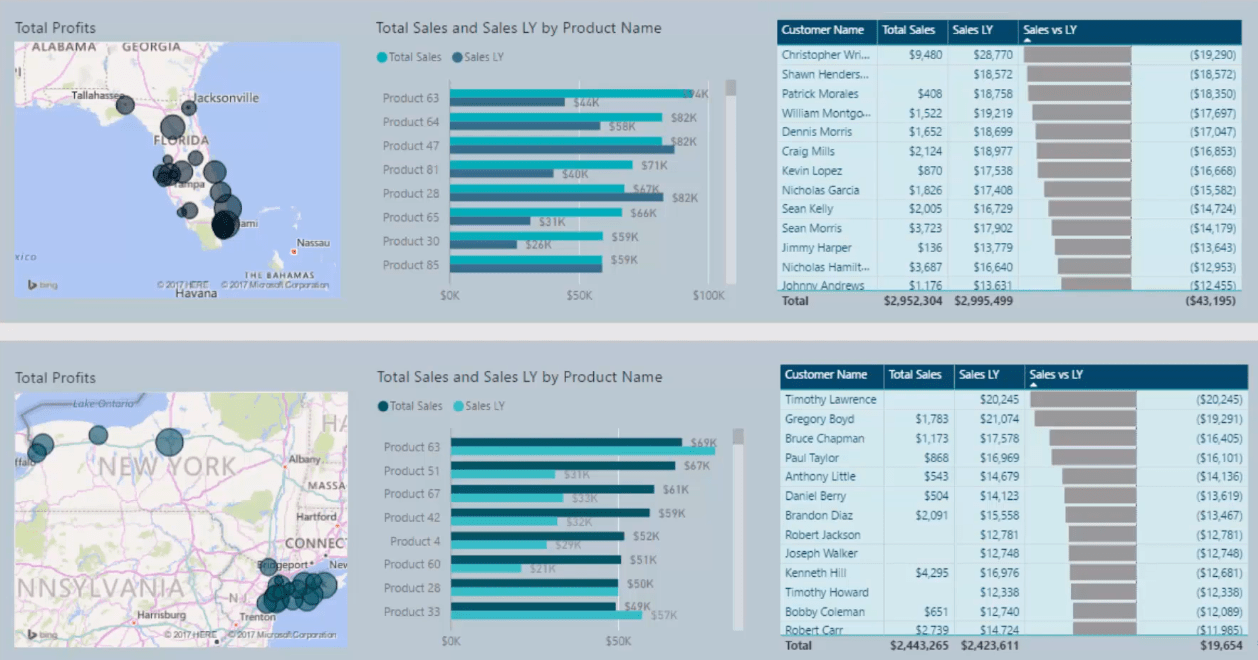
We’re looking at our sales this year versus our sales last year. This demo data set runs the end of 2017, so we’re comparing a total year 2017 to a total year in 2016, in this case.
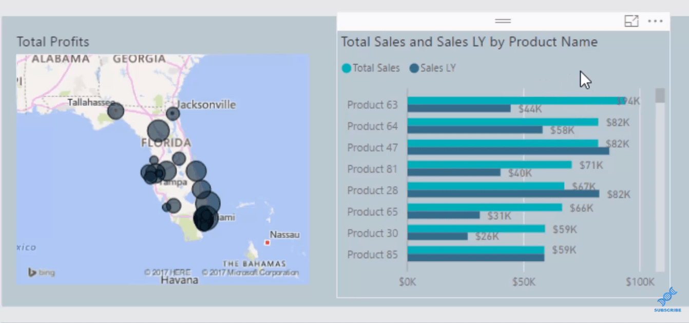
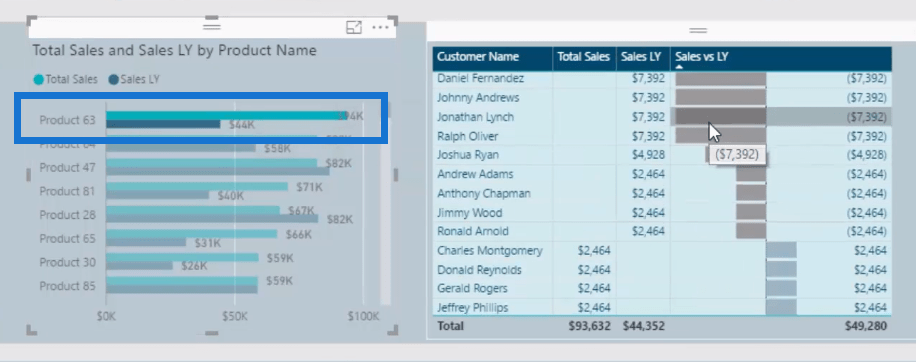
I’ve created a filter in the region, but I’m also comparing our sales this year and last year in one visualization, so we can quickly see our best sellers this year and what we sell last year.
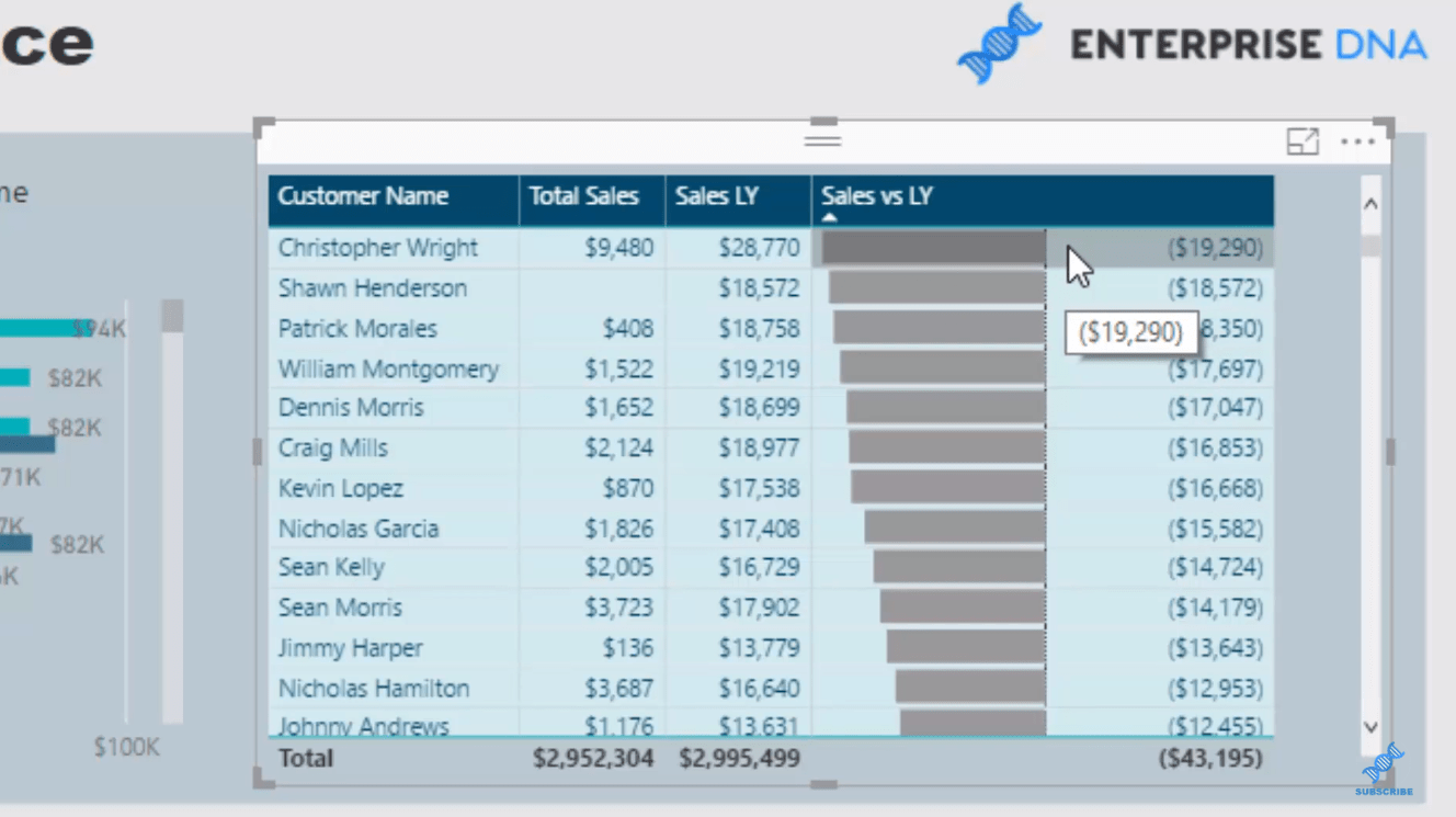
In this table, we have information per customer, so we’re actually looking at the performance of our customers this year versus last year.
And with the incredible data bars visualization inside these tables, we can see who are the worse-performing customers and who are the best.
We could also isolate a lot of things here. We could isolate the biggest difference in the sales last year, or why is that, or what did they buy last year not this year.
We could select inside that table and see where they purchased. In this case, we could see that they purchased product 15 and 17 this year, but purchased products 30, 61, 64, 84, and 86 last year.

We got to figure out why. We should be contacting those customers and giving them discounts or promotions.
We could also look at the product that sold well this year, but not last year. We can drill into that product, and see the customers who bought.
I’ve also divided this up into regions, so we could look at the entire region in our data set. However, we’re just focusing here on Florida and New York.
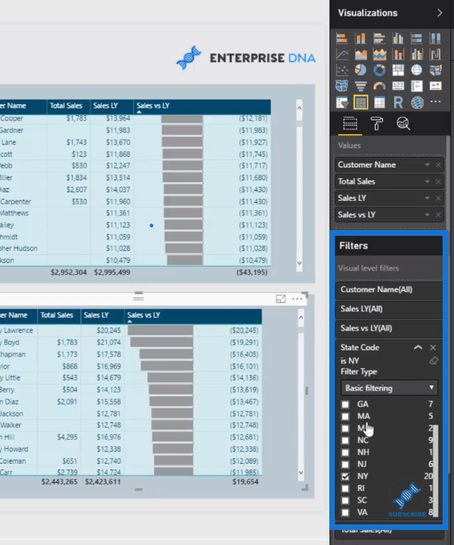
I have utilised some of the filters in the filter field on the right hand side here to just narrow it down each row here into specific region.
Creating The Formulas Needed
Now let’s create the formulas needed for to create this dashboard.
We already got our Total Sales, so we need to work out our Sales last year.

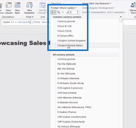
To do this, we can go New Measure, then let’s call this Sales LY. Inside our CALCULATE, we got our Total Sales, and use SAMEPERIODLASTYEAR as the filter.

Then, we make sure that it’s formatted correctly as USD.
How about we want to create the difference? We simply go Sales vs LY equals to Total Sales minus Sales LY (sales last year).

Creating The Visualizations
Once all the formulas are created, we can now utilize some of the visualization features to actually get these insights.
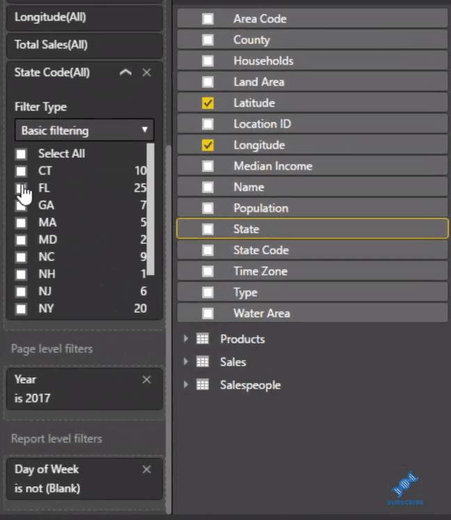
So we’re going to create 2 visualizations. First, we grab our latitude my longitude, and we go Total Sales.
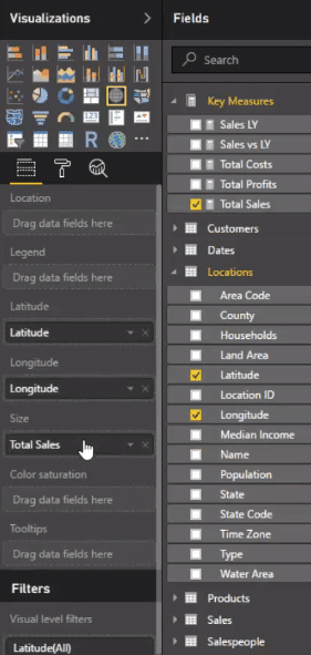
Then, we’ll place this filter (State) here and go Florida. This way, we only drill into Florida.
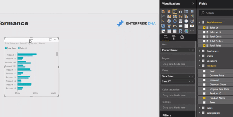
And then, we’ll make our Products table by grabbing our product name here and go Total Sales vs Sales LY. For this table, we will use the clustered bar chart.
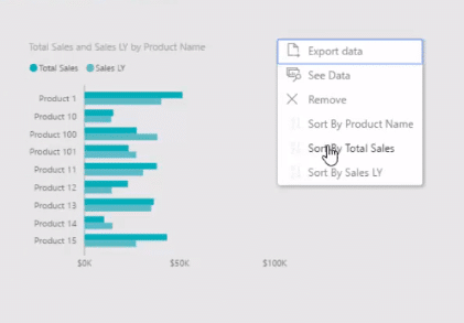
Again, we can filter by the State Code here as well and make sure this is filtered by Florida. We then filter Sort by this Year.
Lastly, we’re going to create a table for our customers. We grab our customer dimension and put it into a table with our Total Sales, Sales LY, and sales vs last year.
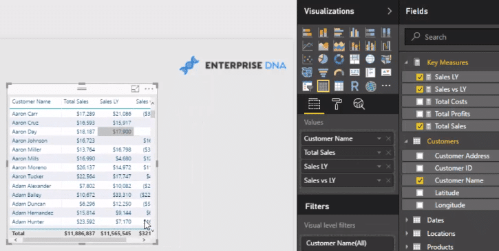
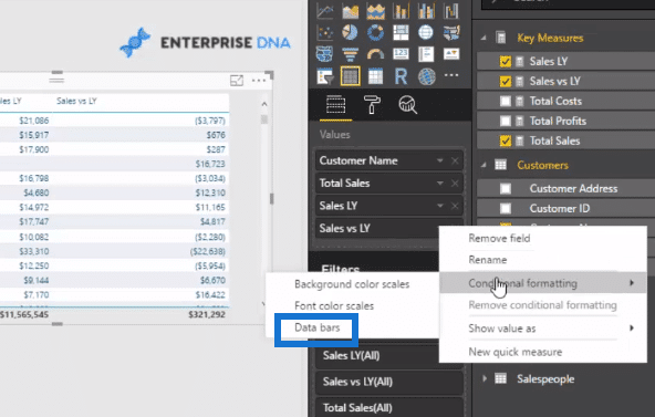
We also utilise these amazing data bars. We can actually have many measures inside our table, but only isolate one particular column or measure, and then put the data bars inside in there.
Click on the right side drop down arrow of Sales vs LY, and go Conditional Formatting, then Data Bars.
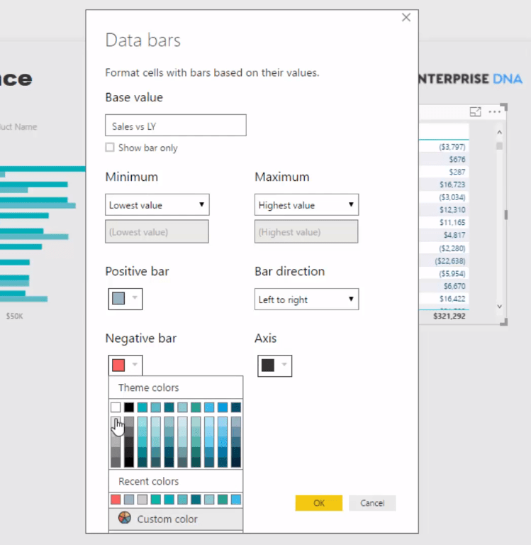
You can choose the color for your positive and negative. In this example, I used a very light grey for negative and light blue for positive.
To create the next layer down, we simply copy and paste, and then change the State Code. This is how you could save yourself a lot of time when you’re building these dashboards.
Let’s select New York and just do the same. You don’t need to create all these additional filters, etc. Just use the power of the data model.
As you are learning Power BI, remember that the data model is where the real power is especially when combined with the DAX formulas.
And now we got exactly what we want. We just need to make sure that the interactions really work and that they filter the correct way.
Editing the interactions is a little bit of manual work, but very doable, if you just think about the speed of what you can create with everything else in Power BI.
***** Related Links *****
How To Create Compelling Reports & Dashboards In Power BI
How To Control The Interactions Of Your Visuals In Power BI
Power BI Data Bars In Table Visualisations
Conclusion
We went through some data visualization techniques in Power BI that could help you make compelling sales report.
It’s just so amazing how quickly you can drill into any aspect of your data when it’s set up well. We can generate a lot of things; marketing events, promotional activity, etc.
You’ll be able to understand why you’re receiving certain results and gain a much greater understanding on what is actually happening in your organization with your sales, who’s making your sales, who you’re making your sales to, and where you’re making your sales.
In this tutorial, I just wanna show you how quickly you could get to these insights and utilizing all of the good features.
DAX is not all that you need to create compelling visualizations. You have a number of options available to you that can really showcase the insights that you may want in a variety of ways.
In the Dashboarding & Data Visualization Intensive course at Enterprise DNA Online, I cover end to end Power BI reports and development.
This is where I really showcase from a blank canvas how you can create some effective report designs and visualizations that will make consumers go “Wow”.
All of this information sits at your fingertips once you can implement these great techniques inside of Power BI.
Cheers,
Sam


