This tutorial will outline a few data segmentation techniques based on any measure that you can easily apply to your reports.
Data segmentation is a unique way of looking at your data. When you use this technique, you can easily break out your top and worst sales data.
Several courses and downloadable resources on segmentation are available in several Enterprise DNA content avenues like the Support Forum and Online Portal. You can easily format these resources to suit the data that you need to segment. These resources are available when you upgrade to a particular course or upgrade your membership.
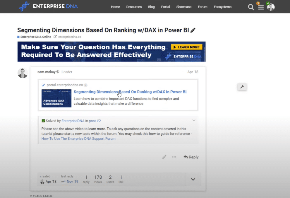
First of all, go to the Enterprise DNA Forum site. This is where you can ask a variety of questions about Power BI. You can also search all of the contents and courses that are available in the portal.
If you like to search for contents, click the How to Search for Content banner.

In the forum page, click the Enterprise DNA Online banner to view all the tutorials that are bundled into a variety of different courses.

If you want to search for something specific, for instance, segmentation, just enter any related work like “segment”. After that, you can see a lot of related courses and videos in the results.

For this tutorial, I’ll be using the Grouping and Segmenting w/ Dax file. But as I’ve mentioned, you need to upgrade your membership to actually access any resources.

As you can see, there’s still many other examples that are available. There are around 270 examples that you can use or enhance in some way. It just means there’s a lot of different data segmentation techniques that you can use.
Data Segmentation Techniques Example
After you have downloaded the report, you can view it inside the Power BI Desktop.
But before I start the tutorial, I just wanted to recommend trying these themes here which can really improve your page visually.

Now, let’s take a look at the Dynamic Grouping/Segmentation report. As you can see, I have set groupings for Low, Mid, and High. I also have a table where I set up the minimum and maximum values for segmenting.

In the Margin Group Profits by Group chart, you can see that the customers are grouped according to their margins.

You can also try something different and group the customers based on other numbers such as profits. To do that, just copy the formula, and then rearrange the parameters or inputs within it.

Another data segmentation techniques that you can apply is to group the customers based on their profits. You can also segment the stores based on their sales or segment the sales people by their performance over benchmark. You can easily apply these data segmentation techniques that I have mentioned by using similar patterns.
The first thing that you need to do is just create a table which indicates the groupings as well as the minimum/maximum values.
If you want to segment the customers or sales people based on their performance versus budgets, you might have a high percentage of budget versus average percentage over budget. Thus, it is important to specify the ranges and place for the groupings.
You can also work out the table that is generated based on the performance versus budget. If the budget amount is greater than or equal to a minimum and less than or equal to the maximum, it will be included in the group. The different sales people always go into one appropriate group of ranges.
Data Segmentation Technique Involving Dimensions and Ranking
There are still a lot of things that you can do in Power BI in terms of data segmentation because of its flexibility. For instance, you can jump back into the Enterprise DNA Forum and select another example like segmenting dimensions based on ranking.

If you click the respective link, you can view all the related videos and tutorials. The particular sample video below works best if you want to do segmenting based on ranking.

The sample below demonstrates a grouping based on where something is ranked versus an outright number like profits, revenues, or margins.

The said data segmentation technique brings a type of analysis that isn’t available by using the raw data. This technique runs the analysis deeper into the key insights.
Moreover, the example uses a different technique in itself. It groups the cities based on their ranking in terms of margin change.
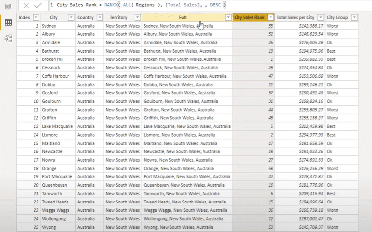
In the formula, I used the SWITCH function and made three segments for the city group.

If the region’s city sales rank is greater than 35 then it’s under the Worst group. If it’s greater than 10 then it’s under the Okay group. Lastly, if the region’s city sales rank is less than equal to 10, it’s under the Best group.
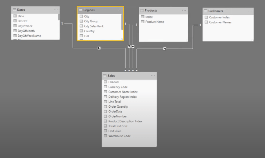
Take a quick look at the location of the Regions table inside the lookup table of the model.

As you can see in the columns inside the table itself, I created a ranking based on the sales for all the different regions and cities. You can see the data for that under the City Sales Rank column.

Additionally, I referenced the Regions table to get the Total Sales per City column. That’s how I got the grouping values under the City Group column. Lastly, I set up the visualization to easily see the data segmentation based on the particular measures.
***** Related Links *****
Customer Segmentation Techniques Using The Data Model – Power BI & DAX
Dynamic Segmentation: How To Segment Customers Into Groups Using Advanced DAX
Power BI Customer Segmentation: Showcasing Group Movement Through Time
Conclusion
Hopefully, just by seeing those two examples, you can see the numerous ways you can group your data. You can utilize a lot of great resources that are available in Enterprise DNA Online and through the different content avenues on the website, particularly the forum. Enterprise DNA Forum has become the central piece of how members interact with us.
Please like the video if you have liked and learnt some good ideas from this tutorial. I hope you also look forward to more content coming your way very soon.
Sam


