When doing an analysis on our model, we might want to find an insight that’s unrelated to anything within our tables. That’s where the concept of using supporting tables for Power BI data modeling comes in.
Supporting tables don’t have any relationship with our tables, but we can use them to support the visualizations in our reports.
Sample Scenario For Data Modeling In Power BI
For this example, we’ll create a supporting table for our Customers table. We can overlay that supporting table with information. Then run DAX logic to create visualizations that are not possible with what we currently have on our Customers table.
On our Report view, we have a visualization that shows the total transactions of each customer. For this example, the highest transaction from a customer is 33.
Then the lowest is 8.
For instance, we want to create a visualization that shows the frequency of our customers based on their transactions. It’s a visualization that shows the total sales of our high, mid-range, and low frequency customers which doesn’t exist anywhere on our model. What we can do is to create a table that will contain those frequencies, so we can run logic through it.
Creating A Supporting Table For Data Modeling In Power BI
There are different ways to create a table. For this example, let’s use the Enter Data option within the Home tab.
Let’s name this table as “Purchase Frequency”. Then set the first column as Frequency Group and add the frequency values as High, Ok, and Low. Add the Min and Max columns as well. In our current table, we’re saying that our high-frequency customers should have at least 25 – 40 transactions. The medium-frequency customers should have 15–25 transactions, and the low-frequency customers are the ones with only 0–15 transactions.
On the Relationship view, we’ll position our added Purchase Frequency table on the right side. This is because the Purchase Frequency table is a supporting table. The columns that are created on this table don’t have any relationship to any tables on our data model. We’ll only use this to run DAX logic to support the visualizations we want to create on our reports.
Creating Measure Tables For Power BI Data Modeling
Aside from the Purchase Frequency table, let’s also create another table using the Enter Data option. Let’s name it Dynamic Grouping. We’ll then create a measure inside this table.
Rename the measure as Sales by Frequency Group table. You can learn more about creating measure tables via this link.
For our measure, we’ll use a DAX code that’s quite complicated. This measure calculates the total sales of each of the customers inside the Customers table. It identifies if their total transactions are within the MIN and MAX value of the Purchase Frequency table, which is the supporting table that we created.
The key thing here is that the Purchase Frequency table doesn’t have any relationship on our Customers table or any other tables. However, by creating a logic using a measure and DAX code, we can now use it to support or create a visualization with our other tables.
Creating Custom Visualizations In Power BI
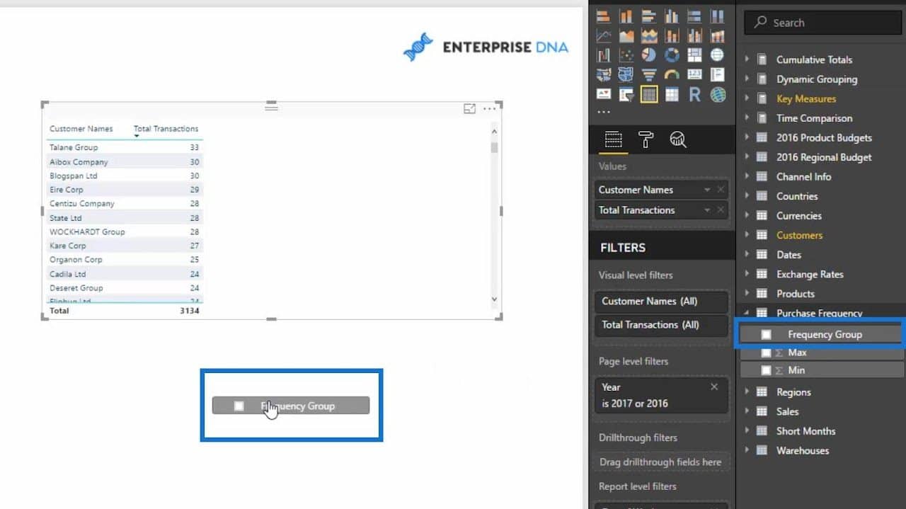
To create the visualization that we want, we just need to drag the Frequency Group column of our Dynamic Grouping table on our canvas.
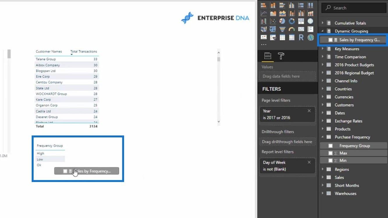
Then, we’ll drag our Sales by Frequency Group measure to our Frequency Group on the canvas.
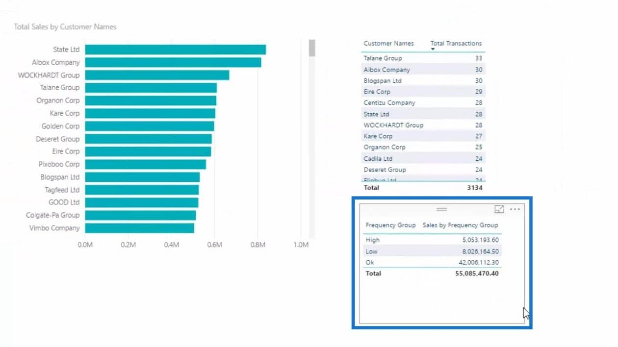
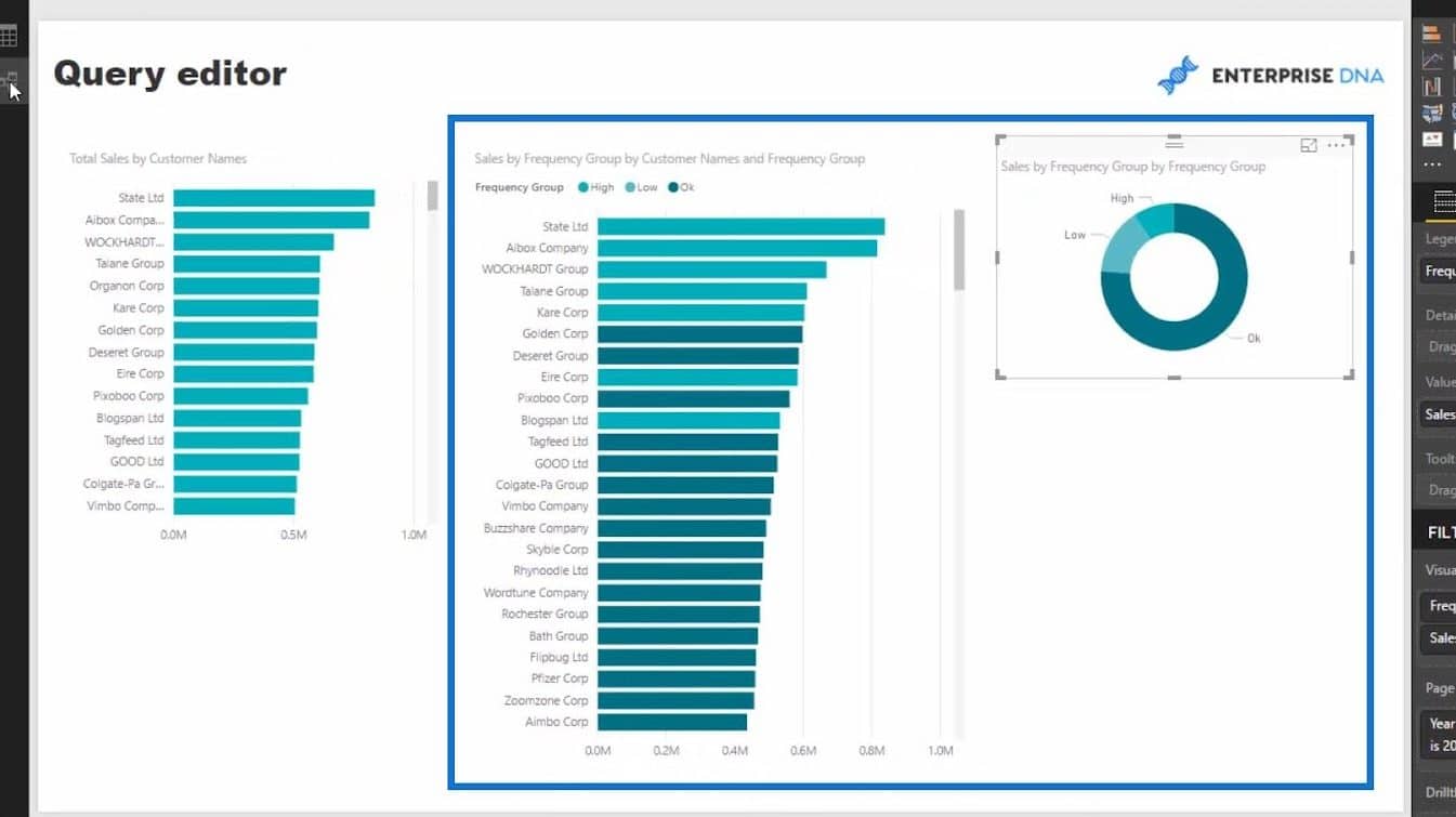
As a result, we now have a visualization that shows us the customer’s total sales from the high, low, and medium-range (Ok) frequencies.
After that, we can turn this into a doughnut chart visualization. Then, we’ll see that based on the logic we created with our supporting table, most of our customers are within the mid-range (Ok) frequency.
That makes sense because if we check the total transactions of our customers, most of them have around 20-21 transactions.
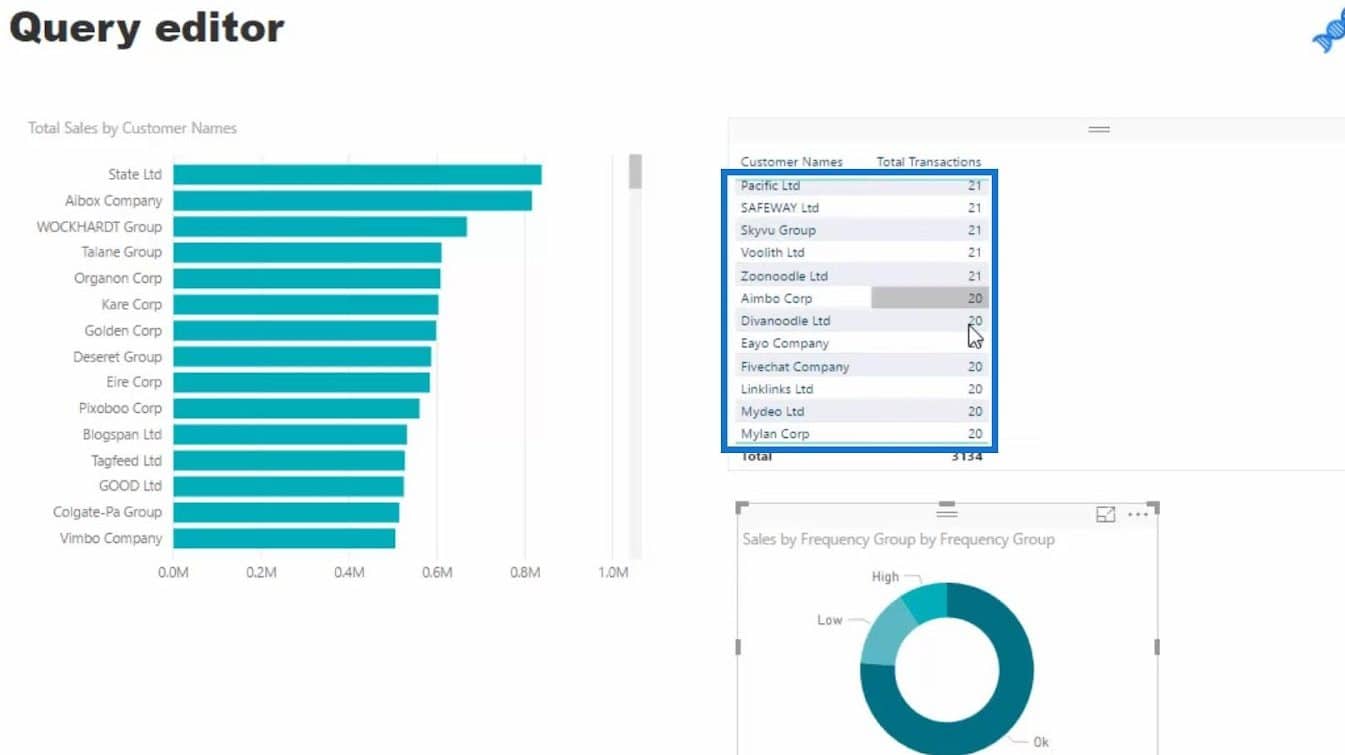
That’s within mid-range 15-25 (Ok) frequency based on our supporting table (Frequency Group).
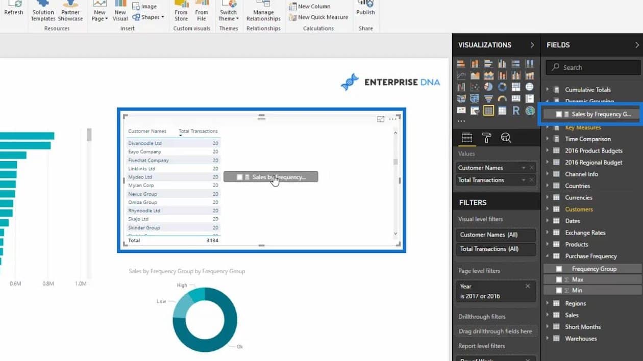
We can also create another visualization by dragging the measure (Sales by Frequency Group) inside our Customer Names visualization…
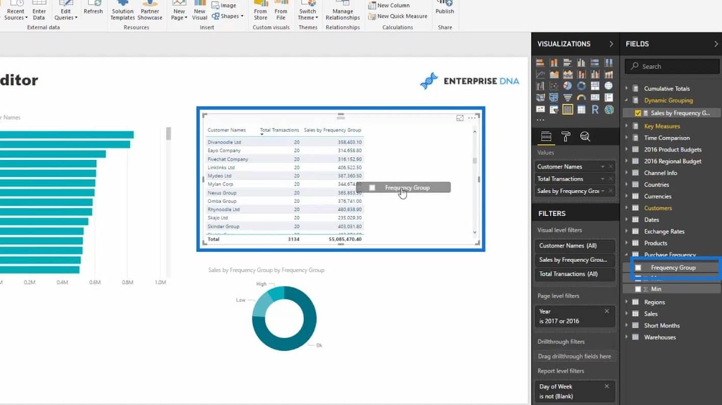
… and the Frequency Group column from our supporting table (Purchase Frequency).
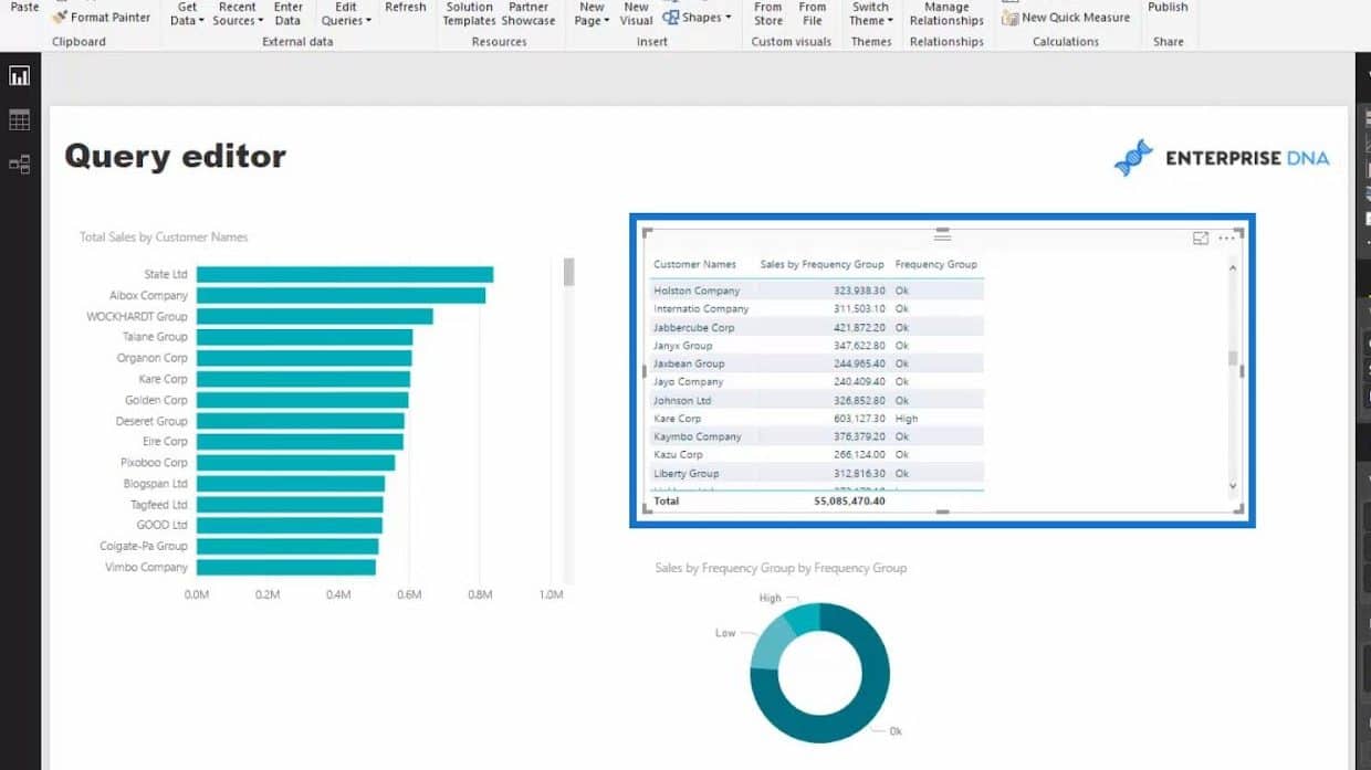
As a result, the visualization now displays the name of the customers, their total sales, and their transaction frequency.
We can then convert this visualization to a Bar chart if we want to.
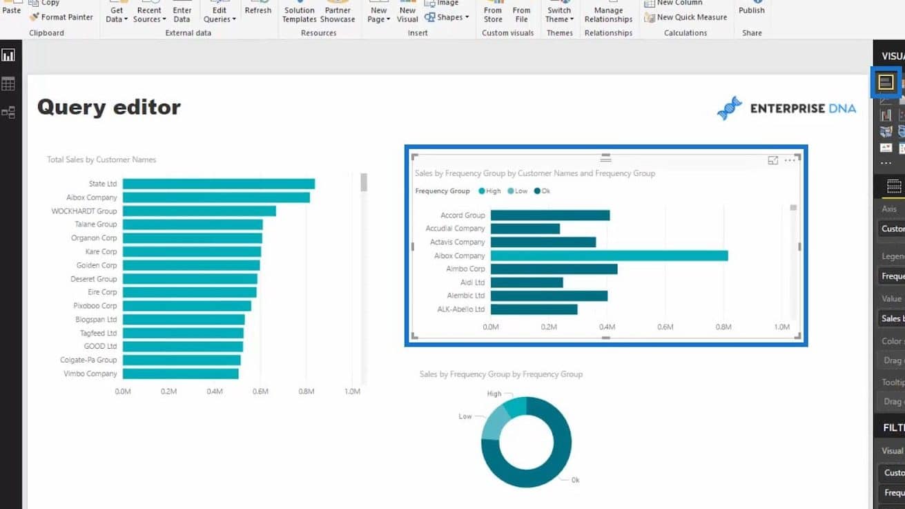
Finally, we have these visualizations for Sales by Frequency Group by Customer Names and Frequency Group, and Sales by Frequency Group by Frequency Group.
***** Related Links *****
Power BI Advanced Analytics: Secondary Table Logic Techniques
Tables In Power BI: Types & Distinctions
Power Query Table: How To Dynamically Merge Columns
Conclusion
In summary, we were able to create a supporting table and use it for data modeling in Power BI. These are some powerful techniques that we can achieve when using supporting tables.
Now, think about how we can expand the logic here. In this case, we isolated transactions but we can also do this to other calculations for a group of people in sales, margins, growth, and many more.
I hope that you were able to see the logic and importance of using supporting tables. Again, they’re purely used to support the logic and the visualization we want to create and we can use them in various ways. With this, you can add fantastic analytical techniques into your own models.
All the best,
Sam


