This tutorial will show you the first step for the deep dive development of a customer dashboard in Power BI. The key thing that you should focus on in this example is incorporating DAX calculations and visualizations.
Setting Up The Data Model
For this example, start on the data model. Without your model, your report pages or DAX won’t work.
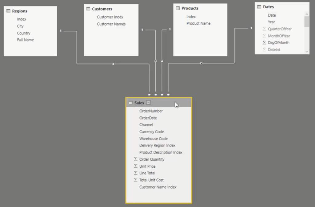
Follow the best practice technique in terms of setting the model. Place your Lookup Tables at the top, and your Fact Tables down the bottom. Then, make relationships between the filters inside the Lookup Table and the Fact Table.
First, grab Date in Dates and put it the Order Date below. Next, grab Index in Products then place it into Product Description Index. In Customers, get the Customer Index and put it in Customer Name Index. Lastly, for the Regions, get Index and place it to Delivery Region Index.
Whenever you’re developing reports, try to get your data model to look like this.
Adding In The Key Measures
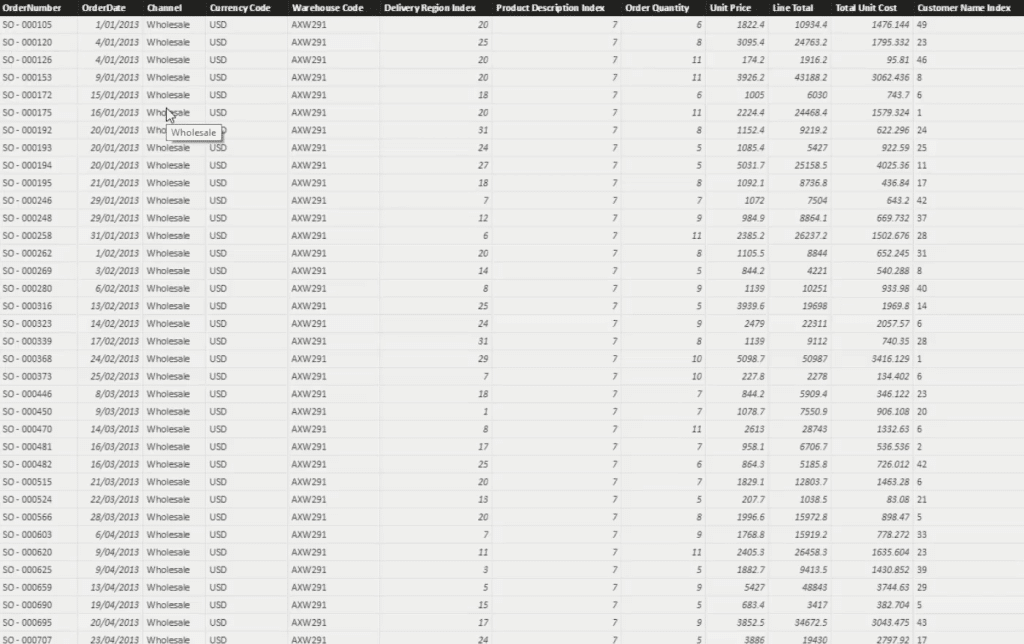
Next, you need to do calculations from this table to put them inside your visualizations.
First of all, create a title for the dashboard and call it Customer Deep Dive.
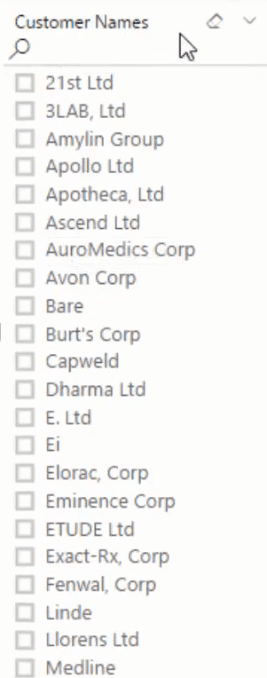
Now, focus on your customers. You have to know what’s going on with them. To start off, create the filters that you need to slice and dice your database. Grab Customer Name from the dashboard and turn it into a slicer. You have many customers in the list, so put in a search bar so you can look up customers easily.
Next, in your Dates table, grab Year and turn it into a slicer. Then, make the visualization horizontal and erase the header. Change the background color to make it stand out. After that, copy that slicer and change the value to Quarter.

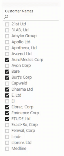
Disable the Single Selection in the Quarter and Customer Name slicers to select multiple quarters and names.

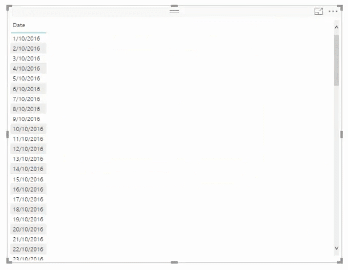
Next, grab the Date column into the canvas and then turn it into a table. Click the drop down arrow and select Date to get rid of the hierarchy.
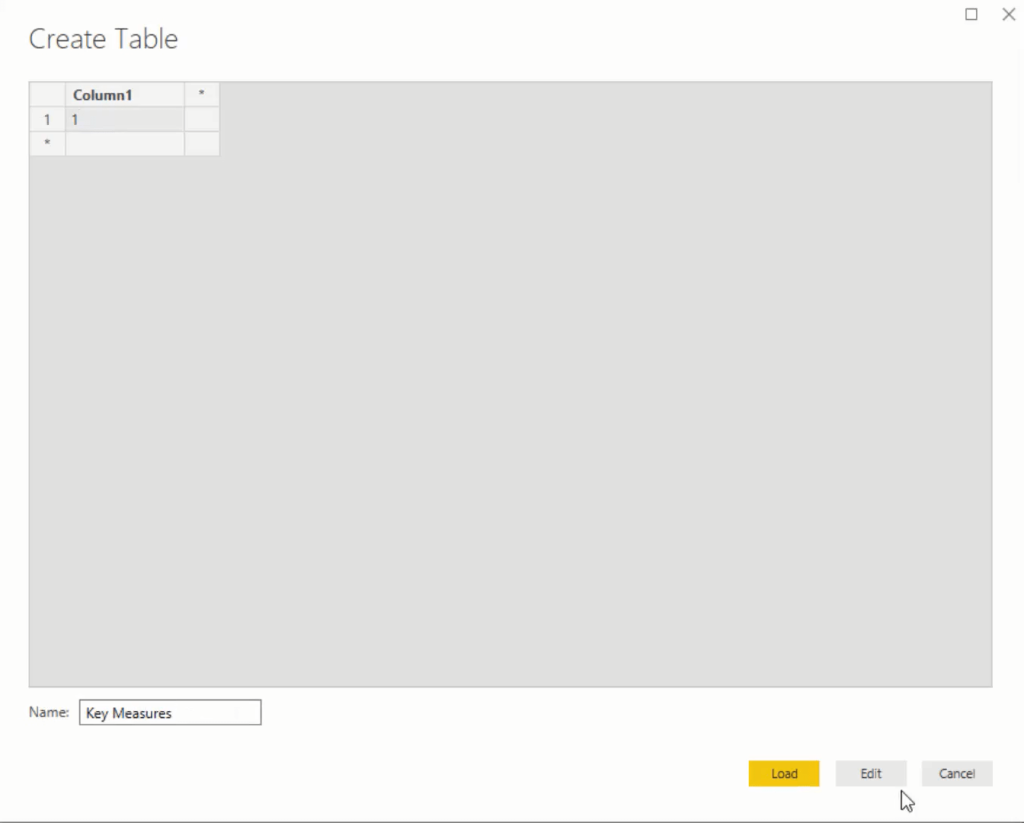
At this point, you’re going to start making measures and writing formulas. You need to create a measure table to catalog and sort them. Go to Enter Data, input 1, and then name it Key Measures.
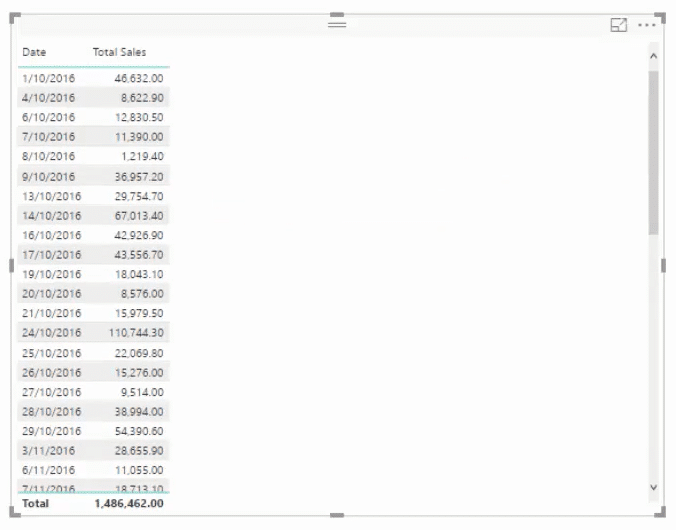
The first measure is for Total Sales. Go to New Measure, call it Total Sales, and then get the SUM of the Revenue column.

Place the Total Sales table into the table in the canvas. You will then have your total sales per day.
Next, create another one for total costs.
If you go to your Sales Table, you’ll see that you have Order Quantity, Unit Price, and Line Total/Revenue columns, but no Total Costs. Because of that, you have to use the SUMX function to generate total costs information.
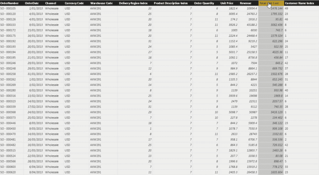
So, create a measure and call it Total Costs. Use SUMX, input Sales, and then for every single quantity multiply it by the total unit cost. This calculates the total cost of every single row; SUMX then adds them all up.

After that, bring Total Costs into the table. You now have your total costs per day.
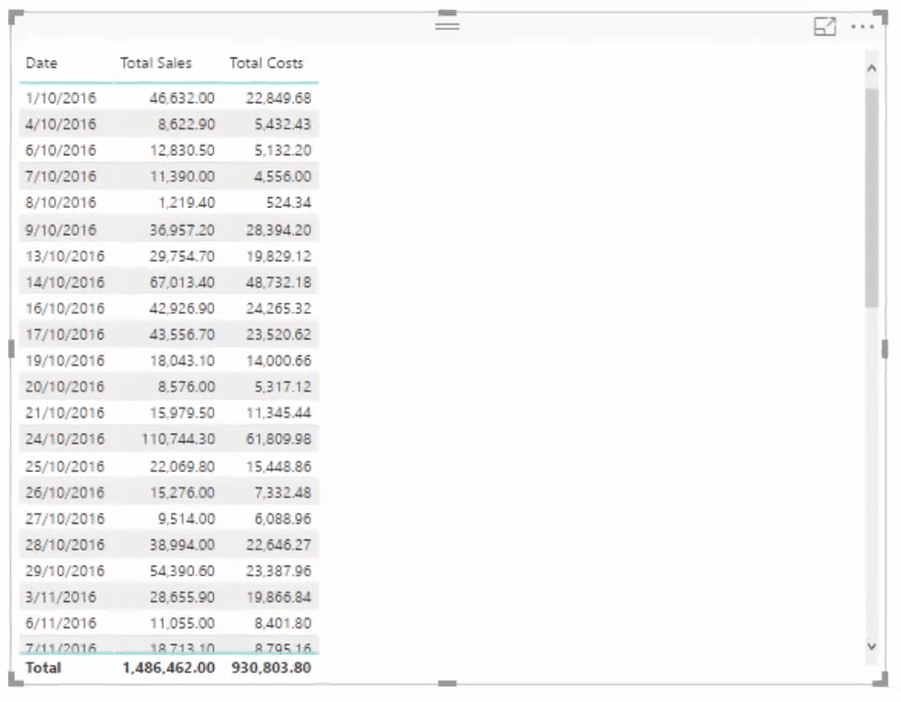
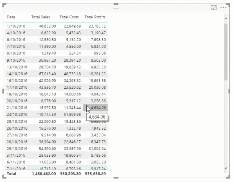
Create another measure for the total profits. The formula needs to subtract the Total Costs to the Total Sales.

Bring that measure into the table and you’ll then have your total profits per day.
Conclusion
Whenever you create dashboards in Power BI, it’s recommended to make sure that the logic is correct and the results you’re getting are right.
The results change based on the context you have. So, your results should be correct based on what you select inside your table or report page.
All the best,
Sam
***** Related Links *****
Creating Compelling Power BI Dashboards With High Quality Insights
Using Filter Fields & Visual Interactions To Create Compelling Visualizations In Power BI
Showcasing Customer Insights Through Reports In Power BI
***** Related Course Modules *****
Dashboarding & Data Visualization Intensive
Financial Reporting With Power BI
Data Visualization Tips
***** Related Support Forum Posts *****
Power BI Challenge 2 – Customer Insight
Advise On Real-time Dashboard
Measure To Exclude Certain Values From Slicer
For more customer dashboard queries to review see here….


