The ggplot2 package is the most comprehensive way of building graphs and plots. Firms, like the New York Times and The Economist, are heavily using ggplot2 to create their visualizations. With big companies using this tool, it’s important to have a knowledge base on how to use ggplot2 to create visualizations such as the jitter plot.
In this tutorial, you’ll learn how to create a jitter plot using ggplot2 in RStudio. Once you understand the grammar of graphics in ggplot2, you’ll be able to string together any graph or plot.
A jitterplot is a type of scatter plot used to display the distribution of a set of numerical data points. The “jitter” in the plot’s name refers to the random variation that is added to the position of each symbol along the x- and y-axes.

This variation helps prevent symbols from overlapping and makes it easier to see the distribution of data points in cases there is high density of points in certain areas of the plot.
If you have a densely populated plot, a jitterplot can make your visualization easier to understand. You can also use it to plot distributions by category, which is an alternative to a box plot or a histogram.
Creating A Jitter Plot In R
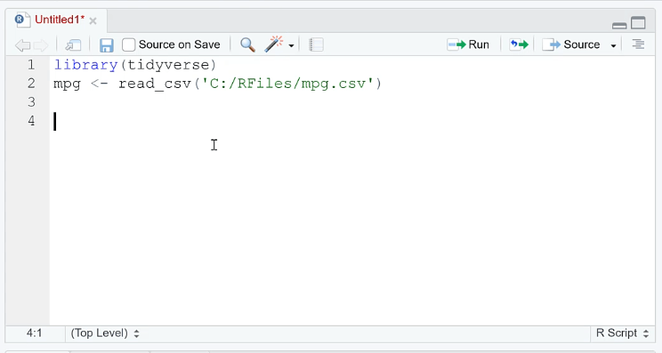
For this demonstration, the tidyverse dataset is used.
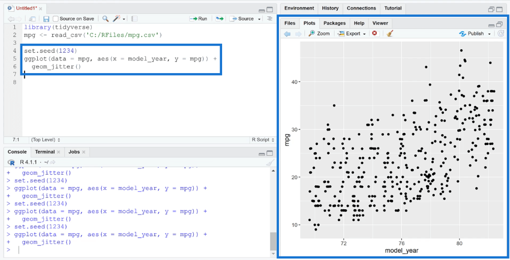
First, create a scatter plot using the ggplot ( ) function. In this case, the x-axis is the year while the y-axis is the mpg dataset.
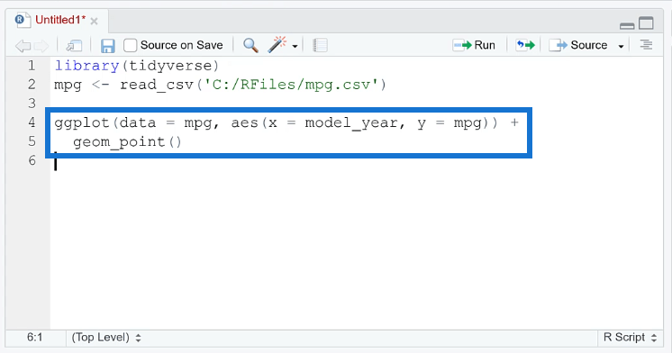
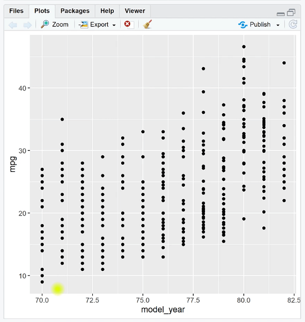
When you run the code, you can see that the plot shows points forming a straight line with respect to the y-axis.
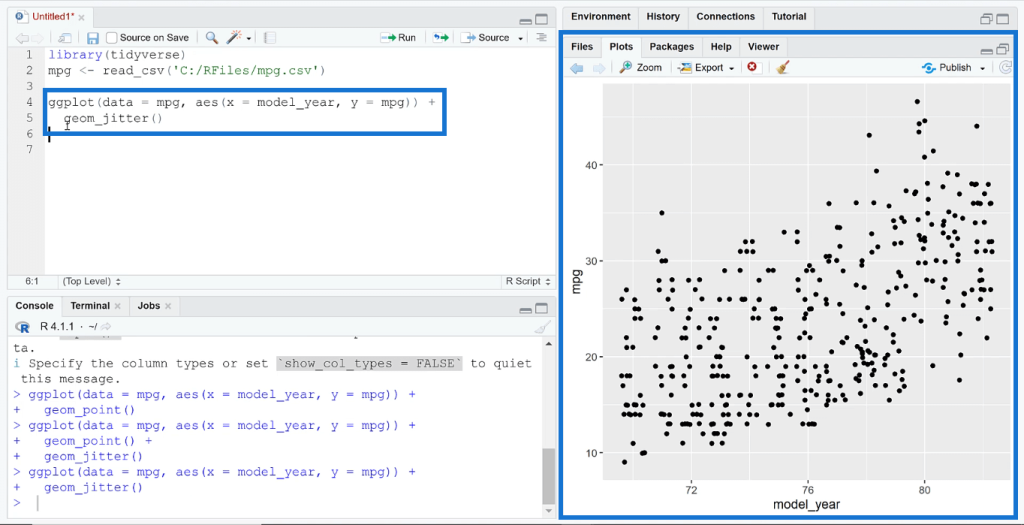
Use the geom_jitter ( ) function to add another layer to the graph. When you run the code, you’ll see that the points in the plot shifted. The points will continue to shift every time you run the code.

To stop the points from constantly shifting, use the set.seed ( ) function. Inside the parenthesis, type in any random number. In this case, it’s 1234. After you run the code, you’ll see that the plot remains the same even if you repeatedly click Run.
Creating A Jitter Plot With Categorical Variables
You can also use the geom_jitter ( ) function for categorical variables.
Using the same argument, let’s change the x-axis to mpg and the y-axis to origin. When you run the new line of code, you can see that instead of showing the data in straight lines, they’re randomly distributed in the plot.
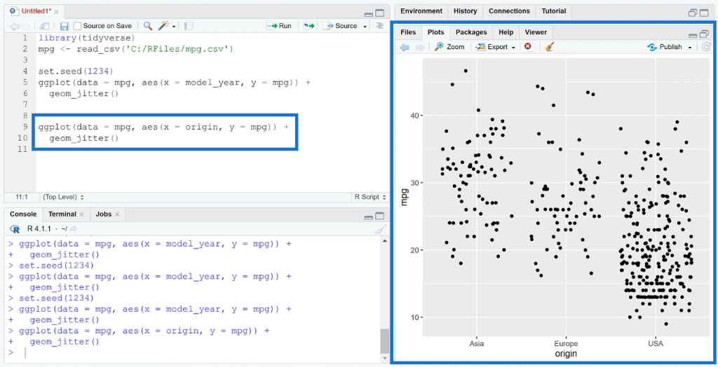
This helps you visualize the individual observations for each category and how they vary. In this case, you can see the typical mileage of one origin versus another.
You can add color to the plot by adding another argument in the aes ( ) function. You can also set the size of the points to a specific data value in your dataset.
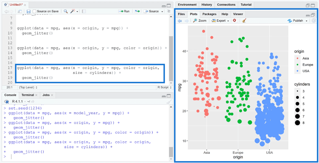
In this example, the jitter plot made it easier to identify the origins with the most cars and those that have better mileage.
Because of the size set in the code, the plot looks oversaturated. You can change the size or color of the data points depending on your preference or business requirements.
***** Related Links *****
RStudio Help: Ways To Troubleshoot R Problems
How To Perform A t-test In RStudio
Create A Histogram Using The R Visual In Power BI
Conclusion
A jitter plot is one of the ways to bring a new form of insight in your visualizations. It helps users to better understand what’s happening with in data. This plot is a great alternative to the typical histogram or box plot for plotting distributions.
The ability to effectively understand the underlying structure of a dataset makes jitter plots a valuable tool in various fields such as statistics, data analysis, and machine learning. Overall, jitter plots provide a clear and easy-to-understand representation of the distribution of numerical data points, making it a powerful tool for data visualization and analysis.
All the best,
George Mount