For today’s blog, I want to walk through a couple of amazing reports and share some of the tips I have around how to work out and create Power BI reports like these. You can watch the full video of this tutorial at the bottom of this blog.
The reports that I will review have so many features added into them and have visualization experiences created in such a unique way that sometimes it’s not immediately obvious how these features are created. I will try to break it down and demonstrate how you can use these in your own reports. Think about how you can leverage these reports, learn the techniques, and showcase them in your own designs.
Create Power BI Reports With Tooltips & Navigations Techniques
The first thing that I would do is look at the report pages. If you want to learn from superior reports like this, you have to understand how the overall architecture of the report is completed.
You could always go to the model first and see how it is structured, but when you’re mostly trying to benchmark on the visualization and navigation ideas, check out how the pages are made. Notice that the pages are hidden to create a seamless, application-like report.
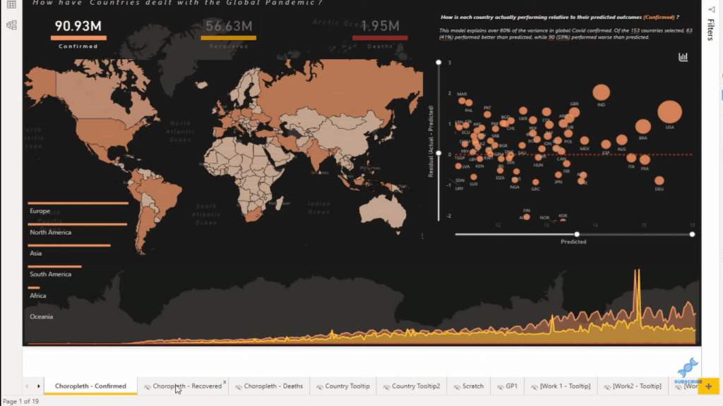
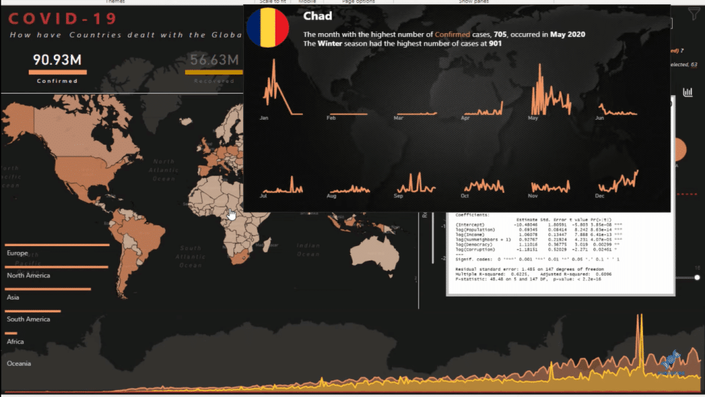
Another thing that you need to look into is the tooltips. You need to understand how they are created and what insights are being shown within the tooltips. Click through the report and understand how the tooltips were created and how the visualizations were built.
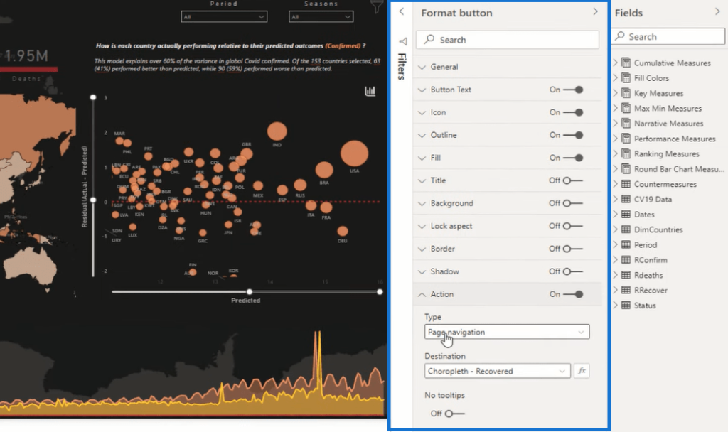
Click on a visual, and then in the formatting area, you’ll find all the options for that particular visualization. You’ll be able to see what format or action has been placed on the visual, how things are appearing, etc.
Create Power BI Reports With Bookmarks
The next thing that I would recommend is to look at the bookmarks. Bookmarks enable a lot of great navigation features. And you’ll see that there’s a range of different bookmarks embedded into this report. If you click through these bookmarks, you’ll be able to see what they’re doing.
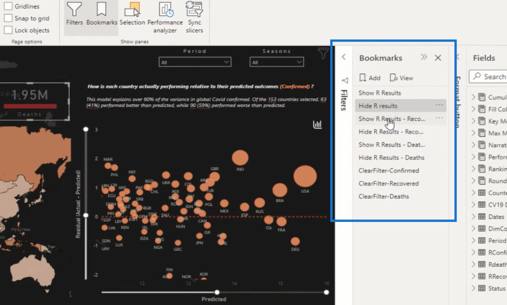
Understanding how all these bookmarks actually work gives you immense flexibility around how you shape the story in your report.
Another key thing to look at is the Selection pane. As you can see here, we have all the different elements on a report page and when different bookmarks are selected, these will all change.
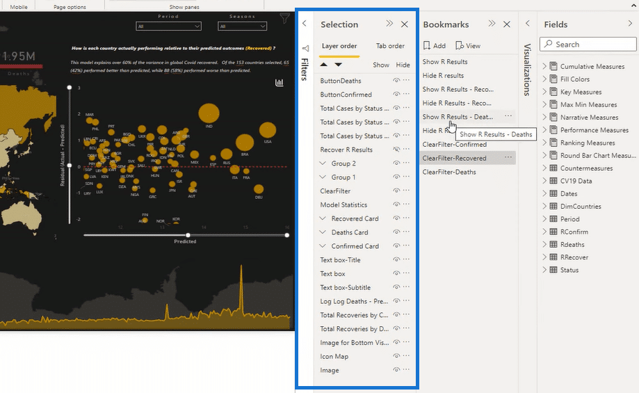
It’s just a matter of understanding how these elements interact together. And that’s how you can create so many different looks and fields for your reporting applications.
Here’s another example of a great design for a Power BI report. Here’s another great design of a Power BI report. It has a neat layout with all the data around emergency services. The pages embedded within this report are hidden as well to give us that application-like navigation experience.
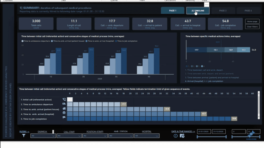
It utilizes a button or shape wherein when you click on it, it will take you to a different page. The report offers a lot of insights using filters, tooltips, and bookmarks as well.
***** Related Links *****
Power BI Design Tips: Creating Application-Like Reports
High-Quality Power BI Report Navigation Experience
Drillthrough In Power BI: Functionality And Usage
Conclusion
Going through a great Power BI report and dissecting the pages is how you can really understand and learn how it was built. That’s how you’re going to improve your own abilities. Hopefully, you’re excited by what you’ve seen. I recommend that you implement them in your own work.
I encourage you to watch the full video of this tutorial below to see the details of the reports that I have highlighted in this blog. Check out the links below as well for more related content.
Cheers!
Sam


