In this tutorial, I show you how you can create totally dynamic Power BI reports, using the measuring branching technique and the power of DAX. You may watch the full video of this tutorial at the bottom of this blog.
When I say dynamic, I mean that you may want to highlight one particular insight across all your visualizations on your report page, but then you might want to be able to select a different metric to highlight all your results on your report page.
The idea is that you can click and all your visuals in your report page will automatically change the calculated measure. For example, total sales, total cost, and total profits. You can click through all of these and then see the entire report update for that one particular metric or that one particular calculation.
You can then slice and dice it using all of the different filters and the visualizations that are available to us in Power BI as well.
The data and dashboard I’m using in this demonstration was from a workshop that I did about visualization techniques as part of the Enterprise DNA Webinar Series.
Let’s dive into it and check out how I made this report dynamic.
Sample Dynamic Power BI Report
In this Power BI report, we have the Shape Map, the graphs, the donut charts, and the bar charts. I have dynamically integrated different metrics into all of these visualizations and the core of what I want to demonstrate in this tutorial.

On the upper right corner of the dashboard, we have Select An Analysis Metric, so we can click on any of these three metrics – Revenue, Costs, and Profits.
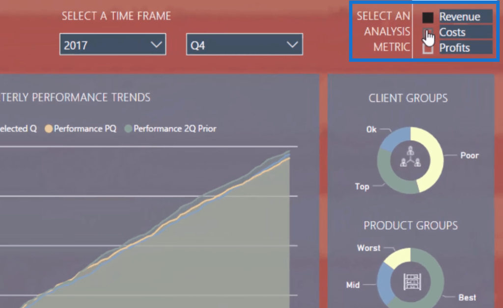
If we click on Profits, for instance, all the visualizations will dynamically change, showing all results related to profits.
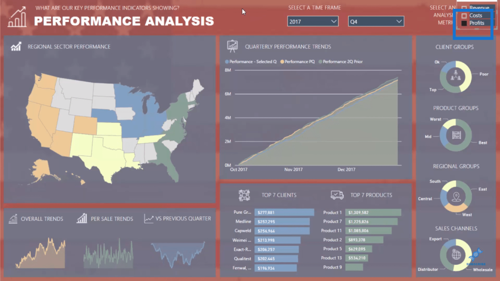
Power BI makes it possible for us to create extremely efficient dynamic reports like this.
Compare this with the amount of time and work we need to put in when creating a static PowerPoint presentation, wherein we have to create a lot of pages to show everything. With Power BI, we can show all of this data within the same visualizations to highlight different metrics.
It’s a really effective way to consolidate information. Power BI simply takes the dynamic report technique to a new level.
Techniques To Create Dynamic Reports In Power BI
The key thing to understand here is Measure Branching, which is a technique that I talk about quite often in my tutorials. It’s the fastest way to create these advanced reports in Power BI.
First of all, in measure branching, we need to create our core measures, such as Sales, Costs, and Profits. Then, we branch out into this one master measure, which enables us to select any of those metrics we set. We need to integrate these core measures into the metric selections that we make.
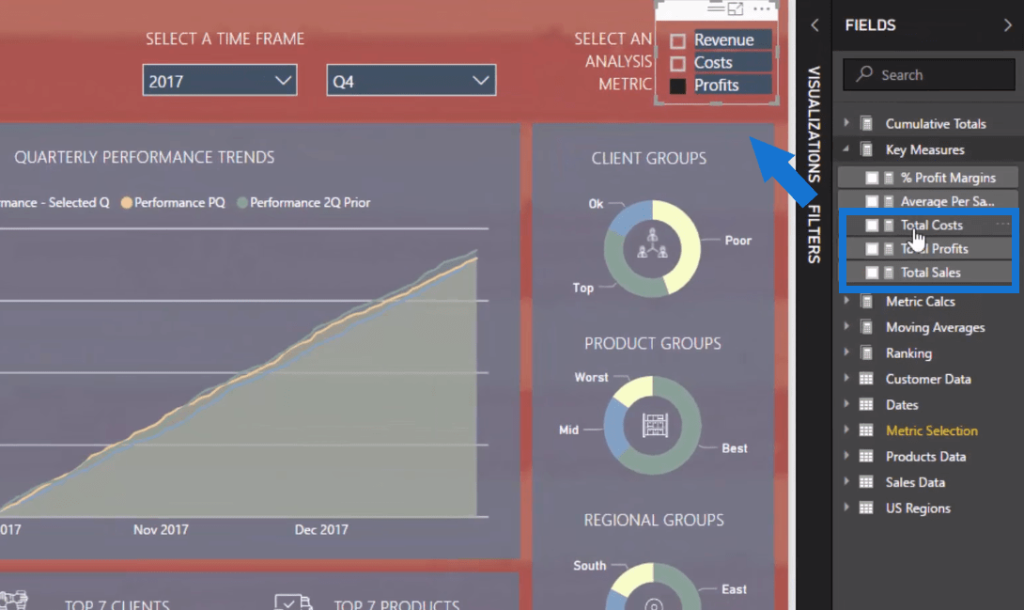
But before we jump into measure branching, we need to create a table with those metrics because we’ll have to create a slicer. This table doesn’t exist in the data, so I created it here.
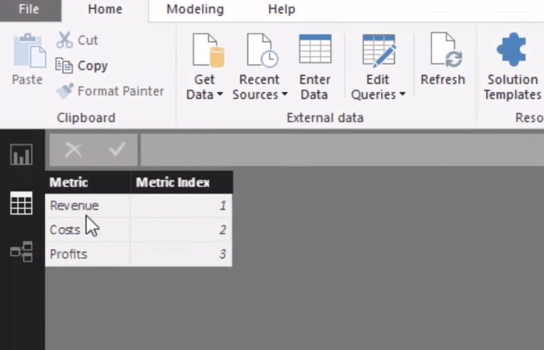
And then we need to create a formula that picks up whichever metric we choose to showcase in the report. The formula uses the SELECTEDVALUE function, and then the metrics. In this case, it’s Revenue.
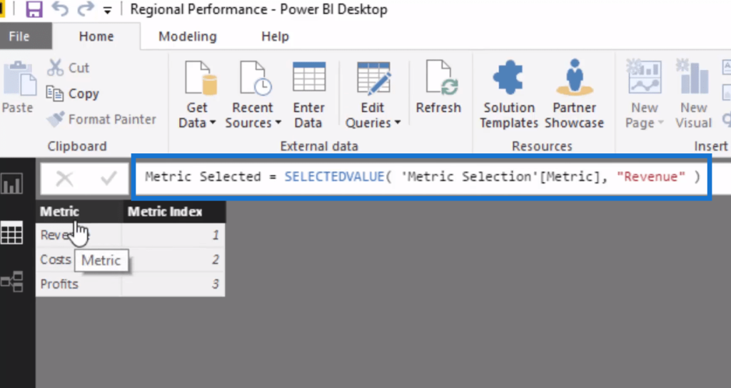
We can then branch out into our master measure and other key calculations.
Measure Branching To Create Dynamic Reports
The master measure is this formula I call Selected Metric, which uses the SWITCH TRUE logic. We then feed this master measure into all of the other different branches of calculations.

So if Revenue is selected, it will showcase Total Sales, Total Costs for Costs, and Total Profits for Profits. The SWITCH TRUE logic is great for this calculation and it’s an effective way of structuring this kind of formula.
Now that we have this master measure, we can branch out into these other other calculations, starting with the Performance – Selected Q. In this formula, we use the CALCULATE function with our master measure.

This is the same pattern when we write a cumulative total formula, but we have incorporated Selected Metric here instead versus our core measures.
We can also branch out to time intelligence, such as in this formula Selected Metric LY (last year) and then feed it to another calculation.

We do the same with our ranking formula,

and the rest of the formulas here.
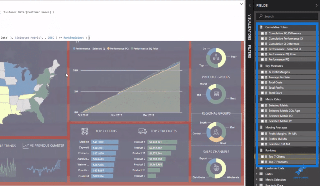
And that’s how we create an entirely dynamic Power BI report based on metrics that you might select. This is seriously an amazing visualization technique.
***** Related Links *****
Creating Multi Threaded Dynamic Visuals – Advanced Power BI Technique
Data Visualization Technique in Power BI – Multi Measure Dynamic Visuals
The Importance Of Creating Compelling Power BI Visualizations
Conclusion
This is a really powerful technique that just requires a couple of steps to organize inside your data model and with your DAX measures. It will enable you to create some compelling report pages that will impress those consuming your data.
When we’re running an analysis inside Power BI, we have to think of the end consumer – how they’re going to feel and how they’re going to look at our report page.
This technique is certainly a great one to utilize to get that engagement from your consumers, which is absolutely key to the success of your reporting and development projects inside Power BI.
All the best!
Sam
***** Learning Power BI? *****
FREE COURSE – Ultimate Beginners Guide To Power BI
FREE COURSE – Ultimate Beginners Guide To DAX
FREE – 60 Page DAX Reference Guide Download
FREE – Power BI Resources
Enterprise DNA Membership
Enterprise DNA Online
Enterprise DNA Events
[youtube https://www.youtube.com/watch?v=cgPnnPBwAqQ?rel=0&w=784&h=441]


