For today’s post, I want us to step back from what we’re doing in Power BI and just think more holistically about what we can achieve through analytical scenarios that we might be dealing with in the future. In today’s example, I will do a marketing dashboard review of an advertising campaign and look at some of the nuances on what this data looks like and how you can analyze it in Power BI. You may watch the full video of this tutorial at the bottom of this blog.
The example is actually a part of the Enterprise DNA Showcase. If you go to our Showcase page, you will see a variety of examples of high-quality development in a whole range of industries and scenarios.
For today, let’s focus on Advertising Campaigns.
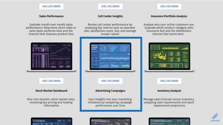
Every business does marketing. It’s a crucial part of any business and it is the key to getting sales and revenues. You need to see how your marketing strategies are performing over time, and that’s what this dashboard is all about.
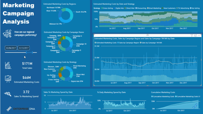
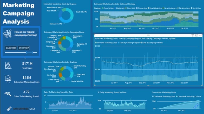
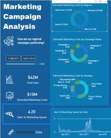
We can look at historical data and determine how we’ve performed historically on the campaigns that we are currently running (highlighted by the blue box).
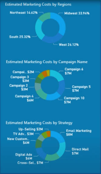
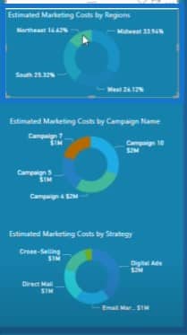
We’ve been able to break down our advertising campaigns over time based on Region, Campaign Name, and Strategy.
On the upper right corner, you’ll see how we’ve distributed our marketing spend across different strategies.

If you click on that chart, you’ll see all the different strategies implemented over time like Cross-Selling, Digital Ads, etc.
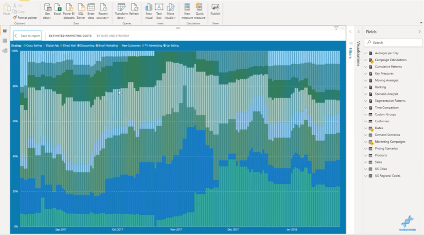
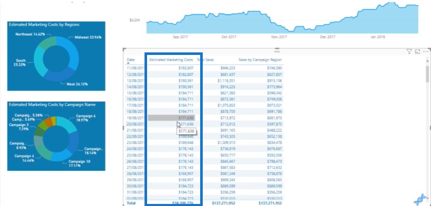
In the middle right visualization, we can look at our Estimated Marketing Costs and see how that has performed versus our Sales.
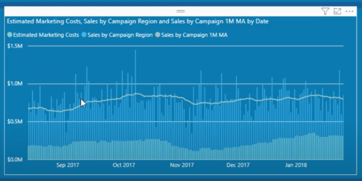
Let’s say we have an e-commerce site selling some digital products. We can see our advertising costs and sales and determine our gross margin on average. We need to compare the cost to acquire a customer versus what we’re getting from that customer. What’s the arbitrage difference?
Well, this visualization will show the insight of the full cost of our campaigns and the sales we’re making over time. We can see the numbers at a daily granularity, which is very relevant for an e-commerce website.
Analyzing The Data Model Of A Marketing Dashboard
Let’s have a quick look at the key data in this particular model. Historically, most of the examples that we’ve done in Enterprise DNA have revolved around a common sales data set. Now I get a lot of feedback as to why I don’t use a data set relevant to the tutorial.
The answer is that once you really get into data, you’ll realize that they can all be evaluated or structured in the same way. A lot of the techniques that you use in one data set can be easily moved to another one. So, if you become a high-quality Power BI developer, you will be able to analyze anything.
This data model showcases the waterfall technique.
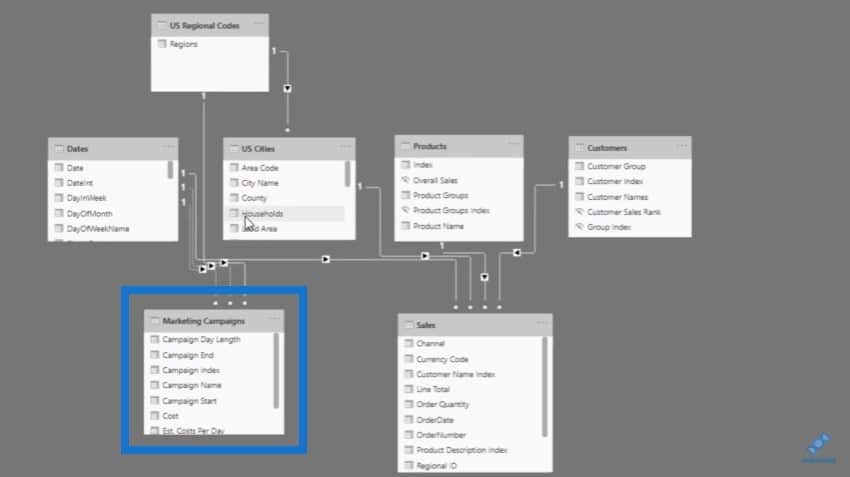
The key table that we want to look at is the Marketing Campaigns table. Let’s take a look at how simple this particular table is, and how it enables us to create such awesome insights.
In this data set, we can see when a campaign starts and when it ends. We can also see how much marketing costs and what is the estimated cost per day.
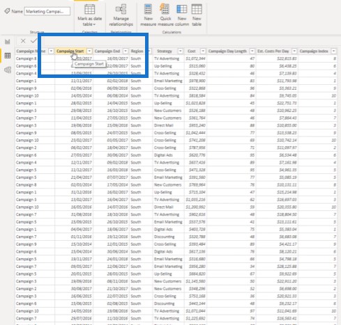
This is just a random data set. Think about how you can capture this kind of data from your own business. Your sales might be coming from any number of software like Stripe or Shopify. You can use these technologies to collate all the information on your advertising and use the techniques implemented here.
Then you can create a power app to capture the information and then put it in a spreadsheet. You can eventually create a report that is as detailed as this one to give you up-to-date, real-time information.
This will benefit your business immensely, as you can direct the investment in your marketing strategies based on their performance. You can compare strategies over time, and see how one region’s strategies compare to another region’s strategies.
We can click into a different region and see how we’ve distributed marketing spending over time and how they have performed.
Another metric we have is the Sales to Marketing Spend, where we can see the return on our investment for a particular region. I just love how we can derive so many of these KPI metrics by using this type of analysis.
Using The Events In Progress Technique For A Marketing Dashboard
In terms of calculations, the data we’ve captured from our marketing campaigns have a start and end date, while our sales information is for every single day.
Marketing campaigns work differently from sales transactions. To make this work, we need to break out the raw data set. We need to flip the Campaign Start and Campaign End into a daily cost.
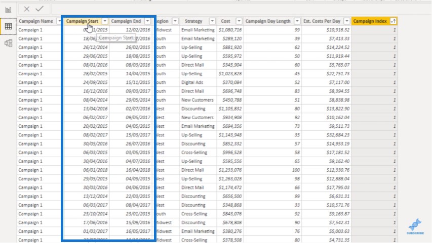
We’ve already evaluated the daily cost here.
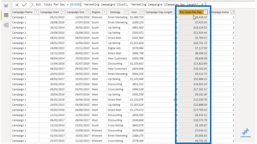
But we need to extend this daily cost across the 99 days so that we can get a like-for-like comparison where we can aggregate all of our marketing spendings across the different marketing strategies. The key technique we need to use here is what’s called an Events in Progress pattern.
The name of the measure we used is Marketing Costs Per Day. This is a formula pattern that you can use on any data that has a start and end date that you want to break down into a per day basis.
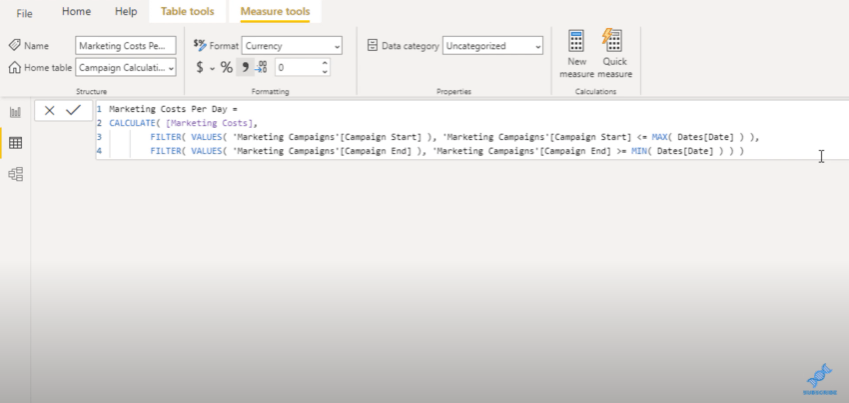
I’ll copy this formula and then paste it in the DAX Cleanup Tool. This tool will format the code in a slightly different and easier to read formula.
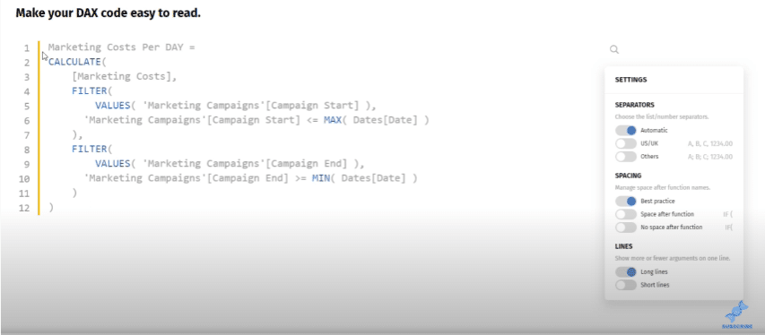
In this formula, we are finding out if a particular campaign is working for every single day. If it does sit on that day, then we want to count up the marketing costs.
We’re not just evaluating one campaign here; we’re evaluating multiple campaigns all at once. We put this in a date context so we can evaluate our total marketing costs, not just the marketing cost for one campaign.
On any particular day, this calculation will work through this table and evaluate if all of these campaigns are open on a particular day. If they are, then we want to estimate the costs on that particular day for all of those campaigns.
***** Related Links *****
New Customer Analysis Using Advanced DAX
Last Purchase Date in Power BI: When Did Your Customers Make Their Last Purchase?
First Purchase of Customer Insight Using DAX
Conclusion
The marketing dashboard example I have shown in this blog post is just one of the many Enterprise DNA showcases that will teach you how to use critical thinking while using Power BI. These showcases will hopefully inspire you to think of what you can achieve with Power BI development.
You can have a play around in the Showcases page and see the possibilities. Please watch the video below for more details and don’t forget to subscribe to Enterprise DNA TV.
All the best,
Sam


