Power BI is a powerful data visualization tool that allows you to easily create and share interactive reports and dashboards. One of the features of Power BI is the ability to create Gantt charts that are often used in project management to present the progress of tasks or milestones.
In this tutorial, you’ll learn how to use the gauge chart type to create a Gantt chart and embed it in a table in Power BI Report Builder. A Gantt chart is a visualization that shows the start and end dates of each task in a project. Report Builder doesn’t have the option to automatically create a Gantt chart, so we’ll use the Gauge Bullet Graph instead.

The Gauge Bullet Graph In Power BI Report Builder
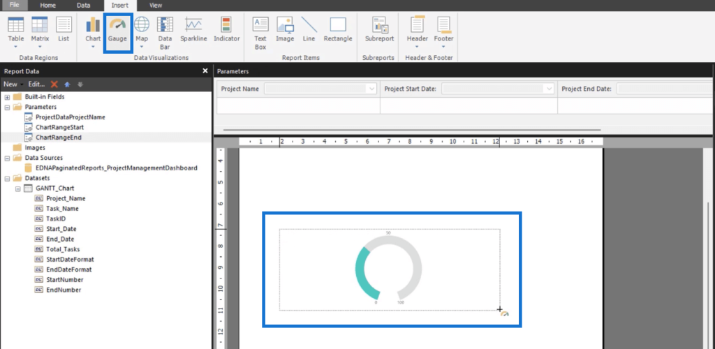
Go to the Insert tab and click Gauge. Drag and drop the mouse pointer to form the chart.
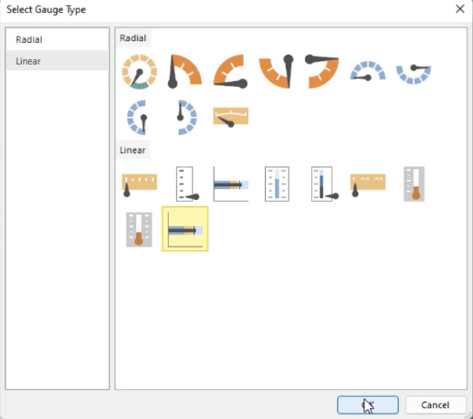
Once the Select Gauge Type wizard pops up, choose the Bullet Graph and then click OK.
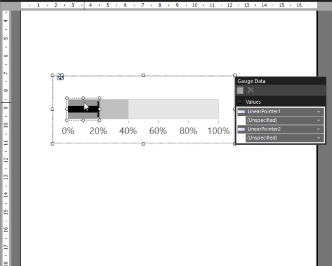
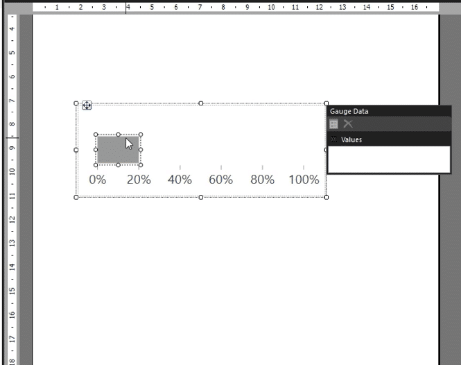
To transform this graph into a Gantt Chart, delete the unnecessary blocks. You only need the scale and one range block.
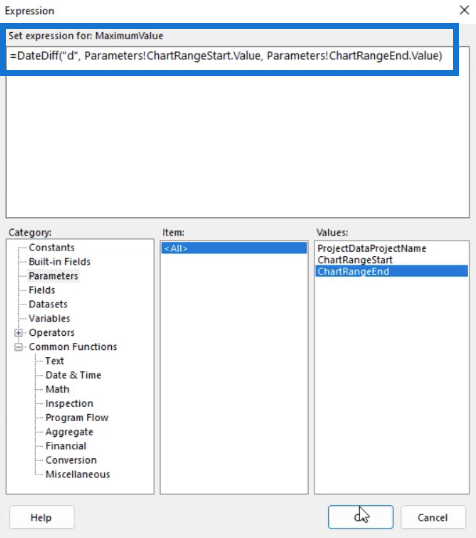
Open the chart’s Expression Builder. Set the Expression to show the date difference in days between the ChartRangeStart and ChartRangeEnd values.
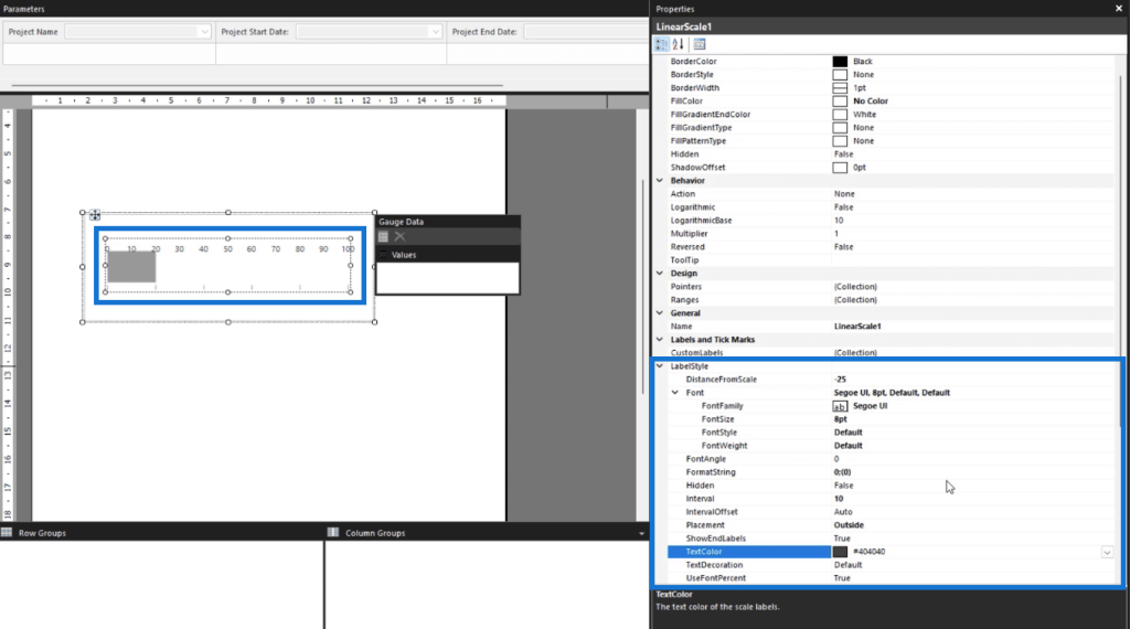
The next thing you need to do is format the scale. Click on it and go to the Properties pane. Change its size, position, and style. You can also set the interval to the number you want.
The Linear Range
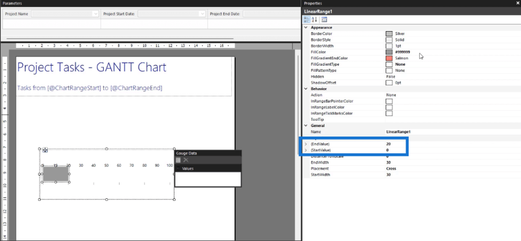
The next thing you need to format is the linear range in your Gantt chart.
This range is dynamic. It will change depending on the data in the table. Thus, you need to format its Start and End Values to correspond to each individual task.
Afterwards, you can format the text and background color of the chart. The key is to make the color theme consistent throughout your report.
A Table For The Gantt Chart In Power BI Report Builder
To create a Gantt chart, a gauge chart needs to be placed in each row. So let’s create a table and assign it with data.
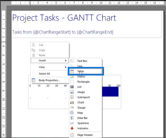
Right-click on your report page and select Insert > Table.
To assign it with data, drag and drop the Fields from the Report Data pane into the table. Create a blank column to the right-most side of the table. This is where the gauge chart will be placed.
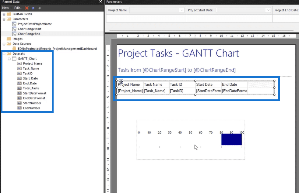
Next, copy the chart and paste in the last column’s two rows.
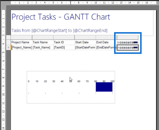
For the top row, delete the range. This will be used as the main reference scale for all the charts in the table.
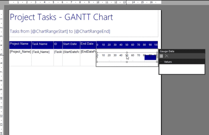
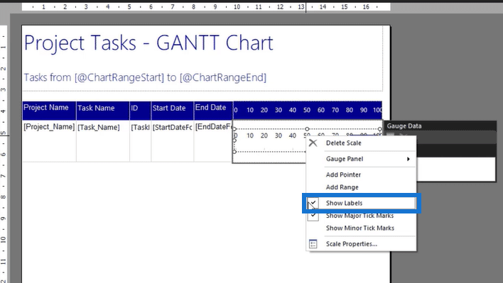
All the charts in the table should only show the dynamic range. To hide the labels, right-click on scale and disable the Show Labels option.
Since the chart is now placed in the table, you can format its Start and End dates to be dynamic. Go to the Properties pane and open the Expression Builder for value.
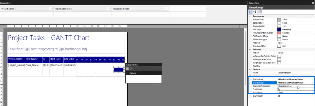
You can then define the StartNumber field as the start value and the EndNumber field as the end value.
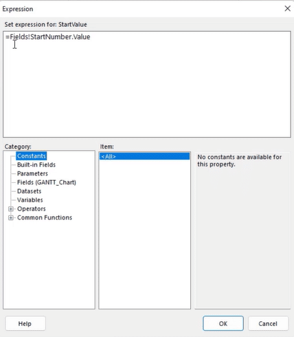
Table & Chart Format Options
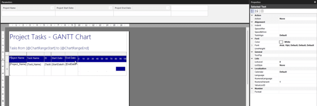
Once you’re done with the technical part of the report, you can now start making formatting changes to improve the Gantt chart’s appearance. There are a variety of formatting changes you can apply using the Properties pane.
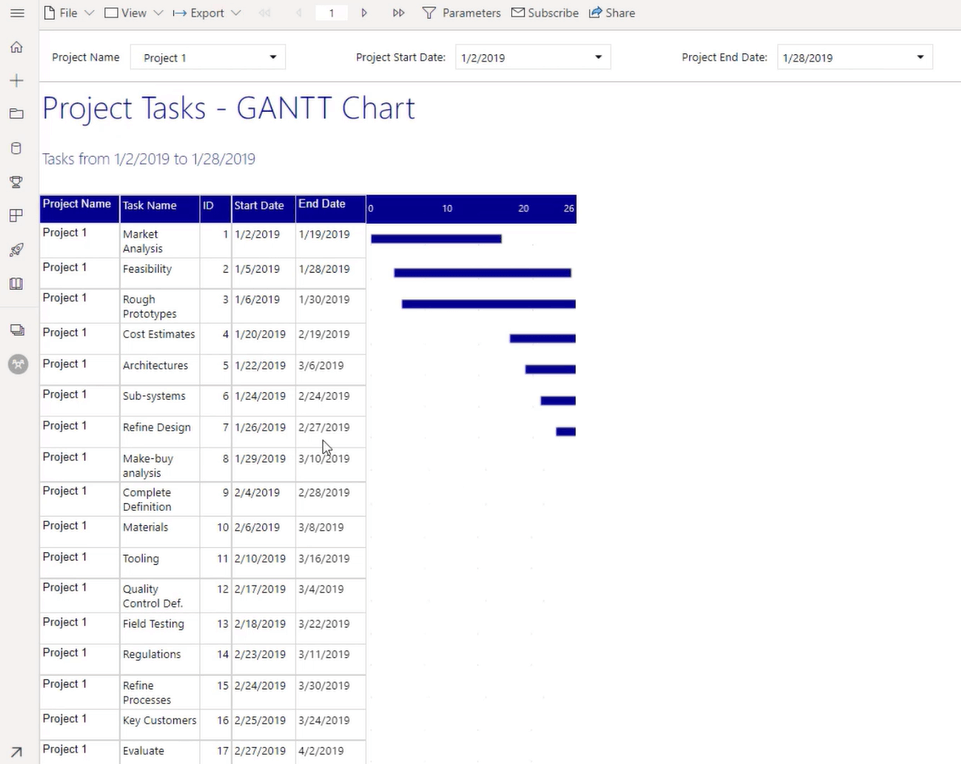
When you run the report, you’ll see that its starting to look better.
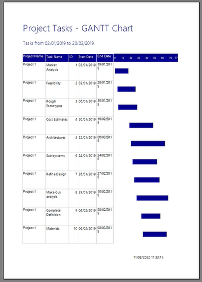
A best practice when creating paginated reports is to regularly run it so that you know how it currently looks and then make decisions as to which parts you need to change.
Once you’re satisfied with how the Gantt chart and overall report looks, you can now publish it to the Power BI Service. This allows other users in your organization to access and view the report.
***** Related Links *****
PowerApps Charts, Graphs And Dynamic Images
Different Bar Charts In Power BI To Elevate Your Reports
Creating A Gantt Chart In Power BI Using Matrix
Conclusion
In conclusion, creating a Gantt chart using the Gauge Bullet Graph in Power BI Report Builder is a powerful and efficient way to display project timelines and progress. It allows real-time monitoring of project progress, making it an ideal tool for project managers and stakeholders to stay informed and make data-driven decisions.
So, whether you are a beginner or an experienced Power BI user, creating a Gantt chart using the Report Builder is a valuable addition to your data analysis toolkit. Though Report Builder doesn’t have a feature to automatically create Gantt charts, it’s still a recommended software to use since you can easily create dynamic reports without having to write any lines of code.
All the best,
Sue Bayes


