
Showcasing cumulative results in Power BI is such a powerful way to visualize your data over time, especially if you are trying to show the difference in performance from one time period to another. You may watch the full video of this tutorial at the bottom of this blog.
When you try to present this at a daily or even monthly level, identifying the trend isn’t always so obvious. When you place this into cumulative totals it becomes as clear as day.
The real power of DAX gets showcased when you start to combine formula patterns.
That’s exactly what we are going to do here. I’m going to show you how you can jump to create any time comparison and then quickly get those results into a cumulative total.

This enables you to layer one on top of the other and really effectively show the difference in performance trends across any time period.
Let’s go ahead and start working on our example.
Creating The Core Measure
First of all, we’re going to create a simple measure. Let us create Total Sales which is going to be the SUM of the Total Revenue column.
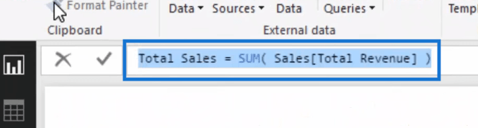
Of course you can use any other measure. But just for the purpose of this example, we’re using Total Sales because it’s very simple which will make this lesson easy to understand.
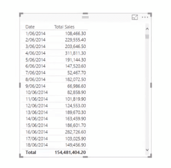
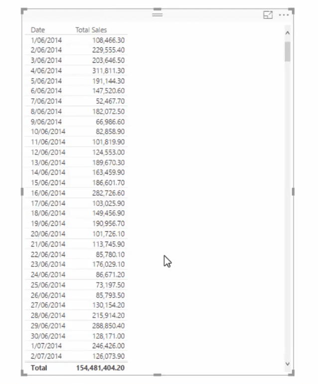
Now that we have our Total Sales measure, let’s set up the table. So this is going to be a Total Sales table sorted by date.
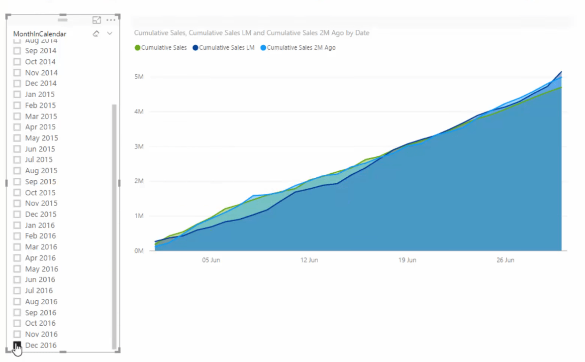
Then we’re going to drag in our MonthInCalendar because we’re going to look at historical information. So let’s drag that in and turn it into a slicer.

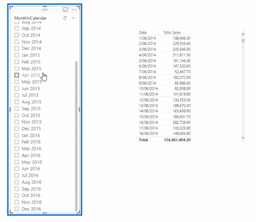
Now, we will be able to select any of the months in this slicer.
After setting up our table, we’re going to need a time intelligence function.
Using A Time Intelligence Function
Let us again take a quick look at our Total Sales table. What we have here are the total sales presented per month.
Now, what we need to do is to generate the calculation that will allow us to compare data from various months.
Here, I’m going to use my favorite time intelligence function which is the DATEADD function. It’s very versatile and flexible as I’m sure you’ll realize once you’ve become more familiar with it too.
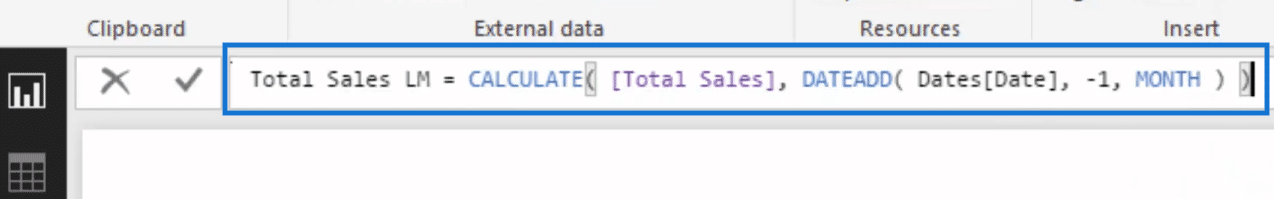
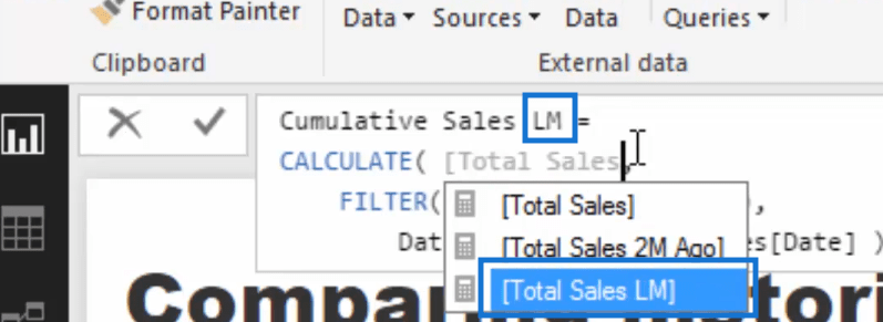
So, we’re going to create a new measure which is Total Sales LM or last month. Then I’m going to add CALCULATE which changes the context of our calculation.
Then I’m going to use DATEADD and put in the Dates column.
Next, I’m going minus one and then go MONTH.
When you’re working on your on calculation, of course you can look at DAY, QUARTER, or YEAR. But here let’s use MONTH.
When we close off our formula, it’s going to look like this one below.
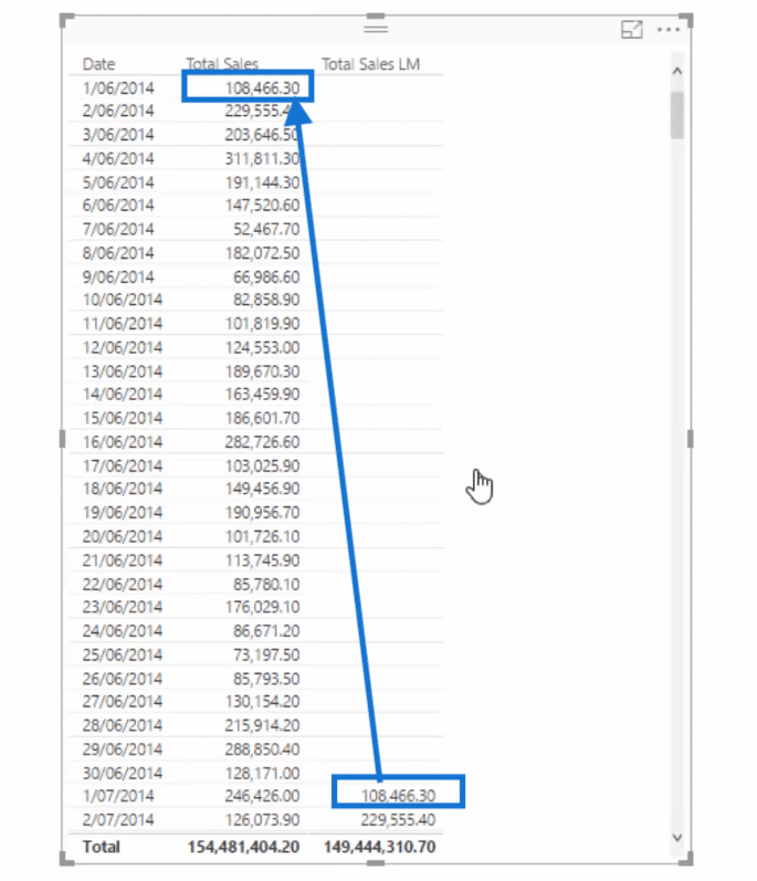
If we drag in this measure into our Total Sales table, you’ll see that the figures in the Total Sales LM column correspond to the figures the previous month in the Total Sales.
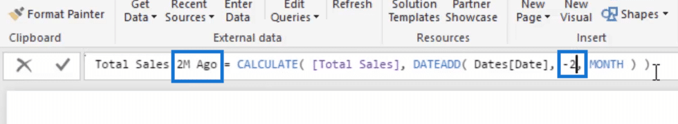
At this point, we can easily look at the figures from two months ago. We just copy and paste our formula and tweak the name of our new measure and then write minus two instead of minus one.
Now, if we drag that into our table, it will show the total sales two months ago.
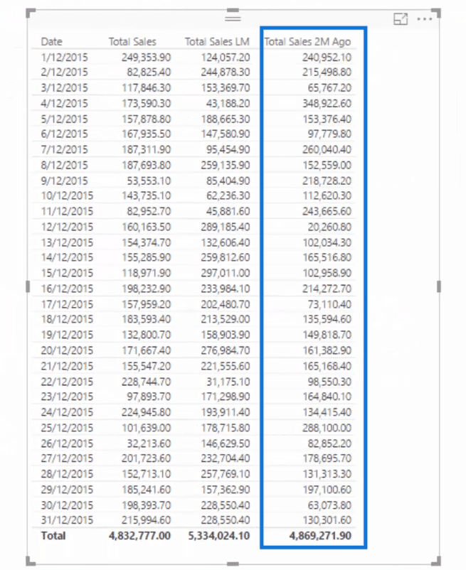
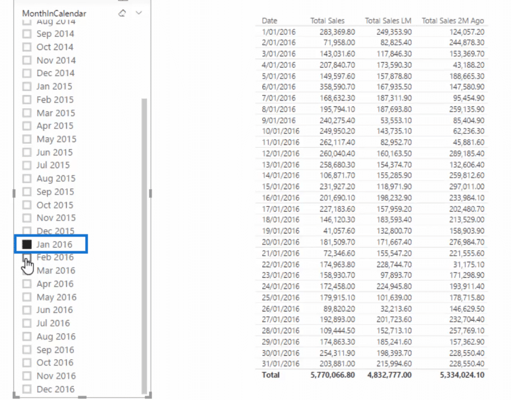
And it’s also dynamic because of our slicer. Whatever month and year that we select in our slicer will be shown in our sales table.
This figure below, for example, shows the January 2016 figures in the Total Sales column and they’re compared with the Total Sales last month in the next column then two months ago in the rightmost column.

Calculating Cumulative Information In Power BI
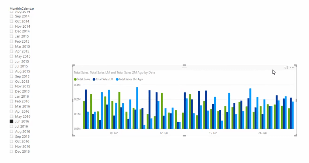
If we convert this table into a clustered column chart, you’ll notice that we won’t be able to generate any trends.
So, let us look at the data in a better way which is cumulatively. For this, we’re going to use the cumulative totals pattern.
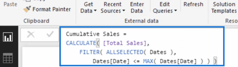
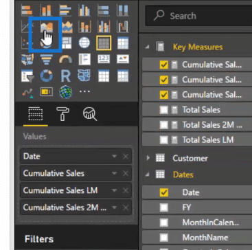
Let’s create a new measure and call it Cumulative Sales, then use CALCULATE, and go Total Sales, then ALLSELECTED, and then add the entire table not just the dates column.
Next we’re gonna go Dates, less than or equal to MAX then Dates.
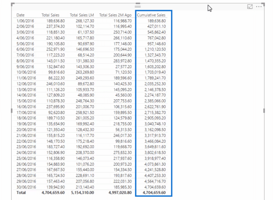
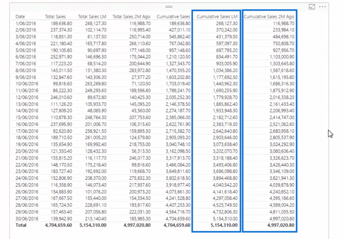
Now, we have a Cumulative Sales column which shows the Total Sales cumulatively.
As you can see, it starts off with 189, 636.80 which is the Total Sales on the first of June 2016. Then it adds the sales on the first and the second of June so we have 427,011.10, and so on and so forth.
Now, check this out. It’s really amazing how easy it is now to compare our Total Sales one month ago with our Total Sales two months ago cumulatively.
All we need to do is to copy and paste our Cumulative Sales formula and then just modify the name so that it says Cumulative Sales LM or last month. Then instead of Total Sales, we’ll select our Total Sales LM measure.
We’ll just repeat this process when we create our Cumulative Sales two months ago measure.
Then let’s drag them into our table.
Now, we can turn our table into a visualization.
Turning The Table Into A Visualization
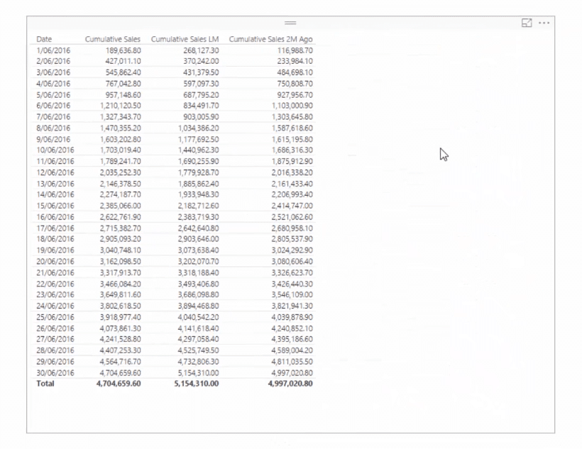
Let us first delete our intermediary calcs such as the Total Sales, Total Sales LM, and the Total Sales 2M Ago.
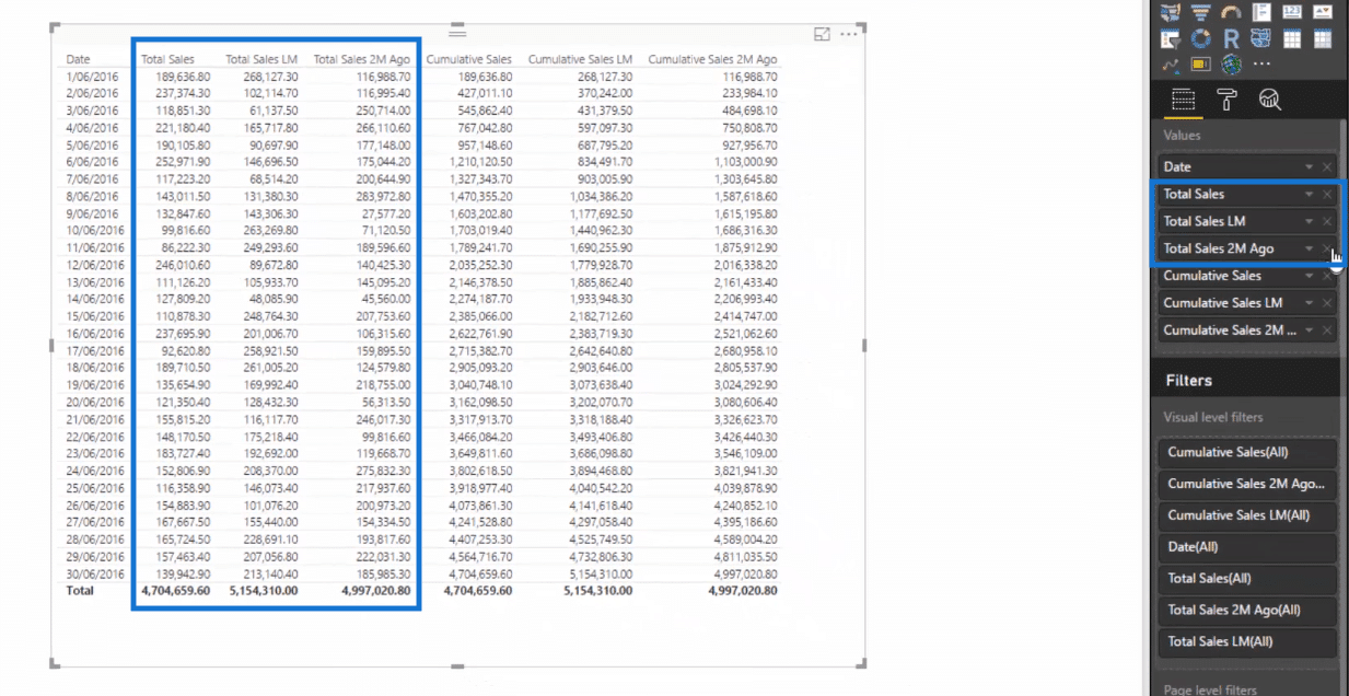
What we have left in our table now are the cumulative sales columns.
Next, let us turn this table into an area chart.
Now, we’ve got this trend analysis across all these months.
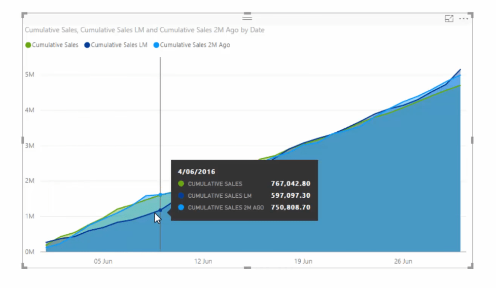
And it’s also dynamic. We can select any of the dates in our slicer and the data for that selection will be shown in our area chart.
I’m sure you find this technique really cool.
It’s very easy to set up because once you have your core measure and time intelligence pattern, you can easily create the cumulative total pattern.
And just like that we have created some fantastic analysis.
***** Related Links *****
Showing Actual Results vs Targets Only To Last Sales Date In Power BI
Calculate A Reverse Cumulative Total In Power BI Using DAX
Cumulative Totals In Power BI Without Any Dates – Advanced DAX

Conclusion
In this example we focused on monthly comparisons. We started off with our Total Sales, and then we compared it with the Total Sales last month and two months ago.
After this, we worked on our cumulative totals which enables us to come up with a very compelling visual that is also dynamic.
But think how far you could extend this. You could use this across virtually any time comparison and across any of your key metrics like sales, costs, profits etc.
The thing I like most about cumulative totals is the trend-identifying aspect.
And when you add in additional context from within your model, it really showcases where diversions in results started occurring. It’s really powerful stuff.
All the best with this one.
Sam


