
Power BI introduced another feature called Anomaly Detection in its November 2020 update. This feature is only available in line charts for now.
Anomaly detection in Power BI enables report creators to enhance line charts by automatically detecting anomalies in a time series data.
This feature allows us to easily find insights without slicing and dicing the data.
When the report is published to the service, report consumers can view the anomalies, explanations, and even their root cause analysis. Additionally, we can also customize the various settings for which anomalies are detected.

Since this feature is in Preview, we need to turn on this Power BI Desktop feature first.
Enabling The Anomaly Detection In Power BI
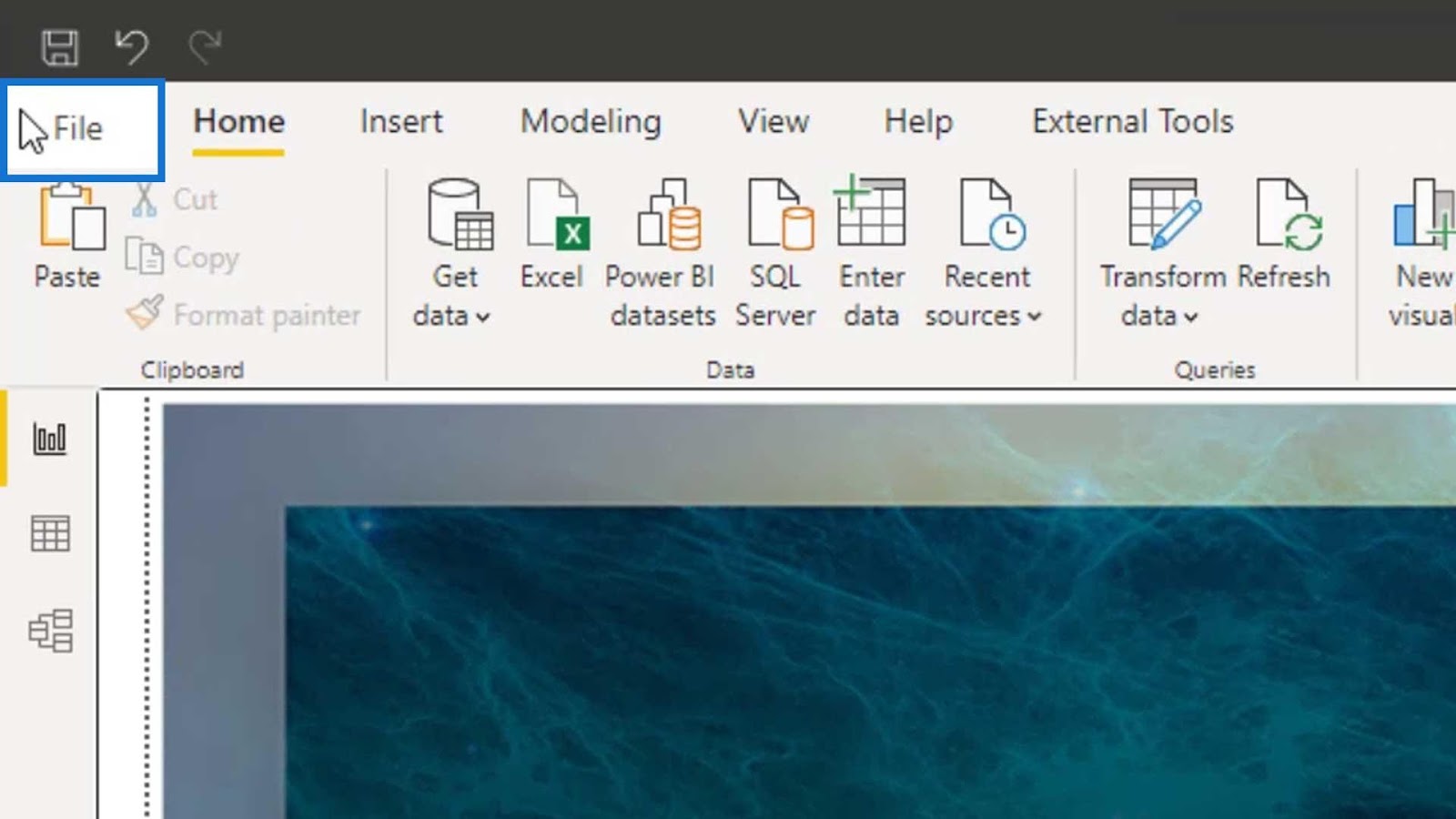
To enable this feature, click File in the menu bar.
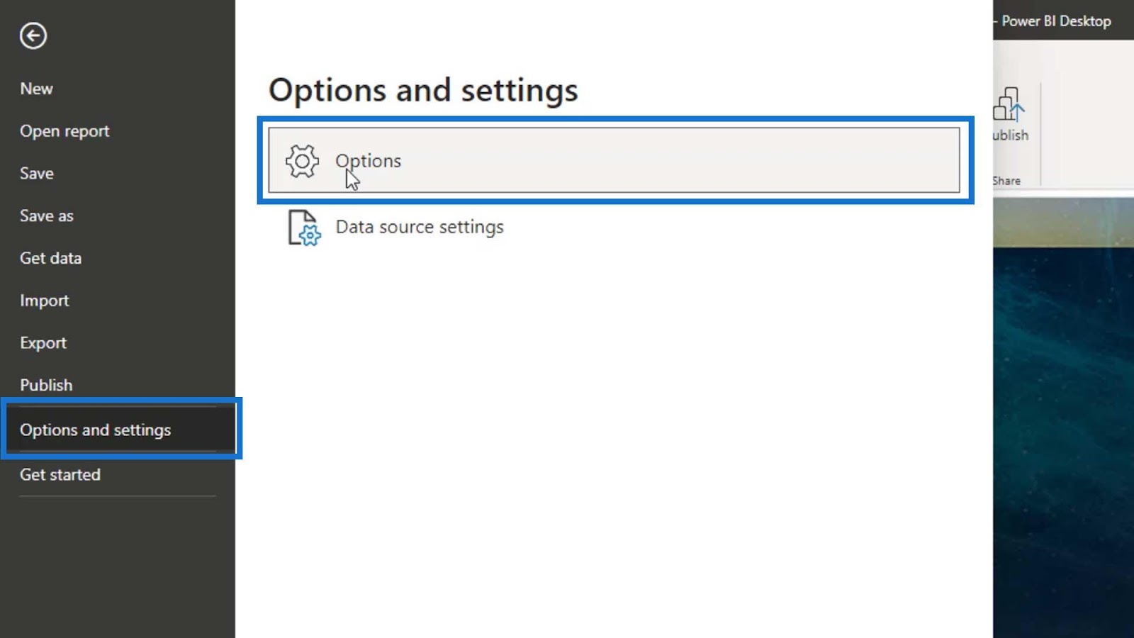
Go to Options and settings, then click the Options.
Click the Preview features, enable the Anomaly detection, then click the OK button.
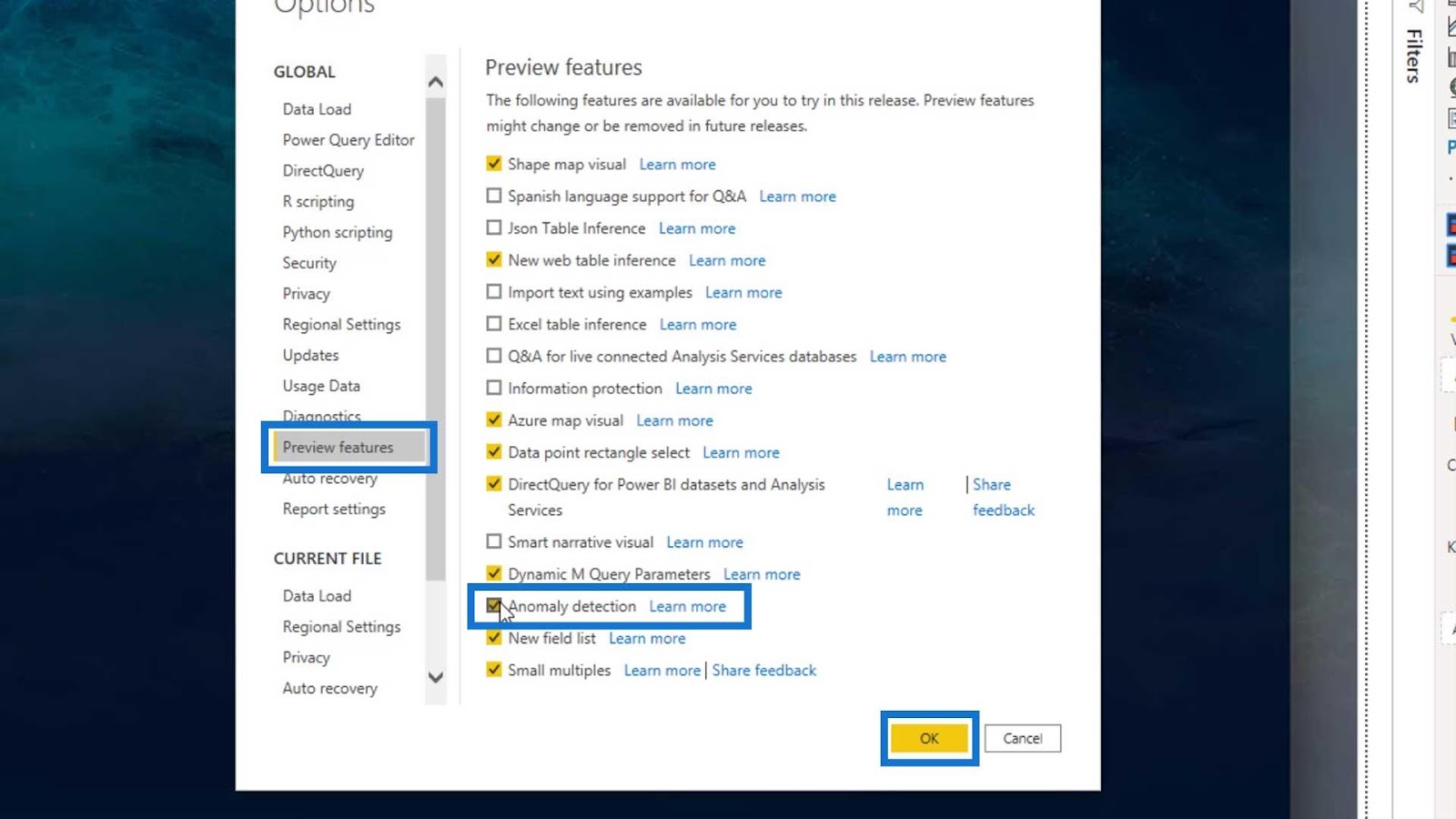
After that, we need to restart the Power BI desktop application so we can use this feature.
Getting Started with Anomaly Detection In Power BI
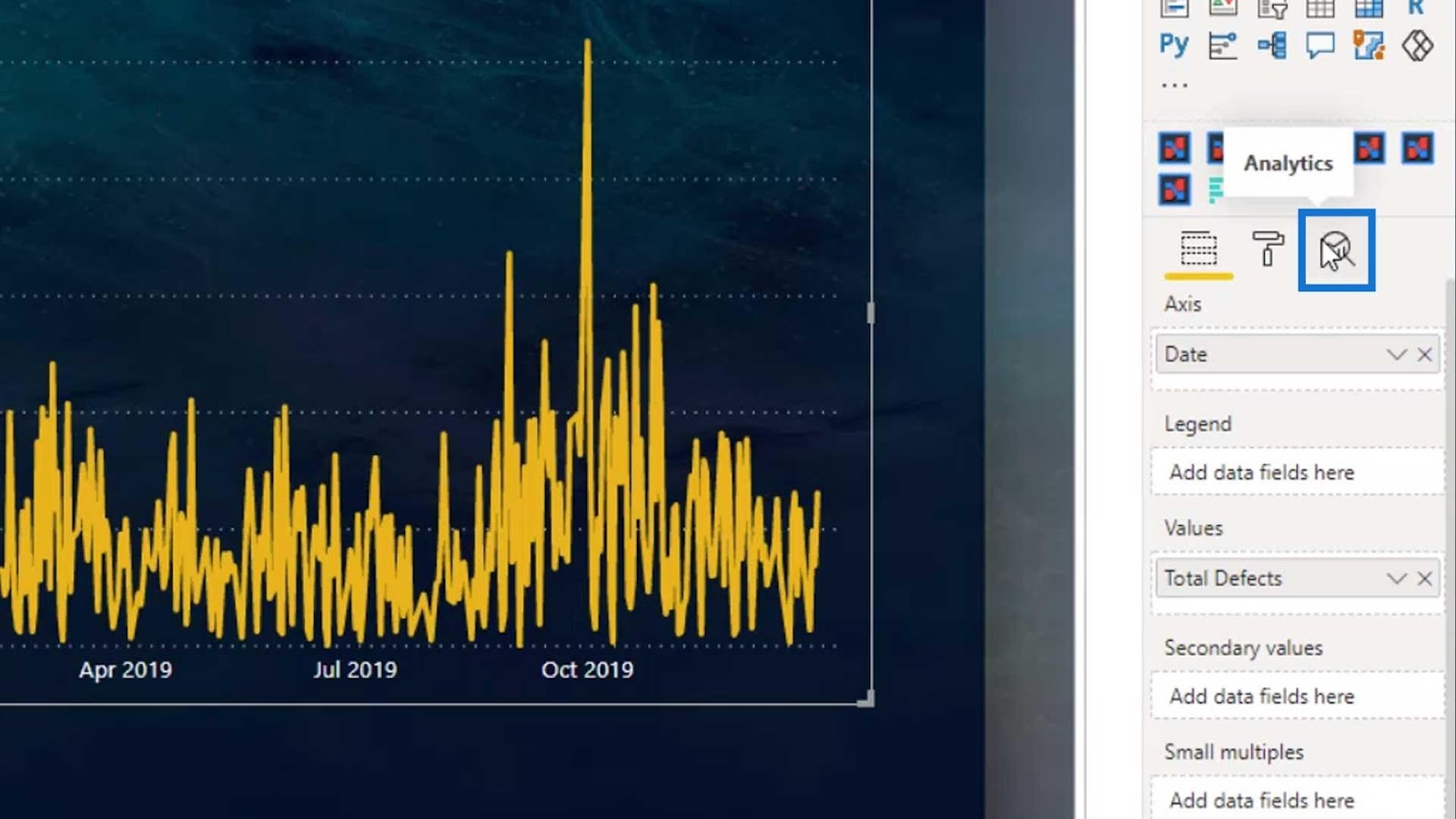
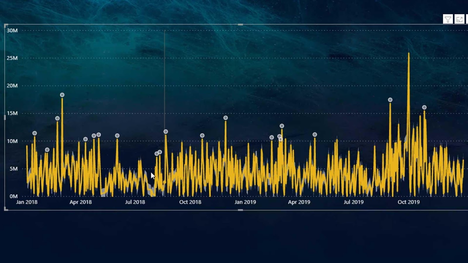
For this tutorial, we’ll talk about the available options and limitations of the Anomaly detection feature. To start, let’s add a line chart on our report page, and resize it as shown in the image.

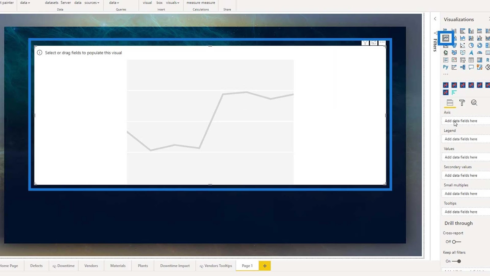
Add the Total Defects measure on the Values field.
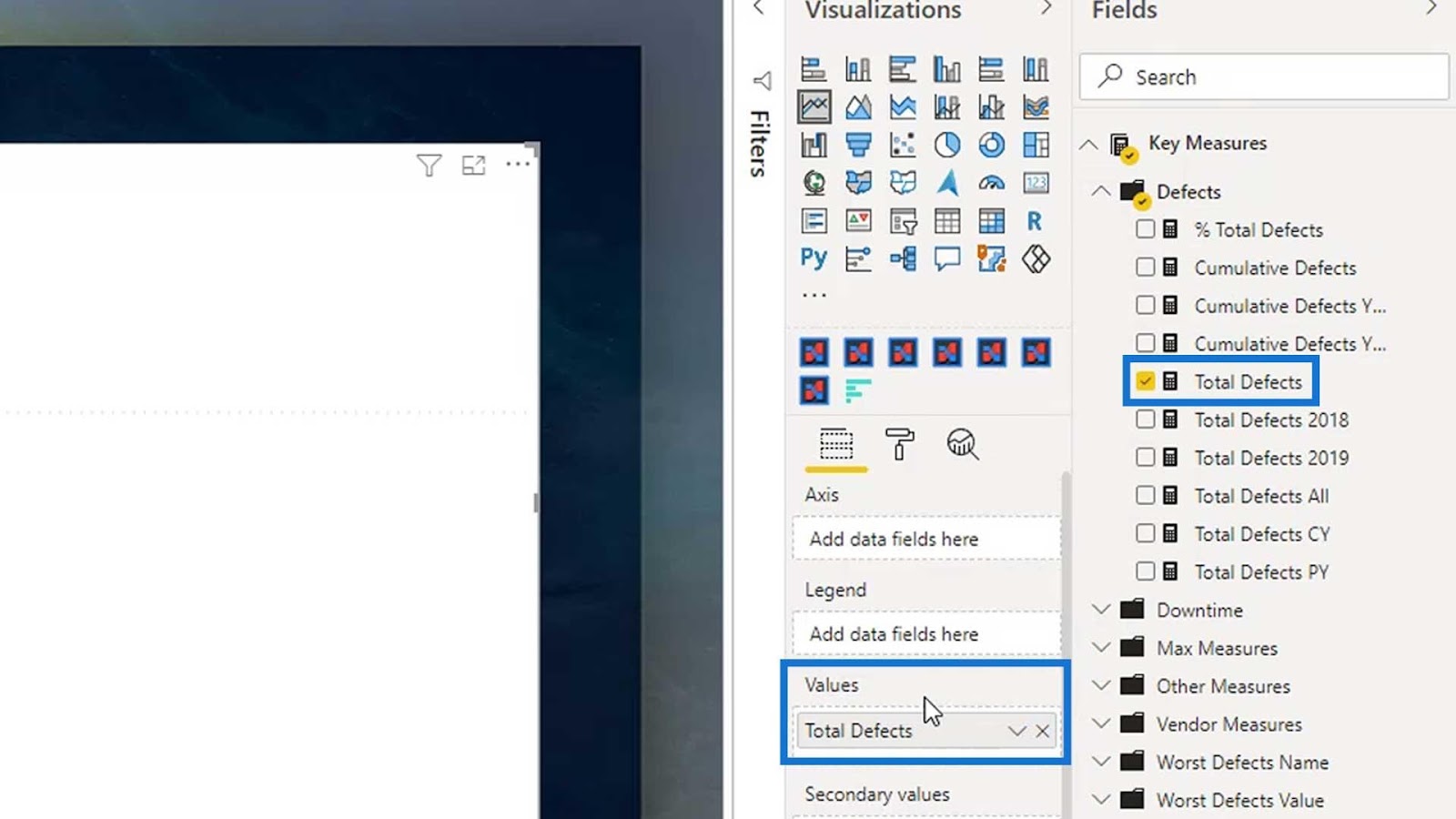
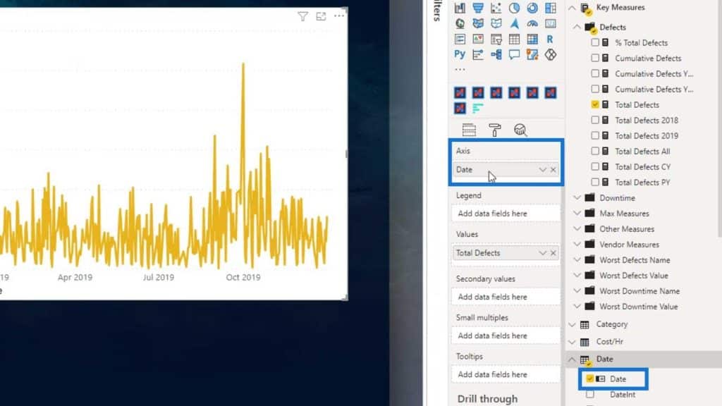
We’ll analyze this by date. So, let’s add Date on the Axis field.
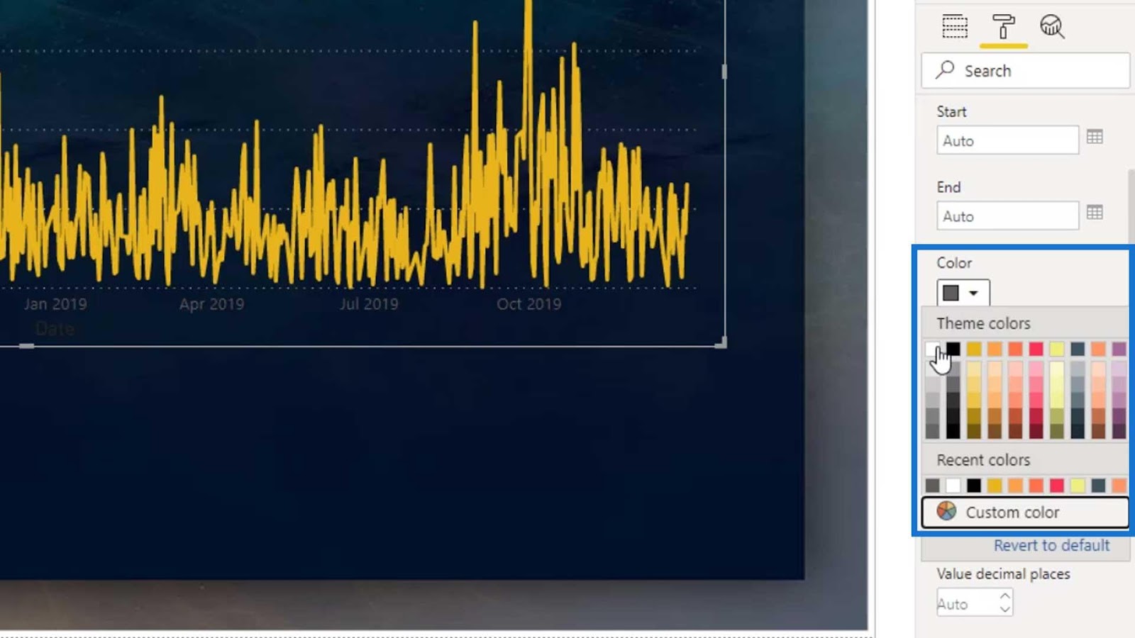
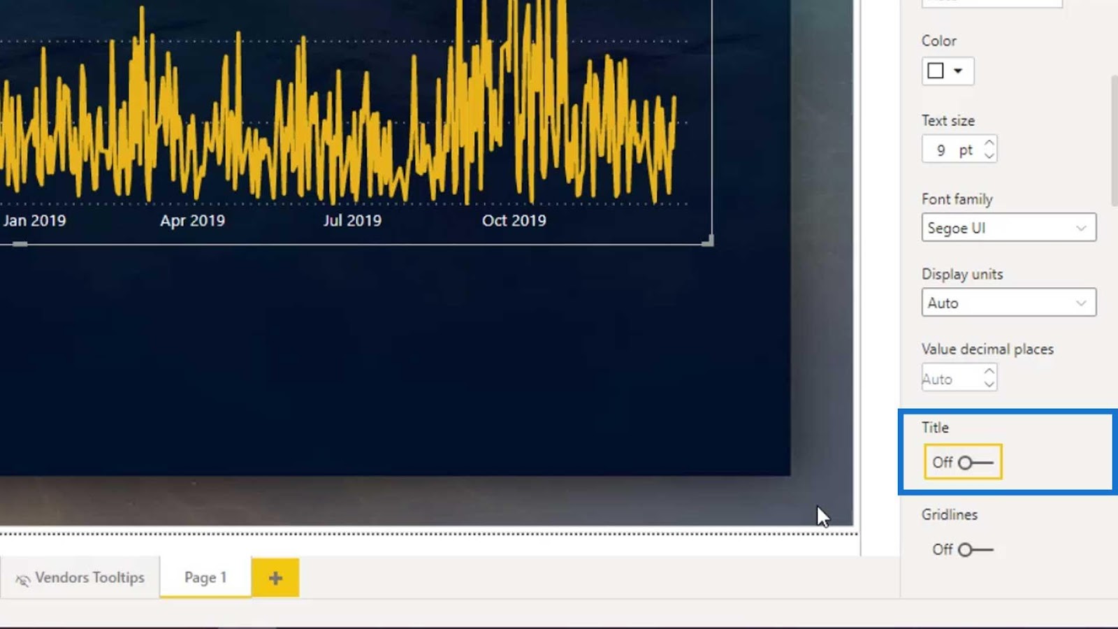
Disable the Title and Background under the Formatting tab.

Change the font color of the X axis and Y axis to white.
Then, disable the Title on the X axis and Y axis.
We should now see the anomaly in this output.

Anomaly Detection: Modifying The Detected Anomalies
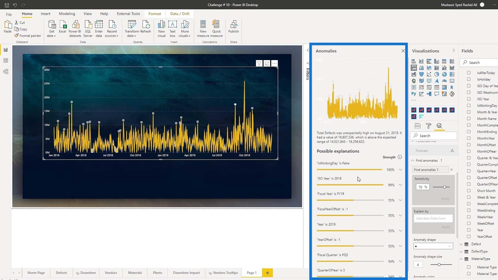
Obviously, something might have happened which caused the increase in the defective part from the suppliers. However, we still don’t know which category these parts belong to or the reason behind this anomaly. What we can do is go to the Analytics tab.
Go to the Find anomalies dropdown, then click Add.

After that, let’s change the anomaly color to gray.

We should now have this output.

We also have the option to adjust the anomaly sensitivity.
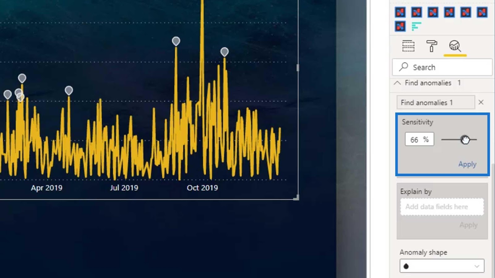
In order for us to see the sensitivity, we need to change the color of the sensitivity to white. Make sure that the color doesn’t blend with the background color.

As a result, we can now see the sensitivity behind the yellow lines.

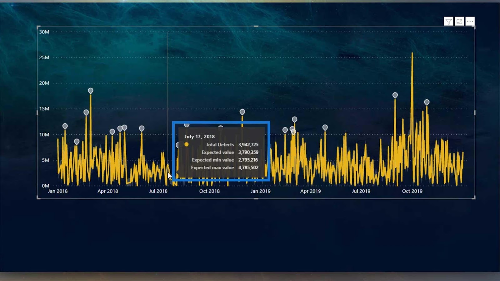
If we hover over the lines, it will show the expected minimum and maximum values. This is the type of chart that we can see on cryptocurrency trading charts.
We can also change the shape of the anomaly by selecting the options in the Anomaly shape dropdown.

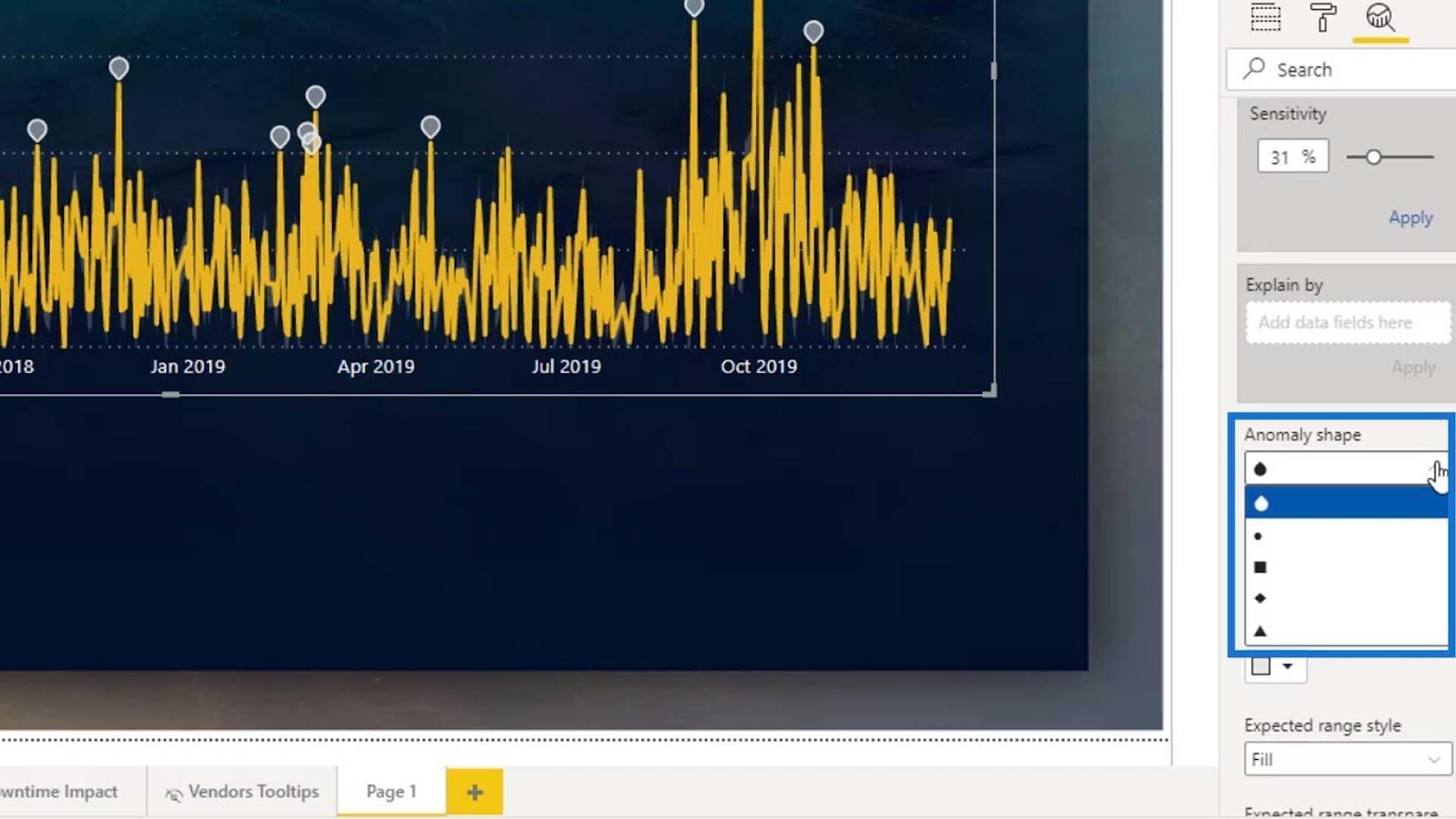
Then, we can adjust the shape’s size by adjusting the Anomaly shape size.

Let’s also change the Expected range of transparency for the anomaly.

By lowering the value of the Expected range of transparency, we’ll see that the gray lines became more visible.
Let’s try to click on one of the anomalies.

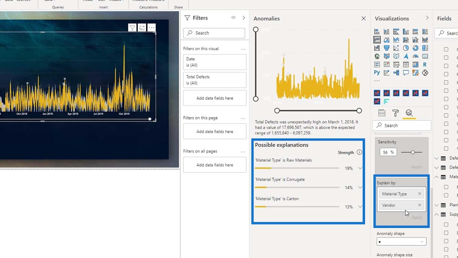
As you can see, it displayed the Anomalies pane, which provides an analysis for the possible reason behind the anomalies.
Modifying The Analysis
To see a better analysis for the anomalies, let’s add the Material Type on the Explain by field, then click Apply.

By doing this, we can see that the Material type is Raw Materials and there’s a 47% defective material in the anomaly we selected.

Let’s expand this anomaly by clicking this icon.

Accordingly, we can see the pattern of the total defects for materials in an orange color.

We can also add this to our report page by clicking Add to report.

As a result, it will look like the image below.

Limitations Of Anomaly Detection In Power BI
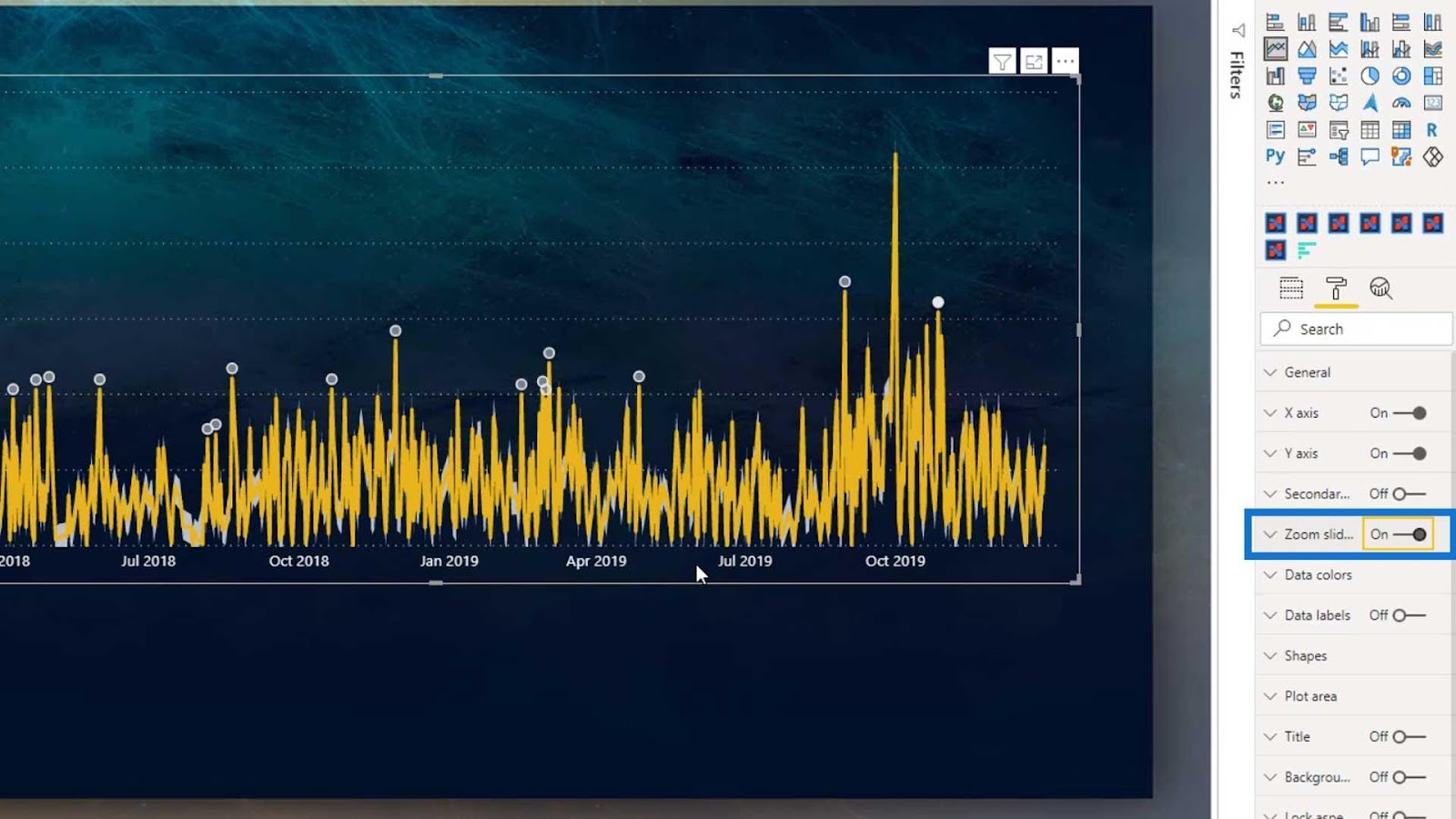
We can use the zoom slider if we want to focus on particular periods.
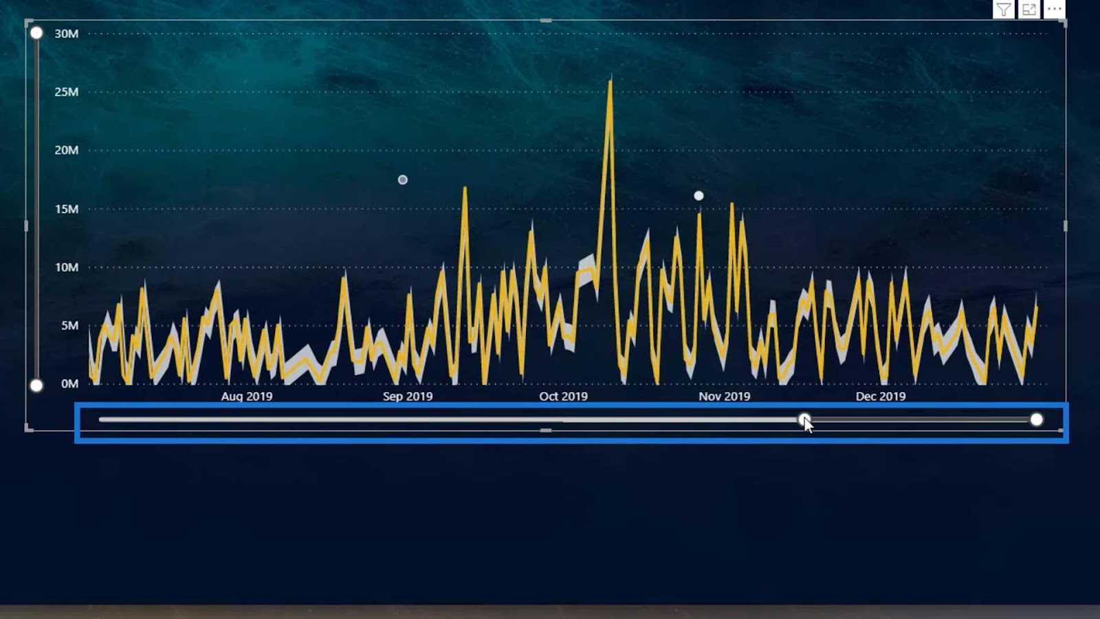
To do that, just enable the Zoom slider.
However, we don’t have any options to change the appearance of the zoom slider.
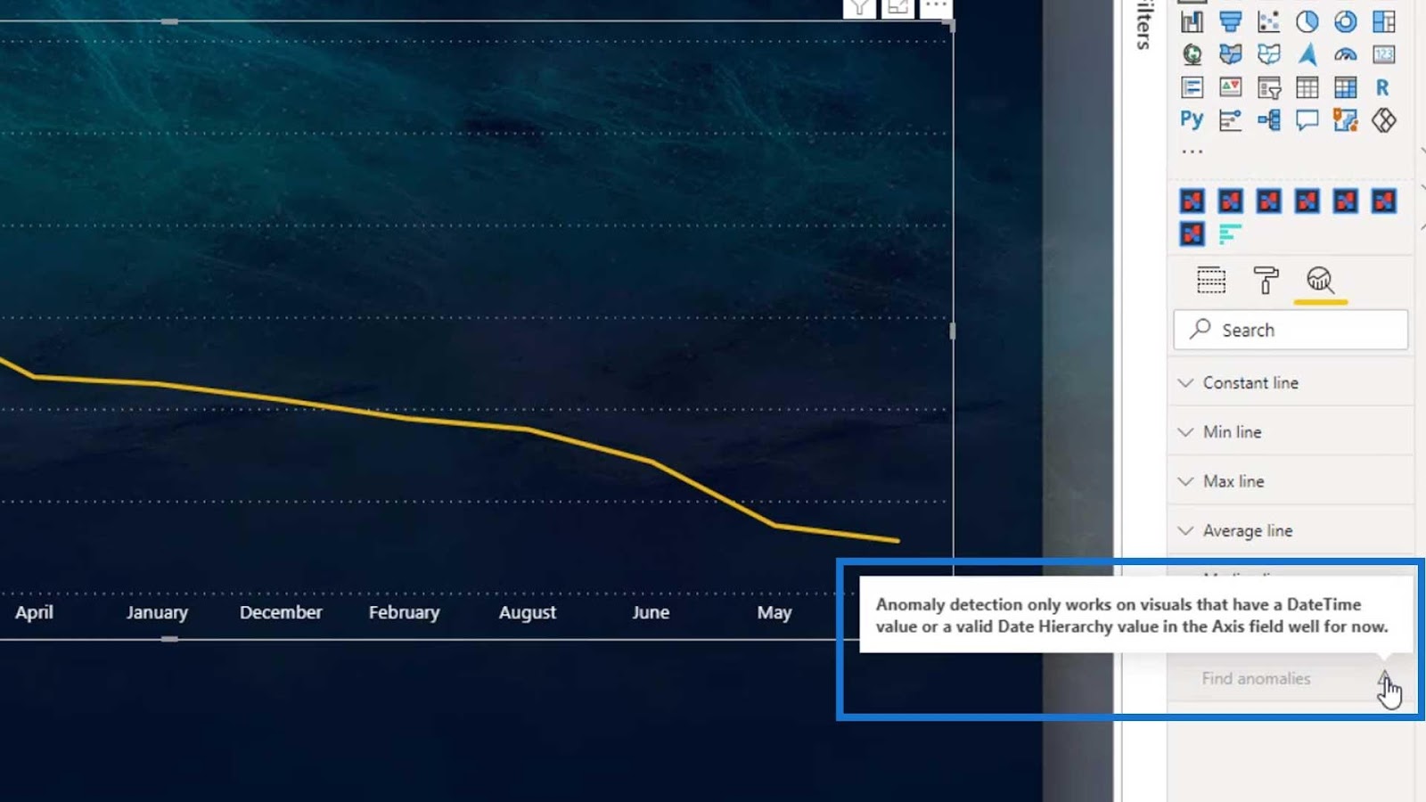
Another limitation of this feature is that if we change the Date on the Axis to Month Name, it won’t show us the anomalies.
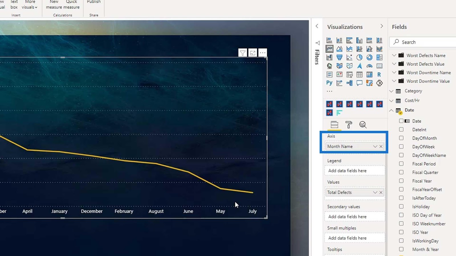
If we click on the Find anomalies under the Analytics tab, it will display a note that says “Anomaly detection only works on visuals that have a data time or valid date hierarchy value in the Axis field.”
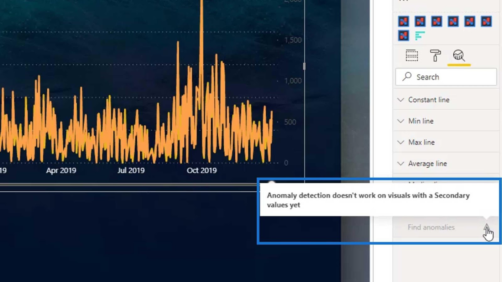
The third limitation is when adding a secondary value. For example, if we add the Total Downtime hours measure on the Secondary values field, it will not show the anomalies again.

If we go to the Analytics tab and click the Find anomalies again, it will show a note saying that it doesn’t work yet on visuals with secondary values.
Furthermore, if we try to add another category on the Explain by field, it will only show one category which is the first one (Material Type) in the explanation pane.
***** Related Course Modules *****
Power BI Anomaly Detection Feature: How It Works
Showcasing And Understanding Anomalies In Power BI
Power BI Data Sets: Learn How To Detect Abnormal Behavior Using DAX

Conclusion
We’ve covered anomaly detection in Power BI and learned some of the limitations of this feature. However, it could still be useful when we want to find anomalies in our reports depending on the values and analysis that we’re doing. Instead of creating complex DAX measures, we can use this feature to find the anomalies in our reports.
I believe that this is still a cool feature and Microsoft said that they are doing some improvements on this feature to provide detailed data analysis and evaluation.
Until next time,
Mudassir


