When you want to add more insights to customer dashboards in Power BI, you need to be able to select products.
You need to know what products are going well this year versus last year and the 2 years before that.
Looking At Product Performance
Drag the Product Name, Total Sales, Sales LY, and Sales 2Yrs Ago into the canvas. Then, turn it into a clustered bar chart visualization. Change the sort order of the table.
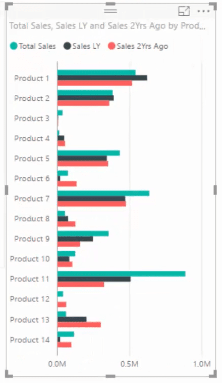
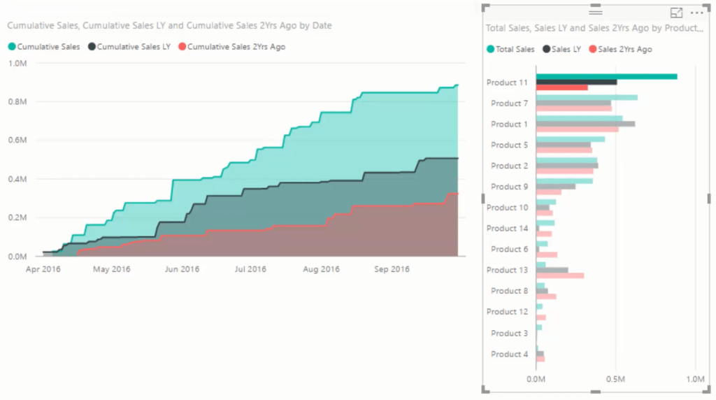
You can see a significant growth in Product 11. It wasn’t much two years ago, but then it increased last year and now it’s the highest selling product. If you select a product, the visualization also changes. It’s a great insight.
Calculating Total Profits
The next thing is to calculate your total profits this year versus last year.
All you need to do is copy and paste the other measure, call it Profits LY, and put the Total Profits inside CALCULATE.

Next, create a table, place the Date column in it and get rid of the hierarchy. Also, place Total Profits and Profits LY in the table. Turn the table into a clustered column chart.

This could potentially identify if there’s a sharp increase in profits over a time period versus another. You can also reduce the time frame and change the interaction to get better insights in Power BI.
Looking At Individual Transactions
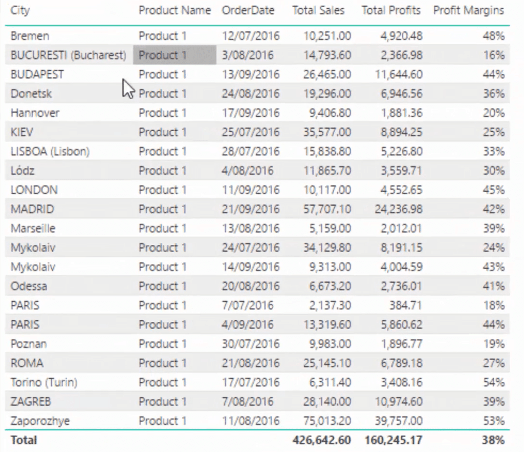
If you want to see what individual transactions contribute to your profits versus the ones that detracted to it, you need to create a table. To make this easier, utilize the measures and tables that you already have.
Get your City, Product Name, and Order Date and put them in the table. Throw in the measures Total Sales and Total Profits.

Calculating Profit Margins
Create another measure and call it Profit Margins. Use the function DIVIDE to divide the total profits by the total sales. After that, change the format to percentage.

Drag that measure into the table and you’ll then have your table of information.

If you select a product, you can look at its sales along with all the different sales areas and cities that it was sold.
For this next step, you have to work out another logic around the profit margins. Place the Date into a table along with the Profit Margins and then turn them into a visual. These are your profit margins through time.
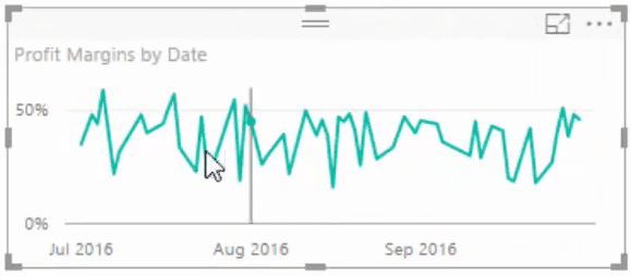
However, this needs to be more insightful because you’ll need data and answers about the profit margins that you are selling. You need to know why some are high, above average or below average.
To extract those insights in Power BI, you only need to calculate your total profit margins without using any time frame. You begin by creating another measure.
Call the measure Lifetime Profit Margin. Calculate the profit margin and then use the ALL function to disregard any day that might be in it. It will only look at everything through time. Next, turn the format into a percentage.

If you drag this down into the visualization, you’ll see there’s a line. This represents the average of the profit margins.
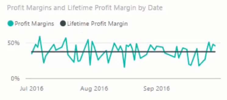
Change the visual into an area chart.
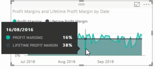
You can now see your sales in the visual. Some are below the line, some are above.
The date August 16 has 16% while the total average is 38%. If you want to look at the individual transaction you could bring in your product or salesperson dimension. This is a great way to find insights in Power BI quickly.
There’s even more you could do to improve this dashboard. You could break down and evaluate all the dates that were under the average margin and only narrow in on those.
Adding Key Metrics To The Dashboard
To finish things off, occupy the space on the side with key metrics and by using the calculations that you have already created.
Create and set up a few cards in the canvas, and then copy and paste it. Set the cards value to Total Sales, Total Profits, Sales LY, Profit Margins, and Profits LY.

There are a few things you can do here. Try to become familiar with the visualization and how you would incorporate them in your models.
Another thing you could do is create a measure for Sales Growth. Divide your total sales by your sales last year and then subtract it by 1. Don’t forget to set the format to percentage.

Next, change the Profits LY card to Sales Growth. You can see there’s a significant sales growth.
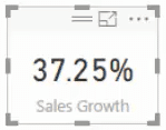
If you change things here, all of these metrics change. That’s why these cards are great because they drill into specific information based on the context of the calculation.
***** Related Links *****
Top Customer Per Product – Power BI Analysis
Power BI Analysis Using DAX: How Many Unique Products A Customer Bought
Discover Multiple Product Purchases Using DAX In Power BI
Conclusion
By adding product insights in your customer dashboards, you’re able to further drill down to specific pieces of information that may be valuable in understanding your organization’s performance.
The dynamic capabilities of this added technique allows you to arrive at different results that reflect the selections you’re making.
If you select a different subset of customers, you’ll also see how the product’s financial performance change with it.
All the best,
Sam


