In this blog post, I want to dive into trend analysis. Specifically, how to highlight trends in Power BI really effectively using moving averages. You may watch the full video of this tutorial at the bottom of this blog.
The concepts that I go through here are techniques you might have already touched on yourself in the past.
But I wanted to show how important it is from a visualization perspective to show trends in a compelling and effective way.
How To Use Moving Averages
We are going to dive into how you can create moving averages very quickly around results that you may have already created. Maybe it’s simple calculations you already have, like your sales, cost, or purchases.
What we’re looking at is a report that I ran through for a workshop at the Enterprise DNA webinar series.

I want to dive into this really powerful trend analysis technique where we are able to compare trends. In this case, we’re comparing quarter-on-quarter trends in sales and margins.

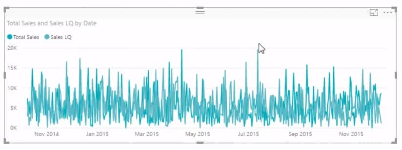
If you are comparing trends on a daily basis and frequently compare your sales analysis to that of a prior quarter, it could become a very, very busy chart.
I’m going to show you what I mean by a ‘busy’ chart. I’ll start by grabbing my Dates and turning it into a filter so we can focus on a specific time period.

Then, I’ll grab my Date, turn it into a table, and get rid of the hierarchy. I’ll also grab my Total Sales here.
Calculating Sales Last Quarter
I’ve also created a measure for my quarter-on-quarter sales. I called this measure Sales Last Quarter and calculated the Total Sales. I’ve changed the context because that’s what we do inside of the CALCULATE function.

To change the context, I used the DATEADD time intelligence function to jump back one quarter.
I dragged the Sales Last Quarter measure to my table and turned it into a line chart.

In my view, this is a busy chart where it can be difficult to identify a trend. When it comes to trends, we just want to see the average over time, right? However, this chart is granular and shows too much information.
Using Moving Averages
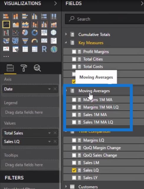
I want to show how we can even out these numbers and derive better analysis from this busy chart. To do this, we need to incorporate our measures inside a moving average pattern that will show these trends a lot better.
I’ve already set it up right here:

Let’s take a look at the moving average pattern I used to create these moving average measures. As you can see, it’s a relatively straightforward measure where the Total Sales appears inside the AVERAGEX function.

Remember that AVERAGEX is an iterating function, so we need to create a table inside the function for it to iterate through. It can be a physical table like something in your data model, or a virtual table.
Using The DATESINPERIOD Function
Let us think logically what we are trying to do in a moving average. On any particular day, we’re opening up a window of time and then averaging all of the results within that window. This is exactly what the DATESINPERIOD function does for us.

It enables us to create a table on any particular day and it opens up the window. In this case, we’ve input some parameters inside the formula to open up this window for one month.
So on any day, we’ll iterate through one month prior to that day. We’re also going to calculate the Total Sales for every single one of those days and average them up. This is going to give us the one month moving average measure, which I’ve called Sales 1M MA.
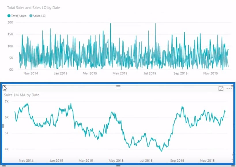
Let’s drag the Sales 1M MA measure onto our table.

You can see that it’s a much smoother number, right? It shows the trend a lot better compared to the first chart we created.
Getting The Moving Average From Last Quarter
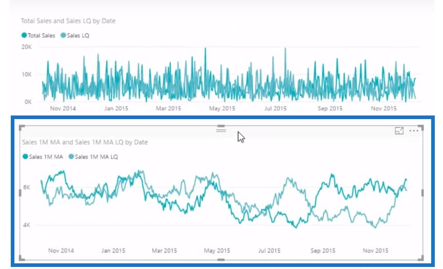
We also want to show this measure against the results. We can do this by using exactly the same pattern of moving average formula. But instead of Total Sales, I’m going to sub in my Sales Last Quarter – the time intelligence calculation we just did earlier.

Once I drag this onto the visualization, you can see how it looks way better when it comes to evening the numbers out and identifying the trends. In this case, there’s not a huge difference in trends and not a huge significance in divergence. But if there was a huge difference, this chart would definitely highlight it.

If we go back to my report, there are lots of different time frames that we can jump into. We can also change the product that we’re looking at to see if there are any trends and divergences that are using the same techniques I showed here.

We can also jump into a particular grouping of customers.

With Power BI, you can dynamically look at all these factors and show a trend in a less busy way.
***** Related Links *****
How You Can Re-Use Moving Averages In Power BI
Measure Averages Per Day Using AVERAGEX With DAX
Understanding How The AVERAGEX Function Works
Conclusion
By overlaying a moving average formula combination and utilizing functions like AVERAGEX, we can quickly turn a very granular result into an average result.
Once we apply this in our reports, we can identify trends which are sometimes far more important to understand than having very detailed and granular information.
For more business insights for Power BI, check out the below course module located at the Enterprise DNA Online. There are so many analytical techniques you can utilize!
Sam
***** Learning Power BI? *****
FREE COURSE – Ultimate Beginners Guide To Power BI
FREE COURSE – Ultimate Beginners Guide To DAX
FREE – 60 Page DAX Reference Guide Download
FREE – Power BI Resources
Enterprise DNA Membership
Enterprise DNA Online
Enterprise DNA Events


