In this tutorial, I show you how you can layer multiple “What If” analysis or scenarios in Power BI, one on top of each other. It takes your analytical output through the roof if you use this technique effectively. You may watch the full video of this tutorial at the bottom of this blog.
As you likely know, I am a huge promoter of scenario analysis in Power BI.
Scenario analysis is an amazing analytical technique you can use in Power BI that virtually allows you to predict what might happen in the future.
I’ll show you how you need to structure your DAX formulas to get this working well and how you can ultimately visualize and combine it with other patterns of DAX formulas to really enhance the insights that you’re showcasing to your consumers, your managers, or to your teams.
This is seriously an amazing analytical technique to utilize in Power BI.
We set up our model, then layer scenarios on top of each other. We’ll also set up some visualizations that would give us an understanding of how the results would actually impact performance.
How To Layer Multiple Scenarios
First we go over our calculations. This is the key point to achieve this multi layering of scenarios. You really need to understand iterators really well. Get a good grip of the SUMX statements because what we need to do is shock the individual variables inside of an iterating function.
We start with our Total Sales. If we want to shock or place a scenario over the demand, then we need to adjust the Quantity bought. If we want to place a scenario over pricing, perhaps increase or decrease, then we adjust the Unit Price variable here. And we do the same for Cost.

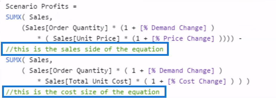
Once we have these formulas, we can have our Scenario Profits. It may appear to be a little bit more complex, but it’s actually not. We are just bringing in these multiple layers of scenarios.
Profits here are going to be derived from Total Sales and Total Costs. In this case, we are going to increase the Demand by whatever variable we place in there. Then, we’re going to increase the Price by whatever scenario we overlay there.

On the Cost side, we are going to increase the Demand. Obviously, it has to be the same if we’re selling more. Not only do we increase the Demand, but also increase the demand on our Cost side. Then, we’re going to look at our Total Cost, and then shock that by the Cost Change.

We could also make this clearer by using descriptive comments like so inside our calculation.

Now that we’ve done that, every single element that we bring in here is going to alter the calculation that it does at a particular row. That’s how we get different results for every single day.
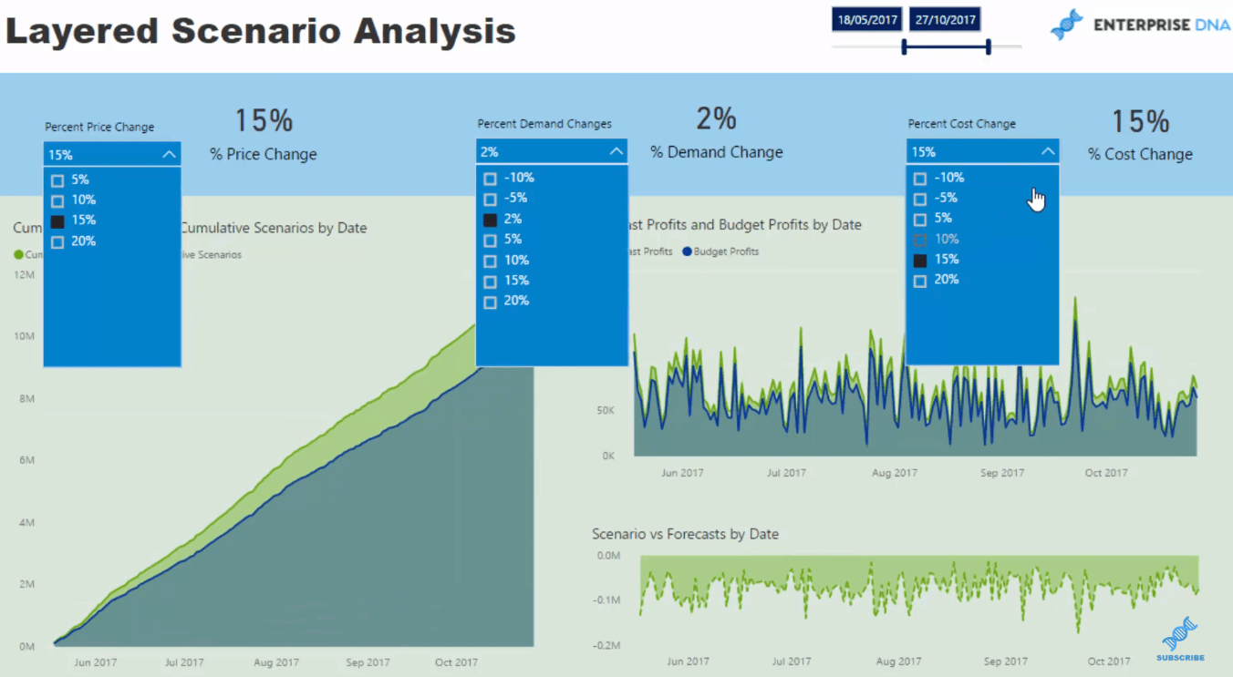
From here, we need a different visualization for further information where we can select any time frame and see what the impact of these layers of scenarios do to our results. But, it doesn’t look very good on a day-by-day basis, as it’s way too busy. The best way to do that is cumulatively.
Using The Cumulative Pattern
We utilize the Cumulative Total pattern, and then just input the initial calculation that we’ve made. We push forward our Scenario Profits calculation to a year because it is just historic information in the example set up. We do it by using DATEADD, as such in Forecast Profits and Budget Profits.

Then, we put them into the Cumulative Total pattern.

This actually represents a much better dynamic way of how changing any of these elements can affect our overall results.

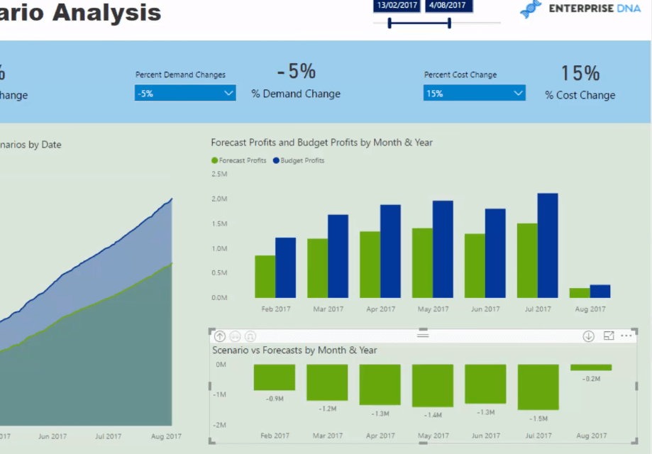
We can extract a number of really great insights from this visualization. We can also change these table to whatever we feel is a much better view of the results.

That’s how quickly you can go and run those scenarios across all of your all of your results.
***** Related Links *****
Using Multi-Layered Scenario Analysis In Power BI
Scenario Analysis Techniques Using Multiple ‘What If’ Parameters
Develop Advanced Scenario Analysis Models Using DAX In Power BI
Conclusion
Sometimes running a particular scenario in your reports and shocking one element is not enough. That’s why we have to have multiple layers of these scenarios and integrate them into our formulas.
Once that’s done, we then have to figure out which visualization is best for our reports. Cumulative Totals are really great especially around this sort of scenario type build-up.
If you can get your mind around some of the more advanced concepts that I run through and show you how to implement, then you’ll be creating very high quality analysis and be able to showcase it in a really effective way in Power BI.
All the best!
Sam


