In today’s tutorial, we will be talking about the key elements of actionable reporting in Power BI based on the IBCS standards. If you’re not familiar with IBCS, it stands for International Business Communication Standards, which are the highest standards for business data visualization and reporting. You can watch the full video of this tutorial at the bottom of this blog.
Let’s go over the key elements of actionable reporting, and you’ll see how quickly we can build them in Power BI.
IBCS Standards In Power BI Reporting: Using Advanced Charts
The first element of actionable reporting is having the ability to use some advanced charts, such as segmented charts, waterfall, charts, and so on, and the variance analysis. To demonstrate this, let’s jump into Power BI.
We start with a blank canvas, and we’ll just simply add in our tables and charts. Once we bring in, say a table here, we can now populate it with the data. Let’s start with a structural breakdown. In this case, the tables are most appropriate, and we can just populate them with your actual data.
Even though this is a table visual, you’ll see that you get the column volumes sorted. We can also simply click on the column to apply different sorting options. This remains consistent for all the columns in the visual.
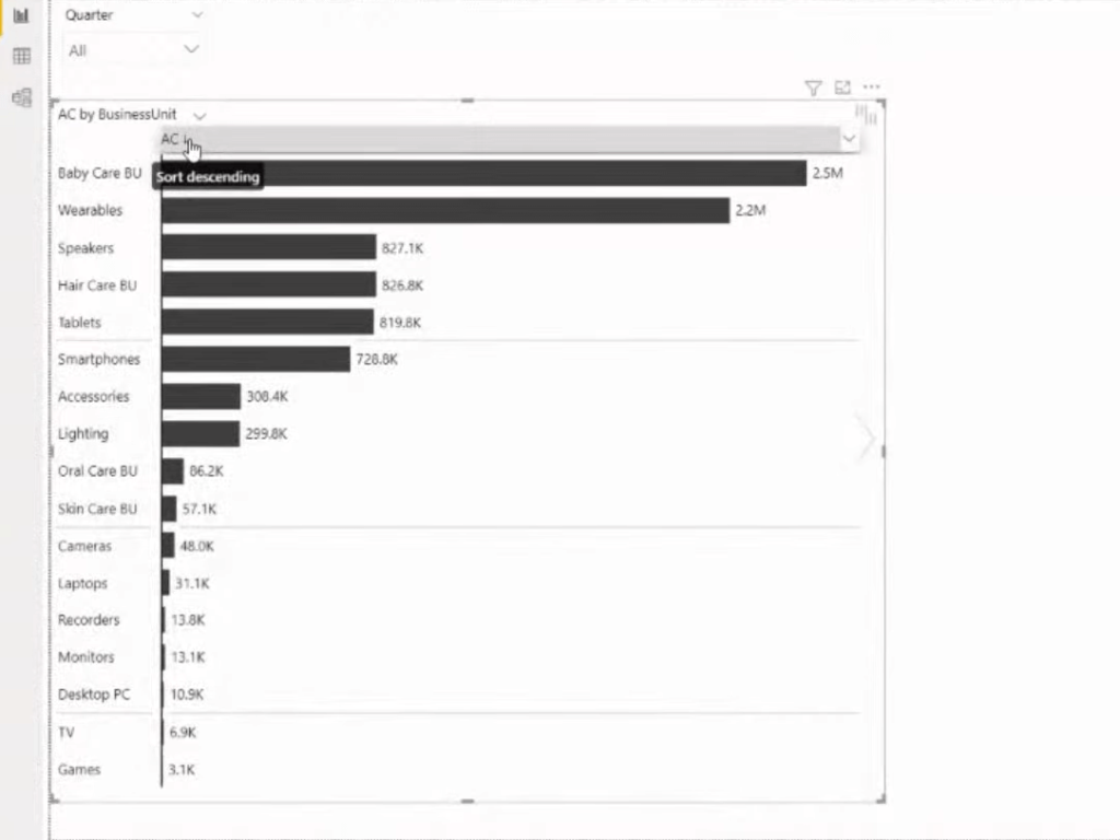
But the key information when trying to compare different elements is to add comparison measures. But the key information when trying to compare different elements is to add comparison measures. So if we put the Previous Year measure into the Previous Year category, you’ll see that we get this column for the previous year as well as the automatic variances.
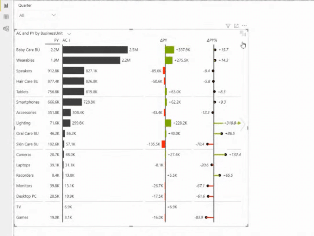
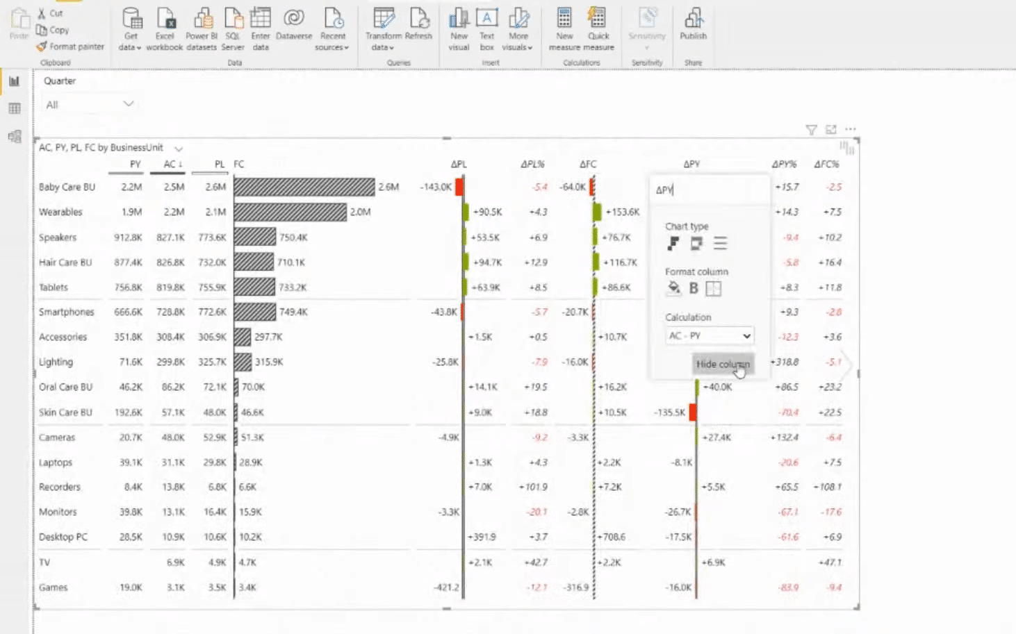
Keep in mind that we want to have a responsive design to keep the maximum amount of information that is available to the visual. We can then make the necessary adjustments and changes as you wish. We can also turn off or hide the columns that are unnecessary. We can also switch to an overlap bar chart on the actual columns. If we want to add highlights to some data, we have the formatting options here as well.
There’s so much that we can do here. We can also add different period calculations. For example, if we want to combine monthly, year-to-date, and time intelligence functions, or even have calculation groups, we can just add those into the group placeholder.
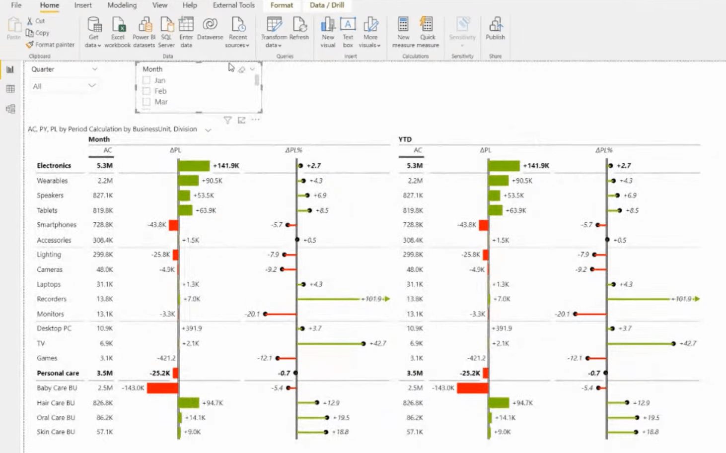
However, if we want to limit the amount of space and data, we can create a really detailed table in such a way that is focused on variances. But we might not want to have those variances displayed at all times. We can just simply switch the view with the chart slider, and then create a completely separate view of the visuals.
But maybe analyzing timeframes in a table manner might not be the best possible solution. So, perhaps for the starting pages and top-level overviews, a better way to compliment this is with charts.
If we add more comparison measures, we’ll get additional information. This is all responsive. If I make it smaller or bigger, it will give us the amount of information depending on the space. We can switch between different layouts and show a particular view in the layout. We are also able to filter the data directly on the visual.
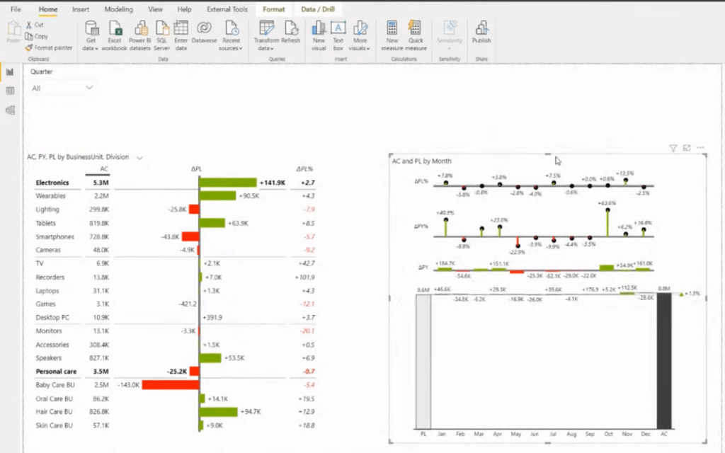
We also want to enable the small multiples. We can quickly enable those features in Zebra BI. We can create multiple elements by just adding those business units, for example, into the group placeholder.
The scaling here is applied. As you can see, the bottom elements don’t really have much volume compared to the top level. What we can do here is just go to the Small Multiples settings and turn on the top N plus other interactions.
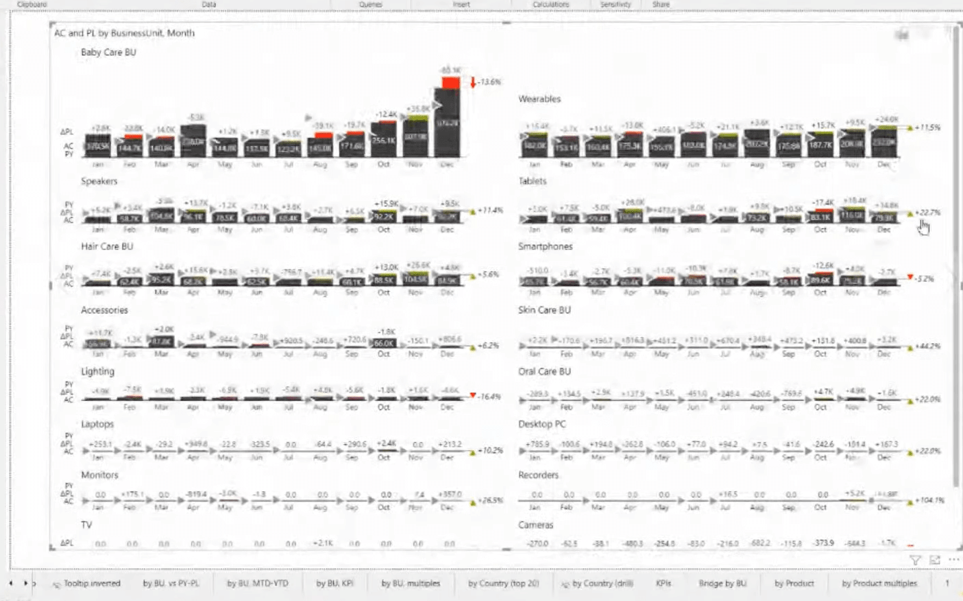
Now we can control the level of items that are displayed with the top five elements and all the rest should be combined in the other fields. We can then increase and decrease this on the visual itself. This is really highly interactive, even for the end-users.
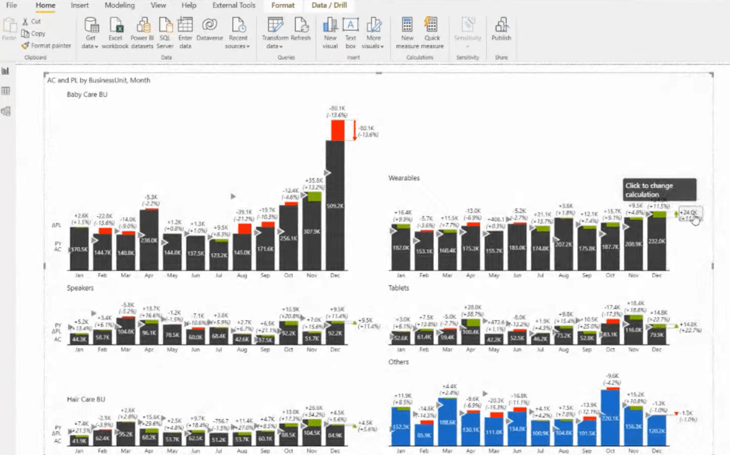
Furthermore, we can also access the stack chart. Usually, stack charts are not the best visualization options, especially if you have many stacks, because it is really hard to compare data, and there are too many elements. But with this Top N plus other functionality, it might be manageable.
Other Important Elements In Reporting Based On IBCS Standards
The next element would be the group tables with variances. Since you can hide certain elements from just a single group, you can create a really detailed approach to this. We’ll see this in action in this example of an executive summary dashboard.
We have here all the comparison measures in the placeholder of the charts at the top. We also have some KPIs on the left side of the dashboard, which we can use to filter the rest of the data. I’ve used the Zebra BI card for the KPIs, which is another key element of actionable reporting. At the bottom, we have segmented charts.
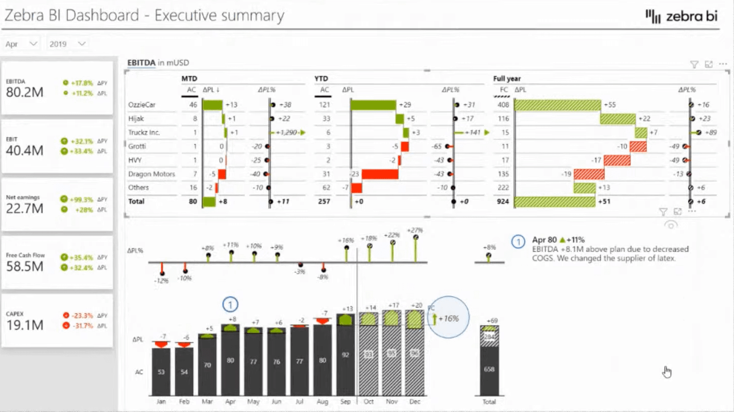
Furthermore, using the Top and Bottom N, which can be also applied to the tables, is also key to report creation. Using report page tooltips for driving additional insights and providing this on the fly can really be powerful in your storytelling as well.
It’s also a really good idea to start with a landing page that has those top-level breakdowns. You can see that the Top N plus Others feature is here applied. We can also combine this with, comparison measures or automatically adjusted variances.
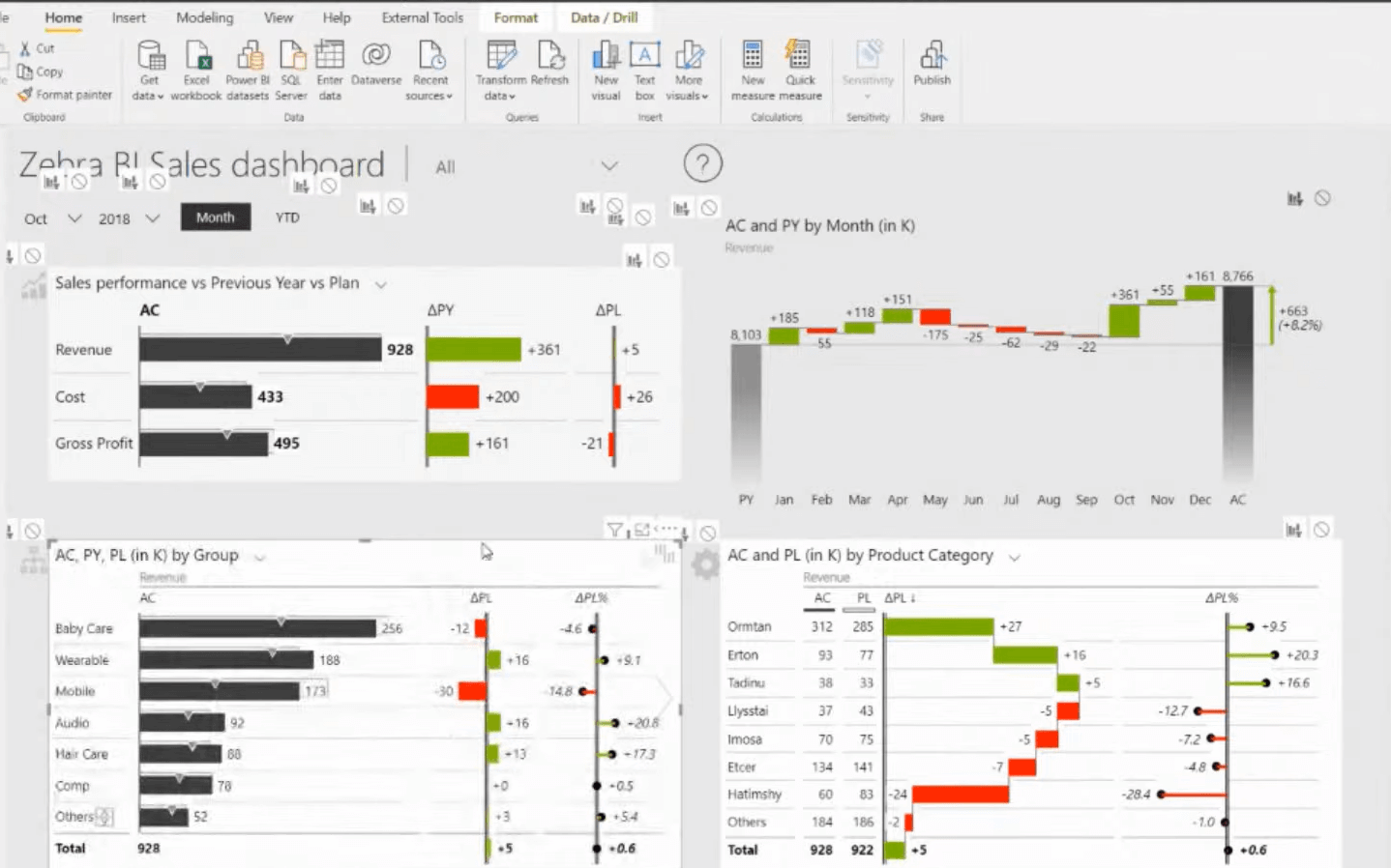
Another key element of a really good, actionable report is onboarding your users. By using Help overlays with buttons and combinations of GIFs and bookmarks, you can create a really good onboarding experience.
Lastly, a really key element of actionable reporting in finances is showing different financial statements. In this example, we have a table visual that has a structure of accounts and your values, compared to the plan. We are using an integrated waterfall chart type on the columns.
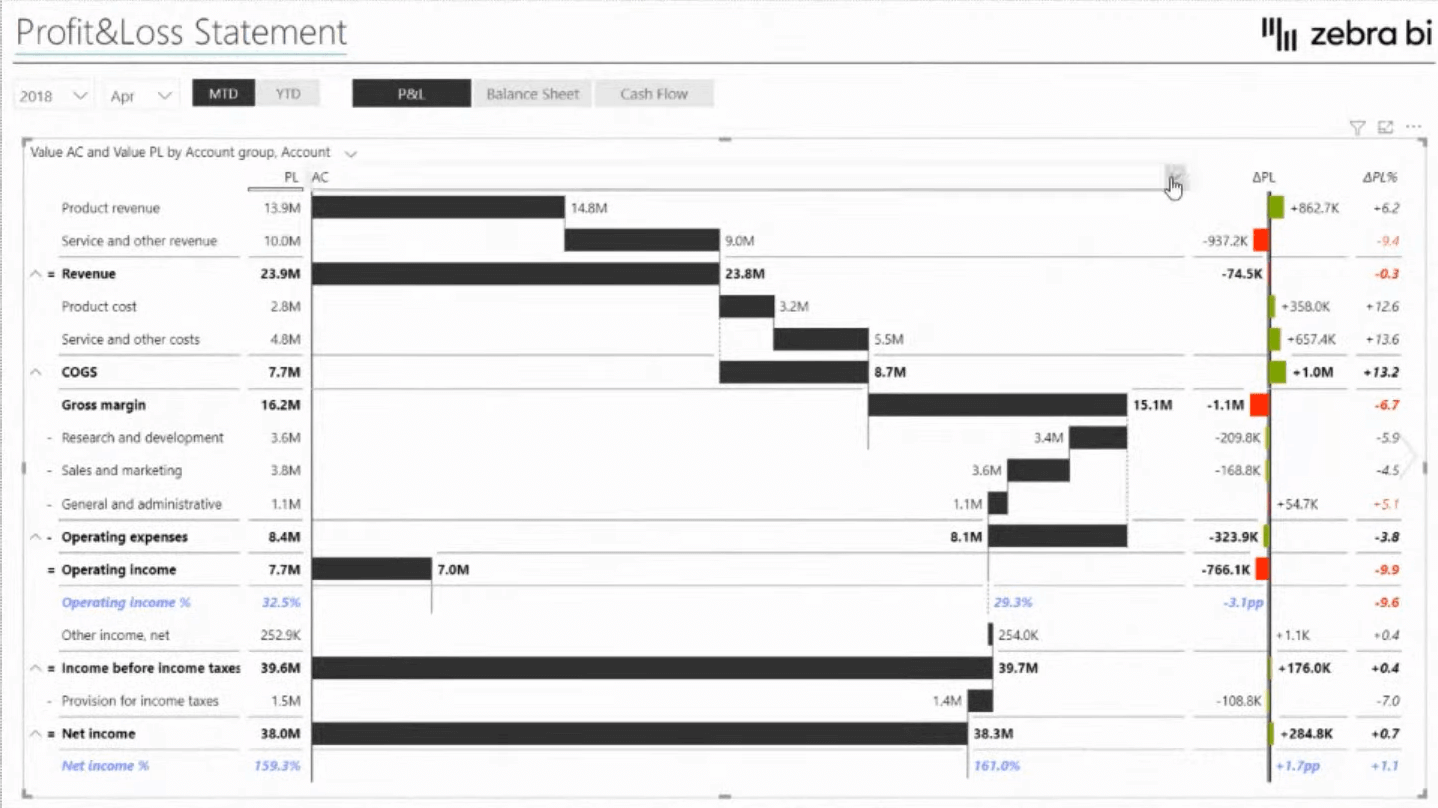
When we are talking about financial statements, we usually don’t have certain measures in the account structure. So, what we can do here is click on any of the categories, we can just go to the Add Formula and write in the formula on the visual itself. This allows the end-users to have this customization, which really helps us when creating the reports and financial statements.
Additionally, when we have structured our visuals, we usually want to have some commentary, which is additional insights into why certain things have happened. And for this, we can use the commenting solution in all three visuals.
***** Related Links *****
Data Visualization Tips For Your Power BI Reports
Power BI Best Practice On Reports & Visualizations
Data Visualization Technique | Power BI Dynamic Visuals
Conclusion
Using the IBCS standards for Power BI reporting is such a great way to elevate your reports. You’ve learned in this blog the key elements of actionable reporting. I hope you find this content helpful.
If you want to understand in more detail how to do this, watch the full video below. Check out the links below for more related content as well.
Cheers!
Enterprise DNA Team


