Using a good color theme in your reports is crucial in Power BI. In this article, I’ll show you the tools that you can easily use to create your own color theme or color palettes and how to create consistent colors that work really well. You may watch the full video of this tutorial at the bottom of this blog.
One great tip around colors is to keep things simple. Don’t overload your reports with colors.
I just want to highlight something that really stands out to me from some of the recent Power BI challenges that we’ve done at Enterprise DNA. The Power BI challenge initiative has created the ability to see the progress in developments of those who have joined our community and how they actually create Power BI reports. In the past, this wasn’t really possible.
One thing that’s really stuck out to me is that colors are still not used as effectively as I feel they should be. But it’s such an easy fix! It is so simple to update and change your reports and it makes a huge difference.
Common Mistakes When Choosing A Report Color Theme
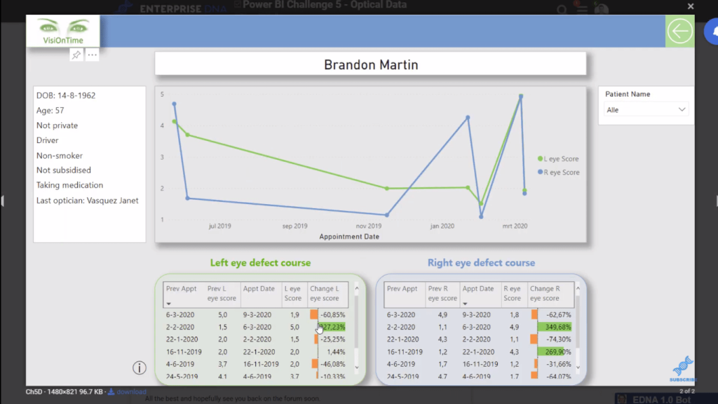
Here are some examples to show you what I mean.
This one looks okay, but I’m not totally convinced that the colors used in this report work well together.
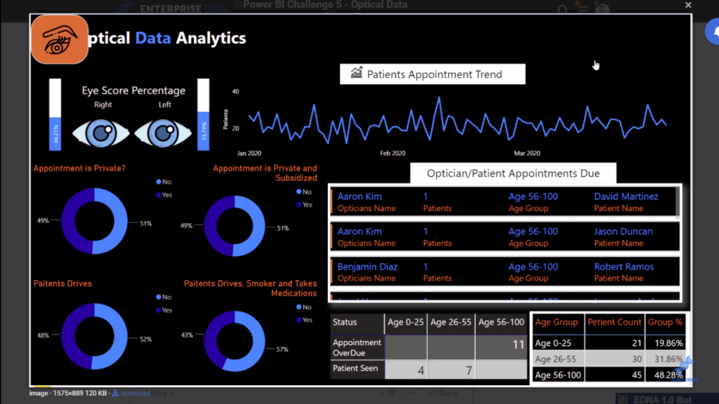
Another example is the report below with a black background. It’s also okay, but I think the red color looks out of place here – it’s not the best!
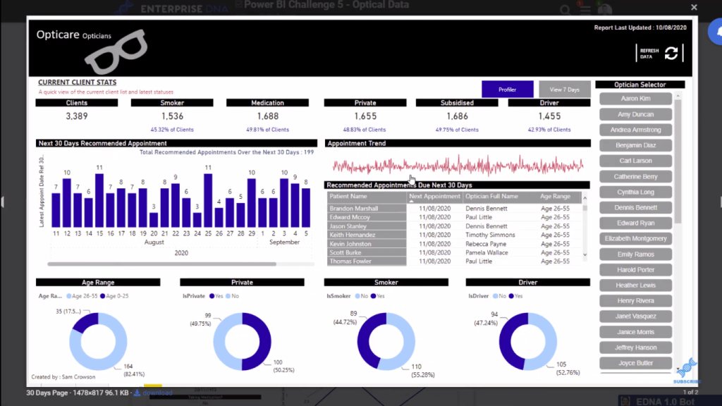
Here’s another one that uses red that doesn’t work well with the other colors in the report. So everything else is kept pretty simple, but then all of a sudden, you’ve got this weird red in there.
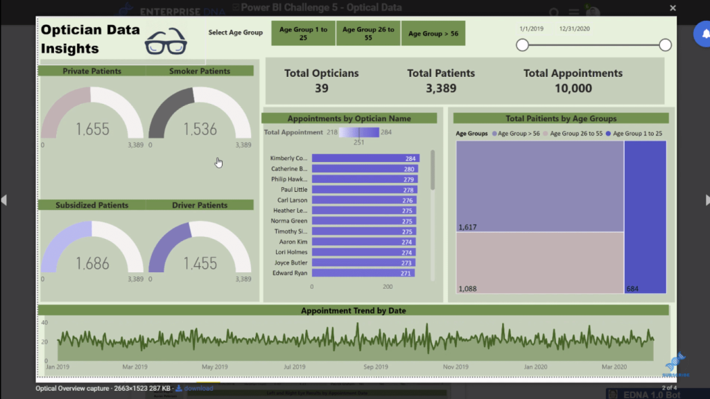
Make sure your colors are consistent. You don’t need to do anything fancy other than just keep it similar.
Here’s another example of a report that uses inconsistent colors. The colors, to me, look a bit random compared to the green that is used around the report. This would look great if the colors are derivatives of this main green that has been used; it would look so much more compelling.
Here are more examples. Notice how the colors collide. They don’t match at all.
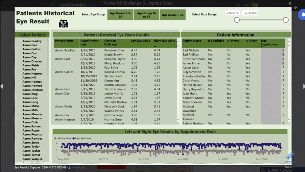
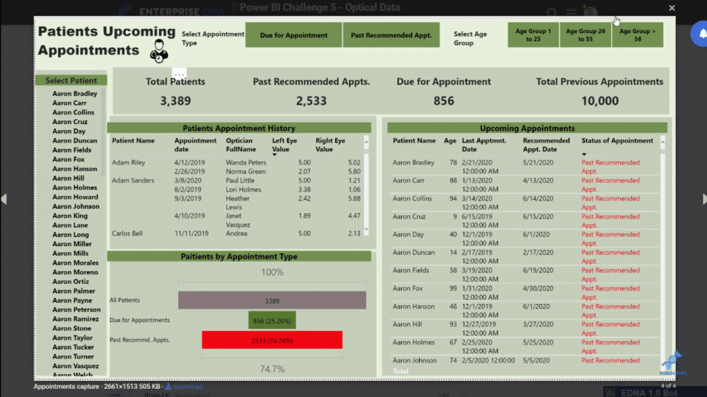
Everything in your report has to work well with a palette. Keep things more consistent.
Good Color Choices For Reports
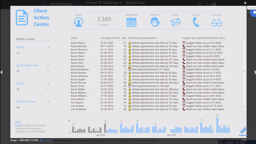
Now, check this one out from one of our Power BI experts at Enterprise DNA. The colors she used is so simple, but it’s also really effective, don’t you think? It’s basically just two colors, but they make the report compelling.
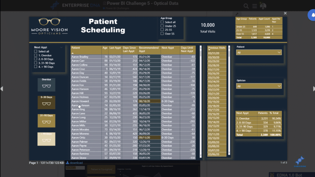
Here’s another one from our expert, Jarrett. I think this is a really good one. See how the use of a really nice color palette works really well.
How To Improve Your Report Colors?
I just want to show you how easy it is to improve the quality of your reports. Here’s one example. The background color in this report, to me, doesn’t really go with any of the colors here. A really simple fix of changing the background color to a different shade would do the trick. The colors are all the same palette, but make sure that there’s a good contrast between the colors.
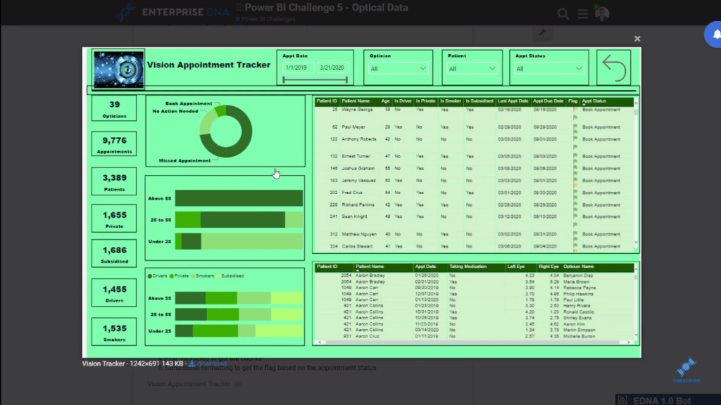
This one is quite innovative, but the colors are random. This would look so much better if it is consistent in colors. Moreover (for this report), it’s better to have the same shapes in the report. Again, keep the colors and the visualizations consistent.
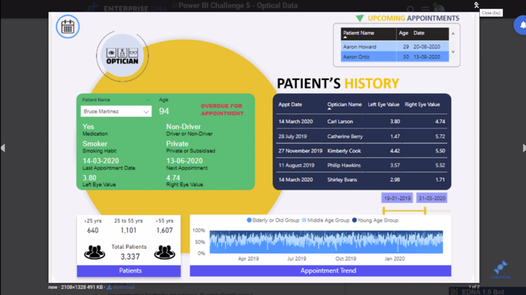
For this report, the background color in the table doesn’t really go with the blues here. So again, it needs to be kept simple and just a change of the background color will make this look better.
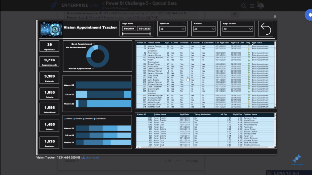
I hope you can see how much more compelling the reports are when they are just simple in terms of the color theme. Just tweaking your colors a little bit makes such a big difference in the way that your report are viewable.
Color Theme Tools In Power BI
If you want to get some good ideas around colors, we have the Color Theme Generator here. It’s within our Analyst Hub application.
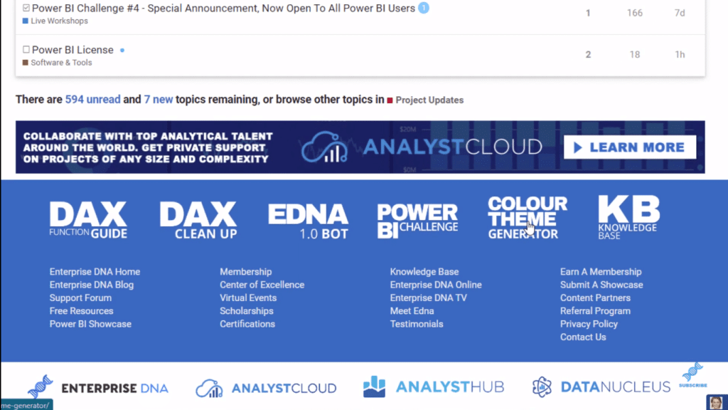
Click on Color Theme Generator and you’ve got three options.
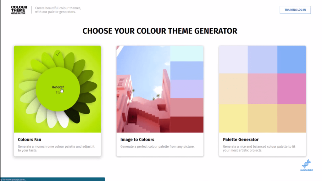
You can use the Colours Fan here. You can twirl it around and get different colors.
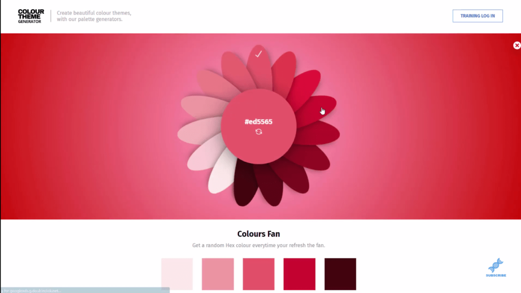
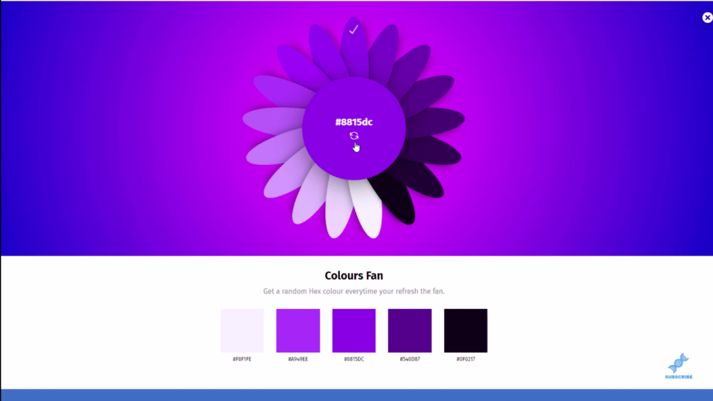
You can click in the middle and you’ll you get the different shades of the same color. This is always an effective way to decide which colors to use. You can also get the hex codes down at the bottom. This is what I use most of the time because I want to choose a color palette and just stick to it.
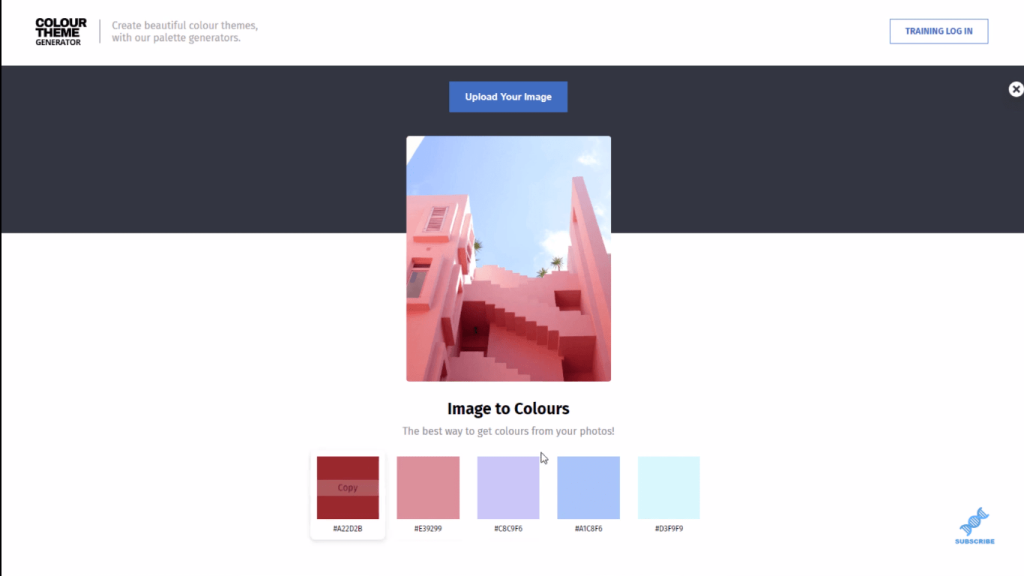
You can also use this Image to Colours, where you can upload an image and get colors from that image.
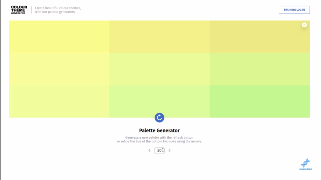
We also have this Palette Generator, where you can change the numbers down the bottom.
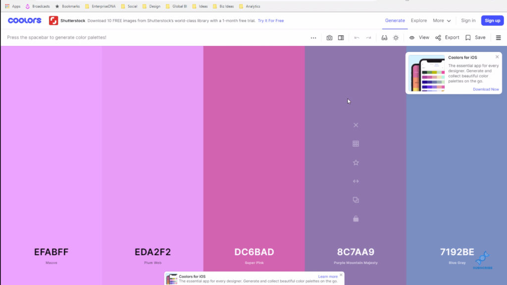
There is another app called Coolors that allows you to start with a particular color, then input that color, and then you can get lots of different colors related to that color.
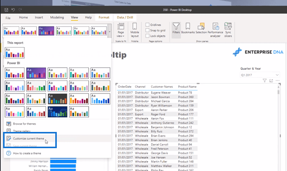
To do that, go to a Power BI model, and then go to View, then Theme. Within the Theme area, click on Customize Current Theme. And then literally all you’ve got to do is change a few of the colors here.
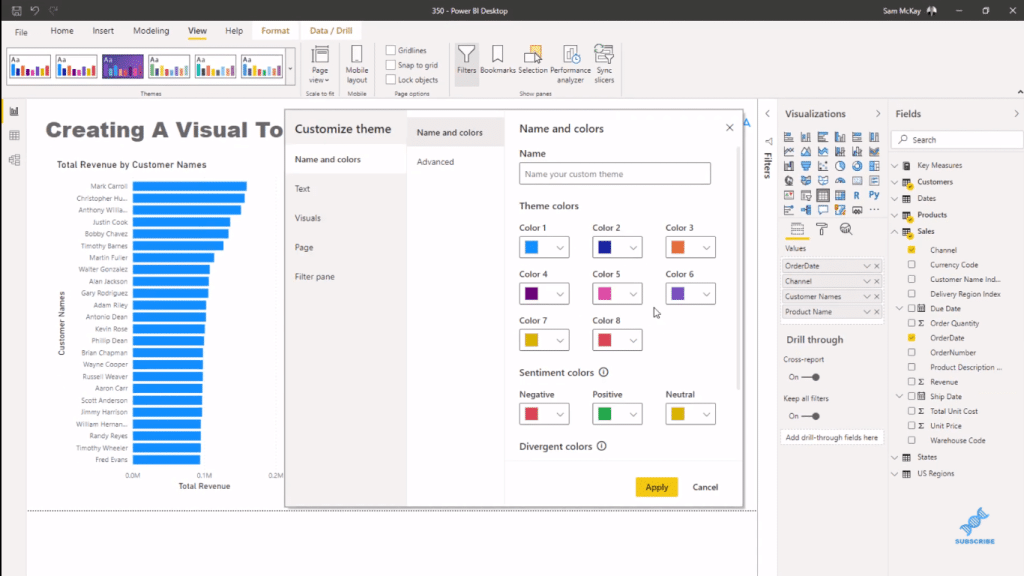
Then, all you need to do is change the colors as you desire.
***** Related Links *****
How To Select Power BI Color Theme For Your Reports
Power BI Color Themes For Uniform Visualizations
How To Create Compelling Power BI Color Palette
Conclusion
In this blog, I’ve given you a few options and ideas when choosing a color theme or color palette for your reports. It all comes down to how important colors are. I hope you can see the usefulness of the tools I showed you to help you out here.
All the very best!
Sam


